

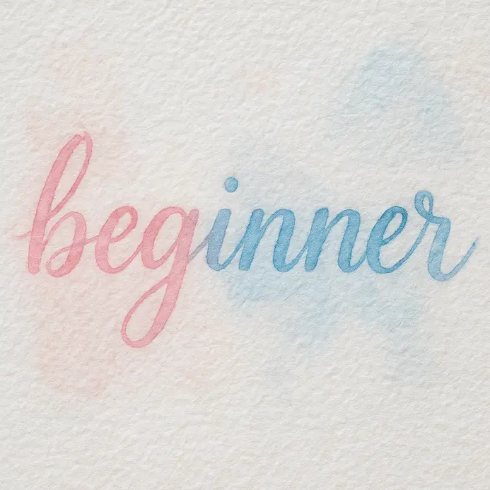

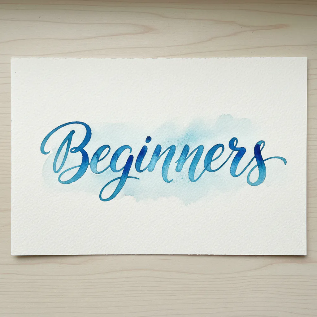
Mastering Water Ratios for Controlled Pigment Flow
Your brush should leave a juicy, colored bead of water at the tip before you touch it to the paper. This bead is your control for transparency and clean edges, making the difference between a vibrant wash and a dull, scratchy line. The good news is, you learn this by touch. Load your synthetic round with clean water first, then dip just the belly into your concentrated paint. You want that perfect middle ground where the pigment flows freely but does not flood the paper. Beginners often make this mistake with a brush that is too dry, which kills the fluid character of the letterforms. Test your mix on a scrap piece first. You will notice the color blooms softly and dries with a smooth gradient when your water-to-paint ratio is right. Trust me, nailing this consistency is the foundation for every beautiful watercolor lettering style.
Selecting Cold Press Paper for Texture Depth
A 140lb cold press sheet has enough tooth to grab the pigment and enough weight to stay flat when wet. That texture is not just for looks. It creates tiny valleys that hold your paint, allowing for those soft, organic transitions and visible water blooms that define the style. Standard printer paper buckles instantly and bleeds, ruining your letterforms. You need that heavier, textured surface to control the flow. The paper’s sizing, which is the internal glue, also determines how the paint sits on top or sinks in. Cold press gives you a perfect balance. It allows you to lift color for highlights and supports wet-on-wet blending without pilling. Investing in proper paper makes every technique easier for watercolor lettering for beginners and your final work looks professional. It is the one supply you cannot skip.
1. Prepare Your Workspace with High-Weight Watercolor Paper
Ever watched your beautiful lettering get ruined by a wavy, buckled page? That’s your paper telling you it’s not heavy enough. Trust me, starting with the right foundation makes all the difference. For watercolor lettering, you need high-weight watercolor paper, typically 140 lb or more. This thicker paper has more fibers to absorb water evenly, which prevents that frustrating buckling and lets you practice watercolor lettering for beginners with multiple washes. To set up, tape your sheet down to a rigid surface like a Canson drawing board. I love using artist’s masking tape for this because it holds securely but peels off cleanly. This simple step keeps your surface perfectly flat, giving you the control you need for crisp, even lettering. It turns a potentially messy experience into a smooth, enjoyable one. You can find fantastic starting points with some easy watercolor painting ideas to practice on your new, stable surface. Isn’t it satisfying when your tools work with you, not against you? Feel the confidence of a flat, professional workspace ready for your creativity.
2. Sketch Light Pencil Letter Guidelines: Your Invisible Framework
Does the idea of perfectly aligned letters feel intimidating? Trust me, it does not have to be. The secret is a simple, invisible framework you sketch before you ever touch your paintbrush. You will create a few light, parallel lines on your paper to define the height and placement of every letter. Grab a ruler and a 2H or H pencil. Draw your baseline first, which is where all your letters sit. Then add a cap line above for your tallest letters, and an x-height line in between for lowercase bodies. It is like building a house on a solid foundation. This structure ensures your lettering looks uniform and professional, not wobbly. Why does this simple step work so well? It gives your hand a clear path to follow, removing all the guesswork. You will be amazed how much cleaner your approach to watercolor lettering for beginners looks with this printable invisible guide. Feel the confidence of having a perfect plan before you start painting.
3. Load Your Round Brush with Pigment for a Perfect Start
Ever wondered why your first stroke sometimes looks weak or blobby? The secret is in how you load your paint brush. Start by dipping your round brush in clean water, then gently blot it so it is damp, not dripping. Next, swirl the damp bristles through your paint, working the pigment up into the belly with a little twist on your palette. I love this step because it gives you a brush full of creamy, ready-to-flow color. This careful loading prevents paint from drying in the ferrule, which protects your brush, and ensures every stroke has consistent coverage. Shape the tip to a fine point for detail work. For a beautiful, soft look while mastering watercolor lettering for beginners, you can create soft pastel watercolor art using this same controlled technique. Feel how much smoother your painting becomes.
4. Test Your Paint Consistency on a Scrap Paper First
Ever find your brush strokes turning into a watery puddle or a thick, clumpy mess? I love this simple trick to save you from that frustration. Before you touch your final piece, always do a quick test on a scrap piece of paper that feels similar to your main surface. Dab a bit of your mixed paint and watch how it flows. You are looking for a smooth, creamy texture that gives you control. If the paint spreads too fast and looks pale, it is too thin. Add a bit more pigment to your mix. If it feels stiff and leaves obvious brush marks, it is too thick, so add a touch more water. This quick check gives you total predictability when approaching watercolor lettering for beginners, letting you focus on your lettering with confidence. It is a fantastic way to explore various watercolor techniques and find the perfect flow for your style. Trust me on this one. Taking that extra minute to test your paintbrush makes all the difference in creating crisp, beautiful letters you will be proud of.
5. Apply Light Upstroke Pressure for Thin, Graceful Lines
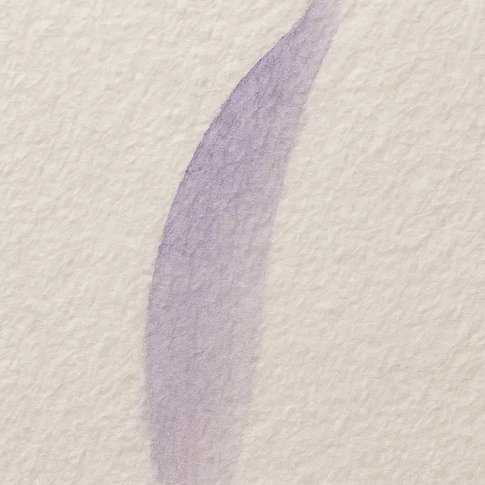
Ever wonder how those elegant letters get those impossibly thin, hairlike lines? The secret is all in your upstroke pressure. For a beautiful upstroke, you want to apply almost no weight to your brush pen tip. Just let it glide across the paper. This creates a huge contrast with your thicker downstrokes, which is a key concept when practicing watercolor lettering for beginners. I love this technique because it makes your lettering feel alive and dynamic. A relaxed grip and moving your whole arm from the elbow will give you the smoothest lines. Does that not feel satisfying when you see those graceful lines appear?
6. Apply Heavy Downstroke Pressure for Bold, Confident Lines
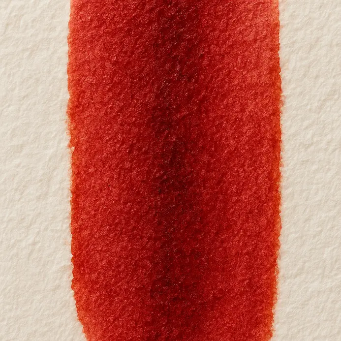
Ever notice how the most striking lettering has those wonderfully thick, confident downstrokes? It is not just about pressing harder, it is a controlled dance with your tool. For watercolor lettering, you will want to use a soft watercolor brush or a pointed brush pen. The trick is to consciously increase pressure as you pull the stroke toward you, letting the bristles spread to lay down more pigment and create that bold line. This technique works because that visual weight gives your letters instant structure, making watercolor lettering for beginners look decisive, not hesitant. A great way to practice this pressure control is by drawing simple vertical lines, focusing on a smooth, heavy application. watercolor tattoo design inspirations. Trust me, once you get the feel for it, your lettering will gain a whole new level of depth and personality. It feels so satisfying to see those bold lines come to life on the page.
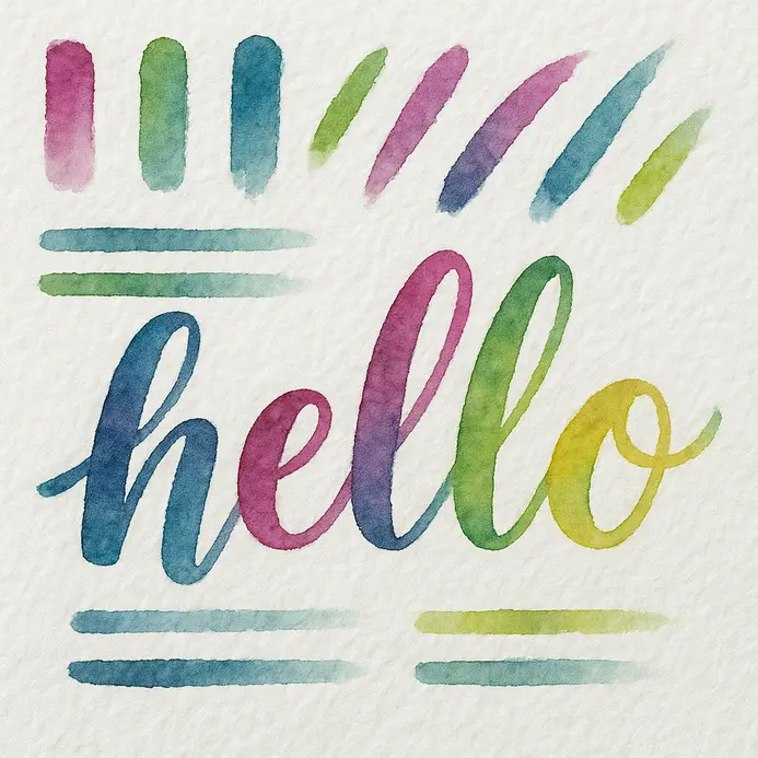
7. Paint Connected Cursive Letter Forms with Fluid Motion
Ever wonder how artists make those gorgeous, flowing words look so effortless? The secret is engaging your entire arm and shoulder, a fundamental habit for mastering watercolor lettering for beginners. Forget drawing with just your wrist. Move from your shoulder to guide your brush in long, sweeping curves across the page. Your paint consistency is crucial here. Aim for something like thin cream so it flows smoothly without bleeding. Use light pressure on the upstrokes and press down for the main parts of each letter. This creates that beautiful thick-and-thin variation. I love the rhythm you find when you get into the groove of connecting letters without lifting your brush. It is incredibly satisfying to see a whole word appear as one continuous, elegant line. achieve realistic watercolor effects.
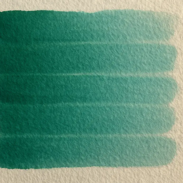
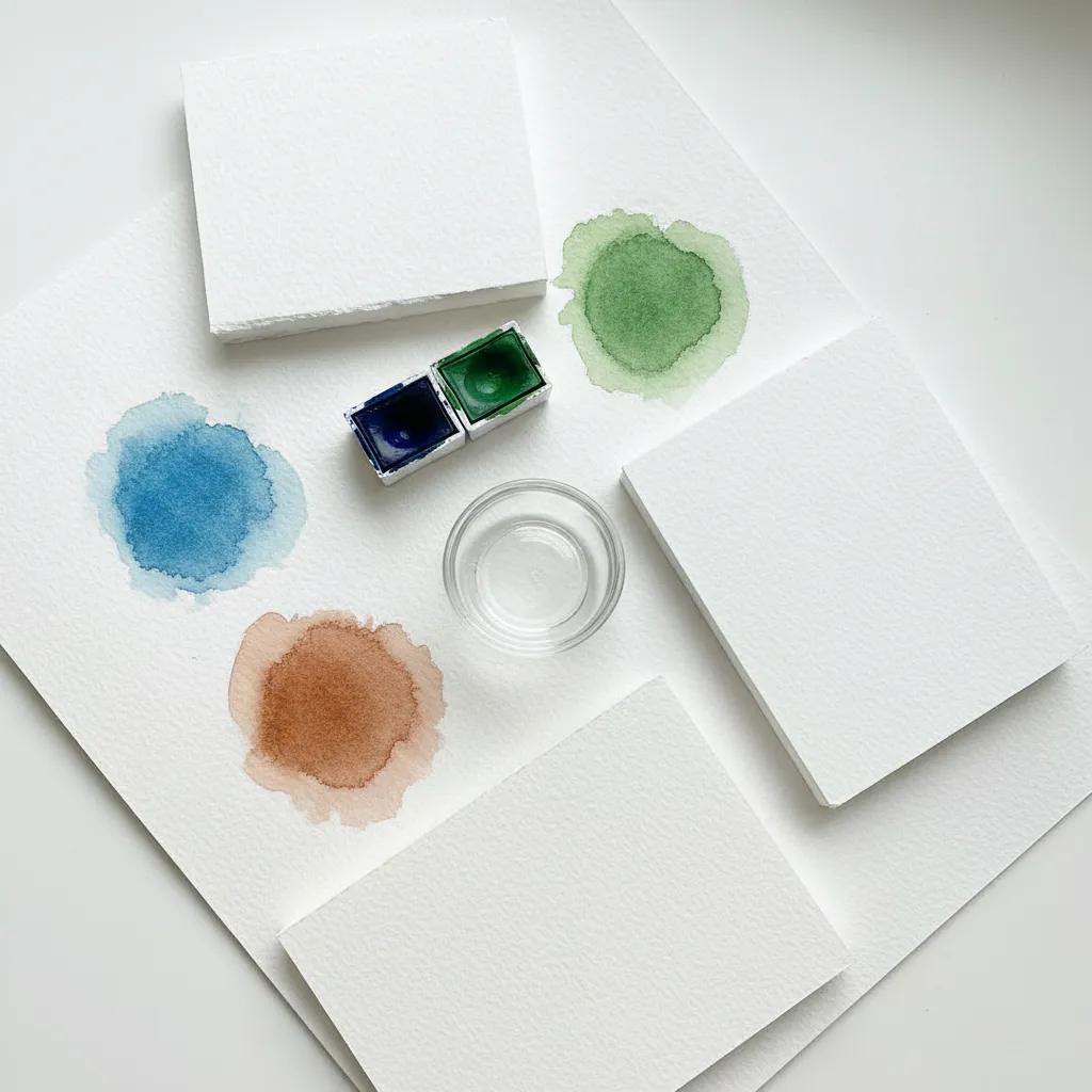
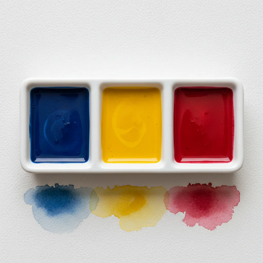
8. Mix Two Colors on Your Palette for Custom Hues
Ever feel limited by the colors in your paint tube set? Mixing your own hues is a rewarding exercise that gives any watercolor lettering for beginners project unique character. Start with a clean palette and squeeze out tiny amounts of two colors. Add the second color bit by bit, mixing with your brush until you see that perfect new shade appear. I love this process because it turns your palette into a personal playground of endless possibilities. For watercolor lettering, this skill lets you create soft, unique gradients for your words. Try mixing analogous colors, like blue and green, for a harmonious look. Remember to test your mix on scrap paper first, as colors can look different when they dry. This direct practice teaches you color theory in the most satisfying way. Do not be afraid of a little imperfection, either. Sometimes leaving colors slightly unmixed creates beautiful, vibrant textures in your letters. Trust me, the ability to create exactly the right mood with a custom color is one of the most rewarding parts of the process.
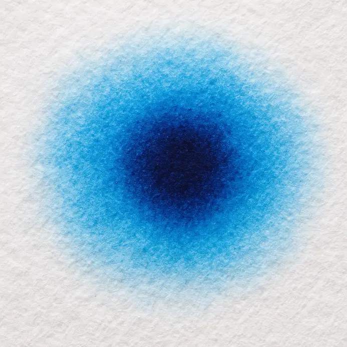
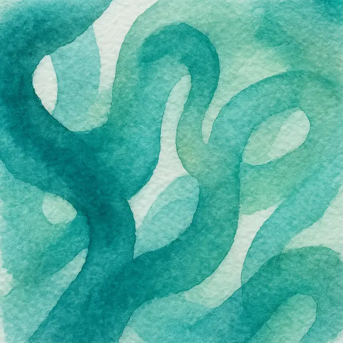
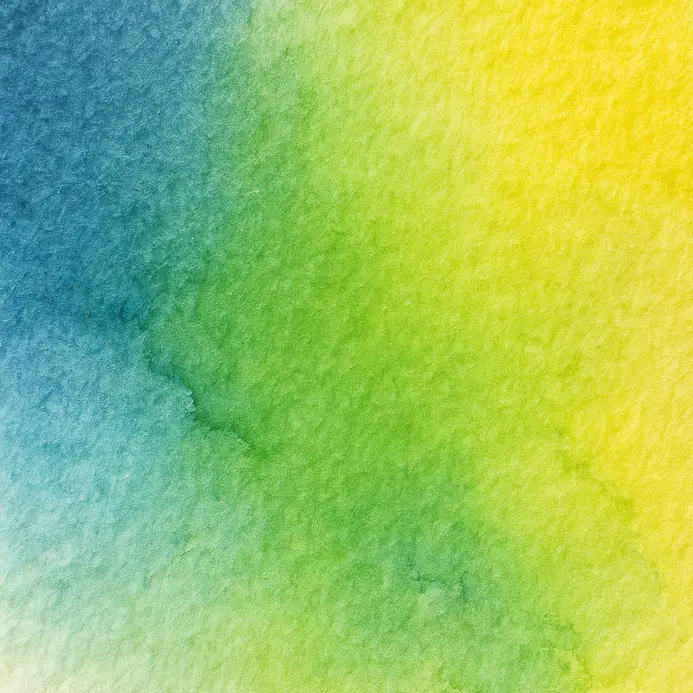
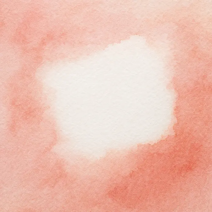
9. Create Soft Wet-on-Wet Color Gradients Within Letters
Ever noticed how the most stunning watercolor lettering has those soft, dreamy color blends? This is your secret. Start by lightly sketching your letter on cold press watercolor paper, which provides the ideal absorbency for smooth results in watercolor lettering for beginners. Then, with a clean brush, pre-wet the inside of the letter until it has a uniform, glossy sheen. While it’s still damp, touch your brush loaded with a light color to one edge and watch it bloom outward. Introduce a second color nearby, and they will mingle into a seamless gradient on their own. I love how this technique feels almost magical. It works because the wet surface lets the pigments flow and mix organically, creating luminous transitions. Your lettering takes on a beautiful, painterly quality you cannot get with crisp lines. For a softer, more expressive look, try blending analogous colors like blue into green. This approach is perfect for creating whimsical watercolor painting ideas where soft blends are key. Pro tip: keep your brush damp, not dripping, to avoid puddles. Feel that satisfaction when your colors melt together perfectly.
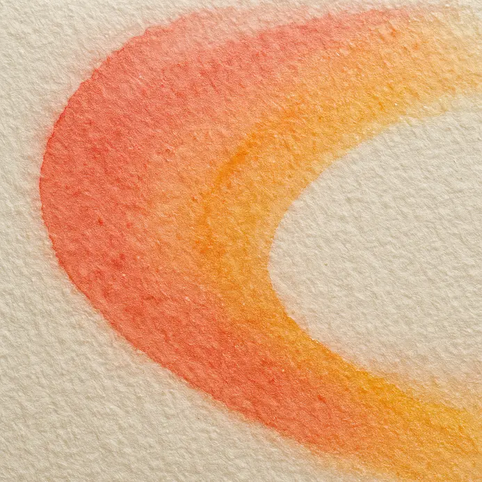
10. Paint Sharp Wet-on-Dry Edges for Crisp Letter Definitions
Ever wondered how to get those perfectly crisp letters you see in beautiful calligraphy? The secret is the tutorial. wet-on-dry technique. You apply your brush, loaded with creamy paint, onto bone-dry paper. This stops the pigment from spreading and gives you those sharp, clean edges that define each letter beautifully. Getting your paint consistency right, including the amount of water, is the key to clean results in watercolor lettering for beginners. You want it like thin cream, not watery. I always test on a scrap first. Load your brush well, then use confident strokes with a steady hand. Trust me, a single continuous motion for short lines makes all the difference for clean letterforms. This technique gives you amazing control and is perfect for building up layers later. If you enjoy mastering different painting methods, you might also love exploring beginner acrylic painting techniques. Feel the satisfaction when your letters look sharp and professional after you let it dry.
11. Blot Excess Water with a Paper Towel for Immediate Control
Ever feel like your beautiful hand lettering is about to turn into a watery mess? This simple trick is my absolute go-to rescue move. When you see a puddle forming or a stroke bleeding, gently press a fresh, dry paper towel right onto the spot. Just press and lift straight up to soak up the extra moisture without smudging your work. Why does this work so well? It gives you immediate command over moisture, a crucial skill for successful watercolor lettering for beginners. You are preventing blurry edges and keeping your letterforms crisp and defined. It also helps your paper dry faster so you can keep going with your next stroke or layer. Trust me on this one, the key is to blot, not wipe. Rubbing will just push the paint around and damage the paper. Keep a stack of clean towels handy and rotate to a dry section often. Feel the satisfaction of taking back control of your artwork.
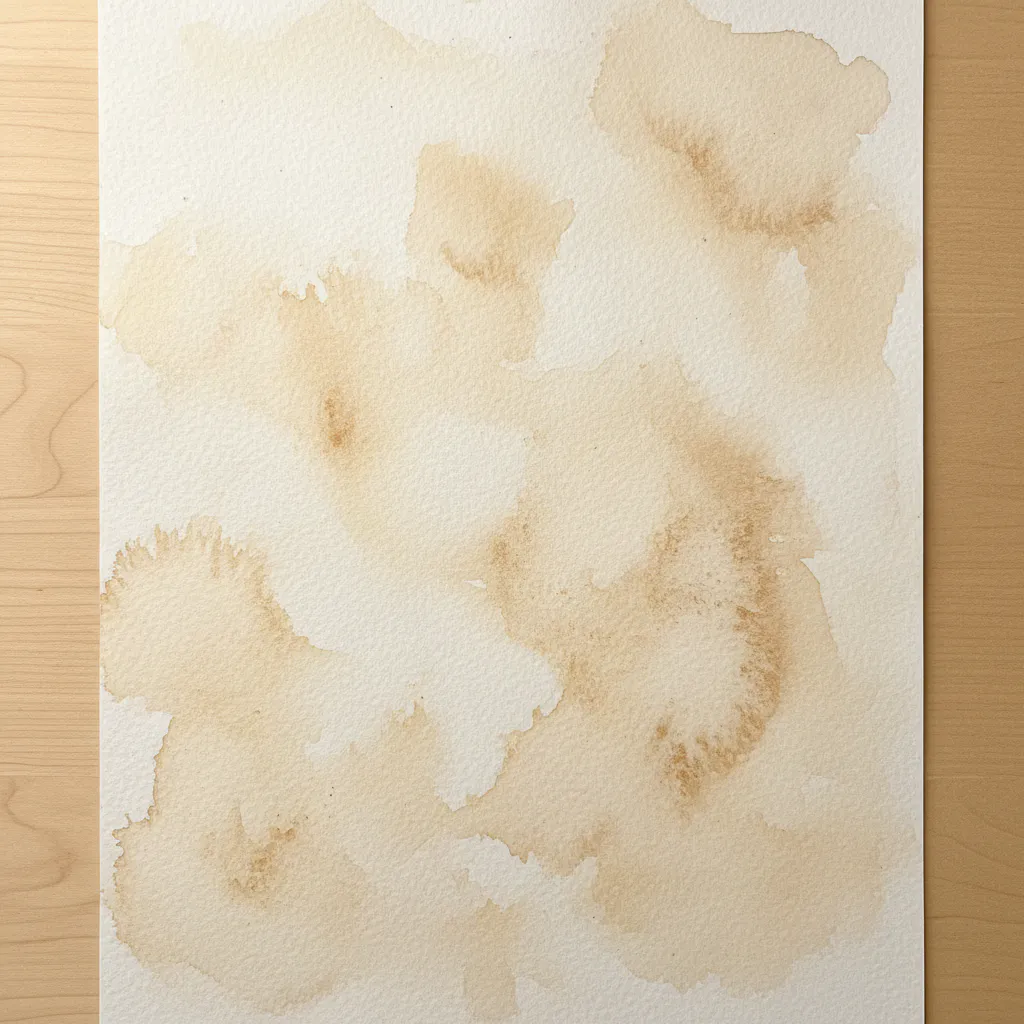
12. Wait for Sections to Dry Completely Before Adding Layers
Ever felt the urge to jump right in and add that next color? Impatience is the number one enemy of clean watercolor lettering. When you let a section dry fully, you create a stable foundation for your next layer. This is the key to achieving crisp edges and preventing unwanted color blending. I love this technique because it gives you total control. You will see the difference in your work. A wet layer has a visible sheen, so wait until your paper looks and feels completely matte. Gently touch a corner to test it. Using a hairdryer on a cool setting can speed things up if you are in a hurry, but air drying is safest. This simple habit prevents muddy colors and protects your paper from damage, ensuring clean glazes while you practice watercolor lettering for beginners. For more layering practice, try out some easy beginner painting subjects. Feel the satisfaction of a job done right.
13. Add Detailed Highlights with White Ink for Luminous Depth
Ever wondered how those beautiful lettering pieces get that glowing, three-dimensional look? This is my go-to secret for making your work pop. It is all about adding tiny, precise highlights with opaque white ink in spots where light hits your letters hardest. Think of it as the final, magical touch you apply after your watercolor is completely dry. That crisp contrast instantly creates form and makes your art look professional. Start with small dots and fine lines, focusing on the tops of curves and along edges. I love how a simple gel pen or a little brush with acrylic ink can bring a flat shape to life. It feels so satisfying to see your letters gain that luminous depth. beginner abstract painting concepts.
14. Outline Your Lettering with a Fine Liner Pen for Definition
Ever wondered how artists get those crisp, perfect edges on their watercolor lettering? This final step is your secret weapon for a professional finish. Once your watercolor paint is completely dry, you will carefully trace over your pencil sketch with a waterproof fine-liner pen. Follow those lines precisely, using short, controlled strokes for the trickiest curves. This creates a dark, permanent border that makes every letter pop off the page. I love how this simple act transforms a soft watercolor wash into something sharp and defined. It works because the stark black outline provides incredible contrast, locking your letters in place and cleaning up any minor color bleeds. Trust me on this one, your patience here pays off with a stunning piece you will be proud to show off.
15. Remove Your Pencil Lines with a Gentle Eraser for a Clean Finish
Ever notice how the cleanest lettering seems to float on the page? That magic touch often comes from one final, gentle step. After your watercolor is bone dry, it is time to address those pencil guidelines. I love this part because it feels like revealing the final, polished piece of art. You will want to use a kneaded eraser for this delicate task. Dab it lightly over your lines instead of rubbing, and watch the graphite lift away without a single crumb or smudge. This careful approach keeps your paper surface smooth and prevents any damage to your beautiful paint layers. Trust me, using too much pressure or the wrong eraser can leave a ghost of gray or even tear the paper. Does that not sound frustrating? A clean removal makes your colors pop and gives your work a truly professional finish. small canvas painting ideas. Feel that satisfaction of a perfectly clean piece.
Preserving Lettering Projects with Acid Free Fixatives
A light, even coat of UV-protective spray varnish shields your work from fading and environmental dust. Watercolor is fragile and can be reactivated by moisture, so this final step locks in your weeks of practice. Choose a fixative labeled acid-free and workable for water-based media to prevent yellowing over time. Apply it in a well-ventilated area, holding the can about twelve inches from your paper. Use short, sweeping passes to avoid drips. Let the first coat dry completely before adding a second for full protection. This sealing process lets you handle or display your lettering without worry. For the ultimate preservation, frame your finished piece behind glass with a mat to keep the paper from touching the surface. Your beautiful gradients and delicate flourishes will stay crisp for years.
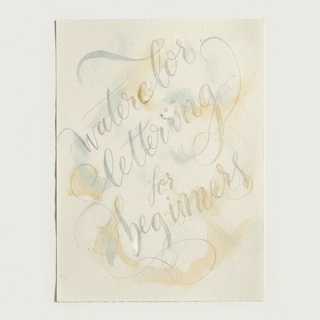
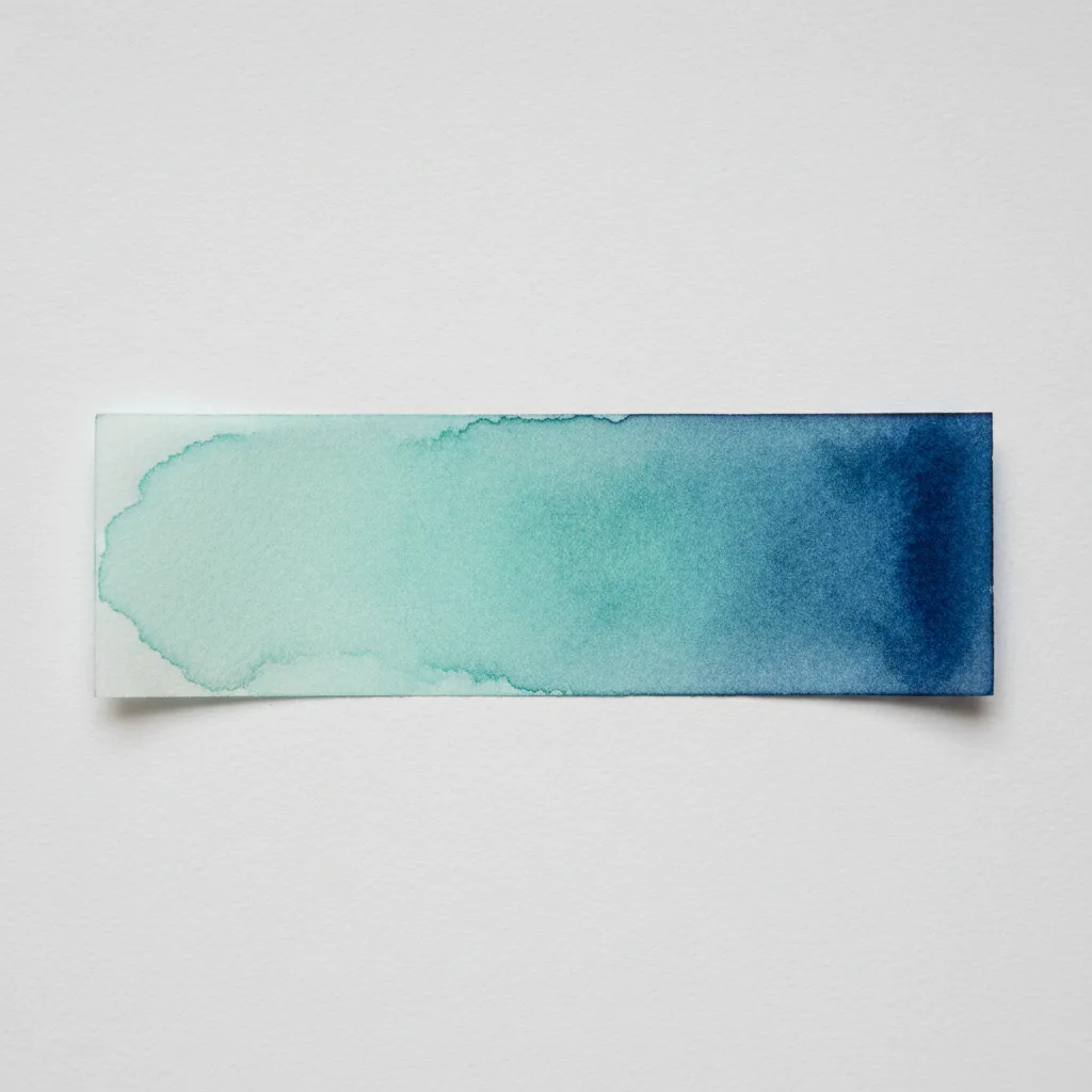
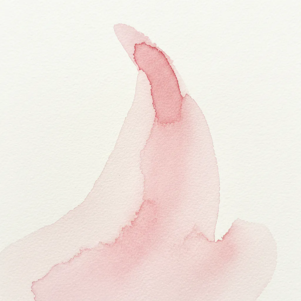
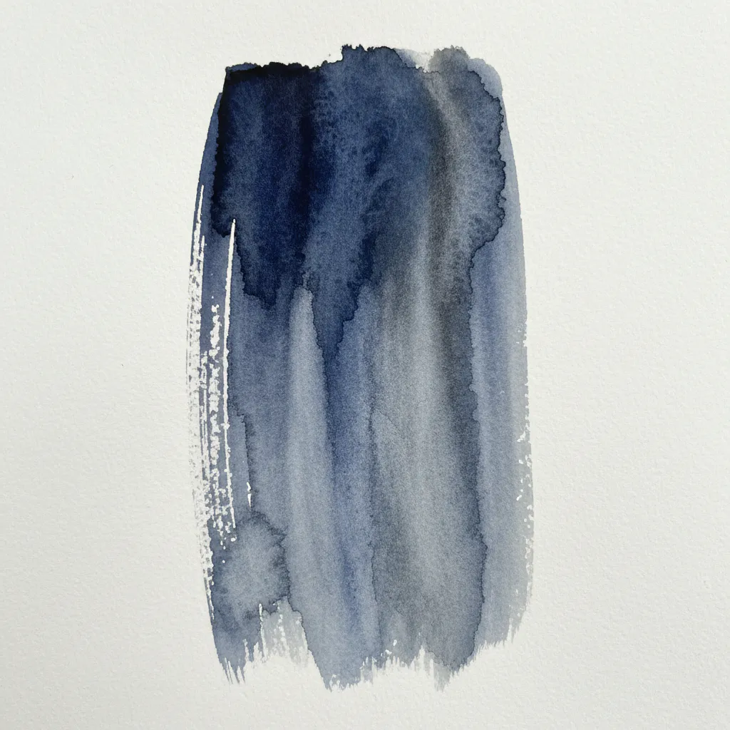
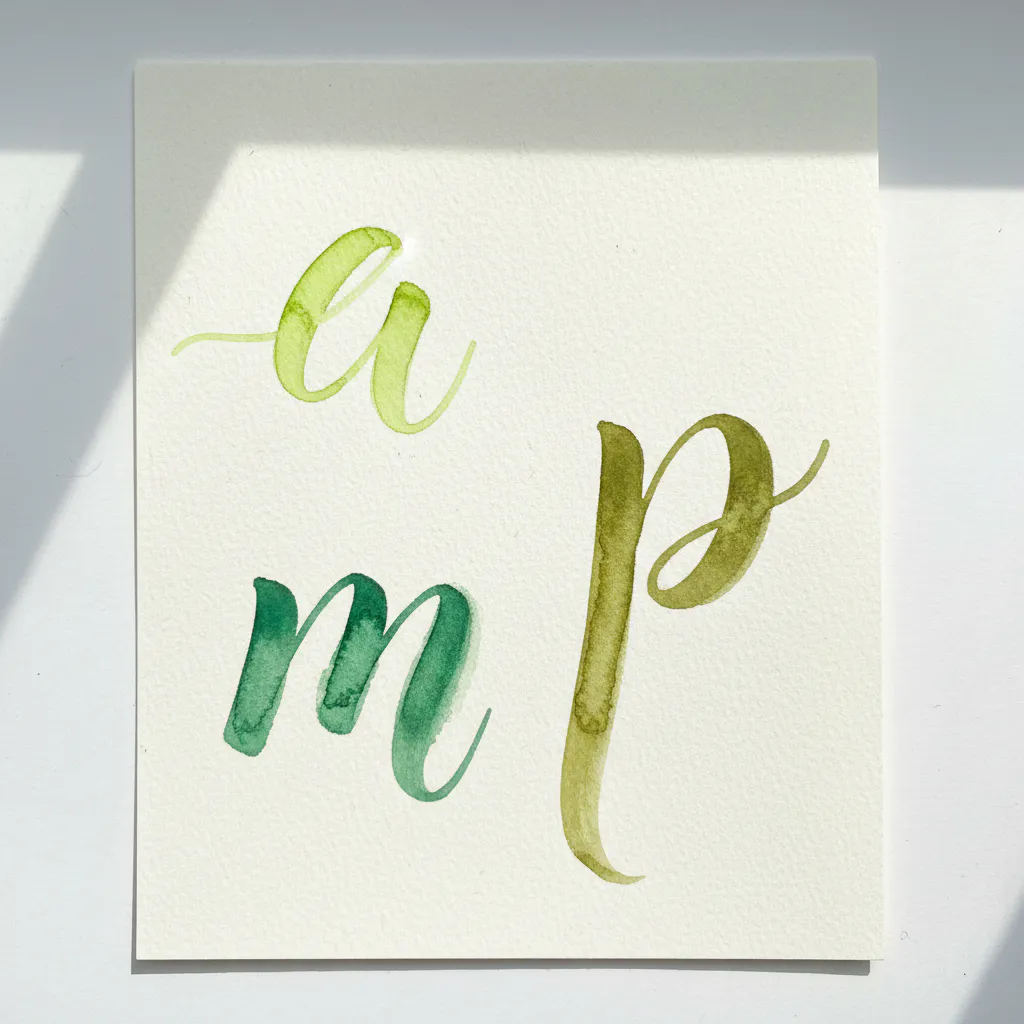
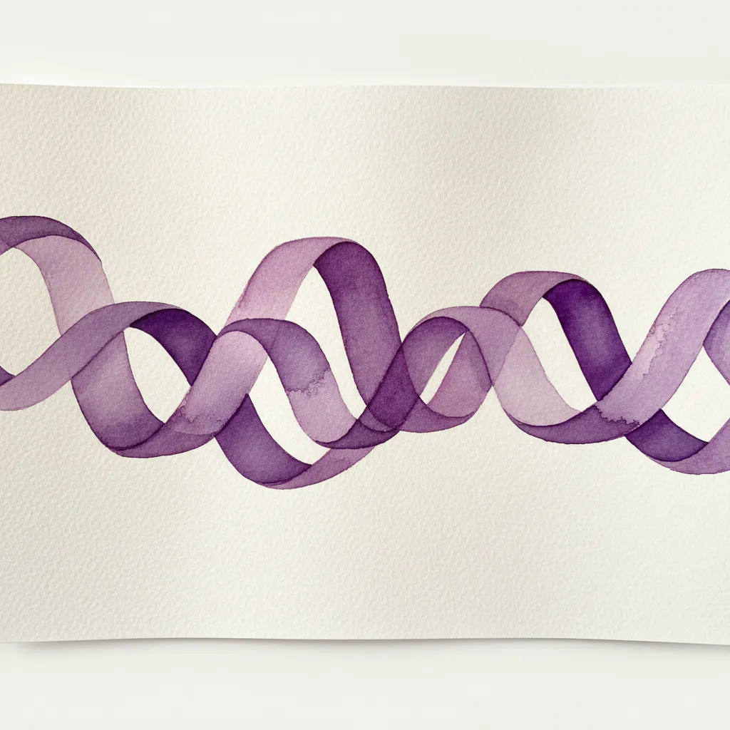
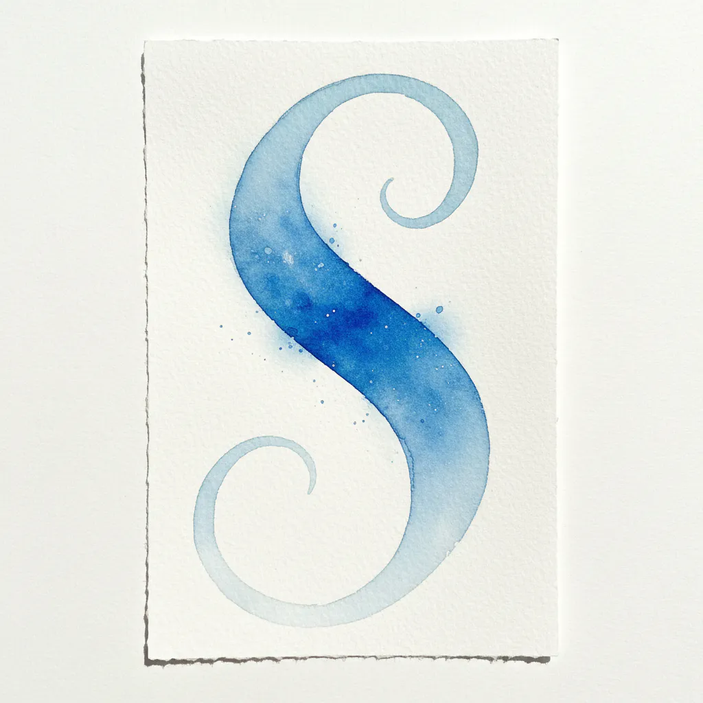
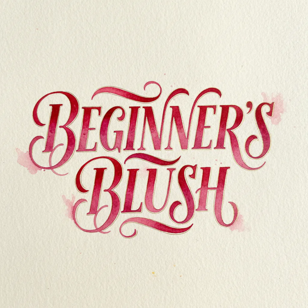
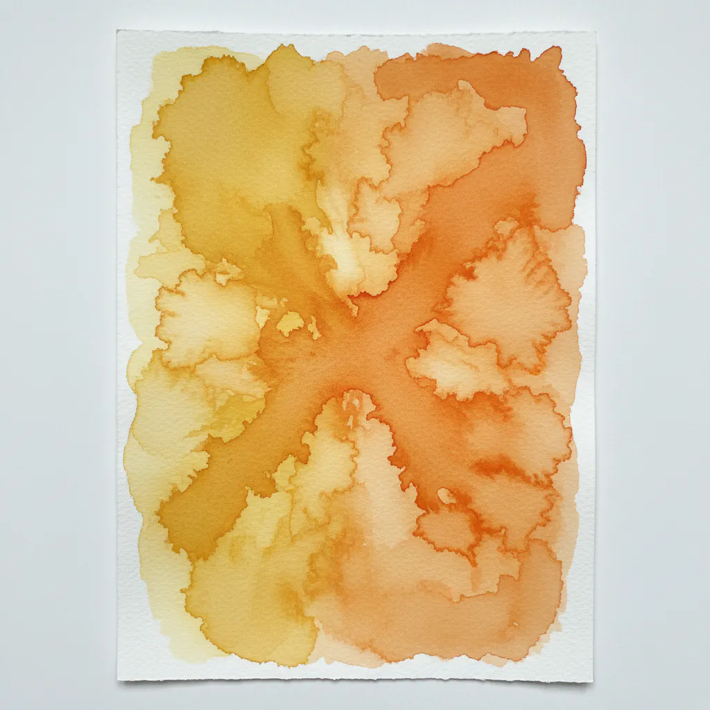
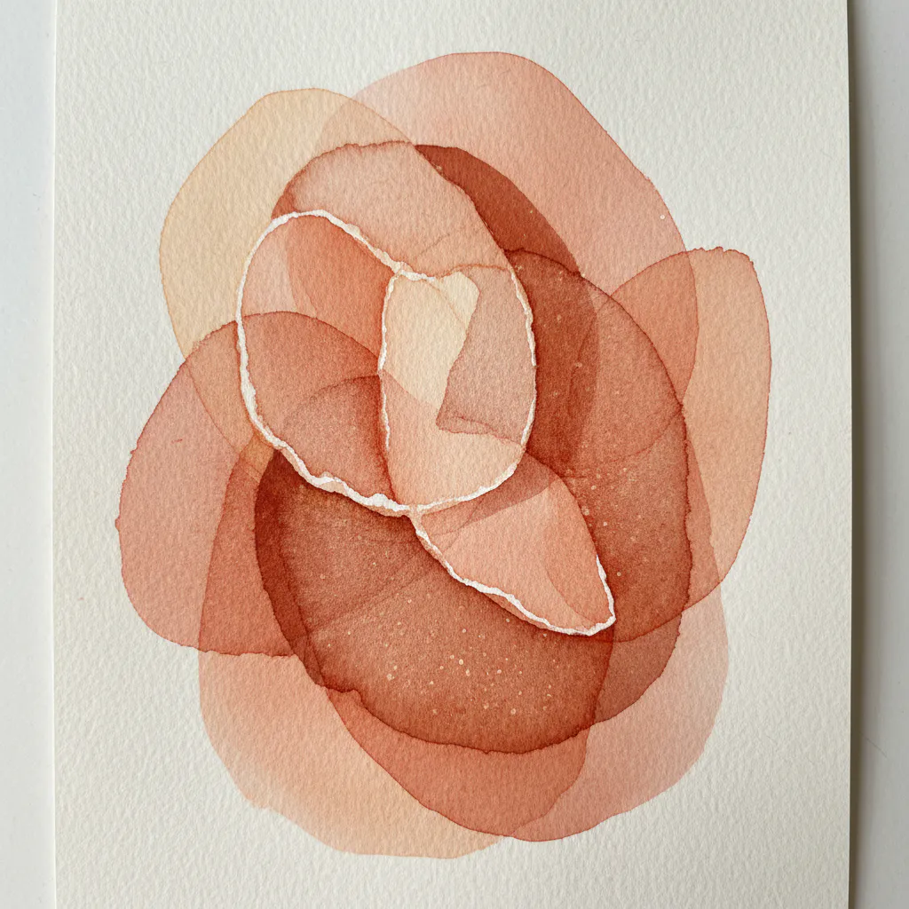
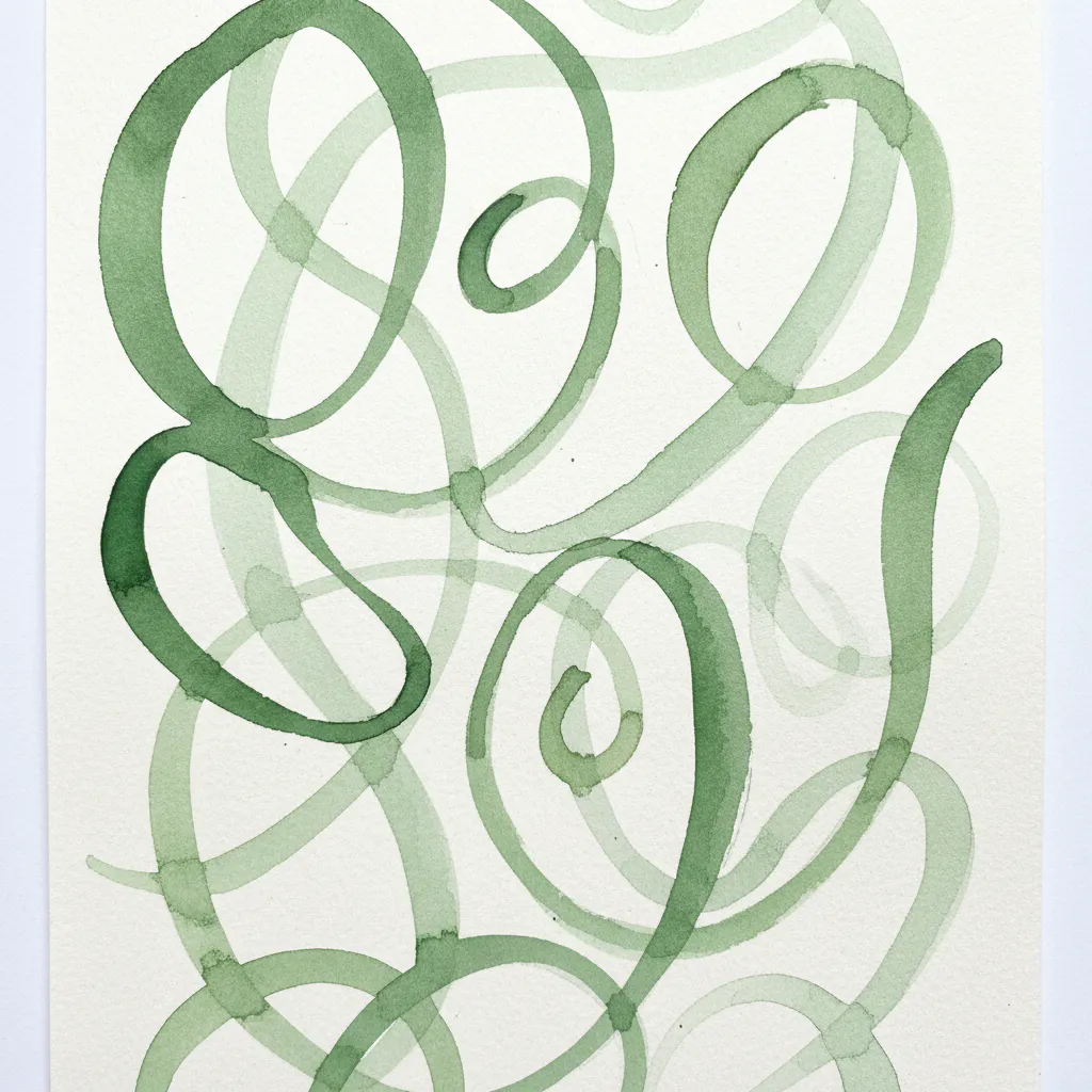
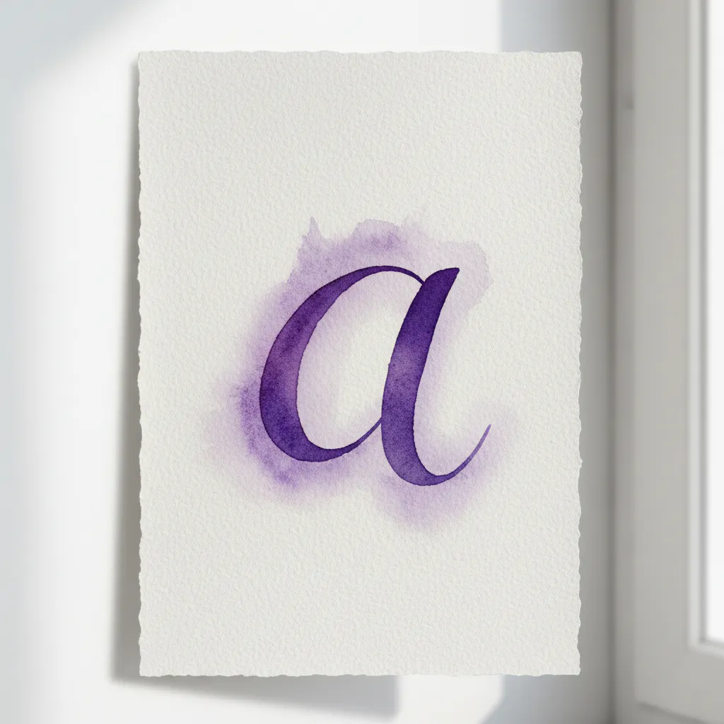
More Watercolor Lettering For Beginners Gallery for Inspiration
Conclusion
Your first attempts at watercolor lettering for beginners are about building a relationship with your materials, learning how they want to move together. That soft gradient you created or that one perfectly crisp downstroke is a real victory. For your next project, pick a single word you love and focus on repeating these steps with a calm pace. The magic is not in perfect execution but in the quiet focus of brush on paper. Keep that first piece, even with its wobbles, as a reminder of where you started. Your hand will remember these movements, and each new page will feel more familiar.
FAQs
Q: What supplies do I need to start a beginner’s guide to watercolor lettering for beginners?
A: To start writing and painting with watercolors you’ll need basic supplies: student grade or artist grade watercolor paint, a water brush or traditional round brushes (pentel aquash is popular), a palette, clean water, paper—hot press paper or Strathmore watercolor pads work well—and a stack of card stock or cardstock for practice. Add a spray bottle for misting, free printable practice sheets or printables, and optional brush pens like Tombow if you want to try brush lettering and modern calligraphy styles.
Q: How do I choose between student grade and artist grade paints for hand-lettering?
A: Student grade paints are more affordable and great for beginners who want to learn watercolor and experiment with techniques; artist grade paints have stronger pigments and blend different colors more vibrantly. For painting with watercolors and learning how watercolor will bleed, student grade is fine at first. Upgrade to artist grade when you want richer color, better lightfastness, and smoother wet-on-wet blends.
Q: Can I do brush lettering or handlettering freehand with watercolors?
A: Yes—start freehand by practicing basic strokes and applying pressure variations like you would in brush lettering. Use a water brush or a soft round brush, practice strokes on card stock or hot press paper, and try a free printable guide to trace until you start writing confidently. For modern calligraphy looks, practice the upstrokes light and downstrokes heavier while using less or more water to control line thickness.
Q: Why does my watercolor will bleed off the letters and how can I prevent it?
A: Watercolor will bleed when the paper is too wet, you add much water, or the brush deposits too much pigment at the top of the paper. Use less water, moisten your brush slightly rather than dipping it fully, work on heavier paper like hot press or good quality Strathmore, and let strokes dry between layers. Holding your brush at a 45 degree angle and using a wet brush with controlled amounts prevents paint from pooling and bleeding outside the letter shapes.
Q: How do I blend different colors without ruining my lettering?
A: To blend different colors smoothly, plan a wet-on-wet or wet-on-dry approach. For subtle blends, keep areas you want to blend slightly wetter but not soaking—if still wet, add the second color and allow them to flow together. Use a clean, damp brush to soften edges or add more water to lift and redistribute pigment. Practice on scrap paper or card stock to see how much water to add and when to let the paper dry between layers.


