Finding a quick, low-mess activity for letter practice takes time when children need something engaging and easy to print. Printable alphabet letters give parents, teachers, and children clear pages for tracing, coloring, cutting, decorations, and classroom projects. I love how one page supports several age groups, from early learners practicing letter shapes to older children arranging words for a display.
We have all seen how bold outlines help little hands stay focused, while decorative styles keep older students interested. Choose pages based on your goal, such as dotted guides for handwriting, bubble outlines for coloring, or solid shapes for signs. Count me on the list of fans of home-friendly pages with strong lines and simple sizing. Let’s look through these useful styles, gather paper and crayons, and get started.
Choose Paper Weight For Reusable Letter Cards
Use 65-pound cardstock for letter cards, since it withstands repeated handling better than standard printer paper. 65-pound cardstock keeps cutout letters firm while still feeding through most home printers. Choose black-and-white outlines when children will color, paint, or cover forms with collage pieces.
Leave generous space around each character so scissors follow clean edges without trimming neighboring letters. High contrast helps children separate similar forms such as b and d, especially during quick matching games. Laminating finished cards protects them from fingerprints and marker smudges, while dry-erase pockets offer a lower-cost reusable surface.

Store cards on a binder ring when portability matters, but keep laminated sets flat for classroom displays and sorting activities. We always keep extra printable alphabet letters ready for sudden classroom projects.
Match Letter Formats To Learning Tasks
Use dotted tracing paths with numbered stroke arrows when children need clear guidance for letter formation. Large uppercase outlines suit coloring pages, cutout decorations, and beginning classroom displays, while lowercase forms support sound and handwriting practice. Add handwriting lines beneath tracing models so children connect letter shape with correct placement.
Beginning-sound pictures give early readers a visual cue, yet each image should stay familiar and uncluttered. Flashcards work well for quick recognition games because one letter stays prominent on each card. Full alphabet charts support room displays and reference work, while generous spacing keeps neighboring characters from blending together.
Match detail level to age, since preschool pages need fewer distractions than kindergarten writing sheets. Finding reliable printable alphabet letters makes daily practice much smoother.
1. Bold Block Uppercase Letter Templates for Clear Printing
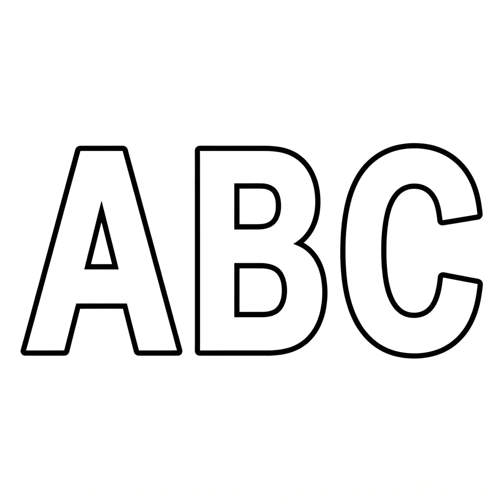
Ever wished your printed capital letters looked crisp from edge to edge? These bold block forms give each character a broad, solid shape, so the letter stays easy to see on ordinary Paper cutting art techniques. I love this style for classroom pages, signs, and hands-on projects where a clear letter needs to stand out.
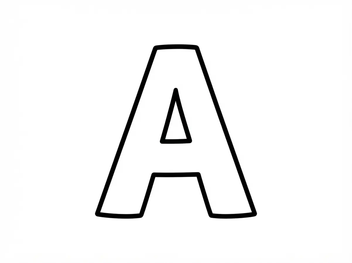
Start with uppercase block forms, then check each stroke for even width. Filled areas should make up most of the letter, while the openings inside letters such as A, B, and R should stay open enough for quick recognition. The sample A shows how dense shapes create a clean, high-contrast result without delicate lines.
Strong contrast between dark ink and light paper helps the form stay distinct after printing, which makes these printable alphabet letters friendly for tracing, cutting, coloring, and display. The weight of each character also gives your page a neat, confident look. You will quickly notice how printable alphabet letters bring clarity to every project.
For the clearest result, choose thick filled strokes instead of narrow outlines, and preview one page before printing a full set. Thin lines weaken the block effect, while solid shapes keep the letter bold. Trust me, seeing a sharp A land perfectly on the page feels so satisfying.
2. Lowercase Cursive Handwriting Tracing Pages for Early Practice
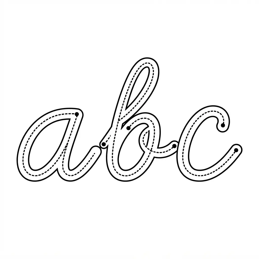
Lowercase cursive tracing feels friendly when each page offers a clear model and plenty of room to practise. Children follow dotted a–z forms with a pencil, then repeat each letter on ruled handwriting lines before trying it alone. The steady pattern gives little hands practice with size, spacing, slant, and smooth pencil control without making the session feel heavy.
I love using pages grouped by shared strokes, such as curve up, curve down, and curve over, because children focus on movement instead of memorising every shape separately. Sound complicated? It is not. A simple page might show one letter, a small picture, several tracing rows, and a final row for independent writing.
Preschool and kindergarten learners often enjoy a short trace-and-race activity too, while older beginners benefit from complete alphabet practice. Keep tracing as the first step, then cover the dots and invite your child to write from memory. Teachers often select printable alphabet letters when clean lines matter most. Watching those letters grow steadier feels so satisfying.
3. Decorative Bubble Letters for Coloring With Open Outlines
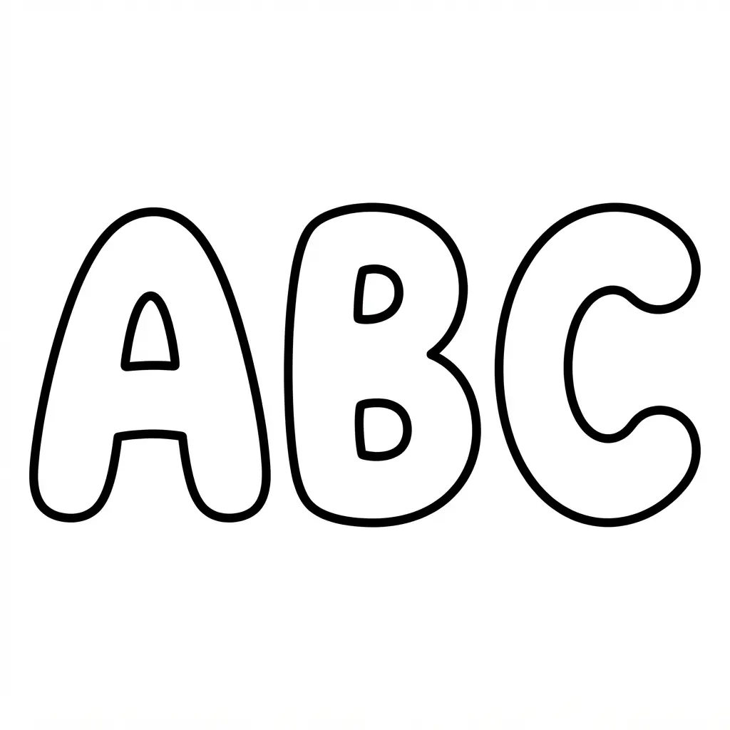
This is one of my favorite styles because the letters feel playful before you add a single color. Ever tried decorating a name with big, rounded shapes? Start with chunky open outlines, then fill the wide interiors with crayons, colored pencils, markers, stickers, or tiny patterns.
Uppercase letters suit banners and signs, while lowercase forms fit name tags and worksheets. The roomy center gives children plenty of space to practice letter recognition without feeling crowded. Type a letter, name, or word into a generator, choose a puffy or comic style, and select a layout.
One letter per page suits posters, while several letters on one page fit scrapbooks, bullet journals, and classroom activities. Large printable alphabet letters create a strong focal point from the back row. Use standard paper for a single coloring session, or choose cardstock for reusable pieces you plan to cut out or display.
Check whether the download is a PNG or print-ready PDF before printing, then let each outline become a bright, personal piece of art.
4. Minimalist Sans Serif Cutout Stencils for Neat Signs
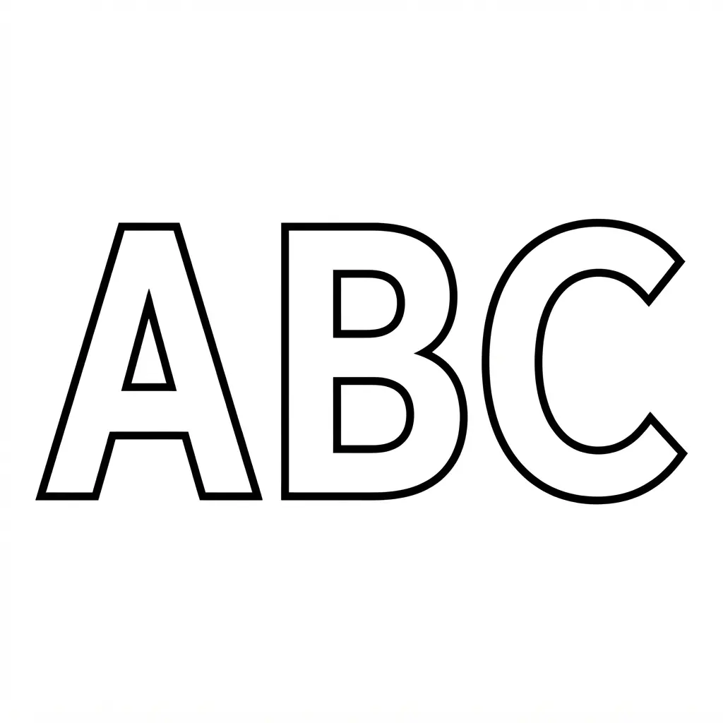
Crisp edges, open interiors, and even spacing give a neat sign a calm, modern look. On paper, each character has clear openings, straight strokes, and tidy stencil bridges. Ever tried this before? The result feels polished without extra decoration.
Choose a sans serif stencil font before arranging your wording. Allerta Stencil keeps signs easy to read, while Stardos Stencil 700 gives heavier industrial weight. PFDINStencilPro-Light suits geometric layouts, Min Sans Stencil brings an architectural tone, and Potel Stencil adds a futuristic display feel.
Print your printable alphabet letters at the final size, then inspect every interior opening before Paper cutting art techniques. Each enclosed area needs a visible connection, so no small piece falls away during use. I love this approach because the simple structure makes alignment feel easy and the finished sign stays uncluttered.
Use consistent letter spacing, keep every character on one baseline, and test a small sample before cutting the full wording. The clear layout of printable alphabet letters makes this step incredibly simple. Fine details often disappear at a reduced size, while heavier strokes stay easier to cut and read. Trust me on this one: a quick scale check saves frustration and gives you a crisp, confident sign.
5. Large Classroom Bulletin Board Letters for Clear Displays
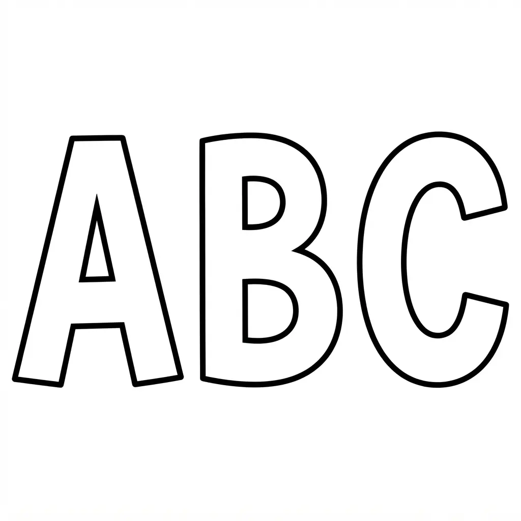
Letters that look huge on screen often print too small for a classroom wall. Check the finished height first, then choose a 7-inch letter set for word walls and everyday headings. Need a stronger focal point? Use uppercase letters near 9 inches tall, while lowercase versions in some sets measure about 6.5 inches.
Print each character on 8.5 by 11-inch paper, colored cardstock, or patterned paper. Preview the file before printing, since pages might hold one, two, four, or six letters. Cut along black outlines, then arrange the message across the board before attaching each piece with a classroom-friendly adhesive.
I love using bold uppercase letters for subject labels, seasonal messages, and student-work displays because they stay readable from across the room. Many educators download printable alphabet letters in this elegant category for quick use. Numbers and punctuation help with behavior charts and longer classroom banners. Cardstock gives repeated displays a sturdier finish than ordinary printer paper.
Trust me on this one: test the spacing on the floor first. It helps you spot uneven case sizes, crowded words, and missing characters before anything reaches the bulletin board. The finished heading feels tidy, cheerful, and easy to read at a glance.
6. Dotted Line Letter Formation Guides for Handwriting Practice
Place a pencil beside a sheet of faint dotted letters, then invite your child to trace each shape slowly. Start with one letter or a small group, following arrows or numbered marks from the starting point through each stroke. Wider 6 mm or 7 mm writing bands give early writers room for larger movements. Isn’t it satisfying to watch scattered dots turn into a clear letter?
Dotted guides give the hand a steady path while children practise pencil control, grip, letter recognition, and fine motor movements. I love using them for name-writing practice because familiar letters keep children interested. Repeated tracing builds comfort with the shape before independent writing begins.
Choose print or cursive sheets to match the learner’s stage, and keep the dots faint but easy to see. Use a fresh pencil rather than a marker, since slow tracing supports controlled movement. Organizing these printable alphabet letters into neat stacks saves valuable time. Trust me on this one: give extra practice to tricky letters, then invite your child to write each one without the guide. Feel proud when those letters stand on their own.
7. Vintage Script Decorative Letter Sets With Curved Forms
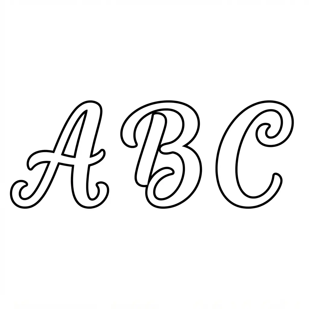
Ever wondered how a simple letter display gets such a graceful old-fashioned feel? Start with flowing script curves, including rounded bowls, looping terminals, and long entry or exit strokes. Ornamental capitals draw the eye, while script-like lowercase forms keep names, headings, and banners connected in appearance. I love how this style adds a personal touch without needing extra decoration.
Choose a set based on your mood. Vintage Lettering Regular feels polished, Vintage Elegance Script feels soft and romantic, and The Softed Touch Vintage Script Font brings gentle ink texture with slightly uneven edges. Quill & Paper has broad downstrokes and thin hairlines, while Parisian Vintage Calligraphy Script adds swashes to capitals and ending letters.
These details give each printable set its own character. Before printing, use extra letter spacing so flourishes do not run into nearby forms. Test delicate hairlines at the smallest planned size, since fine marks and texture might fade on paper.
Keep elaborate capitals for initials or titles, and use clearer lowercase forms for classroom work. You can easily adapt printable alphabet letters for seasonal decorations. Trust me on this tip, a quick test page saves time and helps every curved detail look clean.
8. Playful Patterned Alphabet Letter Cutouts for Party Signs
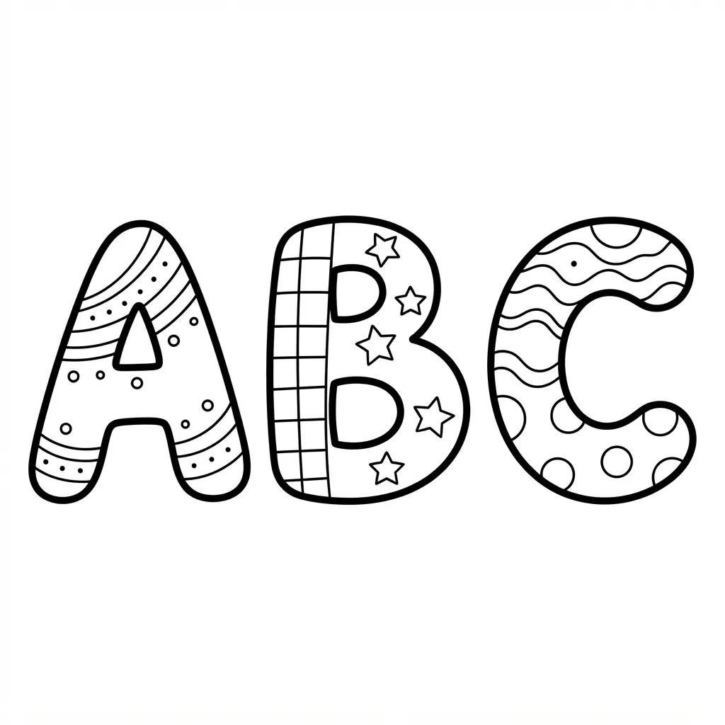
Patterned cutouts give a short party message instant color and personality. Sound complicated? It isn’t, since each character arrives ready for printing, trimming, and arranging.
Printable alphabet letters look especially cheerful with polka dots, stripes, gold dots, or hot-pink dots. Choose the letters, numbers, and punctuation needed for your sign, then print them on cardstock for sturdy handling.
Trim around each character, following the outer cutting line instead of slicing into the printed design. Arrange the pieces on a poster, door, banner, or sign backing, then secure them with tape or glue.
I love how bold outlines help every letter stand apart, even from a busy party backdrop. Keep a short message with generous spacing, and mix patterns carefully so the words stay easy to read and the finished sign feels cheerful.
9. Primary School Manuscript Letter Cards for Early Readers
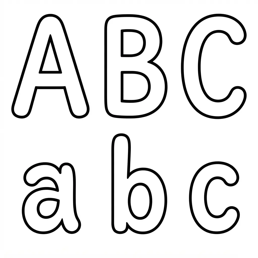
I love these cards because they make early reading practice feel clear and friendly. Each card places uppercase and lowercase forms together, often beside a familiar picture such as an apple for A. Say the letter name, make its beginning sound, then ask your learner to find the matching form. Ever tried turning alphabet practice into a quick matching game?
Start with a few cards, then add more as recognition grows. Ask your reader to place the cards in sequence, find a missing letter, or group cards by beginning sound. Cards with handwriting lines give a helpful visual guide for letter positioning and formation, while movement cues add a physical action to sound practice.
I find this routine works well because it links seeing, hearing, speaking, and writing in one short activity. Print on card stock or laminate each card for repeated use, and choose large, uncluttered lettering with familiar picture cues. Designers frequently use printable alphabet letters for custom layouts. Your reader will feel proud as each letter becomes easier to name, match, and write.
10. Whimsical Serif Alphabet Banner Pennants for Room Signs
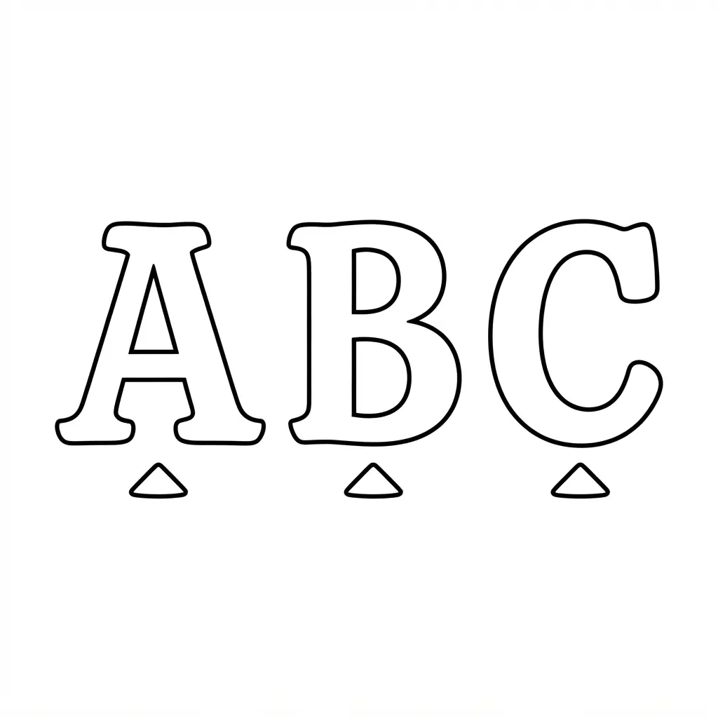
Soft pastel pennants, curly serif edges, and tiny floral details give a finished room sign a sweet storybook look. Each panel holds one uppercase letter, so the full banner feels personal above a bedroom door, playroom shelf, or classroom corner. Ever wondered how a few printed pieces create such a polished display?
Start by spelling the name or label, then select each letter in order and print the set on heavy cardstock. Some layouts place two letters on one page, while a six-inch format gives the sign a strong presence across the room. Trim around each pennant, punch or fold the top edge, and thread string through the pieces. Editable files offer room for changing wording, font choices, or small decorative images before printing.
I love how the serif style adds character without losing letter clarity. Keep even spacing between panels, especially beside leafy or floral details, and check the whole word before cutting. Smaller signs need cleaner letter shapes, while larger pennants show off ornate terminals beautifully. I love adding printable alphabet letters to word-building activities. Hang your finished banner with clips or string, then enjoy the cheerful welcome it brings to the space.
11. Solid Black Silhouette Letter Shapes for Bold Displays
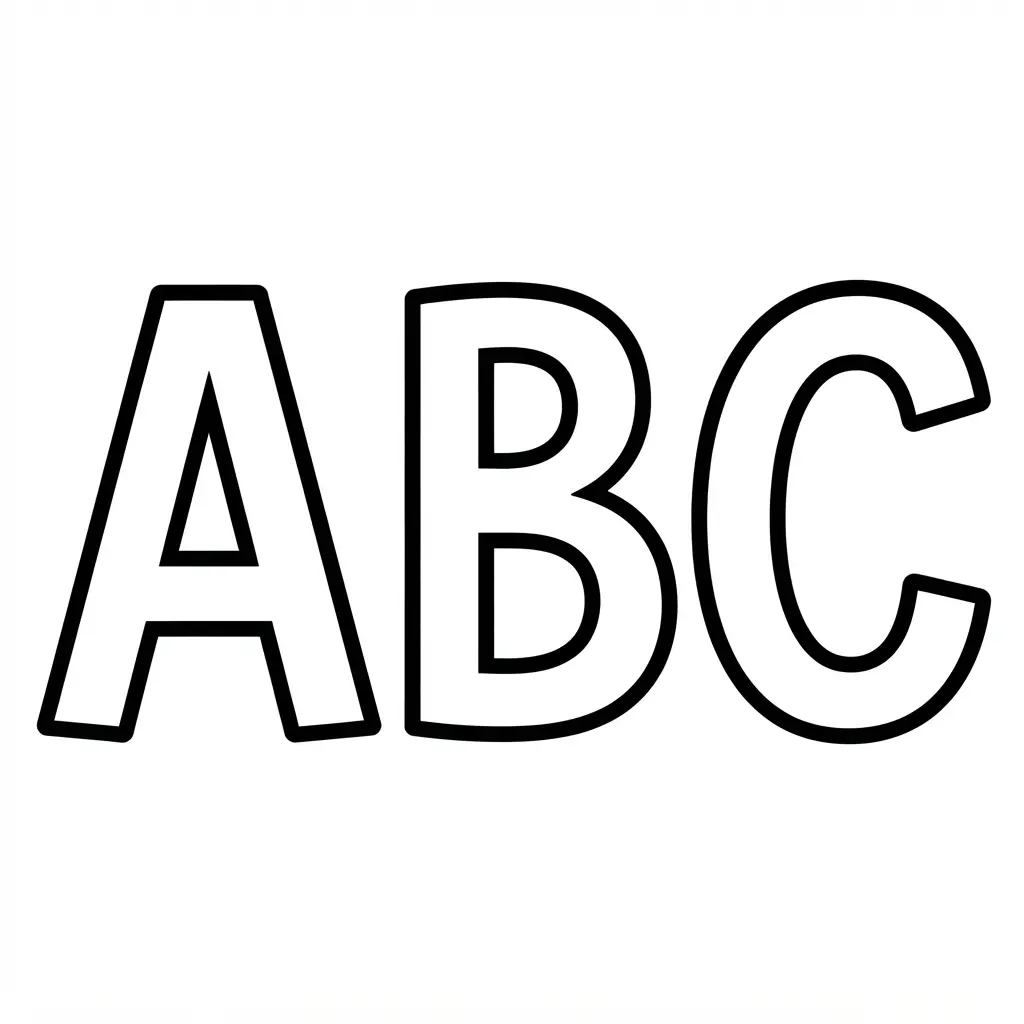
Solid black silhouettes aren’t ordinary letters with a black highlight behind them. The cut-out belongs to the character itself, so each letter reads as a crisp shape from across a room. Sound complicated? Start with a bold display font, then arrange uppercase characters with enough space for every form to stay clear.
For printable alphabet letters, transparent PNG files offer easy placement over coloured paper, shirts, signs, or bulletin boards. Vector graphics suit custom layouts because you can resize and rearrange each character without changing its proportions. I love using a simple black-and-white setup first, since it makes crowded spacing easy to spot before printing.
Negative squared characters bring another look, with a dark tile surrounding a cut-out letter. Test these symbols on your intended device, since older Android fonts might show hollow boxes instead. Keep smaller words away from overly unusual cut-outs, and give each shape breathing room so neighbouring forms don’t merge. A high-contrast print setting keeps the final display clean, bold, and easy to read. Trust me, the finished arrangement feels wonderfully strong.
12. Decorative Bordered Alphabet Letter Tiles for Word Games
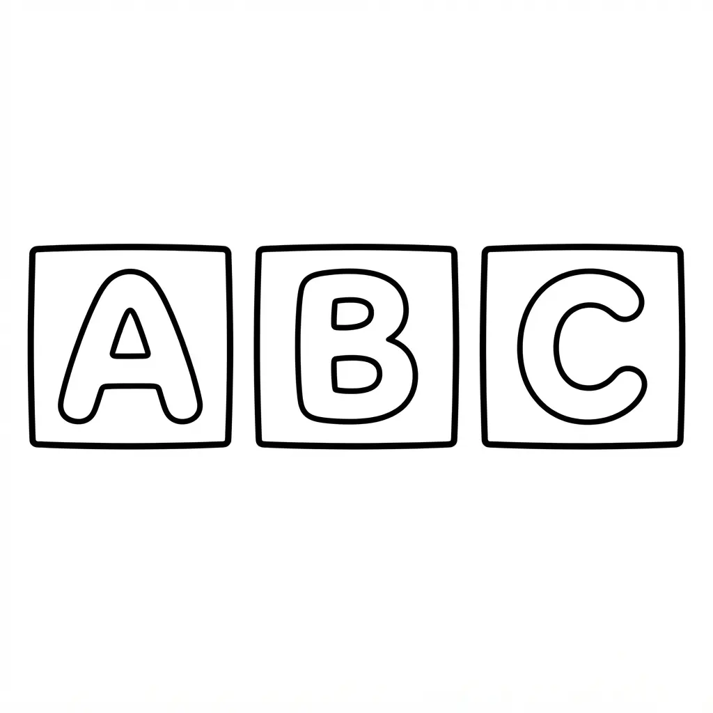
Start by printing printable alphabet letters on sturdy paper, then cut around each square. Keep every tile the same size so letters sit neatly beside one another during play. Leave the border visible around each character, since it helps the set look tidy and gives little fingers a clear edge to hold.
Add a slim frame around each letter with a ruler and colored pen, using one line or two evenly spaced lines. Ever tried building a word from tiles with a fancy frame around every letter? I love how the border gives simple characters a finished look without making the page feel crowded.
Sort the tiles into a small tray before starting, then invite players to build short words, names, or silly combinations. Protect the finished tiles with clear self-adhesive sheets or light lamination if you expect frequent use. Keep vowels in one section and consonants in another for quicker turns, and enjoy the satisfying moment when a neat row of letters becomes a new word.
Store Cut Cards For Repeated Learning Centers
Keep loose letter pieces on sturdy binder rings when several learning centers share the same alphabet set. Hole-punch each card near one corner, leaving enough margin to prevent tearing during frequent handling. Separate uppercase and lowercase groups with colored divider cards, so children return pieces to the correct collection.
Small craft boxes suit cutout letters used for word building, while shallow trays keep larger banner pieces flat and visible. Label each container with a printed letter or alphabet range, helping children tidy materials without adult help. Laminated cards deserve a cool, dry storage spot away from direct heat, which protects edges from curling.
Reserve one container for missing pieces, making weekly set checks quick and easy. Sorting through printable alphabet letters by theme keeps everything organized. This routine saves hours during classroom setup and cleanup.
Conclusion
So how was your creative session? Look at what you have made with printable alphabet letters, from practice pages to classroom signs and personal decorations. Each style gives children a fresh way to recognize shapes, form words, and share their ideas. I love seeing a basic letter page become part of a reading corner, a name display, or a quiet afternoon activity.
For your next step, print one small test page before preparing the full set. Check the letter size, line weight, and paper position, then choose the pages suited to your group. Keep crayons, child-safe scissors, glue, and colored paper nearby so the activity stays easy to start. Pick a favorite style, set out the supplies, and let the children choose their first letter today.
FAQs
Q: What paper works best for printable alphabet letters?
A: Regular copy paper suits tracing, coloring, and classroom practice. Cardstock works well for signs, cutouts, and reusable letter cards.
Q: How do I print large alphabet letters at home?
A: Open the file with your printer settings set to full page or actual size. Check the preview first so each letter fits the paper without unwanted cropping.
Q: Which letter style suits preschool tracing?
A: Dotted formation guides suit early handwriting practice. Bold manuscript letters also help children recognize clear uppercase and lowercase shapes.
Q: How do I make alphabet cutouts last longer?
A: Print on cardstock and cut around each letter with child-safe scissors. Place clear adhesive film over the front for repeated classroom handling.
Q: How do I use letter pages for a classroom display?
A: Choose large block letters for headings, names, or reading areas. Add colored paper behind each letter for stronger contrast and easier viewing.