Selecting Smooth Paper for Brush Pens
Brush pens shred on textured paper, so always start with a smooth 80gsm or heavier stock like Rhodia or HP 32lb. You want the nib to glide, not catch, especially when building consistent downstrokes. A toothy surface disrupts ink flow and frays the felt tip over time, which ruins line control. We all know how frustrating it is to replace a favorite pen too soon. The good news is, even printer paper works in a pinch if you layer two sheets for stability. Just avoid anything fibrous or overly absorbent. Your practice sheets should support clean strokes, not fight them. HP 32lb paper gives you that balance without breaking the bank. This foundation guides hand lettering for beginners toward cleaner results from day one.
Drawing vs Writing Mindset Shift
Hand lettering is not handwriting, so slow down and treat each letter as a shape to build, not a word to rush through. You will notice shaky lines if you default to writing speed instead of deliberate strokes. We tend to skip this step because it feels unnatural at first, but precision comes from control, not fluency. Focus on forming one letter at a time with consistent stroke weight and spacing. The goal is visual harmony, not legibility alone. Trust me on this: even simple sans-serif letters improve dramatically when drawn with intention. This mindset shift separates messy attempts from clean, balanced work. deliberate strokes make all the difference. If you want a smooth start with hand lettering for beginners, embrace this slower pace.
1. Essential Tools and Materials — What You Really Need to Start
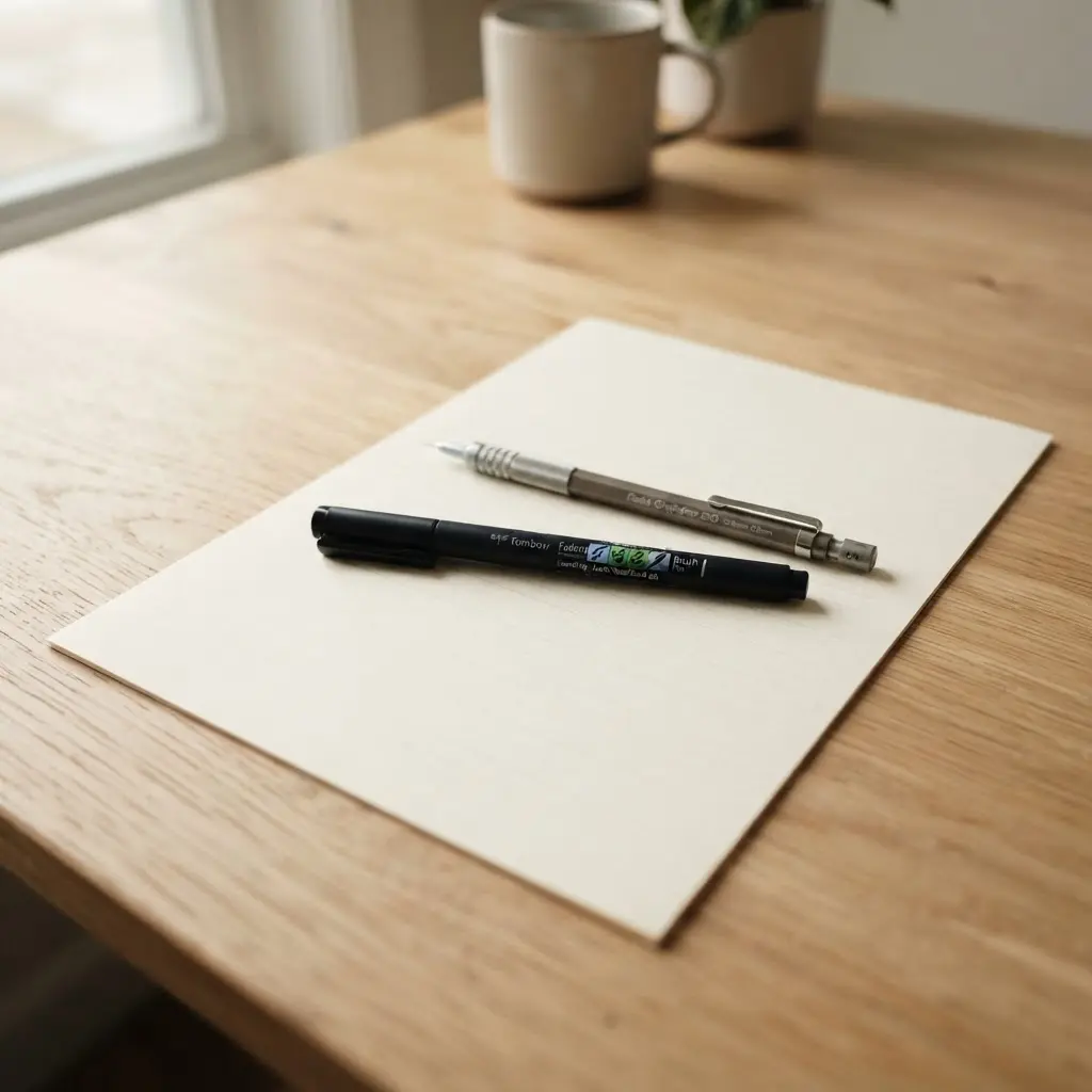
Ever wondered why some pens glide across the page while others leave fuzzy, uneven lines? Start with smooth practice paper, such as HP Premium32 or a Rhodia dot pad. The surface protects brush pen tips and gives your strokes room to move cleanly. This approach works well for hand lettering for beginners.
Sketch each letter lightly with a mechanical pencil using HB or 2B lead. A clear grid ruler helps set your baseline, x-height, ascenders, and descenders, so letters sit neatly together. Keep your pressure gentle, since deep graphite grooves often show beneath the ink. These tools support hand lettering for beginners perfectly.
For thick and thin strokes, choose one beginner-friendly dual-tip brush pen, such as Tombow Fudenosuke or Pentel Fude Touch. Press lightly for upstrokes and add pressure for downstrokes. I love starting with one black pen because it lets you focus on control before adding color. It is the safest route for hand lettering for beginners.
Finish your small kit with a kneaded eraser, a vinyl eraser, and one fine liner for outlines and details. Ink only after your layout feels balanced, then lift the pencil marks once the ink dries. This simple setup keeps practice affordable and makes each page feel more manageable.
2. Basic Stroke Techniques: Build Muscle Memory with Simple Lines
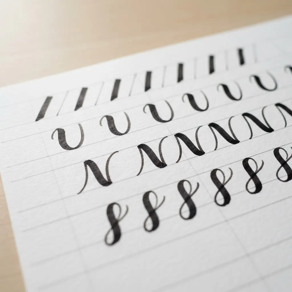
Try these simple drawing practice drills where your control feels strong and where your hand needs more practice. Start with light pencil guidelines for the top line, x-height, baseline, and descender line. Draw ten slow vertical strokes from top to bottom, then add diagonals, horizontals, and gentle U-shaped curves. Keep each mark inside the guides and focus on steady spacing. Isn’t it satisfying to see a row become more even with each pass? That feeling guides hand lettering for beginners through every session.
Settle into an upright posture, angle your paper slightly, and rest your forearm on the table. Hold your pencil or pen with a light grip, since tension makes lines shaky and tires your hand. Brush pen users should keep downstrokes firm and upstrokes light, while everyone else should aim for smooth pressure and a steady pace. Repeat each stroke ten to twenty times, then pause before your hand gets tired. I love this quiet part of practice because the improvement feels clear on the page. Trust me, slow repetition gives your letters a calmer, cleaner look. You will notice it when studying hand lettering for beginners.
3. Understanding Letter Structure: Spacing and Alignment Made Clear
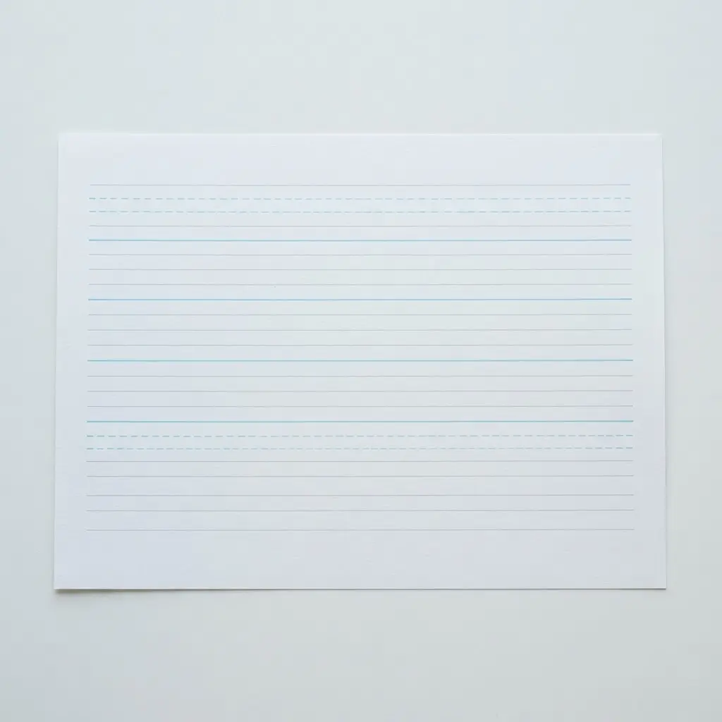
I love this part of hand lettering because a few light guidelines will turn shaky words into clean, confident work. Start with a baseline grid, then add lines for x-height, ascenders, and descenders so each letter sits at the right height. Keep letter gaps visually even, while leaving a space close to the width of a lowercase “n” or “o” between words. Sound fussy? It is not, and your words will read more smoothly. Spacing rules anchor hand lettering for beginners from day one.
Use a pencil and ruler on lined or gridded paper, with roughly 5–10 mm between practice baselines, adjusting the distance to suit your letter height. Watch the spaces around angled pairs such as A and V, since equal measurements do not always look equal. I check the whole line from a short distance, then shift a letter or word before inking. This small pause works because optical balance keeps the rhythm calm, and it feels wonderful to see a crooked line settle into place. Trust me, this is my go-to tip: judge the gaps, not only the letters. This habit defines strong hand lettering for beginners.
4. Choosing a Lettering Style: From Modern to Classic with Confidence
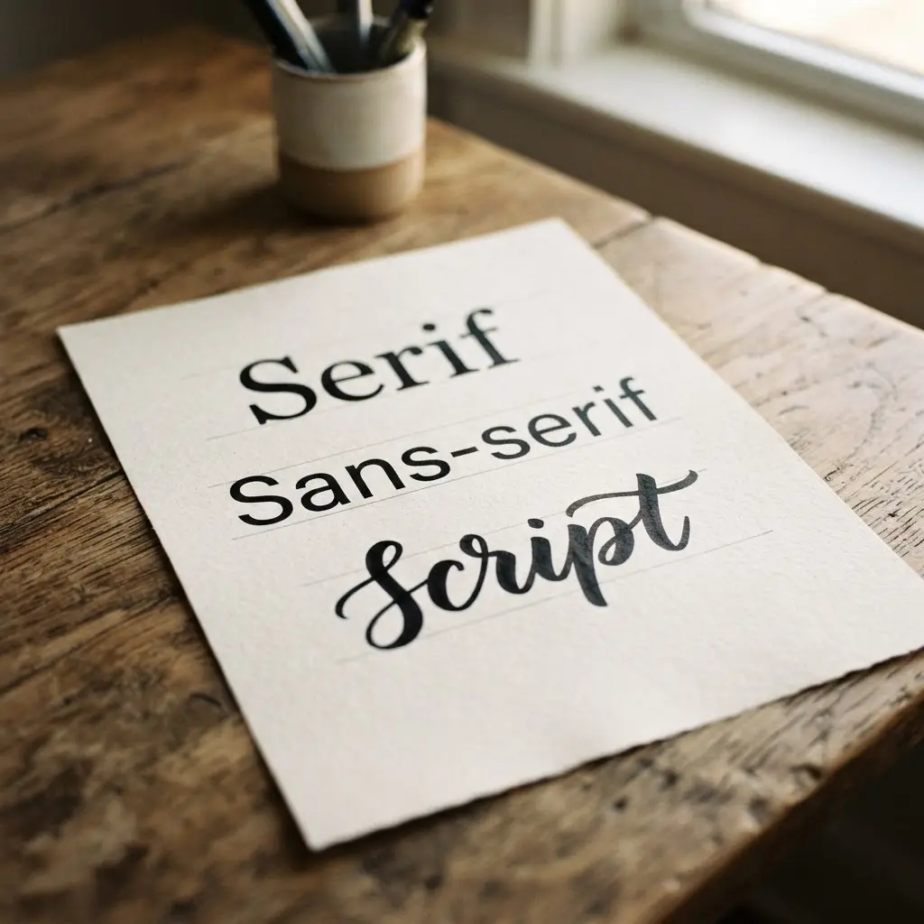
A finished lettering piece might have crisp, even shapes, soft script curves, or strong black strokes with a historic feel. Ever wondered why the same words feel formal in one style and playful in another? Start with sans-serif block letters for easy control, then test classic scripts, serif forms, or bold display styles beside them. It is a reliable method for hand lettering for beginners.
Think about the project first. Wedding stationery suits elegant Copperplate, while a technology logo often needs clean geometric forms. Use light pencil guidelines to mark your x-height, ascenders, and descenders before drawing. A smooth sheet, ruler, fineliner, or brush pen gives you a friendly starting point, while pointed nibs need steadier pressure and practice. These materials support hand lettering for beginners perfectly.
I love making three small versions before choosing one. These thumbnail sketches reveal which style matches the audience, mood, and message, rather than relying on personal taste alone. Keep the strongest option, then pair it with a contrasting style only after checking spacing, stroke weight, and overall tone. Trust me, your choices feel far easier once the purpose is clear.
5. Practice Drills for Consistency: Train Your Hand, Not Just Your Eye
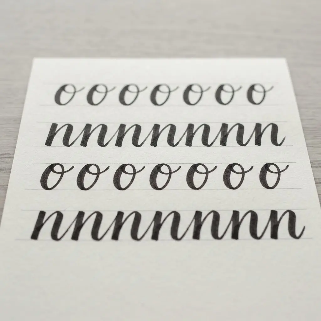
Many beginners practice by writing full words, then wonder why their strokes still wobble. Start with ghosting each stroke instead. Place two dots a few inches apart, hover your pen above the paper, and repeat the motion until your arm finds a smooth path. Lower the pen and make the mark in one steady movement. Sound tedious? It is surprisingly calming. This rhythm trains the hand for hand lettering for beginners.
Match your pivot to the stroke length. Let your fingers handle tiny details, your wrist guide short curves, your elbow move medium lines, and your shoulder lead long arcs. A straight line grid helps you check spacing, direction, and steadiness without guessing. Follow it with ovals and U-shaped curves, keeping your speed even as each shape turns.
Finish with parallel lines, changing pressure from light to heavy and back again. Repeat simple forms such as “oooooo” or “nnnnnn” while watching height, width, and gaps. I love this part because five focused minutes builds muscle memory more reliably than a rushed session. Use an HB pencil, fineliner, or brush pen, keep your arm relaxed, and practice daily. Your hand lettering for beginners will soon feel far more controlled, and every page will look cleaner.
6. Simple Alphabet Practice: Build Letters One at a Time
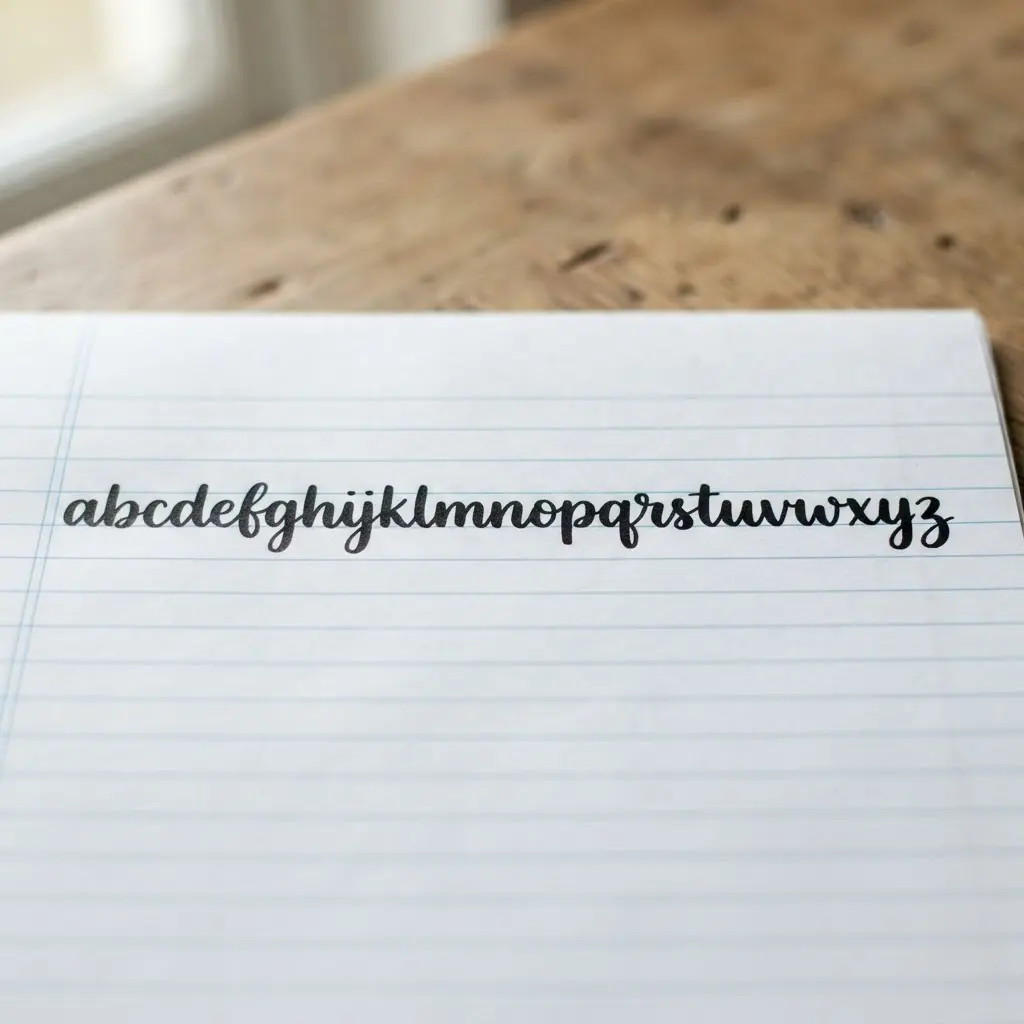
Grab three wooden sticks and form a Big Line, Little Line, Big Curve, and Little Curve on your desk. Say each name aloud, then trace every stroke in the air with your whole arm. This is my favorite starting point for hand lettering for beginners. Air tracing warms up your muscles before any page of hand lettering for beginners.
Build straight-line letters first: L, T, I, H, F, and E. For H, place two Big Lines with a Little Line between them. Sound complicated? It is not. Move slowly, keeping each stroke in the same direction every time. Practice these shapes often when exploring hand lettering for beginners.
Next, try curved forms such as C, O, G, and Q, then move to B, D, P, and R. Use grid paper to watch the height, width, and spacing of each shape. Before small pencil movements, repeat the forms on a whiteboard or with pipe cleaners. Isn’t it satisfying to see a loose curve become a clear letter?
Finish with diagonal letters A, M, N, V, W, X, Y, and Z. A quiet, well-lit spot, upright posture, and an HB pencil help your hand stay relaxed. Slow strokes build muscle memory and confidence faster than rushed tracing. Trust me on this one, correct stroke order matters more than a perfect page, so enjoy each small win. You will see steady growth with hand lettering for beginners.
7. Connecting Letters in Script: Flow Without the Frustration
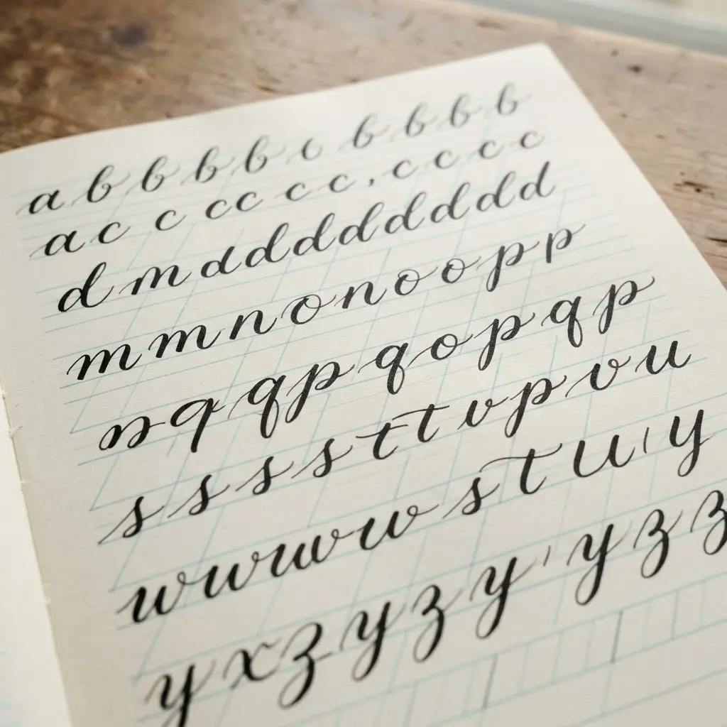
Ever wondered why script words look smooth even though the pen lifts? Finish each letter with a light exit stroke, then pause and lift your pen. Follow its angle to place the next entry stroke, keeping both marks aligned with the same slant and height. A guideline sheet with 55°–60° slant lines helps lowercase letters sit neatly between the baseline and waistline. This small pause keeps your hand relaxed instead of forcing one long, tiring motion. It is a gentle rule for hand lettering for beginners.
Start with pairs like a-e, u-n, v-o, and w-a, treating each pair as a small practice unit. Use light pressure for entry and exit strokes, then firmer pressure for downstrokes. Keep the spaces between letters close to the open space inside an o, so words feel even instead of crowded or broken. Check each connection against slant guidelines before moving on to a full word. I love this slow rhythm because each pen lift gives your hand room to reset, and your script soon looks relaxed and readable.
8. Adding Bounce and Slant: Create Dynamic Lettering with Ease

Bounce lettering gives your words a playful lift without asking for perfect curves. Start with a light pencil guide, then write each letter while letting some letters sit on the baseline and others dip below or rise above it. Keep the tallest letters close in height, and leave a small gap between letters so the word stays easy to read. This spacing protects the flow of hand lettering for beginners.
For slant, tilt each letter slightly in the same direction, using a line from lower left to upper right as your guide. Is it starting to feel uneven? Let the angle stay gentle, especially on rounded letters such as o, c, and e. I love using a consistent slant angle because it makes a loose alphabet feel connected, even when each letter has its own bounce. Practice one short word three times, changing only the baseline positions, then trace your favorite version with a darker pen and enjoy the lively finish. These techniques guide hand lettering for beginners toward lively layouts.
9. Simple Flourishes: Decorate Letters Without Overdoing It
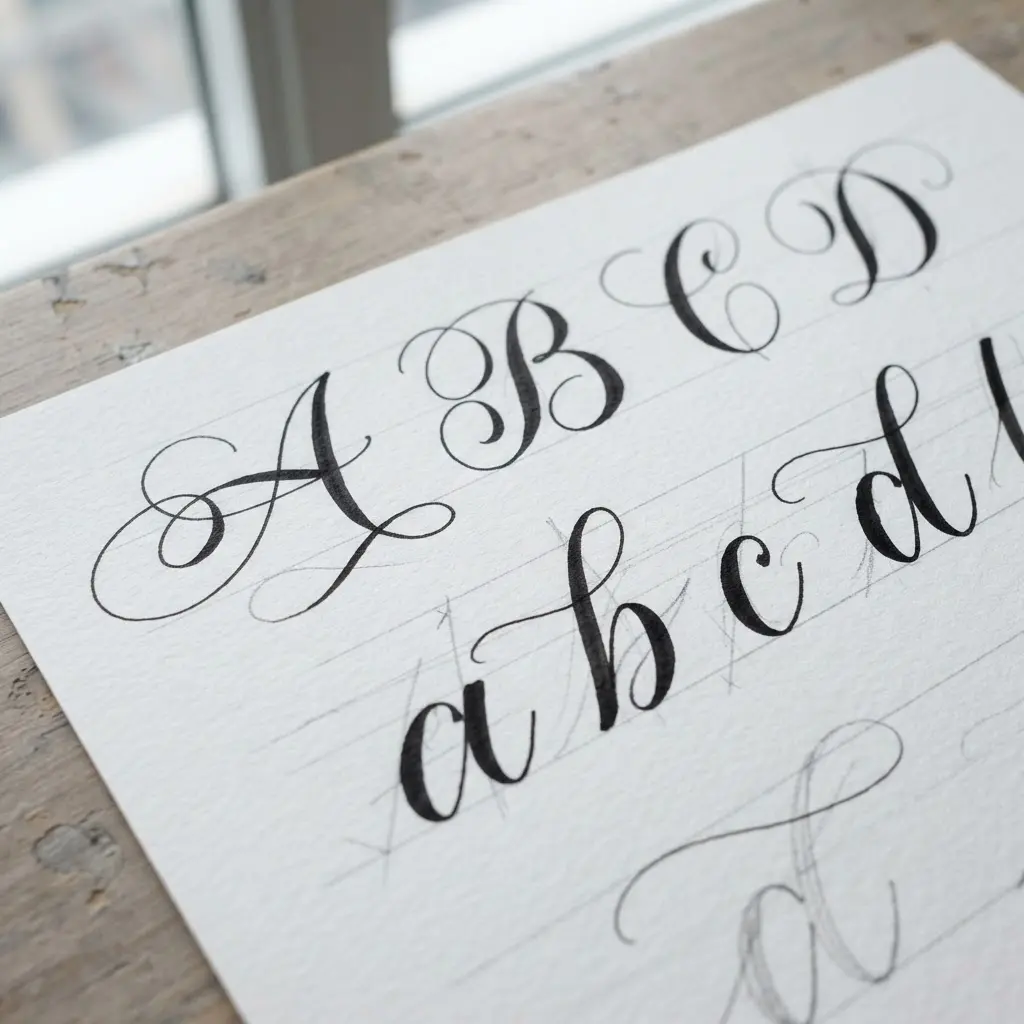
This is one of my favorite ways to make hand lettering feel personal without adding clutter. Start with a small curved line flourish at the beginning or end of one letter, then repeat its direction elsewhere. Keep the movement light and open.
Try a thin loop from a capital letter, a tiny leaf shape beside a word, or two dots near a final stroke. Sound complicated? It is not. Draw the main word first, then add decoration only where the spacing feels empty. Leave breathing room between each detail and the letters around it.
Flourishes look best when they share the same line weight as the hand lettering styles guide. Use a fine-tip pen for small curls, and pause often to check the whole word from a short distance. I love this step because one small mark often shows where the design needs more space.
Limit yourself to one or two accents per word, especially while practicing hand lettering for beginners. A few clean details keep the word easy to read and give the page a neat, cheerful finish. Feel proud when your letters look decorated yet still clear.
10. Daily Practice Prompts: Stay Inspired with Fun Challenges
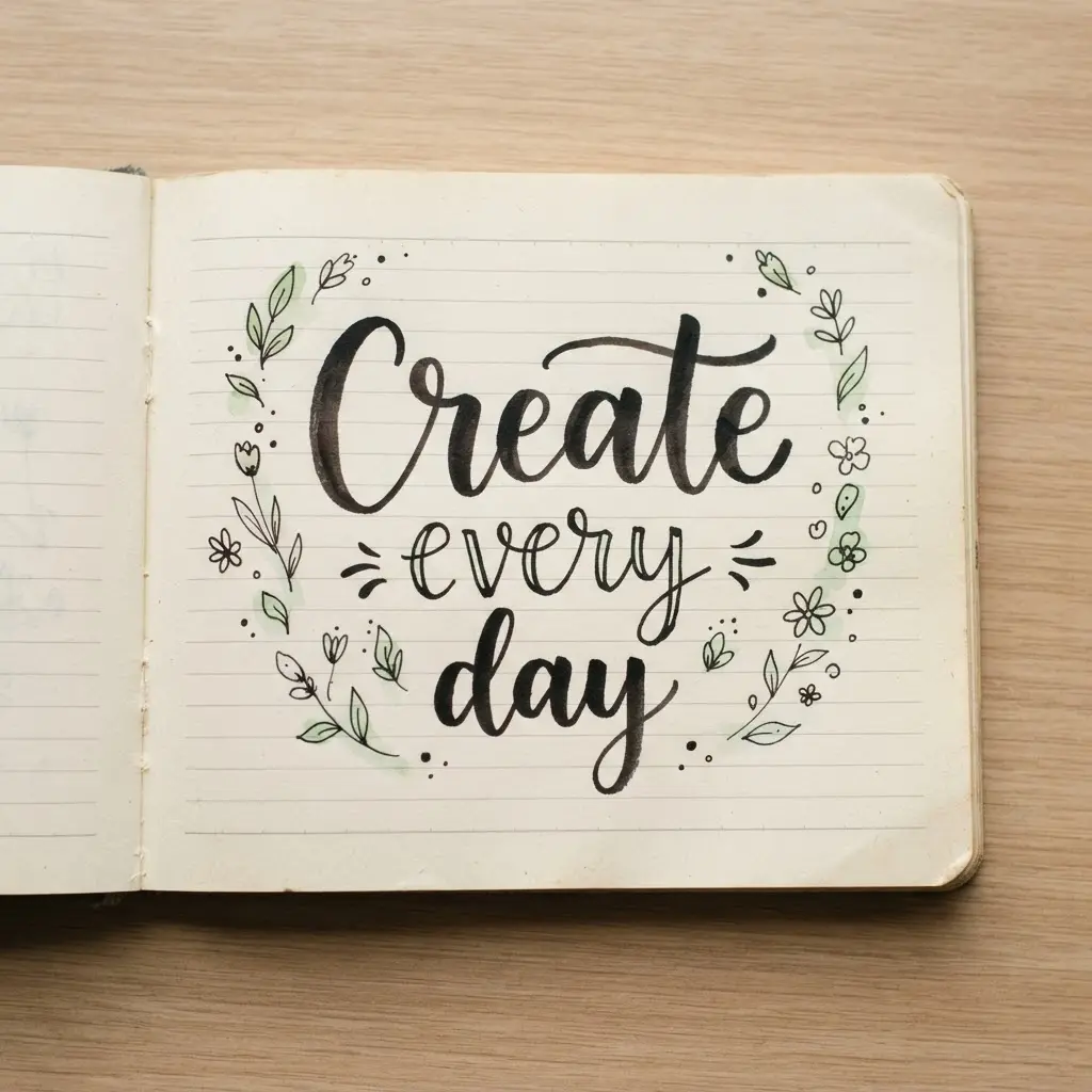
Fresh ink sits dark against the paper, with rounded letters, crisp upstrokes, and tiny flourishes filling the page. Start with a seven-minute prompt: write your name in three styles, repeat one word in five sizes, or turn a short phrase into a stacked layout using a lined practice sheet. Keep your strokes slow, then circle one letter you like and repeat it across the page. Ever notice how one small change in spacing gives the whole piece a new mood? I love this prompt because each round shows visible progress without asking for a long practice session. This daily habit fuels hand lettering for beginners.
Build a weekly prompt jar with slips such as “letters with dots,” “one-word banner,” “curved baseline,” and “two-color greeting.” Pick one each day, set a timer, and stop before your hand lettering styles guide. Save your pages in a folder, dated from the first attempt onward, so you spot stronger spacing and steadier lines over time. Tracking growth helps hand lettering for beginners immensely. Change one detail daily, such as letter height, slant, shadow, or flourishes, rather than starting from scratch each time. Keep your favorite results nearby for fresh ideas, and finish each session with one cheerful word. Feel proud of every page you fill.
Conclusion
So how was your first practice session? Did you feel that little spark when your letters started looking more like you? That’s the magic of hand lettering for beginners — it’s not about copying perfectly, it’s about showing up and making something that feels alive. My best advice? Pick one drill or style you loved and do it again tomorrow. Consistency beats perfection every time. Keep your pen close, celebrate the wobbles, and let your letters grow with you — one joyful stroke at a time. For anyone finishing hand lettering for beginners, this closing step ensures lasting joy in every page you create.
FAQs
Q: What kind of pen should I use for hand lettering as a beginner?
A: Start with a soft-tip brush pen like a Tombow Fudenosuke. It gives you control and helps you learn thick and thin strokes without frustration.
Q: Do I need to be good at drawing to learn hand lettering?
A: Not at all. Hand lettering is about forming letters with consistency, not drawing freehand art. Anyone can learn with practice and the right guidance.
Q: How long does it take to get good at hand lettering?
A: With daily practice, you will see clear progress in two to four weeks. Real confidence builds over a few months of steady, mindful drills.
Q: Can I practice hand lettering without special paper?
A: Yes. Regular printer paper works fine. Use a ruler to draw light guide lines so your letters stay aligned and consistent as you learn.
Q: Why do my letters look uneven even after practicing?
A: This is normal. Focus on one letter at a time and slow down. Consistency comes from muscle memory, which takes repetition and patience.