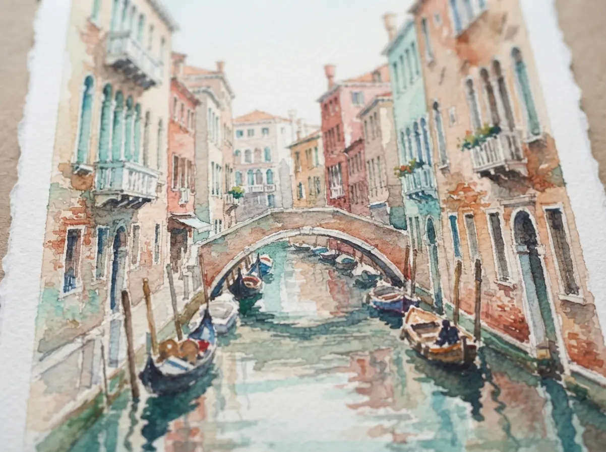

Start with the scene that holds your attention, or should I say, the one you keep returning to. Let us gather our pens, charcoal, washes, markers, or tablet and give the next architectural study a clear point of view. Pick a favorite and get started.
Sightline Planning For Complex Building References
Set the horizon line at the reference’s eye level before judging any roofline or window. A scale ruler helps compare façade widths against doors and vehicles, keeping perspective proportions credible across a complex street view. Mark each vanishing point lightly, since angled walls often require separate points rather than one shared point. Keep vertical edges near the picture center upright, while outer edges receive measured convergence toward the horizon.
Repeating windows need spacing checks, not copied shapes, because small errors accumulate across a façade, especially when studying Architectural Drawing and Paintings for Professional Artists. Reference photographs help confirm changing eye level, roof overhangs, and hidden floor lines. Reserve darker line weight for focal openings, leaving distant structures lighter. This setup gives your final architectural drawing stable depth without burying it in detail.
Value Mapping Before Architectural Color Studies
Reserve the lightest value for sky openings or sunlit walls before choosing any pigment. On watercolor paper, a diluted wash reveals broad value groups without hiding construction lines. Build a small tonal map beside the reference, with five values covering pavement, façade, recesses, glazing, and cast shadows. Warm sunlight against cool reflected light keeps adjacent planes separate, especially inside courtyards and narrow streets.
Test pigment strength on scrap paper because watercolor darkens as it dries. Gouache offers opaque corrections for signs or bright trim, while transparent watercolor preserves atmospheric softness in distant buildings, which is a core principle in Architectural Drawing and Paintings for Professional Artists. Keep window reflections quieter than focal entrances, and avoid equal contrast across every surface. A controlled value structure lets color support perspective instead of flattening it.
1. Watercolor Venetian Canal Perspective Scene
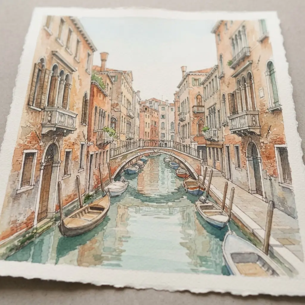
Ever wondered how a narrow canal gains such convincing depth? Begin with a low eye-level view, then guide both canal edges and the closely packed Renaissance facades toward one vanishing point, using the distant stone bridge as your strongest depth cue. Lay transparent watercolor washes in ochre, terracotta, rose, and pale blue, then break those colors across gently rippling water with softened reflections, small boats, striped mooring poles, balconies, plants, and laundry.
I love leaving selected details crisp while letting morning light fade the bridge and far buildings through atmospheric perspective. Keep the paper texture visible, and save darker marks for focal details so your travel sketch feels peaceful and airy, just as noted in Architectural Drawing and Paintings for Professional Artists.
2. Charcoal Victorian Gothic Manor Façade
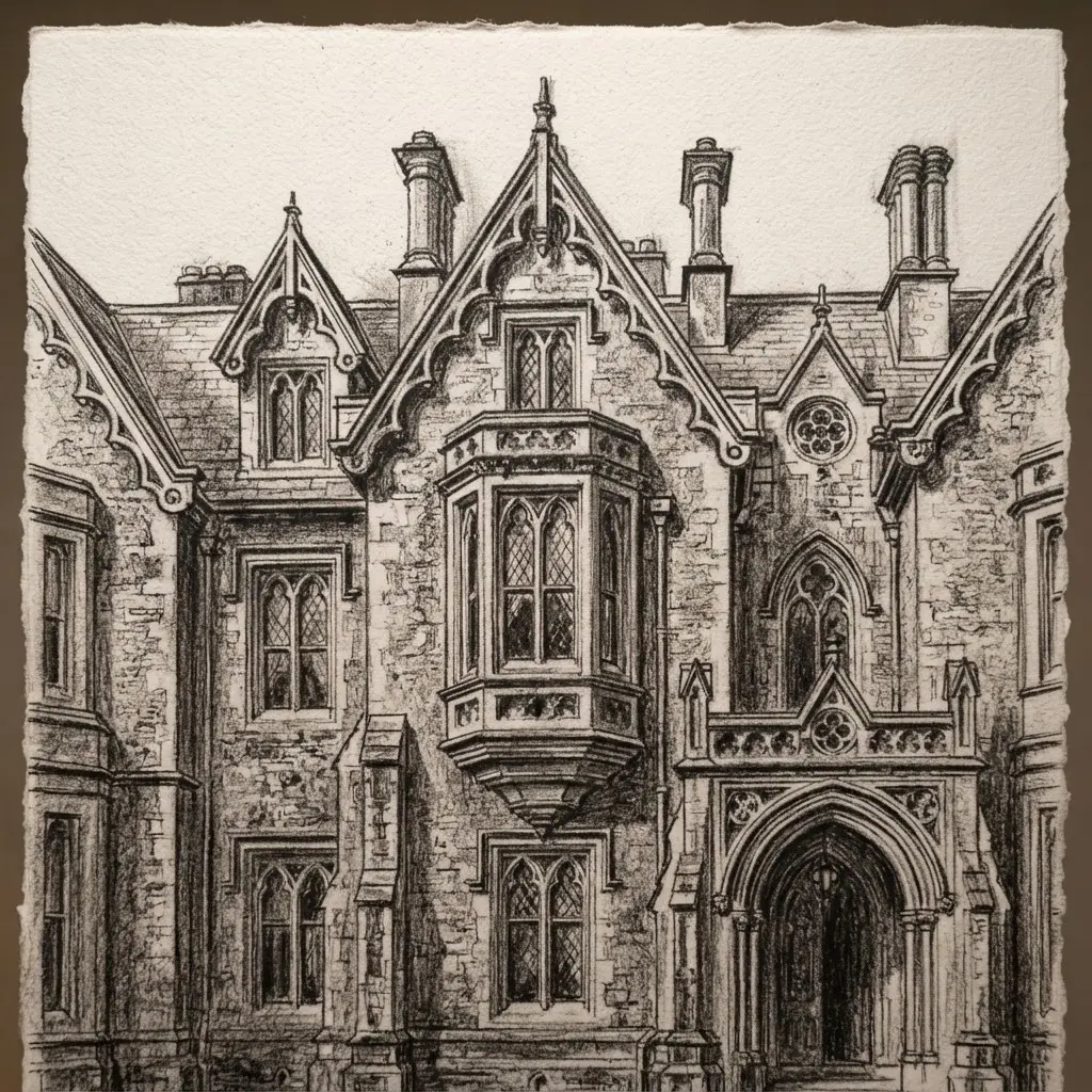
This façade feels moody from the first charcoal mark, yet its structure stays clear. Start with a symmetrical frontal layout, placing the grand arched entrance at center, then arrange tall, narrow windows beneath steep roofs, ornate gables, and pointed arches. Build weathered stone, carved timber, wrought-iron balconies, ivy, and twisted bare trees with layered charcoal, slate, and muted gray, leaving near-black for the deepest recesses.
Sound complicated? It isn’t, since each texture keeps the Gothic architecture readable while faint amber windows guide the eye through the dusk. I love adding soft fog last, then checking the balance of the façade before stopping, because the restrained light and rough surfaces give the manor a formal, aged presence, exactly as explored in Architectural Drawing and Paintings for Professional Artists.
3. Ink Wash Brutalist Concrete Tower
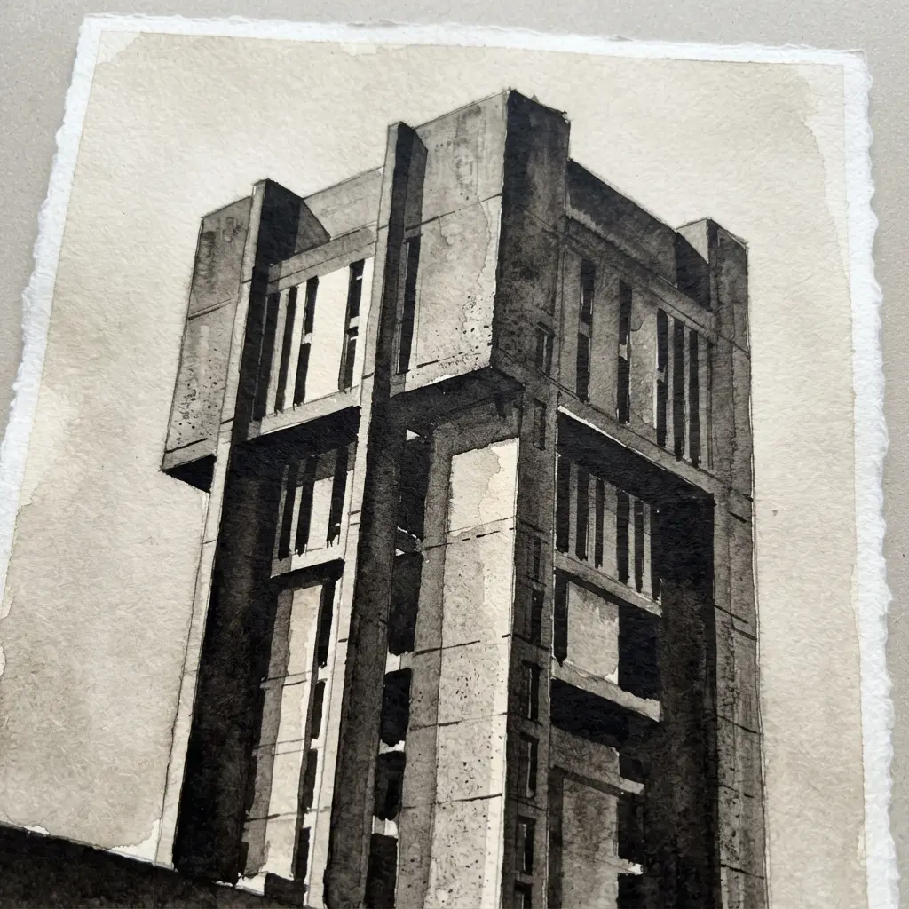
This one is my favorite because the sketch the iconic Eiffel Tower before you add much detail. Does a simple monochrome study sound dull? Not here. The fog and hard planes give it plenty of mood, which aligns with techniques found in Architectural Drawing and Paintings for Professional Artists.
Start with fine architectural lines to map the tower’s vertical structure, sharp planes, recessed windows, and strongest edges. Keep the main silhouette clean, then soften selected edges as they fade into the mist. Build the concrete mass with black-and-gray ink wash.
Use deeper tones inside windows and beneath overhangs, while lighter washes suggest raw concrete texture, drifting fog, and wet pavement. Add tiny pedestrians near the base, along with faint reflections and distant buildings. I love how this small human detail makes the tower feel enormous. Keep the surroundings quiet, and enjoy the satisfying contrast between control and flow.
4. Graphite Minimalist Glass Skyscraper Detail
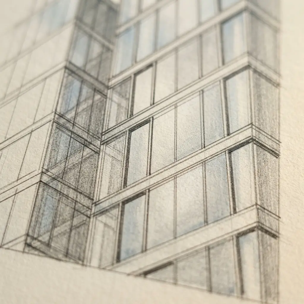
The finished study shows smoked glass rising in a tight crop, with graphite tones sliding across polished panels and fine lines climbing out of view. Subtle skyline reflections sit beneath the surface, while soft overcast light keeps the mood cool and controlled. Doesn’t this feel wonderfully sleek?
I love how the limited palette gives every façade detail room to breathe. Begin with a smooth surface and map the main verticals before adding graphite gray planes. Build the glass with gradual dark values, then place razor-thin metal mullions using steady, precise strokes, following guidance from Architectural Drawing and Paintings for Professional Artists. Keep reflections lighter and softer than the structure, so they support the dramatic perspective rather than interrupting it.
This close-up study works because it separates metal, glass, and reflected forms without relying on colour. Pro tip: protect the cleanest edges with a scrap sheet while blending nearby areas.
5. Acrylic Industrial Warehouse Loft Interior
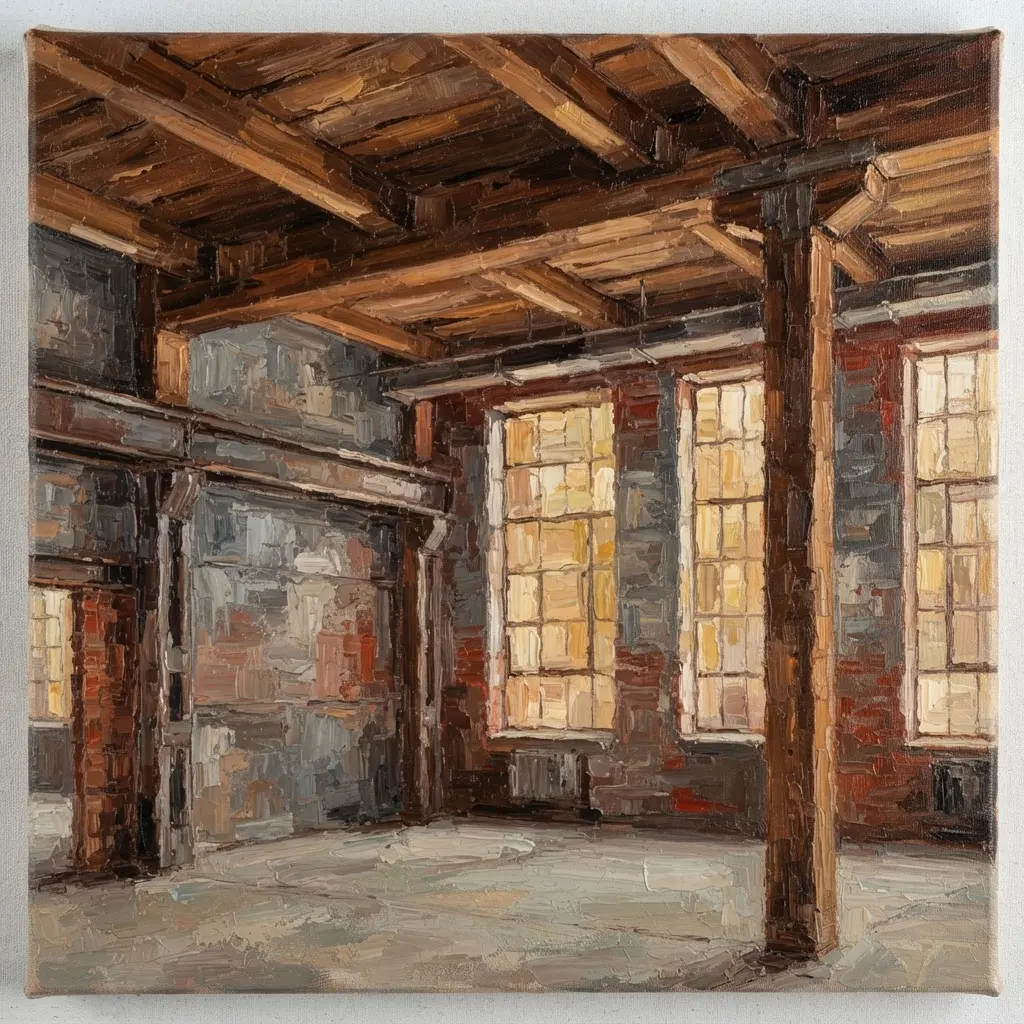
Many artists paint acrylic as a flat white shape, but selective highlights and visible background forms make it read as clear material. Start with the high ceiling, factory windows, brick walls, black beams, ductwork, and floor perspective before placing furniture. Use a pencil perspective grid to position frosted partitions, clear seating, shelving, and glossy cabinetry, then vary edges so steel stays firm while leather, plants, and textiles feel softer.
Cool daylight beside warm pendant lights gives acrylic gentle reflections, and I love how this scene keeps its spacious open plan while adding visual structure. Sound complicated? It isn’t once the large shapes are settled, especially when reviewing Architectural Drawing and Paintings for Professional Artists.
6. Pen and Ink European Streetscape
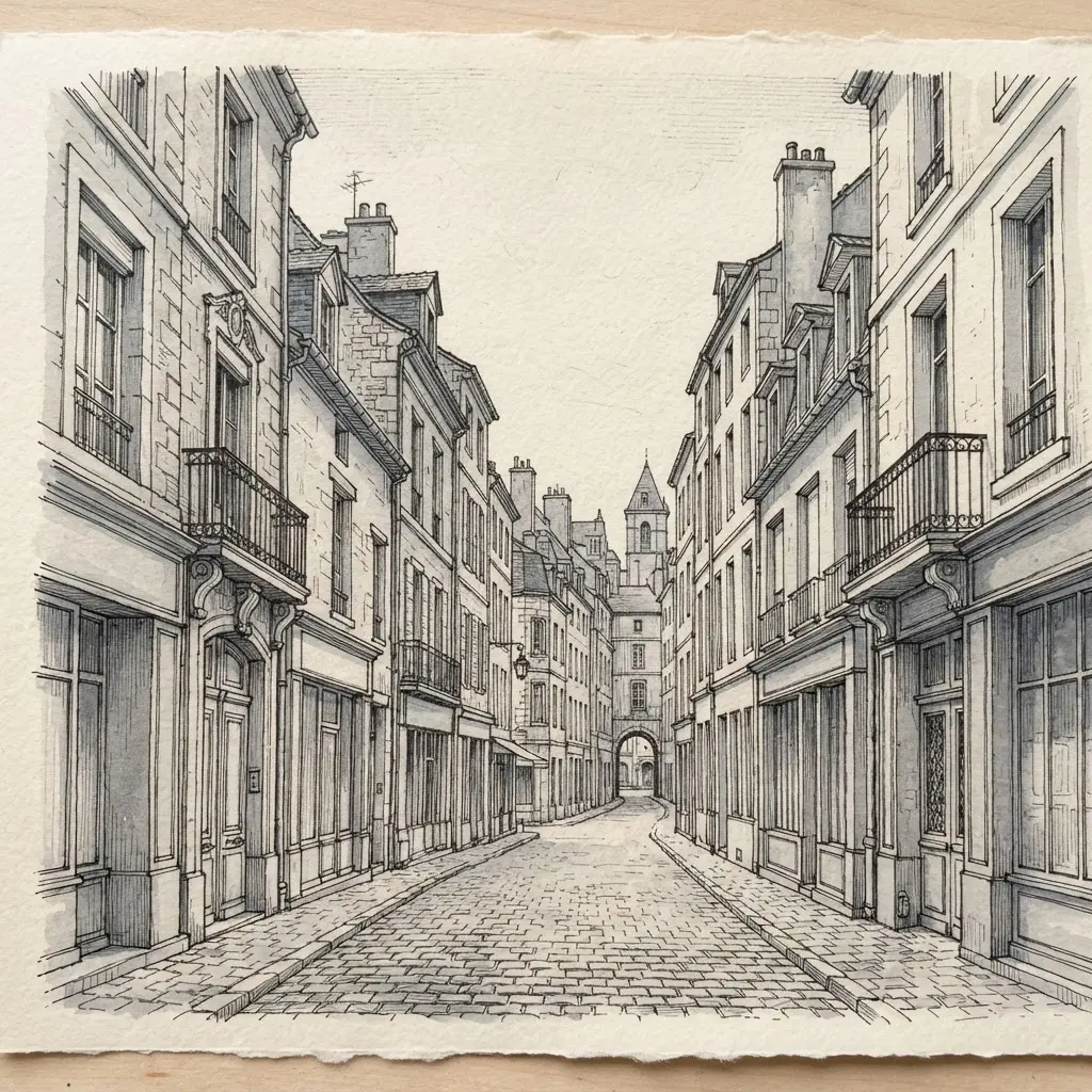
Draw the winding lane first, letting its edges lead toward a distant church tower. Add the main façades, rooflines, balconies, shutters, doors, awnings, and overhead lamps before touching smaller details. Build the foreground with cobblestones, café tables, flower boxes, weathered wood, and pedestrians beneath patterned umbrellas.
Use expressive cross-hatching to separate stone, metal, fabric, and pavement, keeping marks denser near the viewer and lighter toward the tower, a standard approach in Architectural Drawing and Paintings for Professional Artists. Sound complicated? It is not, once the perspective flow stays clear. I love how slight line irregularities give this monochrome streetscape a personal travel-sketch feeling.
Keep the darkest accents around foreground doors, balconies, and café furniture, then leave open paper in the distance. Your scene will feel spacious, lively, and full of place.
7. Digital Painted Modern Atrium Lighting
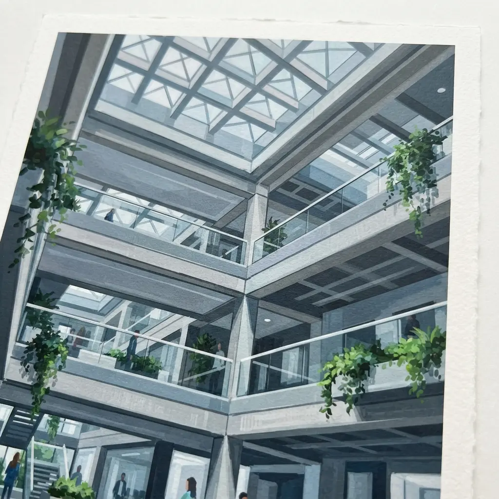
How does a modern atrium glow with depth instead of looking flat? Start with tall walls, a glass ceiling, sculptural stairs, and polished stone flooring in clean perspective. Build the cool-to-warm lighting palette with deep blue, violet, and teal, then place amber accents near suspended linear fixtures and glowing geometric pendants. Keep the structure crisp before adding atmosphere.
Paint broad gradients across the walls, tying each wash to a visible source. Soft reflected shapes on the floor pull the space together, while strong contrast keeps the architecture readable, which matches the methods in Architectural Drawing and Paintings for Professional Artists. I love how this method gives a polished interior both calm and energy.
Keep the brightest areas near focal points, then soften distant reflections for spacious depth. Trust me, the final image feels refined when light supports every stair, wall, and ceiling line.
8. Gouache Mediterranean Villa Courtyard Study
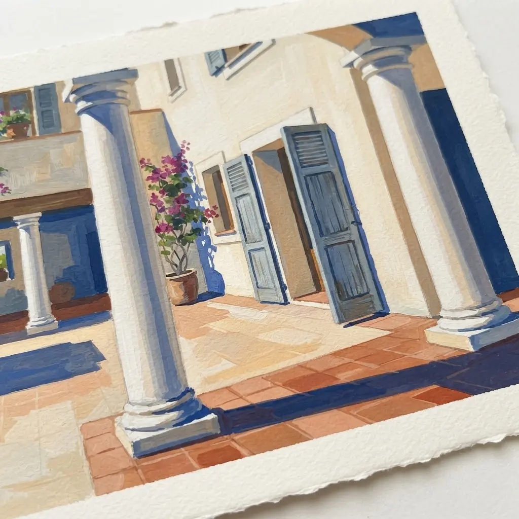
This study feels like a sunny plein-air travel sketch with plenty of room for expressive brushwork. Start with simplified architectural masses, placing the whitewashed walls, arches, roofline, shutters, fountain, and tiled floor before adding small features. Keep the forms clear and slightly loose so the scene feels painted rather than mechanically rendered.
Lay in creamy white stucco, terracotta tiles, cobalt blue shutters, sage green foliage, and golden ochre accents, then add olive trees, bougainvillea, citrus pots, and trailing vines. Isn’t it satisfying when crisp shadow shapes sweep across the courtyard and make the warm afternoon light clear? I love leaving visible paper texture beneath selected brush marks.
Soften a few hard edges with foliage, sharpen the fountain and foreground tiles, and let the cooler blue notes pull the eye through the warm scene, a tip often shared in Architectural Drawing and Paintings for Professional Artists.
9. Detailed Pencil Art Deco Entrance
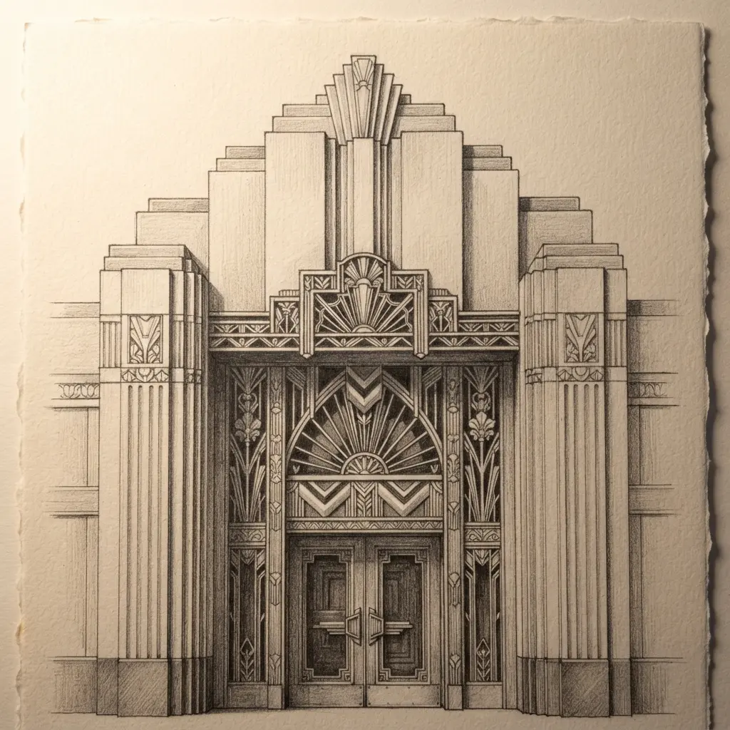
This one is a favorite of mine because the doorway feels grand before any shading begins. Sound complicated? Start with a clean central axis and build outward. Map the dramatic arch, slim columns, double doors, and layered moldings with graphite.
Add stepped borders, diamonds, chevrons, fans, and a sunburst, keeping every motif aligned. Use varied line weights so structure stays firm while ornament stays crisp, as demonstrated in Architectural Drawing and Paintings for Professional Artists. Hatching and cross-hatching give recessed areas depth, while delicate shading separates polished stone, reflective glass, and aged metal.
Keep the darkest graphite beneath the canopy and around the doorway, leaving small highlights in the glass panels. This contrast makes the architectural perspective feel deep and believable. Pro tip: use a sharp pencil for handles and decorative glass lines, then soften broad shadows with a broader graphite point. Careful layering keeps the symmetry convincing and gives the finished entrance an elegant, cinematic vintage mood.
10. Pastel Impressionistic Rainy City Skyline
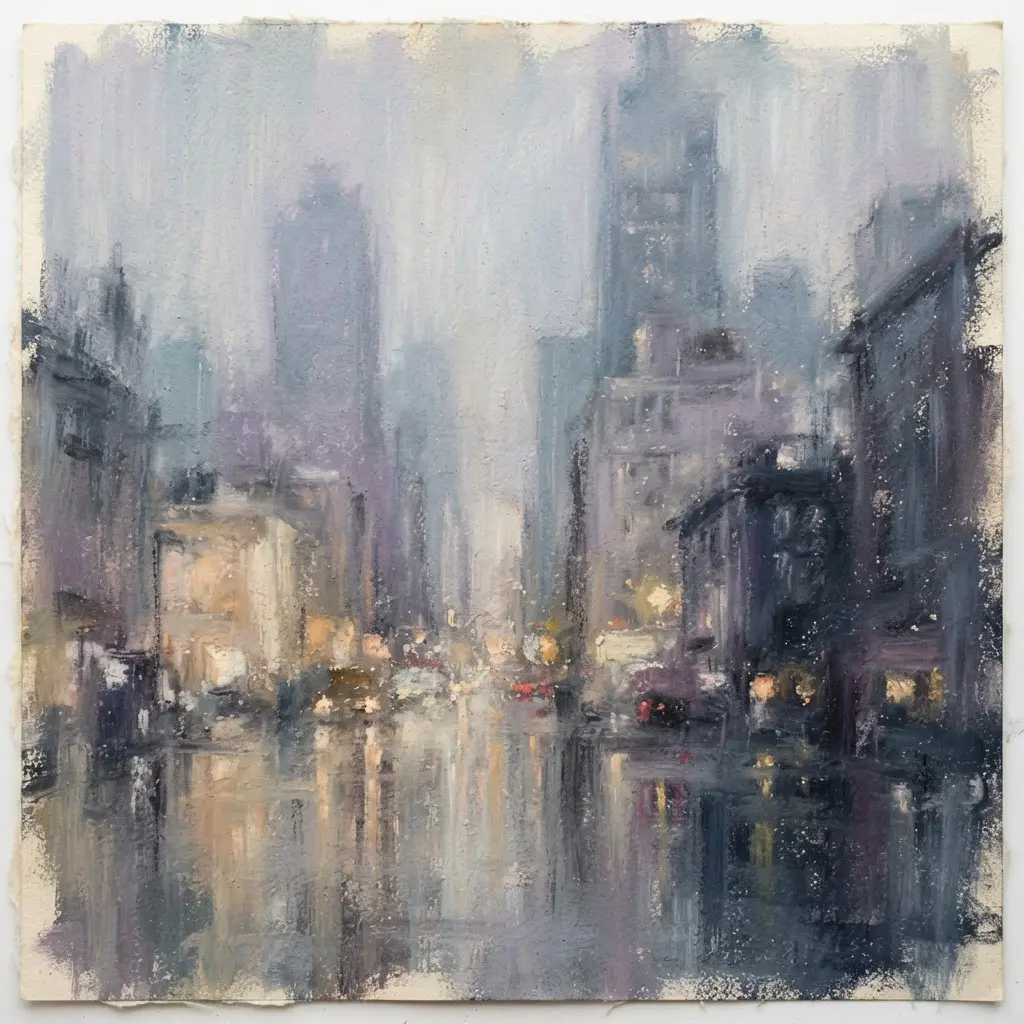
Wet rooftops catch lavender, blush pink, and pale gold light beneath a powder-blue sky. Mist blurs the distant towers, while glowing windows and street reflections soften the skyline. Sound complicated? It isn’t. I love how this approach lets mood lead before detail.
Start with a pale pastel wash across the sky, then place hazy building shapes behind a veil of rain. Add loose, expressive marks for falling rain, blurred lights, and wet rooftops. Keep edges firmer near the foreground and softer as forms recede.
Use small pale-gold window touches, then echo them in broken reflections below. This balance gives your architectural painting quiet depth and a cinematic rainy mood, echoing techniques from Architectural Drawing and Paintings for Professional Artists. Pro tip: leave some sky untouched so the diffused light has room to breathe.
11. Mixed Media Ruined Monastery Archway
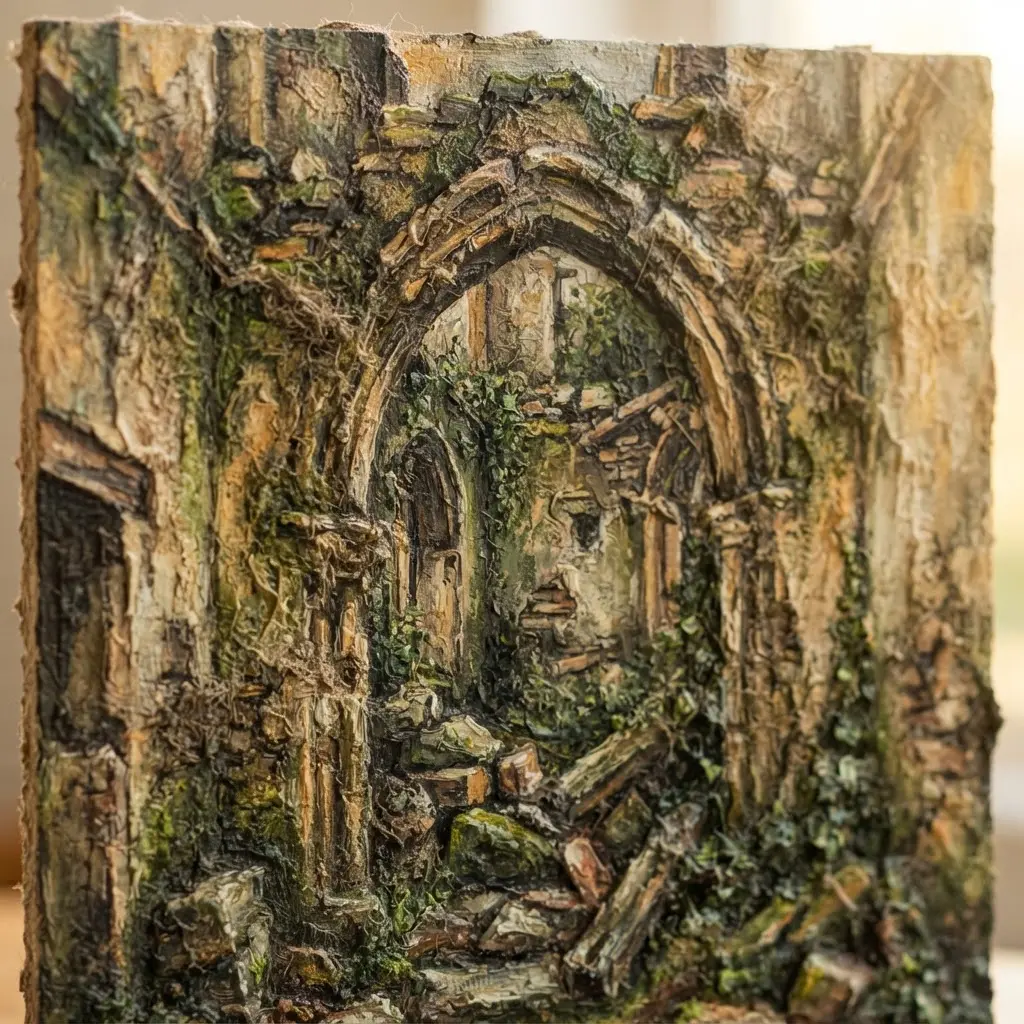
A ruined archway shouldn’t look clean and balanced, so don’t draw it like a polished doorway. Treat the broken columns, cracked masonry, and uneven arch with charcoal linework, using strong perspective to lead your eye toward the cloister courtyard. Sound complicated? It becomes manageable once the structure is set, as outlined in Architectural Drawing and Paintings for Professional Artists.
Next, add muted sandstone, sepia, moss green, and slate blue watercolor washes, then press torn parchment and faded manuscript fragments into selected areas. Keep ivy, moss, and wildflowers light enough to leave the stone visible. I love adding small ink splatters near distressed edges, since they give the surface a worn age without making every mark equally sharp.
Finish with restrained antique-gold accents and soft golden light behind the arch. This layered process feels satisfying because solid drawing and expressive texture share the same scene.
12. Technical Marker High-Rise Structural Section
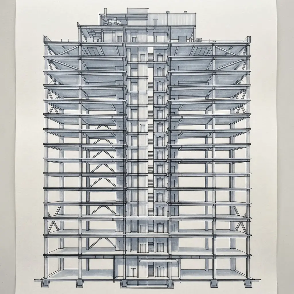
Lay out the tower’s floor levels with a blue-gray marker, then cut through the mass from roof to foundation. Draw the basement and footing first, followed by the core, columns, beams, and repeated slabs. Add the façade beside the frame, then mark mechanical floors, fire protection, and the roof so the section reads as a complete building system.
Sound complicated? It is not, once each level lines up. Use darker strokes for cut elements and lighter tones beyond the cut plane, which follows the standards of Architectural Drawing and Paintings for Professional Artists. Arrows should trace the load path from slabs and beams into columns, the core, and foundation, while short labels keep every part clear.
I love how this approach turns a tall structure into an easy-to-follow graphic, not an exterior elevation. Pro tip: leave small white gaps around labels so marker color never swallows your notes.
13. Charcoal Sketch Traditional Japanese Temple
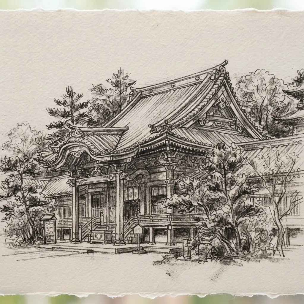
Ever wondered how a quiet temple scene gains such depth from one dark medium? Start on textured cream paper, placing the curved tiled roof, exposed beams, entrance, and stone steps with calm, measured lines. Frame the building with tall pine trees, leaving open areas for soft mist around the roof and doorway.
Build the strongest shadows beneath the eaves and along the steps, then soften nearby tones so the light feels dramatic without losing the serene mood. Add paper lanterns as small pale shapes, and use expressive cross-hatching for beams, stones, and tree trunks, exactly as taught in Architectural Drawing and Paintings for Professional Artists.
I love how this architectural study joins structure with atmosphere, giving professional artists and students a peaceful way to practice depth. Trust me, keep the roof curves clear and the shading will feel wonderfully balanced.
14. Watercolor Colonial Townhouse Row Perspective
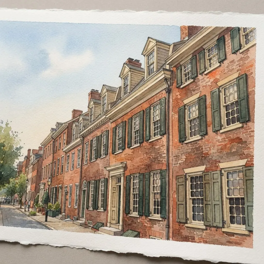
This townhouse row gives watercolor artists a graceful way to show depth without losing charm. Start with a gently angled street view, using receding façade lines to make each building shrink toward the distance. Sound complicated? It is not, once the first few angles are in place.
Build the brick and clapboard fronts with white-trimmed windows, shutters, paneled doors, stoops, iron railings, and flower boxes. Add a cobblestone sidewalk, leafy trees, vintage lanterns, and a bicycle or two, keeping each detail quiet, as often noted in Architectural Drawing and Paintings for Professional Artists. I love using transparent watercolor washes in muted brick red, warm cream, sage green, and soft blue-gray.
Cold-press paper preserves the loose edges, pigment blooms, and gentle afternoon shadows. Those sidewalk shadows anchor the row while the softened distant façades create calm atmosphere. Keep the urban details smaller than the architecture, and enjoy the satisfying rhythm of the finished street.
15. Ink Drawing Ornate Baroque Church Detail
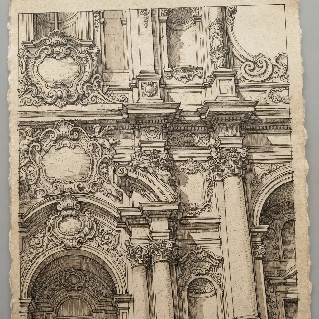
I love this subject because a few black lines bring an ornate Baroque church detail into focus. Does it look too rich for ink? Start with a symmetrical framework for the columns, arches, altar, and layered moldings, then let the ornament grow from this structure. Trace acanthus leaves, cherubs, and carved edges with crisp contours.
Add fine decorative lines where forms overlap, then build recessed areas with fine crosshatching, following the pacing found in Architectural Drawing and Paintings for Professional Artists. Keep selected sections white so projecting surfaces stay clear, while dense marks suggest deep shadows and aged relief. Gilded altar details gain visual richness through contrast instead of color.
This approach works because line density gives the interior depth without losing its clean white background. Trust me on this one, structural drawing skills matter as much as decorative detail. Keep checking both sides for balance, and feel proud when the finished ink study looks crisp, formal, and full of character.
16. Graphite Abstract Geometric Form Composition
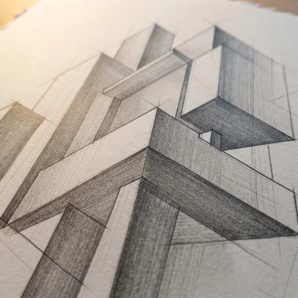
Deep charcoal cubes, pale circles, and silver-gray planes seem to float across textured white paper, with erased highlights tracing their edges. Sound complicated? It is not, since overlapping forms create depth without color. Arrange triangles, cylinders, and angular planes, then anchor selected shapes with dense graphite shading.
Blend silver-gray midtones across curved surfaces, keep advancing edges crisp, and leave hatching visible rather than smoothing every mark, a method highlighted in Architectural Drawing and Paintings for Professional Artists. I love how the limited palette gives the study a calm, modern feeling. Use a sharp eraser for small highlights, and deepen only the masses meant to move forward. Feel proud when the spatial structure settles into place.
17. Acrylic Nighttime Neon City Alleyway

A common mistake is painting neon as flat stickers, but its colour must spill across nearby walls, cables, shop fronts, and pavement. Start with one-point perspective, guiding brick walls, fire escapes, and storefronts toward a clear vanishing area. Block in deep nighttime tones first, leaving separate planes for each architectural feature.
Add magenta, cyan, violet, and electric blue signs, then drag broken reflections across the rain-slick ground. A lone figure in a dark coat beneath a transparent umbrella gives the tall alley a clear sense of scale, which aligns with practices in Architectural Drawing and Paintings for Professional Artists. I love how thick acrylic marks bring grit to brick and pavement.
Pro tip: keep the brightest highlights close to the signs, then let the surrounding darkness make every colour glow. Sound complicated? It is not, once the perspective leads the brushwork.
18. Fine-Liner Detailed Clock Tower Elevation
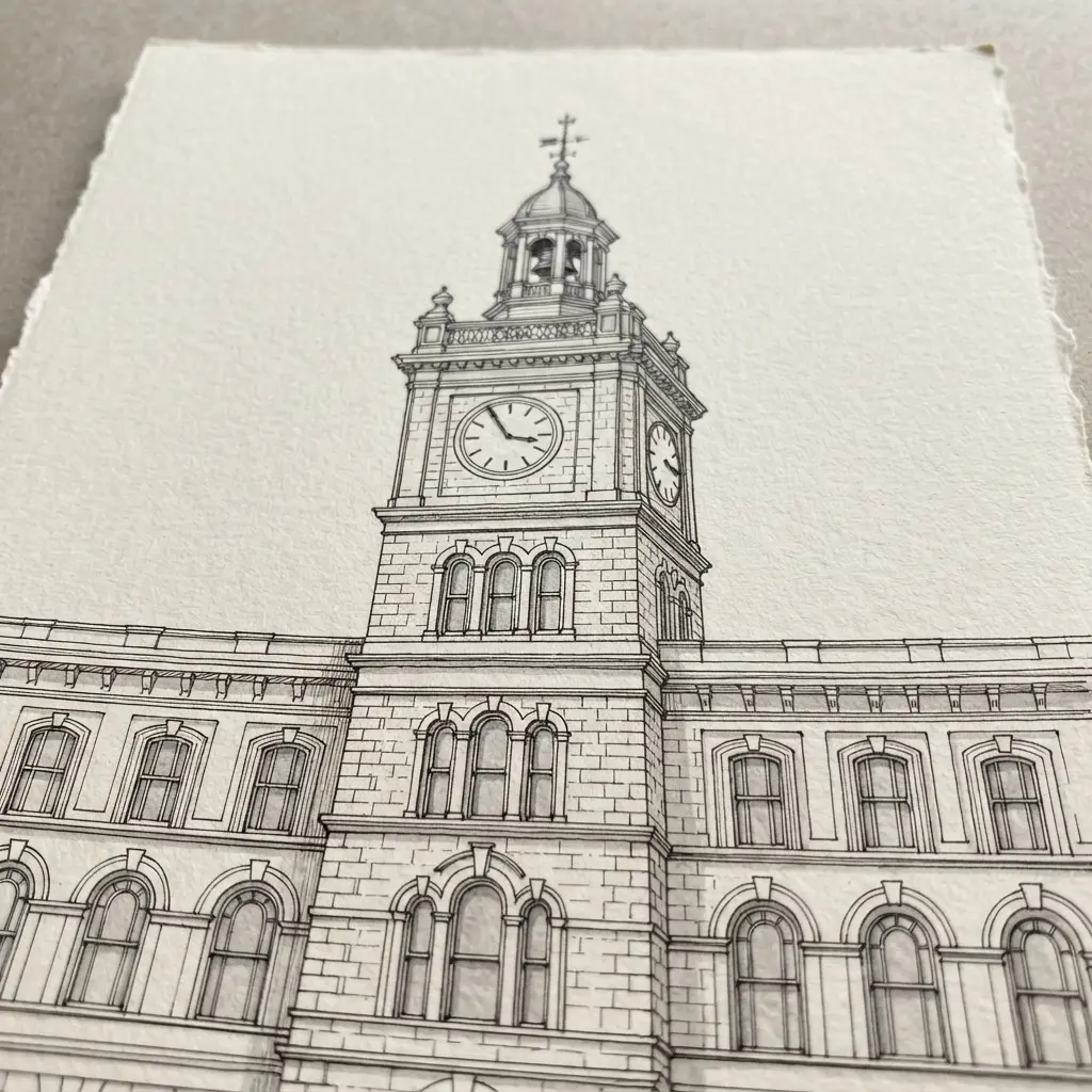
Set a light vertical centerline on your paper, then mark the tower’s base, clock level, and roofline. Use a fine-liner pen to trace the outer silhouette, keeping each edge clean and steady. Build the tower from its broad base to narrower upper stages, aligning windows, cornices, and openings on both sides.
Add the clock-face geometry with a compass, then draw numerals, hands, masonry joints, and small ornaments in measured strokes, as recommended by Architectural Drawing and Paintings for Professional Artists. This process makes proportion and symmetry easy to see. Vary line weight by pressing lightly for distant details and slightly harder for major edges.
Isn’t it satisfying when the façade begins to look solid and balanced? I love this one for focused practice. Pro tip: leave the darkest lines around the clock opening, so your finished elevation feels crisp and clear.
19. Watercolor Mediterranean Waterfront Harbor View
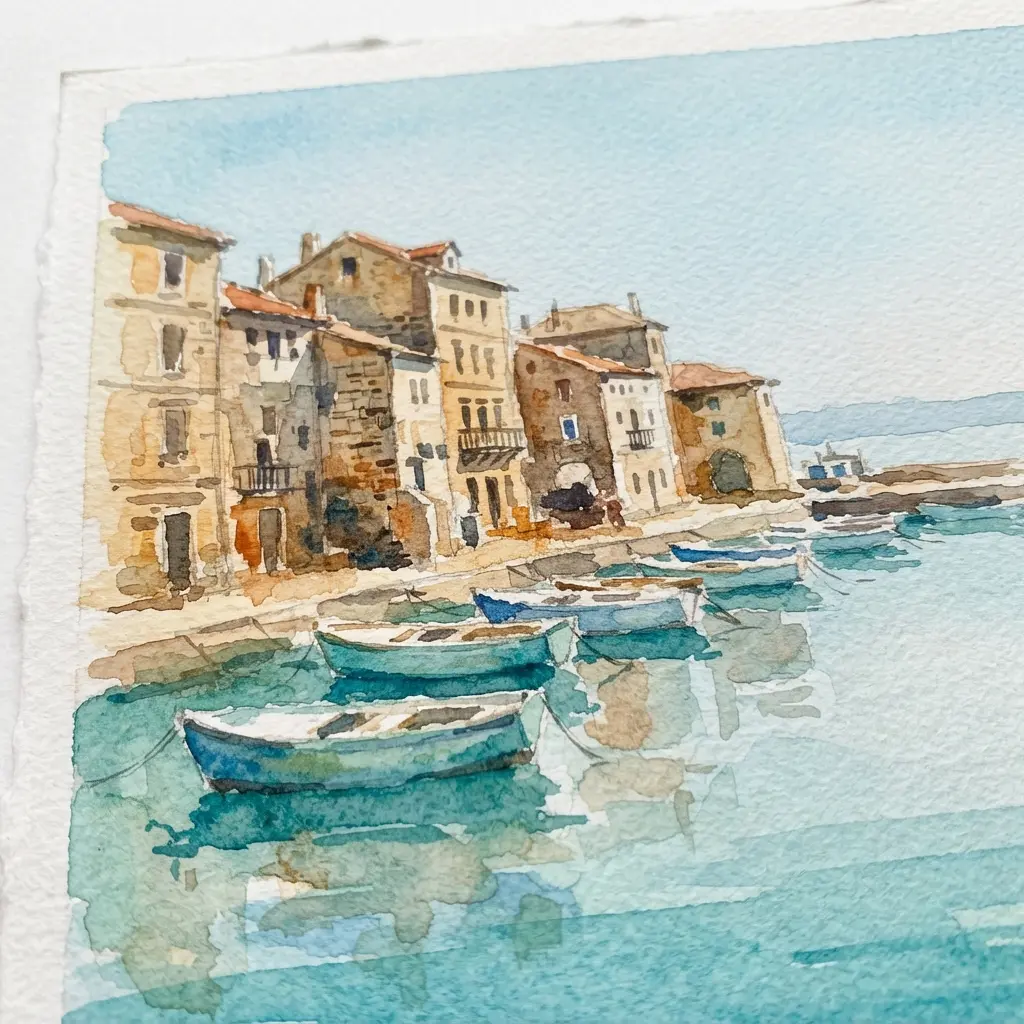
How do whitewashed buildings stay lively beside turquoise water? Start with a soft horizon, distant hills, and a loose atmospheric perspective wash on textured watercolor paper. Block in terracotta roofs, cafés, and the stone promenade before adding fishing boats in the foreground and middle distance.
I love placing bougainvillea near windows, since small green and pink marks bring the harbor streets to life without heavy detail, matching examples from Architectural Drawing and Paintings for Professional Artists. Keep the hills and sailboats pale, then strengthen color around the boats, buildings, and sunlit walkway. Leave patches of paper visible, and let golden light tie the coastal palette together. Trust me, loose brushwork gives this scene its calm travel-poster feel.
20. Charcoal Rough Urban Construction Site
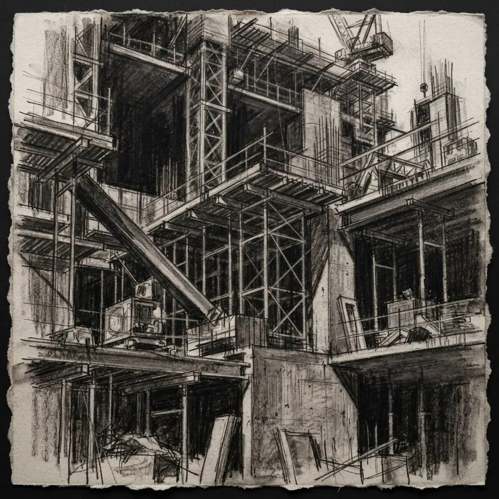
This charcoal scene feels raw from the first broad mark, and I love how quickly it builds a busy city site. On coarse paper, place strong diagonal lines to set dramatic perspective, then block in unfinished concrete buildings, steel beams, scaffolding, cranes, timber, rubble, and small workers. Keep the nearest forms dark and broken, with smudged shadows under beams and across the ground.
Use an eraser to pull out bright edges and open patches of paper, while softer gray marks push distant buildings into haze. Sound complicated? It is not, which proves a point from Architectural Drawing and Paintings for Professional Artists. The rough texture works because every scratch supports the dusty, active mood without polishing away the observed moment. Trust me on this one: leave a few awkward marks, and your drawing will feel more alive.
21. Ink Pen Scandinavian Cabin Forest View
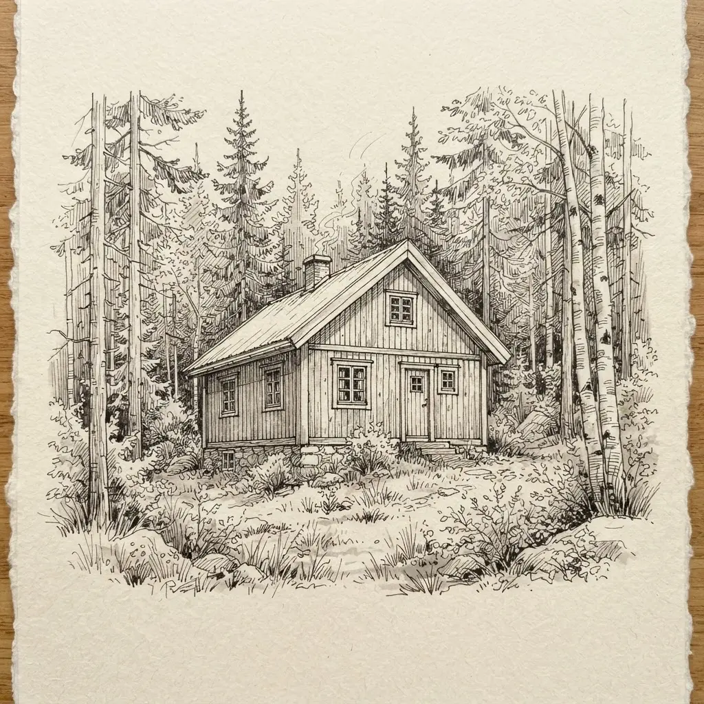
I love this subject because a few black lines give a Nordic cabin such a calm presence. Start with the cabin silhouette, using a steep roof, broad windows, and a small porch. Keep the structure clean before placing trees around it. Frame the building with tall pines and slender birches, varying each contour so the forest feels natural.
Add fine cross-hatching beneath the roof, porch, and nearby ground to create depth, exactly as taught in Architectural Drawing and Paintings for Professional Artists. Leave open paper around the windows and clearing for soft daylight. Why does this work so well? The cabin offers firm architectural lines, while the trees bring gentle movement and texture.
I love how this balance suits an architectural sketchbook without losing the peaceful travel-sketch mood. Trust me on this tip: keep wood grain sparse and let darker marks gather near the cabin’s base. Your drawing will feel spacious, rustic, and wonderfully calm.
22. Digital Illustration Futuristic Bio-Dome Structure
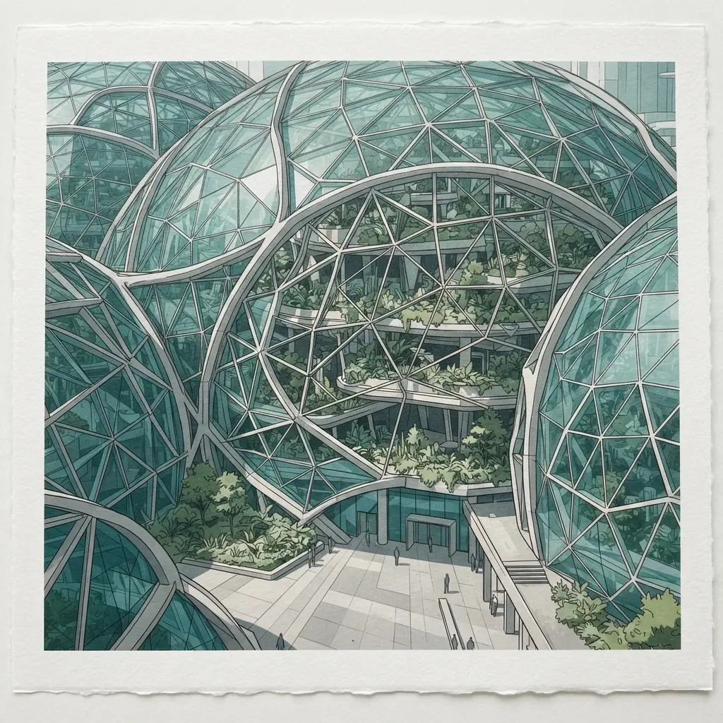
Blue and emerald gardens glow beneath a glass dome at twilight, while mist softens distant mountains and a glowing planet. Ever wondered how to make such a huge scene feel orderly? Start with a cinematic wide-angle view, then block the dome using transparent panels and crisp metal supports. Keep the enclosure readable against the sky before placing interior details, so every walkway and building follows the same perspective.
I love adding towering tropical trees, cascading waterfalls, floating walkways, solar towers, and small buildings in careful layers, a technique covered in Architectural Drawing and Paintings for Professional Artists. Give the gardens their blue-green light, then finish with atmospheric lighting, reflective glass, textured metal, and gentle haze. This approach works because rigid geometry and living growth share one clear space, giving your digital illustration a strong eco-futurist feel.
Pro tip: reserve the brightest glow for the center, and let quieter edges guide the eye inward. Feel proud when the dome begins to feel inhabited.
23. Gouache Sunlit Desert Adobe Dwelling
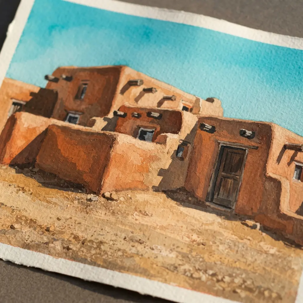
Many artists make every adobe surface equally bright, but sunlight needs deep shadows to give the home depth. Start with rounded earthen walls in terracotta, ochre, and sandy beige, then place a small wooden door, deep-set windows, and a shaded porch. Sound complicated? It is not, and I love how quickly the turquoise sky sets the warm structure apart.
Use textured paper and varied brushwork, keeping some paper grain visible as you add desert grasses, prickly pear, agave, rocks, and distant mesas in dusty rose and lavender. Soften a few pigment edges around the mesas and ground, while keeping the doorway and window shapes clearer, just like the guides in Architectural Drawing and Paintings for Professional Artists. Trust me on this one: those light pools and quiet plant details give the scene its welcoming Southwestern character.
24. Pencil Detailed Staircase Architectural Study
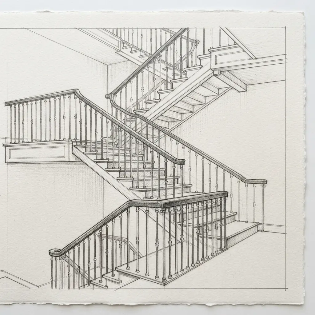
Place a sheet of textured ivory paper vertically, then lightly map the staircase curve, vanishing lines, and overall height with faint construction lines. Ever tried keeping repeated treads aligned while the stairs sweep upward? Build each riser and tread before shaping the ornate balustrades, carved newel posts, railings, and classical columns. Add a partial floor plan, elevation notes, and measured annotations around the view, leaving some early marks visible.
Use varied graphite shading, cross-hatching, and soft smudging, then press in darker cast shadows beneath every stair and lift small highlights with an eraser. I love how this balance keeps the picture technical yet warm, with perspective doing the work of showing depth, which matches the core lessons in Architectural Drawing and Paintings for Professional Artists. Trust me, keep ornamental details lighter until the structure reads clearly, then enjoy the polished museum-study finish.
25. Mixed Media Industrial Steel Bridge Scene
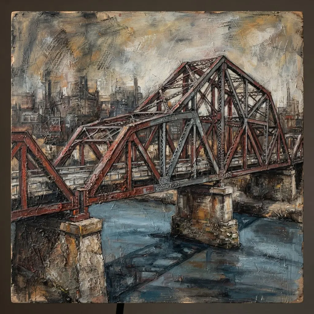
Ever wondered how a steel bridge scene gains such a gritty gallery presence? Begin with charcoal perspective lines, mapping the deck, angular beams, cables, supports, rivets, and deep geometric shadows across a dark river. Brush rust-coloured acrylic washes over selected beams, then place deep navy, concrete gray, and muted cream around hazy city structures and smoky clouds.
Press torn newspaper fragments into the surface, leave their uneven edges visible, and scrape through dry passages for worn metal effects, following methods from Architectural Drawing and Paintings for Professional Artists. I love how dry charcoal, fluid paint, paper, and rough brushwork give the bridge clear structure and tactile age. Keep the background soft while the bridge holds the darkest values, then let overlapping framework and sharp shadows strengthen the scale.
Pro tip: allow each acrylic layer to dry before collage work, and enjoy the moody finish.
Portfolio Presentation For Finished Architectural Artworks
Choose museum glass for watercolor originals when reflected light threatens to hide pale washes. Use a deep enough window mat to keep glazing away from the surface, especially with textured watercolor paper or raised mixed-media passages. Graphite and technical-pen drawings benefit from a crisp white or warm gray border, since an aggressive mat color competes with delicate line hierarchy.
Mount larger sheets on rigid backing with archival corners rather than adhesive across the paper, preserving movement from humidity. For acrylic and oil paintings, a slim frame with a spacer protects impasto and keeps the image plane visually clean, a tip emphasized in Architectural Drawing and Paintings for Professional Artists. Record the title, medium, dimensions, and date on a separate label, then photograph the work straight on with even lighting for accurate color reference.
Conclusion
So how was your creative session? A building study often says something about the way you notice space, light, age, and the people who move through a place. Look at what you have made. Each measured line, softened edge, shadow, and surface mark reflects your artistic judgment. Architectural Drawing and Paintings for Professional Artists is not about copying every detail.
It is about choosing which details carry the feeling of the structure. For your next piece, keep one strong light source, add a small human-scale detail, and let the surrounding air affect distant forms, exactly as encouraged by Architectural Drawing and Paintings for Professional Artists. I love revisiting an old subject with a new medium, so perhaps your next study could pair ink with watercolor, or charcoal with a restrained digital wash.
Pick the reference you keep thinking about, set out your preferred tools, and give it a fresh interpretation. Your next building study is ready when you are.
FAQs
Q: Which perspective method suits an architectural painting?
A: One-point perspective suits hallways, roads, and centered interiors. Two-point perspective suits building corners, streets, and exterior façades.
Q: How do artists show glass reflections in building studies?
A: Use a limited value range and repeat nearby shapes across the glass. Keep reflection edges softer than the main frame lines.
Q: Which tools suit detailed architectural drawings?
A: Use fineliners, graphite pencils, technical markers, watercolor, gouache, and a pressure-sensitive tablet. Choose tools based on line precision, wash control, and surface detail.
Q: How do shadows keep buildings grounded?
A: Set one clear light direction before adding surface details. Connect the building shadow to the pavement or interior floor with a consistent value.
Q: How do artists add atmosphere to distant structures?
A: Reduce contrast, soften edges, and shift distant colors toward the surrounding air color. Keep foreground lines darker and more varied.