Paper Grain And Ink Drying Behavior
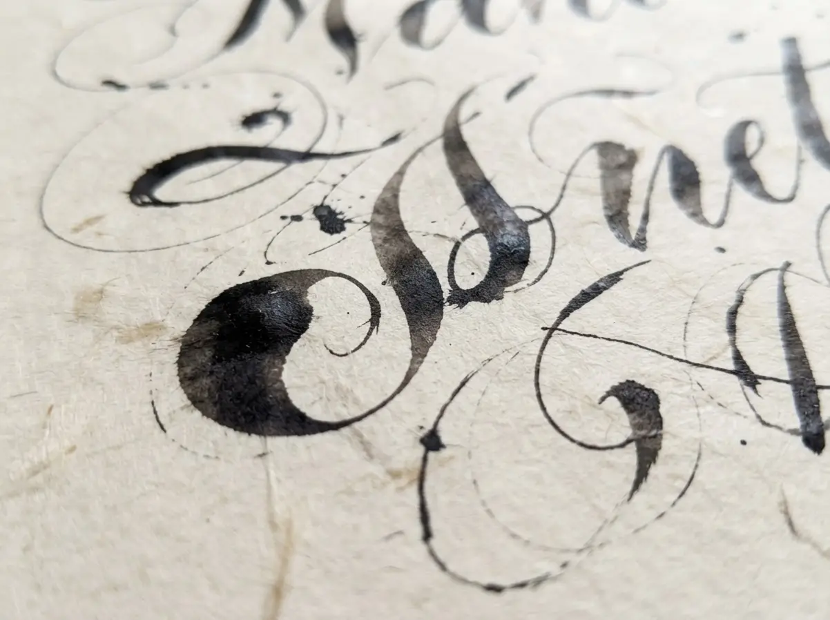
Hot-press cotton paper gives pointed-pen hairlines cleaner edges than textured stock, especially with thin black ink. Choose smooth cotton paper for envelopes, menus, and place cards when crisp contrast matters. Porous sheets pull ink beyond the letter boundary, while coated sheets slow drying and increase smearing beneath your hand.
Test the exact paper, ink, and nib together because a nib that behaves well on invitation stock might blot on handmade fiber paper. Metallic gouache often needs a slightly denser mix than black acrylic ink, and excess water weakens coverage. Letting each addressed piece dry flat protects hairlines from fingerprints and prevents stacked envelopes from transferring wet pigment. Keep a scrap beside your work, drawing from wedding calligraphy tips, so you see drying speed, feathering, and color shift before committing to the final suite.
Matching Lettering Character To Wedding Formality
An invitation with black pointed-pen script suits formal ceremonies when its hairlines, measured slant, and restrained flourishes keep names easy to read. Choose broad-edge nib lettering for structured italic or Roman forms, particularly when the venue calls for old-world dignity and firm visual order. Brush lettering brings wider, livelier strokes to relaxed garden celebrations, though oversized swashes need enough surrounding space.
Monoline lettering suits minimalist stationery because consistent stroke weight supports clean layouts and quiet typography. Match lettering scale to the item, applying wedding calligraphy tips for visual balance, since a place card needs intimate proportions while a welcome sign needs stronger contrast from across the room. Keep one dominant script for names and pair it with a simpler style for dates, directions, or meal details. This reading order keeps personality present without making guests decode the wording.
1. Calligraphy Style Selection Methods for Wedding Stationery
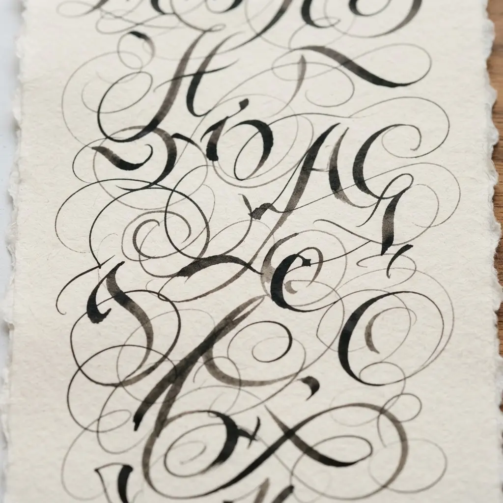
Ever wondered why one script feels perfect on an invitation yet awkward on a place card? Start with the wedding mood, then apply wedding calligraphy tips when choosing controlled pointed-pen script for formal celebrations, flowing flourishes for romantic plans, clean italic lettering for modern suites, or relaxed brush lettering for rustic outdoor settings. Vintage themes suit Art Deco or engraved forms, while bohemian stationery welcomes organic, uneven strokes.
I love this first check because the lettering feels connected to the celebration instead of competing with flowers, borders, or paper texture. Next, test the actual names, dates, numbers, and venue lines at their final size. Keep decorative script for names and headings, then use a simpler style for body text, menus, and seating details. Match each piece to its job, with clear addressing on envelopes and bold lettering for signs viewed from across a room. Before choosing foil stamping, letterpress, engraving, or digital printing, use reliable wedding calligraphy tips to inspect a proof on the selected paper and check every punctuation mark.
Trust me, a readable final-size proof prevents a gorgeous script from turning cramped or unclear, and the finished suite feels polished from invitation to thank-you note.
2. Essential Calligraphy Tool Kits for Consistent Lettering
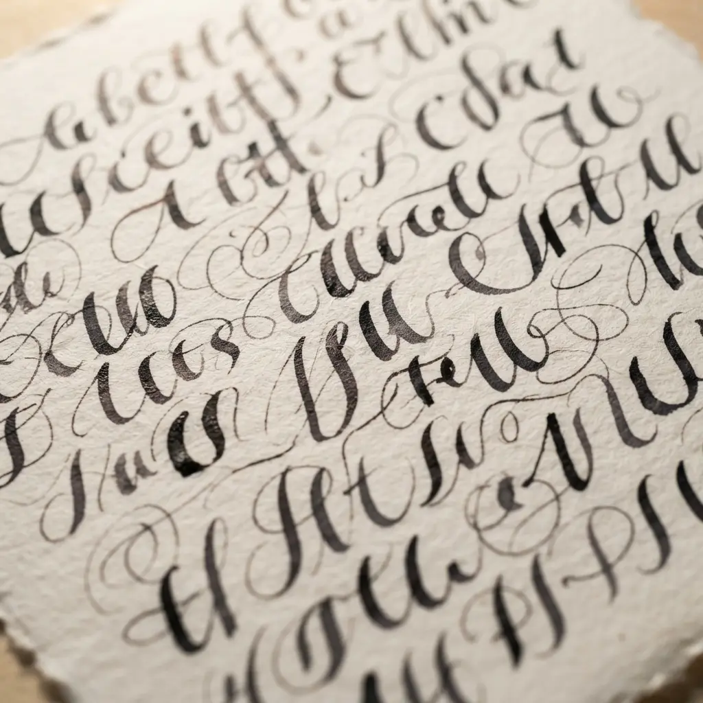
Consistent mastering single line lettering requires a small kit you know well, not a drawer packed with unused supplies. For brush lettering, begin with a flexible brush pen, smooth paper, a pencil, ruler, and printed guidelines. For broad-edge scripts, choose a flat nib or broad-edge fountain pen, while pointed scripts need a flexible nib in a straight or oblique holder.
Place smooth, bleed-resistant paper over lines, guided by wedding calligraphy tips, for the baseline, x-height, spacing, and slant. Use one compatible ink and nib during practice so uneven strokes point to pressure, angle, or ink flow rather than changing equipment. Sound complicated? It is not. I love seeing wedding lettering settle into neat rows once the paper and tools respond in a predictable way.
Keep water, a small cloth, and a soft brush nearby, then clean the nib after each session and store it in a compact container. Dip-pen ink belongs in dip pens, not fountain pens, and rough paper often causes bleeding or broken hairlines. Pro tip: repeat the same warm-up strokes before addressing names or envelopes, and enjoy the satisfying rhythm of steady lettering.
3. Surface and Ink Testing Procedures for Envelopes
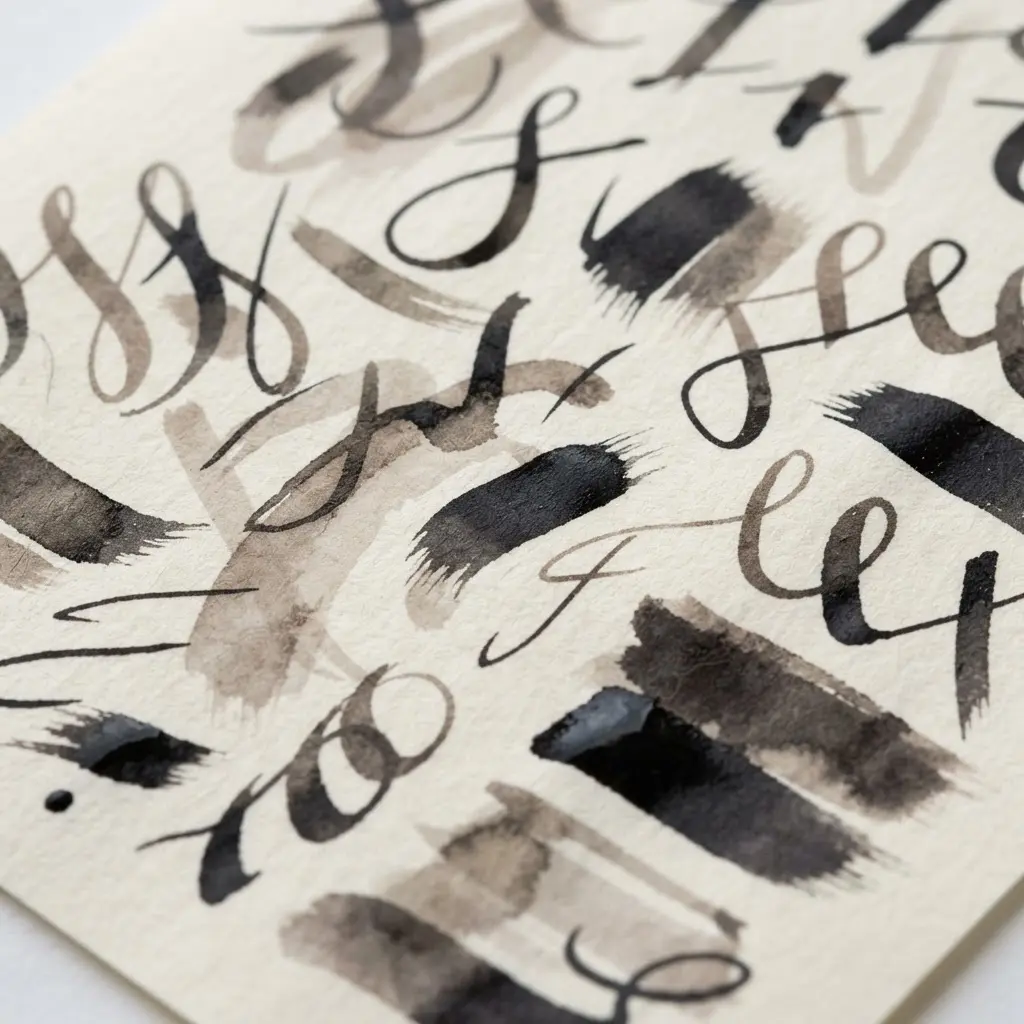
I was skeptical about testing every envelope area, yet this step saves so much frustration. Before addressing your suite, choose five envelopes from each lot and mark the front, flap, seams, window, and adhesive zones. Sound fussy? It is not, since each area takes ink differently.
Flatten samples gently, following proven wedding calligraphy tips by letting them rest for at least 24 hours in the same temperature and humidity. Keep fingers off printable areas, since oil and moisture affect adhesion. Under steady light, look for dust, coating skips, wrinkles, folds, fiber lifting, or adhesive squeeze-out. I love using a magnifier here because small defects stand out before lettering begins.
Print a small test using your production ink and the same pen, nib, pressure, and drying setup planned for the invitations. Check edge sharpness, color, drying time, rub resistance, and skips across every tested area. A crockmeter or gentle tape check gives extra guidance, though delicate paper deserves care. This pairing of ink and envelope matters because a generic paper swatch gives false confidence. Trust me, a clean test makes full-suite addressing feel calm and satisfying.
4. Guideline Drafting and Layout Techniques for Balanced Spacing
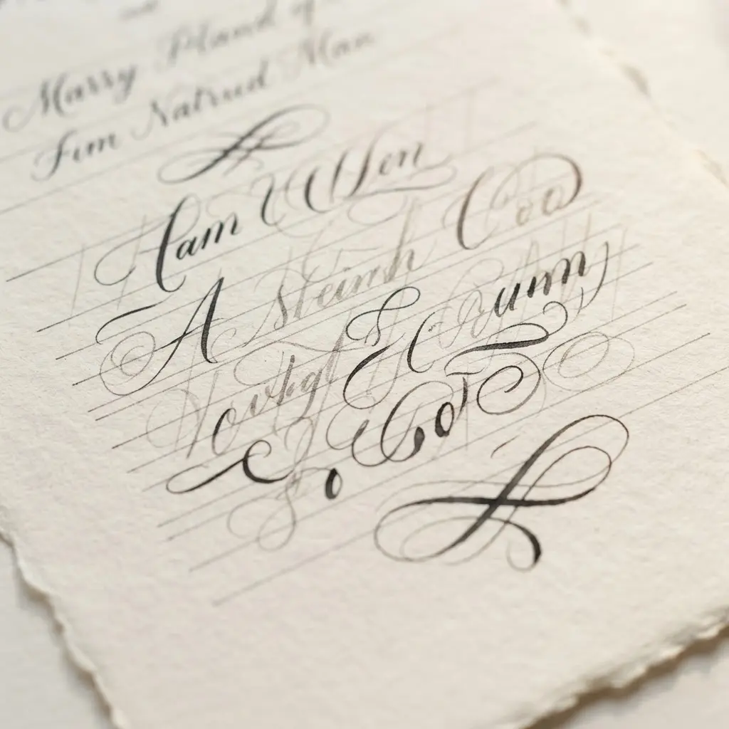
The finished card looks calm and polished, with names sitting neatly on one line and each phrase given room to breathe. Start with light pencil guidelines, as trusted wedding calligraphy tips suggest, for the letter height, baseline, margins, and major text groups before touching the ink. Keep small gaps between a name and its phrase, medium gaps between related details, and larger spaces before a new section.
Use one repeatable spacing unit across the page instead of inventing every gap as you go. Aim for line height around 1.4 to 1.6 times the letter height in supporting text, then keep headings closer to the words they introduce. Sound complicated? It is not. I love this step because a quick layout sketch reveals crowded areas early and gives the final piece a steady vertical rhythm.
Leave extra white space around the couple’s names, while keeping dates and small details grouped nearby. Trust your eye, make small pencil adjustments, and feel the calm settle into every line.
5. Pointed Pen Pressure Control Basics for Elegant Strokes
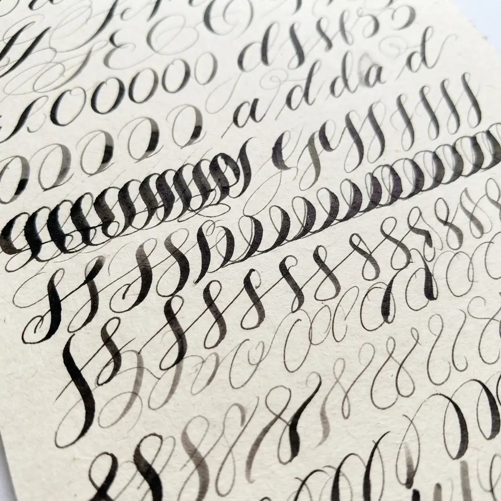
Pressing harder does not create prettier thick strokes. A pointed nib needs measured pressure, not force. Keep your grip relaxed, glide upward with light pressure, then increase pressure gradually on the downward path. Isn’t it satisfying when a fine hairline opens into a smooth, rich shade?
Begin each downstroke lightly, practicing these wedding calligraphy tips to add pressure through the middle, and ease off before the line ends. Sudden force often leaves blobs, pooled ink, or blunt edges. I love practicing slow curves because they show exactly where pressure changes need more care. Keep your movement steady, since stopping mid-stroke leaves visible bumps.
Build control with downstroke ladders, compound curves, ovals, and push-pull strokes. Let each line begin thin, widen smoothly, and return to a fine finish. Use thin upstrokes and fuller downstrokes while keeping ovals rounded and even. These patterns prepare your hand for graceful connections in names, place cards, and envelopes.
Hold the pen at a stable angle, often between 30 and 45 degrees from the writing line, and avoid twisting it around curves. For long capitals or flourishes, guide the motion with your forearm instead of relying only on your fingers. Check the nib, ink, paper, and steady pen angle before adding pressure. Your strokes will feel easier, cleaner, and full of elegance.
6. Ergonomic Hand and Wrist Care During Addressing
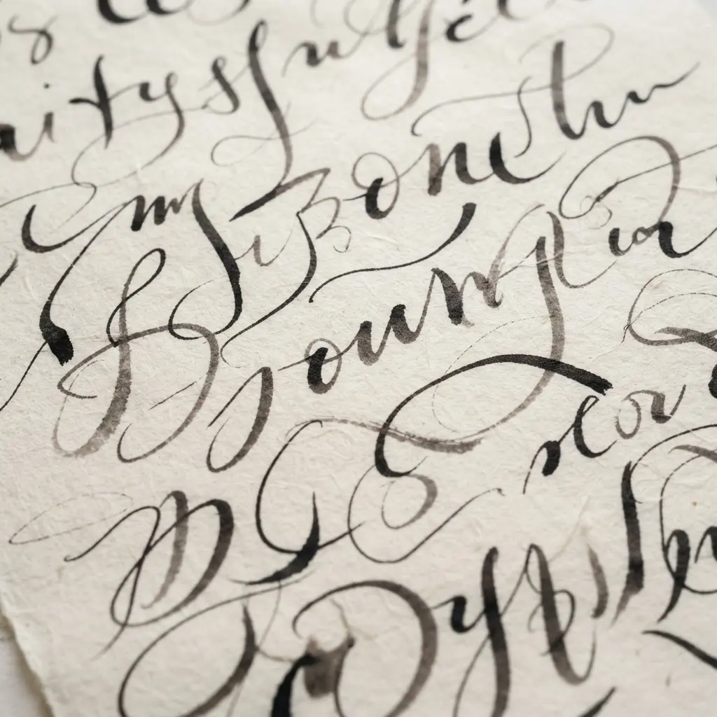
Set your envelope close to your body on a stable, nonslip surface, then sit with your back supported and shoulders loose. Keep your elbows near your sides and turn the envelope until your wrist stays straight, rather than bending it toward the thumb or little finger. A larger-barrel or cushioned pen gives your fingers room to relax, while a light grip keeps each stroke controlled. Sound complicated? It is not, and this small setup change feels kind to your hands.
Guide long names with forearm-led movement, applying wedding calligraphy tips for comfort, instead of asking the wrist to do every movement. Rest your hand near a soft, rounded edge, never a hard corner, and keep the work surface high enough to prevent hunching. Every 20 to 30 minutes, pause for slow finger opens, gentle wrist stretches, and shoulder rolls, then switch to sorting or sealing for movement variety. I love this one because relaxed muscles give you steadier lines and a happier addressing session.
Stop with pain, numbness, tingling, weakness, or swelling, and seek medical advice if symptoms continue or worsen. Pro tip: move the envelope often, so your wrist angle stays easy from the first name to the last.
7. Systematic Batch Addressing Workflows for Organized Stationery
Ever wondered how to keep a large invitation mailing neat from the first envelope to the last? Start with a verified master address list, then sort it into labeled groups such as local, domestic, international, and review needed. Keep one group on your work surface, with matching envelopes, stationery, postage, and writing tools close by.
Follow the same order each time, using standard wedding calligraphy tips, choose the next recipient, confirm every line, address the envelope, add the return address, and check placement. Match each envelope with its invitation before moving it to a finished tray, then mark the recipient complete on your checklist. I love this approach because the steady rhythm reduces mix-ups and keeps your calligraphy style consistent.
Use a ruler or light envelope guide for even spacing, and test printed layouts on scrap envelopes before starting. A final quality-control review should check names, unit numbers, ZIP Codes, postage, smudges, and stationery pairings against the master list. Trust me on this one: pause before the last review, then enjoy seeing a polished, orderly stack ready for mailing.
8. Drying and Ink Curing Protocols for Clean Envelopes
Clean envelopes depend on patience after the lettering is finished. Give each piece a clean, dry substrate, then check the ink suits the paper, coating, seams, and adhesive zones. Sound complicated? It is not, but a quick surface check saves a polished batch from fingerprints and smears.
For water-based ink, use gentle forced air, which aligns with practical wedding calligraphy tips, with good ventilation, keeping lightweight envelopes still while moisture leaves the surface. Solvent-based ink needs controlled airflow and exhaust, while water-based UV ink often needs hot air or infrared before UV exposure. I love this step because the surface changes from tacky to smooth right before your eyes.
Never stack envelopes when they only feel dry. Test a sample with a rub and blocking check, then look for ink transfer before inserting, folding, packing, or mailing. Reduce ink coverage or press speed if the finish stays soft, and avoid excess heat, which might curl paper, weaken seams, or affect pressure-sensitive adhesive areas. Let the batch settle before bulk handling, and your names and addresses will stay crisp.
9. Postal Requirement and Space Planning for Readable Addresses
This is one of my go-to wedding calligraphy tips because a graceful envelope still needs a clear path through the mail. Before mastering single line lettering, gather the recipient’s full name, street number, directional, unit detail, city, state abbreviation, and ZIP Code. Collect the complete address before adding any flourishes.
Plan the street line and city, state, ZIP line as one block, applying precise wedding calligraphy tips for even spacing and left alignment. Keep it at least half an inch from each side, 5/8 inch above the bottom, and below the upper OCR boundary. Use dark ink on a pale, smooth envelope, with letters separated and parallel to the bottom edge. Sound fussy? It is not.
Leave the postal area clear of borders, seals, folds, patterns, and extra graphics. If an apartment or suite number will not fit on the street line, place it immediately above, never below the city line. Check window clearance, leaving at least 1/8 inch around the full address block. I love this step because balanced spacing keeps elegant details from competing with delivery information. Trust me on this one: readable lettering gives the envelope a polished finish and helps it reach the right doorstep.
10. Buffer Stock Calculation Strategies for Wedding Envelopes
A neat stack of wedding envelopes feels crisp beneath your fingertips, guided by solid wedding calligraphy tips, with every flap clean and ready for a name. Sound complicated? Start with buffer stock formula: multiply your expected quantity by a percentage, then add the result to your order. For 200 envelopes, a 10% reserve gives 20 extras and 220 envelopes total.
Use 5% for standard, easy-to-replace stock, 10% for colored envelopes, liners, or printing, and 15% to 20% for handmade, imported, or specialty pieces. Address printing, calligraphy, sealing, and postage add handling risk, so I prefer a 10% to 15% production buffer for those stages. This keeps one smudge or tear from interrupting your rhythm.
Keep guest-list needs separate from production mistakes. For 150 adding watercolor to invitations, 5% guest-list allowance rounds to 8 envelopes, while an 8% production allowance rounds to 12, bringing the working total to 170. For small orders, hold at least 5 extras under 50 and 10 extras from 50 to 150, then round up to supplier packs of 25, 50, or 100. Trust me, this is one of my favorite wedding calligraphy tips because it keeps the whole process calm and organized.
Archival Storage For Keepsake Wedding Stationery
An acid-free archival box protects invitation suites better than ordinary cardboard, which releases acids as it ages. Store acid-free archival boxes flat in a cool, dry room away from attic heat, basement moisture, and direct sunlight. Place each piece between unbuffered tissue sheets when preserving metallic ink, since alkaline buffering sometimes alters delicate pigments. Polyester or polypropylene sleeves provide safer individual protection than PVC, whose additives often migrate into paper. Keep envelopes and inserts together, but avoid tight packing that bends deckled edges or presses raised ink against neighboring sheets. Write dates and names on the box label rather than on the stationery, and handle every piece with clean, dry hands. Stable indoor humidity helps paper hold its shape, while repeated damp and dry cycles encourage curling and ink transfer.
Conclusion
So how was your creative session? Your names, dates, and little paper details now carry more of your personality because you chose the lettering with care. Look at what you have made, this is real skill right there. Wedding calligraphy tips are most useful when they lead to a repeatable routine, so keep your best sample beside the stationery and compare each line as you work. My favorite next step is a small keepsake card for your own home, using the same ink and a fresh layout. Give every finished piece time to dry before stacking or sealing, and keep a few spare envelopes nearby for relaxed practice. There is no need for perfect sameness, since small differences show your care. I hope your lettering feels more like yours with every name. Pick your favorite style, set out one sample sheet, and get started right away.
FAQs
Q: What ink works best on wedding envelopes?
A: Choose archival ink suited to the envelope finish and nib you plan to use. Test it on a spare envelope, then check feathering, drying time, and rub resistance.
Q: How do I stop calligraphy ink from bleeding?
A: Start with a clean, dry envelope and a light touch. Test a thinner ink layer on the same paper, then allow each address to dry before stacking.
Q: What nib size suits wedding invitations?
A: Begin with a pointed nib in a fine or medium size for readable names. Match the nib to your lettering scale, then practice uppercase letters and flourishes on the same paper.
Q: How much space should I leave for postal addressing?
A: Keep the recipient lines clear and leave room for the postal label and stamp. Check your postal service layout rules before printing or writing the final batch.
Q: How many extra envelopes should I order?
A: Set aside spare envelopes for testing, smudges, and lettering slips. Count your invitation quantity, then add a practical reserve based on your comfort level and project size.