What Is the Bold Outline Technique in Pop Art Painting
The bold outline is the graphic skeleton of pop art, a deliberate rejection of the subtle, blended edges of traditional painting. Pioneered by artists like Roy Lichtenstein, this technique isolates subjects with crisp, black lines, mimicking the look of commercial printing and comic books. It creates instant visual impact, flattening space and forcing the viewer to focus on the simplified, iconic form within. For modern artists, mastering this approach in classic and modern pop art painting means choosing line weight strategically—thicker for dominance, thinner for detail—and using it to define shapes without relying on shading for dimension.
How to Master Flat Color Application for Graphic Pop Art Effects
Flat color application eliminates gradients and brushstrokes to achieve a smooth, uniform surface, a hallmark of the pop art aesthetic. This technique transforms a painted object into a graphic symbol, echoing mass-produced advertisements and posters. The key is using opaque paints like acrylics or gouache, applying even layers to avoid texture. Success lies in color selection within a limited palette; in classic and modern pop art painting, each flat plane of color must hold its own visual weight and create dynamic relationships with its neighbors, building composition through color blocks rather than tonal modeling.
The Ben-Day Dots Technique Explained for Modern Artists
Ben-Day dots are the quintessential pop art texture, originally a cheap printing process for comics and newspapers that artists like Lichtenstein elevated to fine art. The technique uses a grid of small, evenly spaced dots to simulate tones and shading, creating a mechanical, half-tone effect. Modern artists can replicate this by hand with stencils, the end of a paintbrush, or digital tools. Beyond nostalgia, these dots introduce rhythmic pattern and a critical layer of commentary on reproduction, inviting viewers to see the manufactured screen between them and the image in classic and modern pop art painting.
1. Comic Book Style Pop Art Painting Examples with Bold Outlines
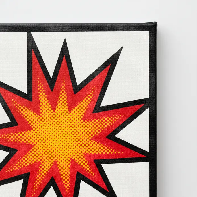
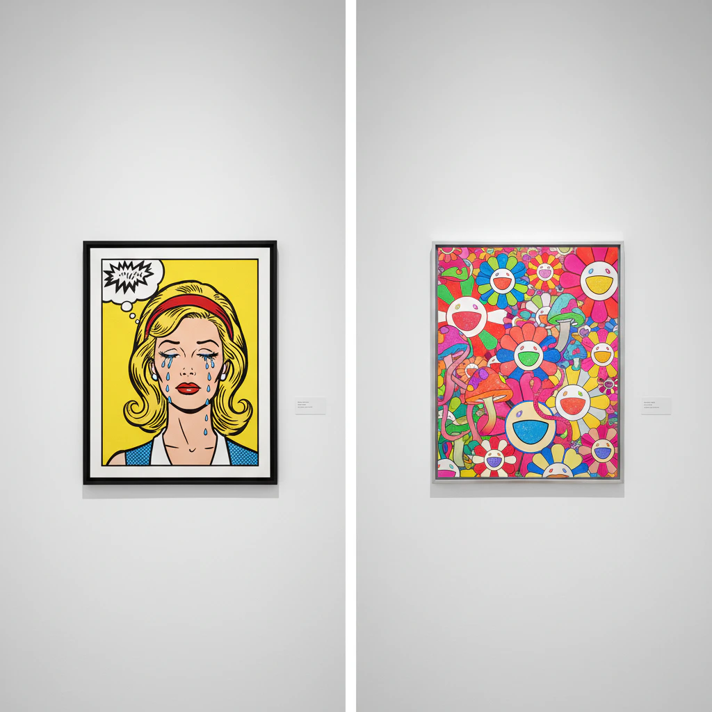
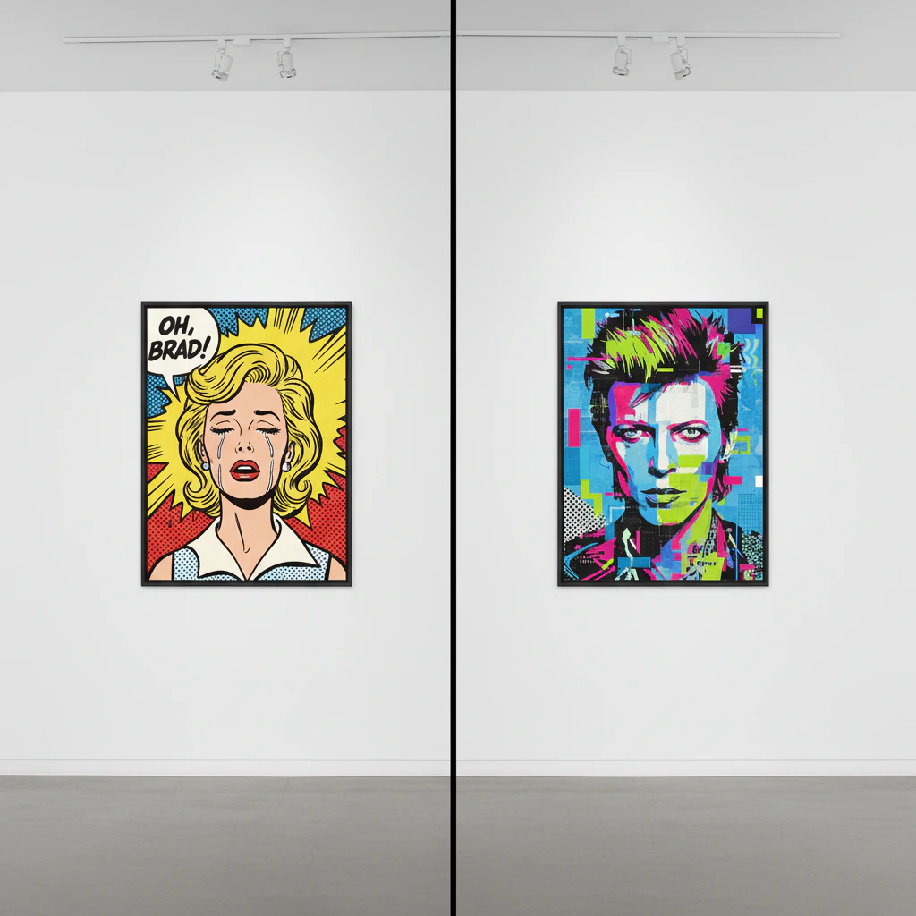
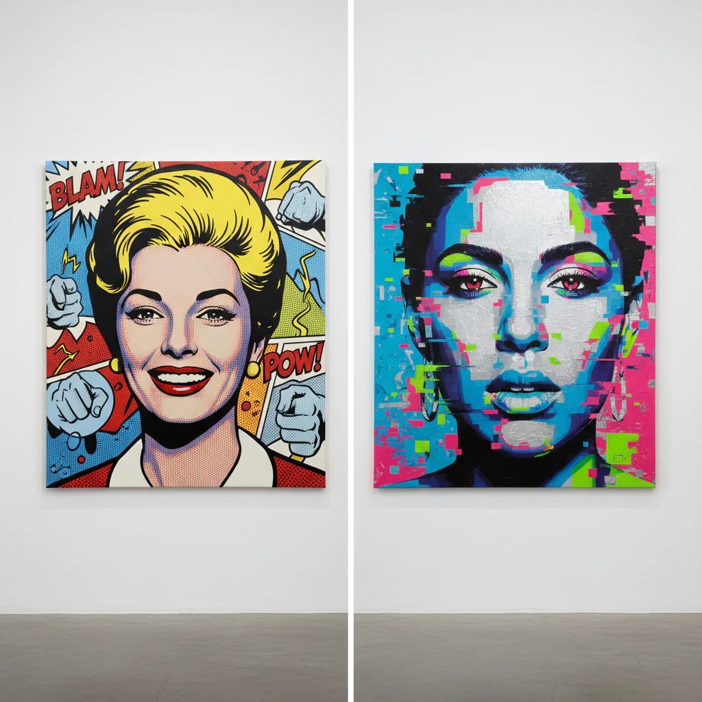
Who didn’t spend hours as a kid getting lost in the bright, punchy panels of a comic book? Let’s bring that same electric energy onto a canvas. This style grabs imagery straight from the funny pages, blowing it up huge and framing it with those unmistakable bold, black outlines. It’s all about flat, vibrant colors and that classic dot pattern, called Benday dots, which artists like Roy Lichtenstein used to create shadows and texture. We love it because classic and modern pop art painting turns everyday stories from our newsstands into monumental, iconic works of art. Want to try a modern twist? Scan an old comic panel and use it as a reference for your own painting project inspired by the techniques of 20th century pop artists., simplifying the colors into just a few bold shades, a technique characteristic of early pop art.
2. Consumer Product Pop Art Painting Ideas Featuring Everyday Objects
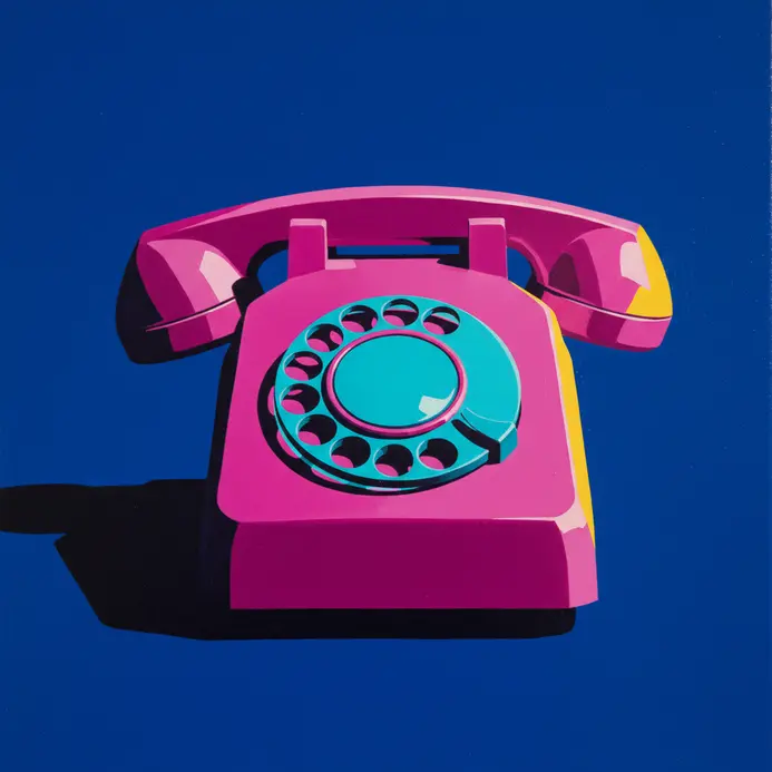
Let’s turn your shopping list into a gallery show. Consumer Product Pop Art takes the ordinary stuff we use every day and transforms it into bold graphic statements. We’re talking about painting your favorite soda can like a monument or arranging a grid of cereal boxes with vibrant, flat colors. This approach celebrates—or sometimes playfully mocks—our consumer culture by making the mundane iconic. It works because we instantly connect with these familiar objects, and seeing them elevated through classic and modern pop art painting is a fun surprise. Why do we love these ideas? They’re a strong blend of nostalgia and modern commentary, letting you make a personal statement about the world right outside your window. You can start with a single heroic object, like a giant tube of lipstick on a solid background, to keep things simple. For a more conceptual piece, try a triptych showing a pristine bottle, a discarded one, and a wave of plastic debris, reminiscent of the themes in British pop art. This tells a powerful story without a single word. Ready to raid your pantry for inspiration? What everyday item on your counter deserves its own portrait?
3. Celebrity Portrait Pop Art Examples with Unnatural Color Palettes
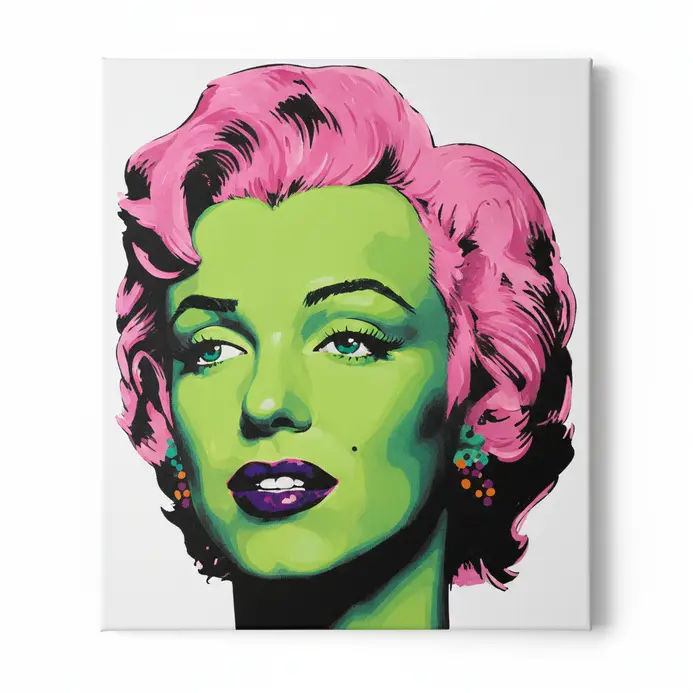
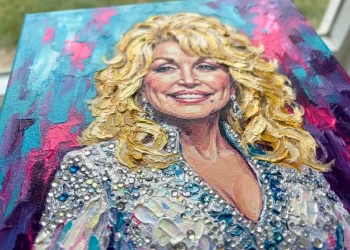
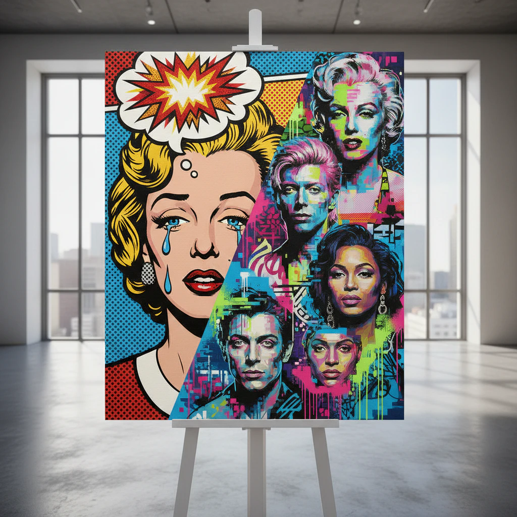
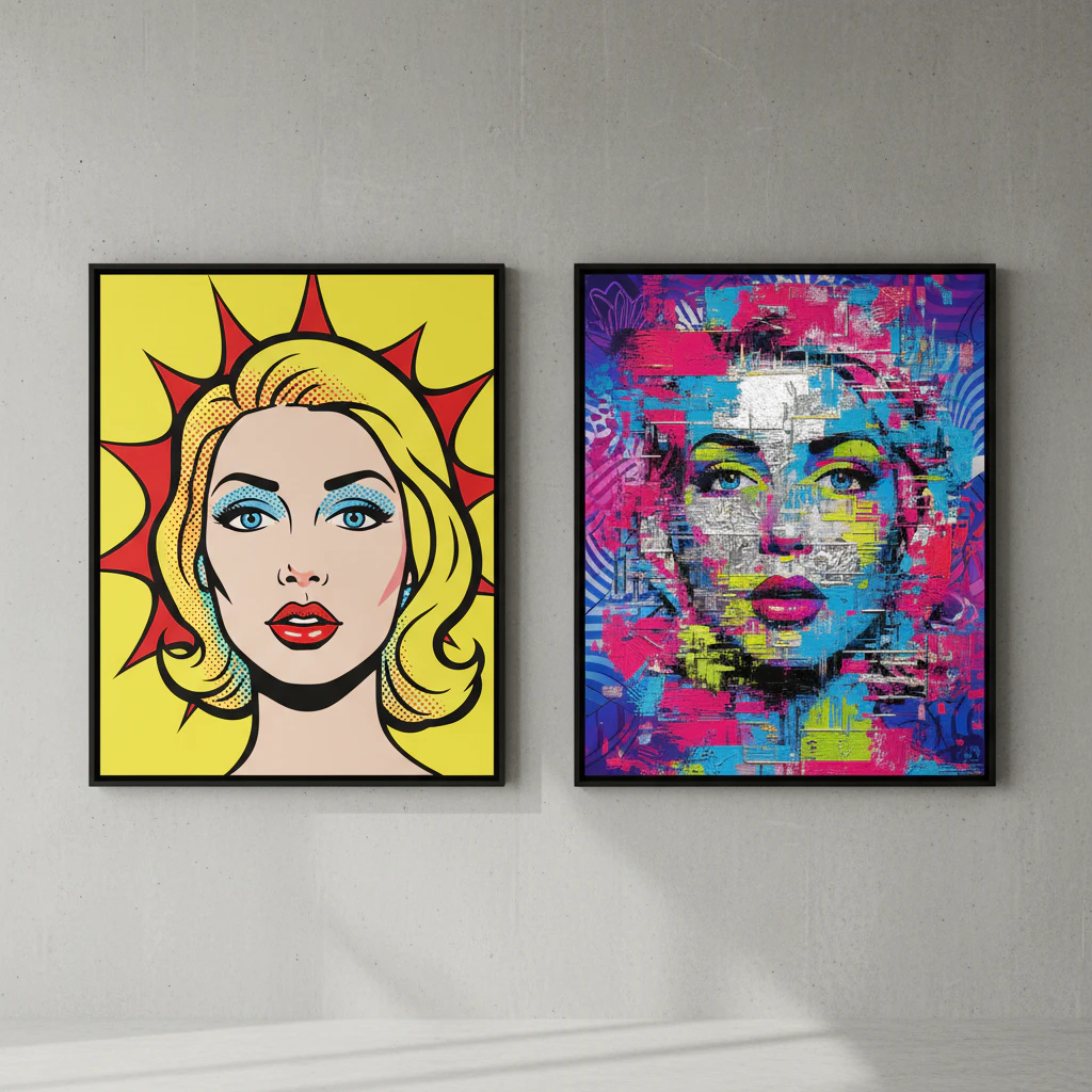
We all know that face, but have you ever seen it glowing with electric blue skin or hair in acidic lemon yellow? That’s the magic of celebrity portrait pop art. This style takes our most iconic stars and completely reimagines them with bold, graphic color palettes you’d never find in nature. It transforms a familiar face into a symbolic piece of classic and modern pop art painting, pushing past realism into the language of icon and emotion, much like the works of Peter Blake. Think about Andy Warhol’s Marilyn Monroe with her searing magenta lips and toxic green shadow. He wasn’t trying to capture her likeness; he was turning glamour into a mass-produced commodity. Modern artists do this too, using clashing complementary colors or neon glows to match a star’s energy. Why does this work so well? Because these unnatural colors strip away the person to comment on the idea of fame itself, making the portrait about culture, not only a face. Let’s look at a quick tip. If you love this style, notice how artists often match the palette to the celebrity’s persona. Psychedelic swirls for Jimi Hendrix, radiant purple for Prince. It’s all about using color as personality shorthand, a technique often employed in classic pop art.
4. Minimalist Pop Art Painting Styles Using Limited Color Schemes
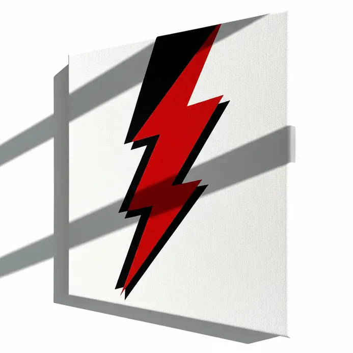
Picture this: a massive canvas with nothing but a perfect, flat red circle on a white background, characteristic of early pop art. That’s the power of minimalist pop art painting. We take the vibrant energy of classic and modern pop art painting and distill it into essential forms and a handful of colors. By using techniques like reductive portraiture or object isolation, artists create works that are both bold and serene. The magic happens because limiting your palette forces you to focus on composition and symbolism, making each element count. Here’s a pro tip: experiment with an achromatic scheme using black, white, and grays, plus one shocking pink accent for your next piece. It’ll teach you a lot about balance and impact.
5. Geometric Pop Art Painting Examples with Hard-Edged Shapes
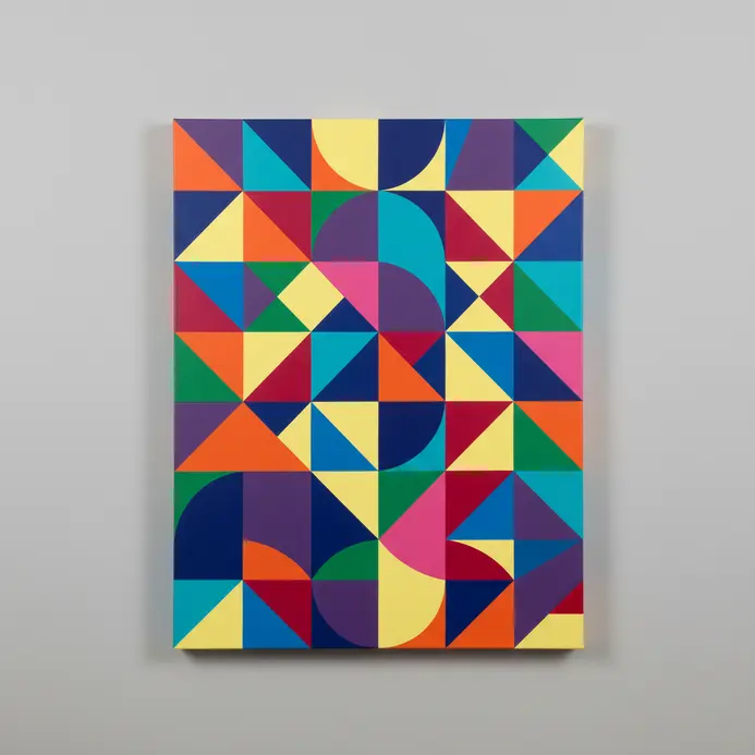
Get ready for art that looks like it was cut with a laser. Geometric Pop Art is all about those crisp, sharp shapes that feel so clean and modern. We’re talking about bold, flat colors and perfect outlines that rejected the messy, emotional brushstrokes of earlier art styles. It’s like your favorite comic book or a classic ad got blown up and put on a gallery wall. Why do we love this style so much? It feels fresh, graphic, and instantly recognizable. Artists like Roy Lichtenstein and Andy Warhol were masters of this look. Lichtenstein’s Whaam! is a quintessential example of classic pop art. turns a fighter jet explosion into a stunning composition of rigid triangles and smooth curves. Warhol took something as simple as a soup can and celebrated its pure, graphic geometry. Their work proves you can make iconic classic and modern pop art masterpieces with just a few perfect shapes and a fearless color palette. Want to try this aesthetic yourself? Start by sketching with a ruler and fill your shapes with solid, unblended color. No shading allowed. It’s a fantastic way to practice clean composition and make a bold statement.
6. Mixed-Media Pop Art Painting Ideas Incorporating Collage Elements
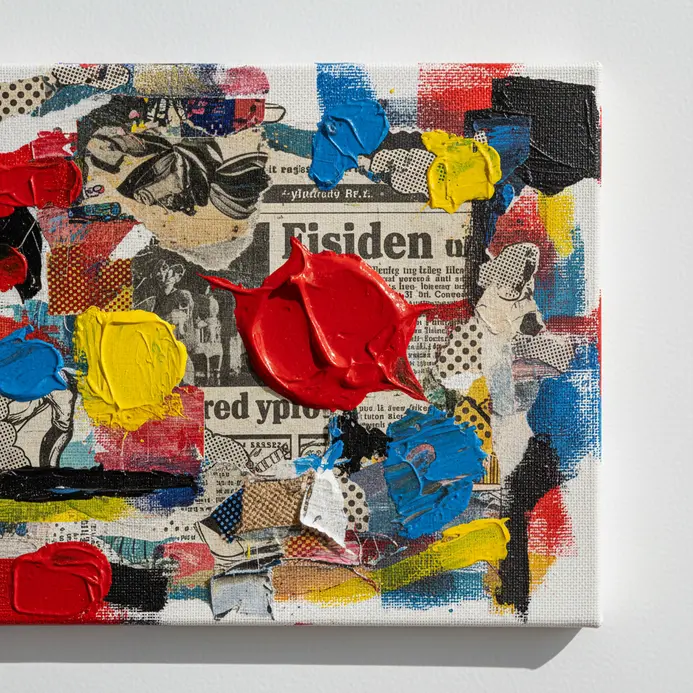
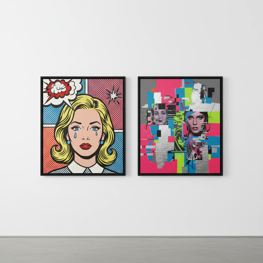
Let’s get tactile and layer up some real-world stories into your work. Mixed-media pop art with collage is where those bold, graphic paintings meet the texture and narrative of actual stuff from our lives, a characteristic feature of the genre. We’re talking about gluing down vintage ads, candy wrappers, or concert tickets right onto the canvas and then painting over and around them. It physically smashes together high art and everyday culture, which is the whole point of the pop art movement. Isn’t it fun to think your old ticket stub could become part of a modern masterpiece? Why does this combo work so well? It’s because collage brings a found narrative and raw texture that pure paint does not replicate. You’re not only painting a comment on consumer culture. You’re using the actual consumer debris to build it. A pro tip: try the layered ground method. Glue down book pages or maps first, let them dry, and then paint your classic and modern pop art painting subjects right on top. The text and patterns will ghost through, adding depth and secret history to your piece.
7. Text-Based Pop Art Painting Examples Featuring Slogans and Typography
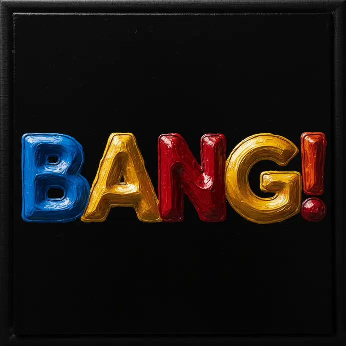
Have you ever stared at a soup can and thought, ‘That’s art?’ Let’s talk about the brilliant, bold text that made classic and modern pop art painting so in-your-face and unforgettable. Artists like Andy Warhol and Roy Lichtenstein didn’t only add words as decoration. They lifted slogans, headlines, and comic book shouts straight from our everyday world and slapped them onto the canvas. This made the art feel instantly familiar, but also ironic, asking us to rethink the messages we see all the time. Why does this style work so well? We’re wired to read, so a bold graphic word grabs us faster than any abstract shape, especially in the context of popular culture. Think about Warhol’s repeated Brillo or Lichtenstein’s dramatic I DON’T CARE! bubble. The text does the heavy lifting, turning a simple painting into a sharp comment on advertising, love, or even the news. It’s art that talks back, and honestly, who doesn’t love a good conversation starter on their wall? A fun tip for your own projects: try using a single, powerful word from a magazine ad and paint it with exaggerated, wobbly letters, reminiscent of the cartoon styles popular in modern art. It’s a blast.
8. Animal Subject Pop Art Painting Styles with Graphic Simplification
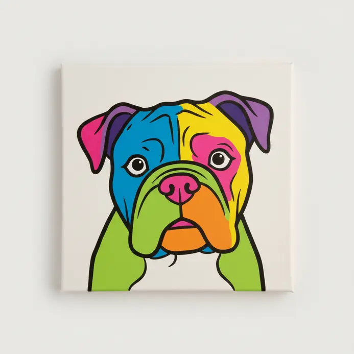
Get ready for animals that look like they jumped straight off a comic book page or a bold concert poster. We’re talking about turning your favorite creatures into graphic icons, where a lion’s mane becomes a radiating sunburst and a zebra’s stripes are just five perfect black lines. This style takes the fun, bold spirit of classic and modern pop art painting and applies it to the animal kingdom with extreme graphic simplification. You strip away all the realistic fluff until you’re left with a powerful silhouette, flat blocks of shocking color, and those iconic thick black outlines. Why does this work so well? It makes animals instantly recognizable as cultural symbols, which is pure pop art magic, often celebrated in museum exhibitions. My tip: start by drawing just the outer shadow of an animal, then fill it in with a crazy color like hot pink. You’ll be amazed at how graphic it looks already.
9. Food and Beverage Pop Art Painting Examples in Series Format
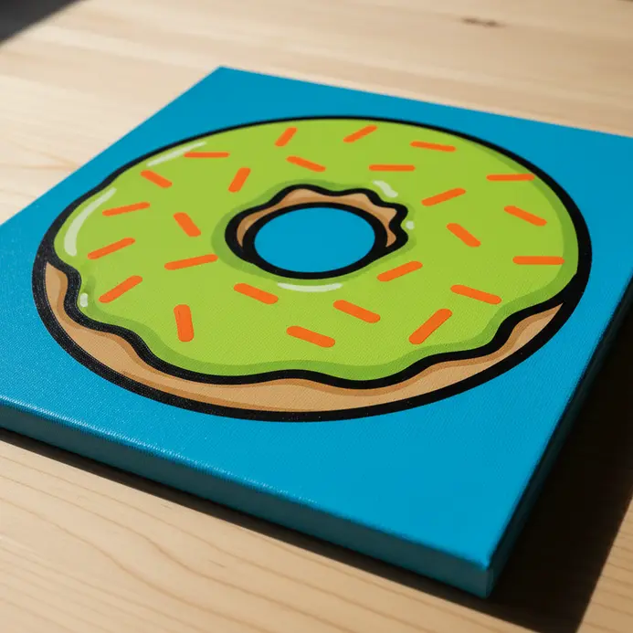
Have you ever stared at a wall of soup cans and seen art? In food and beverage Pop Art, artists create series that celebrate and critique our consumer habits. This approach is a key part of classic and modern pop art painting. Andy Warhol’s Campbell’s Soup Cans set the standard with 32 flavors lined up, while Wayne Thiebaud’s dessert paintings use thick, frosting-like paint to make pies look good enough to eat, showcasing the artistic flair of 20th century pop artists. Why does this work so well? It taps into our shared nostalgia for comfort foods and turns the ordinary into something extraordinary. From Warhol’s silkscreened Coca-Cola bottles to the comic-book style of Roy Lichtenstein’s diner scenes, these series formats mimic mass production. Pro tip: when you view these works, notice how the repetition makes you think about everyday life in a new way, a concept prevalent in modern art.
10. Urban Landscape Pop Art Painting Ideas with Advertising Elements
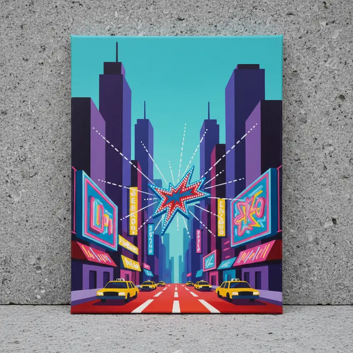
Let’s dive into the electric clash where city grit meets commercial gloss. Picture a rain-slicked alley where the only color comes from flickering neon signs advertising a 24/7 diner or a fictional movie. We’re mashing up the raw texture of brick walls with the slick, bold language of ads. This tension creates such a vibrant, living commentary on the world we walk through every day, echoing themes found in abstract expressionism. The magic happens in the juxtaposition itself, turning a simple street scene into a question about what’s real and what’s being sold to us. I love using a limited palette of deep blues and blacks, then punching it with those shocking pinks and yellows from the signs, reminiscent of the bold choices in British pop art. It makes the advertising elements pop like visual fireworks against the urban decay. Why does this idea work so well? It’s instantly recognizable and packed with narrative—you feel the city’s pulse, much like the vibrant works of pop artists. Try this: use reflections in puddles or wet windows to double your advertising imagery, creating a layered, collage-like effect straight out of the pop art movement. It’s a fantastic way to play with classic and modern pop art painting techniques, using halftone dots or Ben-Day patterns on the ads themselves. What if the graffiti on the wall is a dialogue bubble from a comic? Let your cityscape tell a story where the buildings themselves are the billboards.
11. Monochromatic Pop Art Painting Examples Using Single-Hue Variations
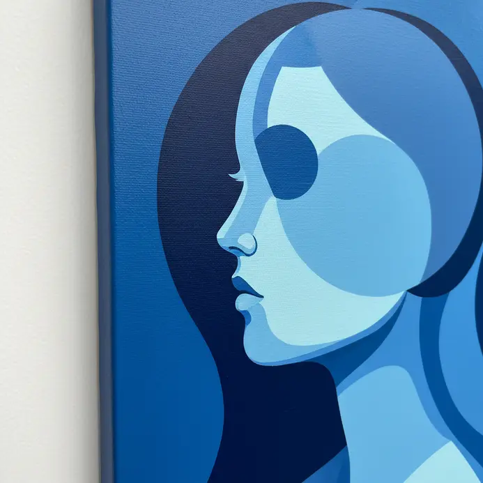
Let’s dive into the bold, graphic world of monochrome pop art masterpieces, where artists ditch the rainbow to make a bigger statement. We’re looking at classic and modern pop art painting that uses only one color, plus black and white, to transform familiar images into something iconic, a technique seen in many pop art masterpieces. This approach flattens everything into pure form, making a Campbell’s soup can or a comic panel feel more like a universal symbol than a simple object. It works because stripping away realistic color forces us to focus on the power of the image itself and its commentary on our mass-produced world. Why do we love it? It turns everyday visuals into graphic art you can’t ignore. Think of Andy Warhol’s Blue Marilyn, where a single blue hue drains the glamour to create a haunting icon, or Roy Lichtenstein using just red and black to make his brushstrokes feel mechanically ironic. The chosen color does all the emotional heavy lifting. A tip: if you’re feeling inspired to try a monochrome piece, start with a strong, simple image and pick one color that captures the mood you want.
12. Digital-Inspired Pop Art Painting Styles with Pixel and Glitch Effects
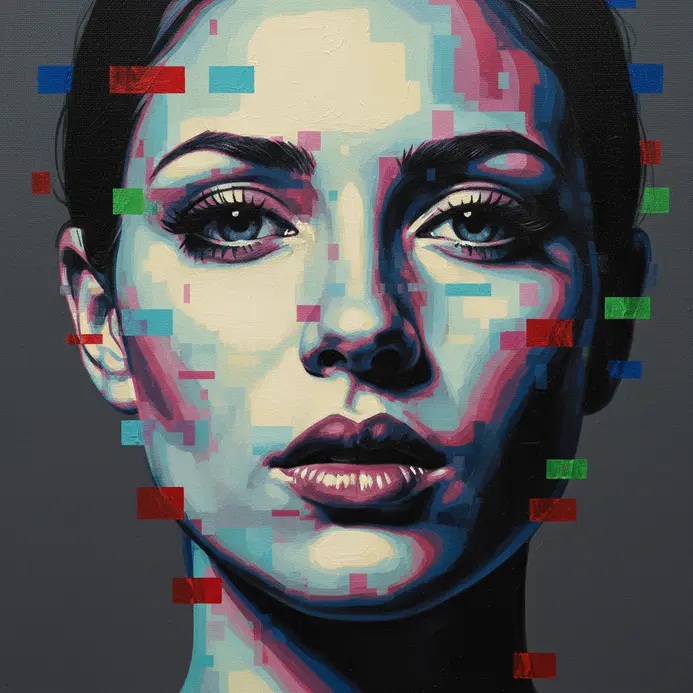
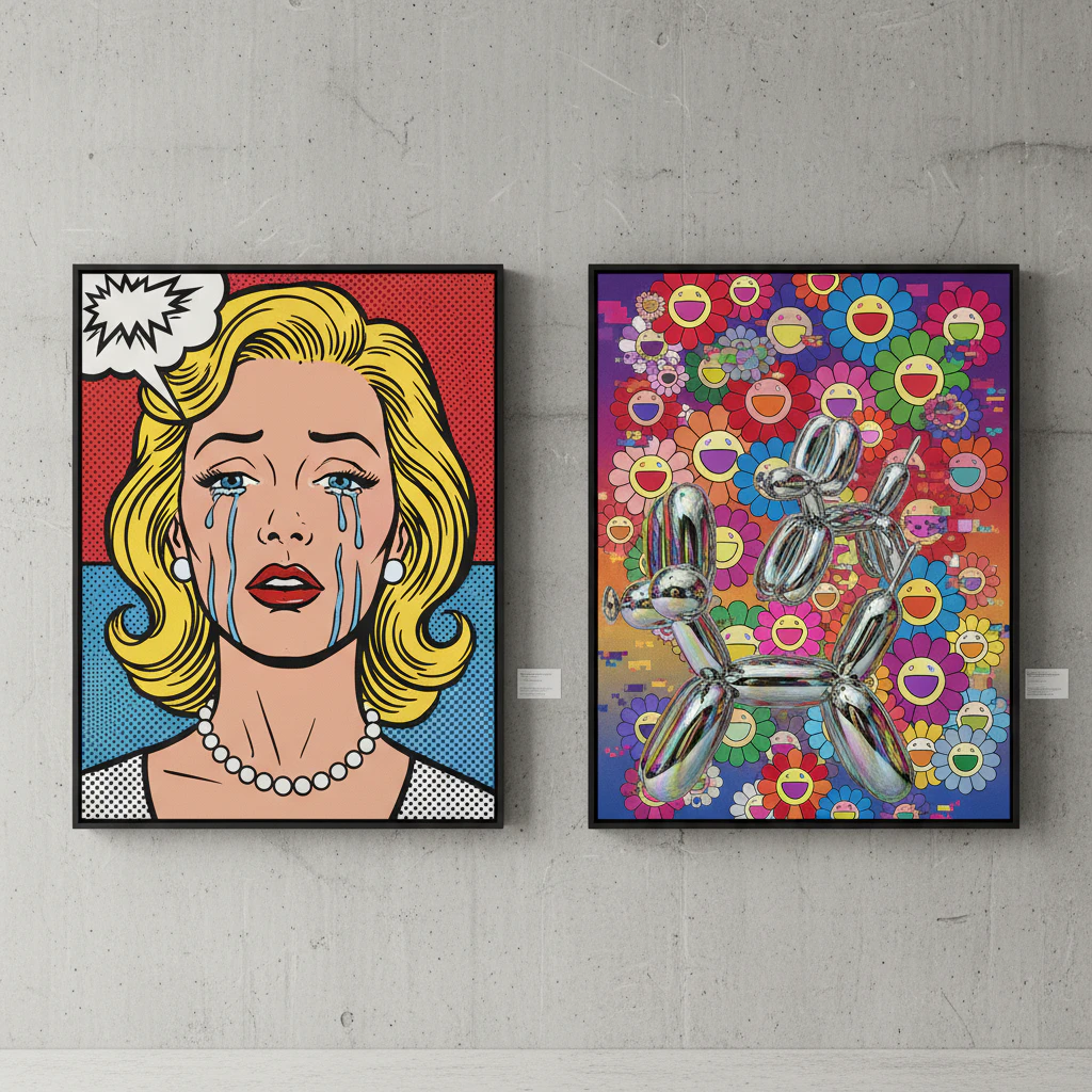
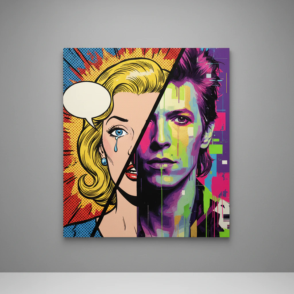
Ever see a painting that looks like a vintage video game crashed into a gallery wall? That’s the wild, nostalgic charm of mixing pixel and glitch effects with classic and modern pop art painting. We’re taking those bold, graphic icons we love and running them through a digital filter—think a glitched-out Marilyn Monroe portrait or a Campbell’s soup can made of giant, wobbly pixels. It’s a style built from the artifacts of our screen-based lives, celebrating errors as beautiful. We love it because it feels so authentically now, turning our collective memory of old tech and internet hiccups into something you can hang on your wall. A fun tip: try using painter’s tape to map out a clean grid for your pixels, then go wild with a channel displacement effect by slightly offsetting your red, blue, and green paints.
13. Botanical Pop Art Painting Examples Featuring Stylized Florals
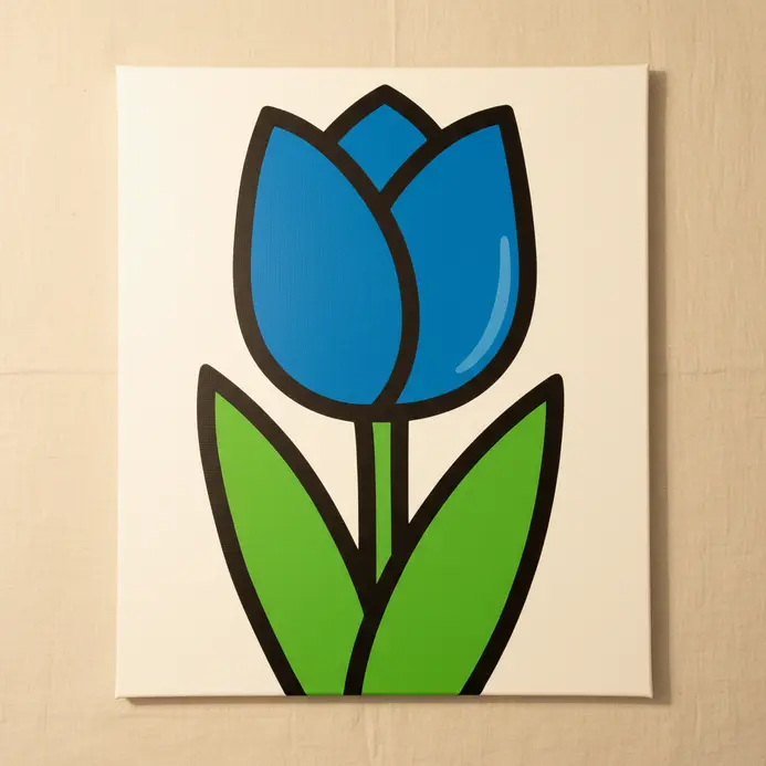
Let’s talk about flowers that pop off the canvas with the energy of a comic book. Botanical Pop Art takes the timeless beauty of florals and gives it a bold, graphic, and playful makeover. We get to see nature through a lens of bright, unnatural colors, simplified shapes, and cheeky repetition. Why do we love this style? It makes the familiar feel fresh and fantastically artificial, turning a simple bloom into a vibrant cultural icon. Think of Andy Warhol’s Flowers series where hibiscus blooms are repeated in electric pinks and oranges. Roy Lichtenstein applied his comic-book style with bold outlines and Benday dots to create flowers that look like graphic symbols. Want to try a modern twist? Instead of painting a realistic rose, simplify it into basic shapes and use a wild, contrasting color palette you’d never find in a garden. It’s a fun way to play with classic and modern pop art painting techniques without needing perfect botanical accuracy.
14. Retro-Futurist Pop Art Painting Ideas Blending Vintage and Sci-Fi
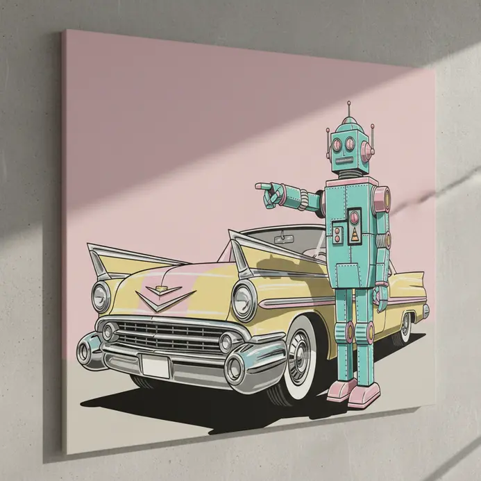
Let’s paint a future dreamed up by the past. Retro-futurist pop art mashes the sleek optimism of 1950s design with bold, graphic pop art styles to show a tomorrow that never was. We’re talking about chrome-plated robots in atomic-age kitchens and rocket-ships with tailfins, all rendered with flat, vibrant colors. The appeal is pure nostalgia for a future that feels cozy and wildly imaginative at the same time, a sentiment echoed in many pop art masterpieces. For a fun twist, try using a silkscreen stencil technique to create a Warhol-style grid of vintage soda cans, but label them for a Martian colony. It is a playful route into classic and modern pop art painting with a sci-fi edge, reminiscent of the imaginative worlds in popular culture.
15. Beginner-Friendly Pop Art Painting Examples with Simple Silhouettes
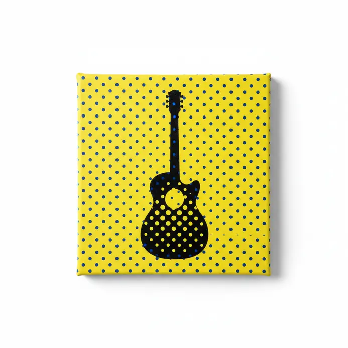
Diving into classic and modern pop art painting doesn’t have to feel daunting when you start with simple silhouettes. Have you ever felt overwhelmed by detailed drawing? Let’s fix that by focusing on bold, graphic shapes like music icons or consumer goods. By using silhouettes, you eliminate sketching anxiety and can play with vibrant colors and composition, much like the works of Roy Lichtenstein or Andy Warhol. This approach works because it makes art accessible and fun, allowing you to create high-impact pieces with minimal technical skill. You’ll be amazed at how professional your paintings look with only a few simple steps. A handy tip: try using painter’s tape to mask off areas for clean lines or a grid pattern, and experiment with Ben-Day dots for that authentic pop art texture.
16. High-Contrast Pop Art Painting Styles Using Complementary Colors
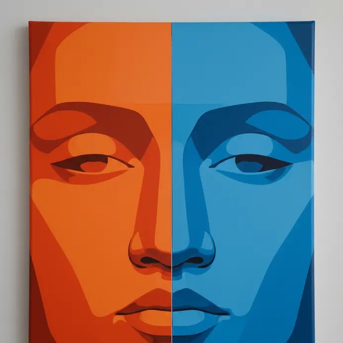
Want your work to practically buzz off the canvas with electric energy? Let’s talk about the ultimate power move in classic and modern pop art painting: slamming pure, complementary colors together. We’re talking about those perfect opposites on the color wheel—like red and green or blue and orange—that create a visual vibration you can feel. This isn’t about subtlety; it’s about maximum impact, mirroring the bold, saturated world of advertising and comic books that inspired the whole movement. Why does this style work so well? Because our brains love the clash, making simple graphic shapes and familiar imagery feel instantly iconic and impossible to ignore, particularly in the realm of modern art. Look at Roy Lichtenstein’s technique, using crisp black outlines to contain a riot of orange against blue. Or check out how Andy Warhol would layer transparent inks in jarring combinations to make a portrait of Marilyn Monroe hum with disorienting life. Their secret? They used these colors straight from the tube, avoiding muddy mixes to keep that punch. A great tip if you want to try this yourself is to pick one color as your dominant background and use its opposite purely for your focal point, like a bright yellow subject on a deep purple field. Let the color contrast define the form, and don’t be afraid to let it sing.
17. Cultural Icon Pop Art Painting Examples Beyond Western Consumerism
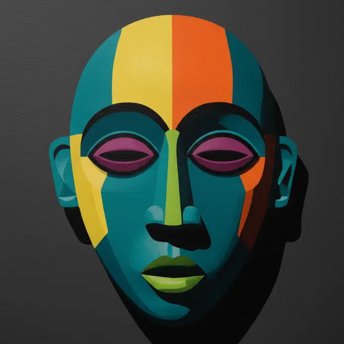
Get ready to see how the bold colors and punchy style of pop art get used for way more than only soup cans and comic strips. Artists around the world took this visual language and turned it into a tool for serious cultural and political commentary. We are talking about powerful works that confront history, challenge authority, and explore complex identities, all while keeping that instantly recognizable, graphic pop feel. It is so compelling because it uses the familiar, accessible language of mass media to make us rethink deep historical and social issues, which is a brilliant twist. This broader field expands classic and modern pop art painting beyond Western consumerism into art and culture shaped by different cultures. Let’s look at how Kehinde Wiley, for instance, places contemporary Black subjects into grand historical portraits, a stunning move you can explore more in our guide on easy things to paint for beginners, inspired by classic pop art themes. if you are inspired to create your own iconic imagery.
18. Pattern-Based Pop Art Painting Ideas with Repetitive Motifs
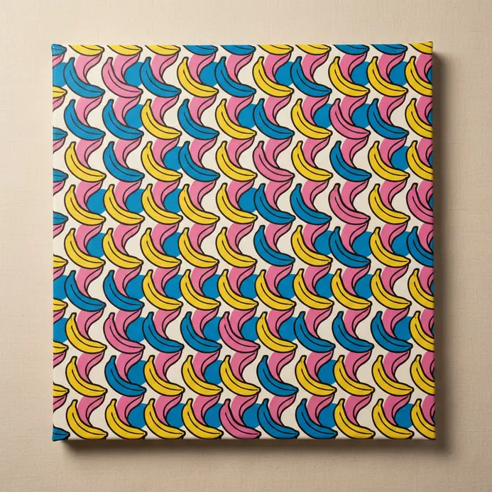
Ready to make your canvas feel like a factory floor? Let’s play with repetition. Pattern-based work is a cornerstone of classic and modern pop art painting, turning simple objects into powerful, hypnotic statements, much like the works displayed in a museum. We take a single motif—like a soup can or an emoji—and repeat it across a grid until it becomes something entirely new. The repetition mimics mass production, making us see the familiar in a totally fresh, sometimes overwhelming, way. Why does this style hit so hard? It transforms a single, mundane item into a bold collective symbol, commenting on how consumer culture bombards us with the same images. You can start with a rigid grid of logos or try a swirling pattern of comic book fragments. A fun tip: use a stencil for your core shape to keep each repetition crisp, then go wild with color variations in each cell. It’s like digital wallpaper, but with way more personality.
19. Abstract Pop Art Painting Examples Merging Gesture with Graphic Elements
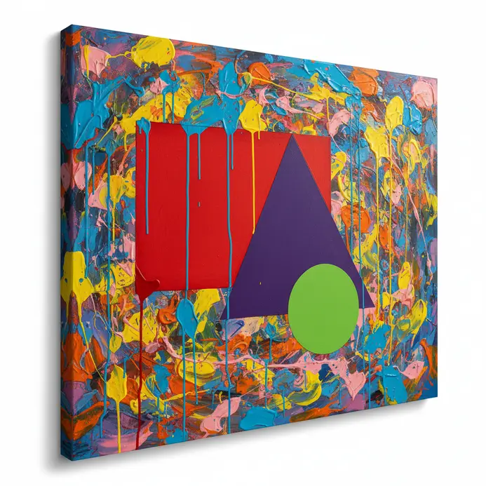
What happens when you mix the wild energy of a paint splatter with the clean lines of a comic book, a fusion evident in many pop art artworks? You get this incredible mash-up where emotion meets design, a hallmark of contemporary popular culture. We’re looking at paintings that have the raw, physical feel of an artist’s hand at work, but they’re organized with bold shapes and flat colors you’d see in an advertisement. This creates a compelling tension between feeling and thinking, which is why these pieces feel so alive and modern. Think about Jean-Michel Basquiat. His work is the perfect hybrid, isn’t it? He’d take frantic scribbles and drips and combine them with graphic crowns or blocks of text painted right onto the canvas. Another strong approach is starting with a graphic field and adding gesture, like Christopher Wool does with his stenciled word paintings that he then smudges and disrupts. The gestural ground with graphic overlay works too, where a messy, expressive background gets punctuated by crisp outlines of everyday objects, a hallmark of this art movement that emerged in the 1960s. Why does this fusion work so well? It gives us the best of both worlds: the immediate, human touch of classic and modern pop art painting with the sharp, iconic punch of pop culture imagery.
20. Narrative Pop Art Painting Styles Telling Visual Stories
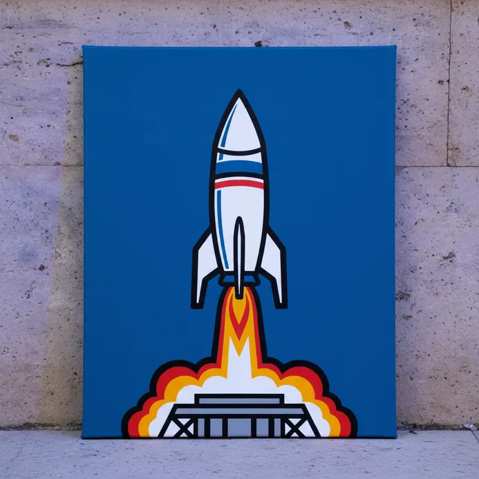
Have you ever looked at a Pop Art painting and felt a whole story unfolding right before your eyes? That’s the magic of narrative Pop Art painting styles. Moving beyond single, iconic images, this approach uses sequential panels and layered collages to tell visual stories drawn from comics, film, and personal life. Artists like Roy Lichtenstein transformed comic book scenes into dramatic narratives, while others wove social commentary into cinematic canvases. We adore this style because classic and modern pop art painting takes the cheerful, bold look of pop culture and infuses it with deeper meaning and emotional resonance that sticks with you. If you’re itching to try it, grab some old magazines and create a short visual sequence about your day—it’s a playful way to experiment with storytelling in your own art.
21. Advanced Technical Pop Art Painting Examples with Layered Glazes
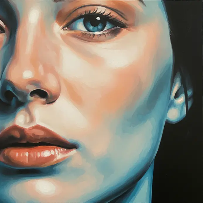
Want to make a classic comic book panel look like it has real, breathing depth? Let’s talk about one of the coolest tricks in the book: layered glazes. This technique takes the flat, bold look we love from the pop art movement and adds a new dimension of painterly magic. We build up thin, transparent layers of color over a detailed underpainting, letting light bounce through in a way opaque paint never could. So why does this work so well for a subject like a photorealistic soda bottle? It creates an impossible, electric glow that feels both handmade and mechanically perfect. The color vibrates because you’re seeing optical mixing happen right on the canvas, not mud on a palette. I love how a simple grisaille underpainting in grayscale sets the stage for those luminous reds and blues to truly sing. Give it a try on your next piece of classic and modern pop art painting, and watch a flat image become sculptural.
Developing a Recognizable Pop Art Style Through Consistent Technical Choices
Your signature pop art style emerges from the consistent application and personal remixing of these core techniques. Whether you lean into hyper-graphic bold outlines and flat colors or a more collage-inspired, textured approach, repetition in your methodological choices creates cohesion. Decide on your stance—ironic, celebratory, or analytical—and let it guide your subject matter and technique. By deliberately combining, for instance, isolated object composition with a specific limited palette or adapting Ben-Day dots for digital portraiture, you move beyond pastiche to develop a contemporary voice that makes classic and modern pop art painting immediately recognizable as pop art, yet uniquely yours.
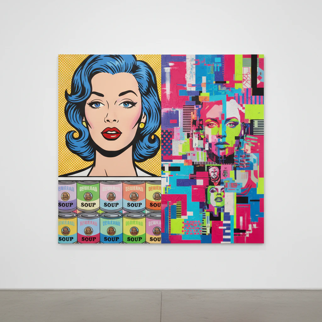
More Classic And Modern Pop Art Painting Examples for Inspiration












Conclusion
We have taken a wild ride through different ways to see and make classic and modern pop art painting. From the comic book roots to glitchy digital futures, this movement is far from stuck in the 1960s. It is a living, breathing style that invites you to play with color, simplify forms, and shout about the world you see. The best part? You do not need permission. Grab your boldest paints and choose a subject that makes you excited. Will you try a monochromatic series or a mixed-media collage? Your next classic and modern pop art painting masterpiece is waiting, so start sketching that first bold outline today.
FAQs
Q: What defines classic and modern pop art painting?
A: Classic and modern pop art painting is defined by its use of popular imagery, vivid colors, irony, and distinctive iconography drawn from mass culture. While classic pop art of the 1950s and 1960s often referenced consumer goods, comic strips, and advertising, modern pop art continues those traditions while incorporating contemporary media, cartoon characters, and new materials to comment on twentieth century and present-day visual culture.
Q: Who were the major artists in the late 1950s and early 1960s that shaped pop art’s development?
A: Key figures include Andy Warhol, Roy Lichtenstein, Robert Rauschenberg, and Tom Wesselmann; Rauschenberg’s experimental mixed-media work and Wesselmann’s evocative nudes and still lifes helped define pop art’s vocabulary. Dates like 1957, 1962, and 1963 mark important exhibitions and works that propelled the movement into mainstream attention during the late 1950s and 1960s.
Q: How did Robert Rauschenberg and Tom Wesselmann contribute to the movement?
A: Robert Rauschenberg contributed by merging found objects and painterly techniques—his “combines” blurred boundaries between art and everyday life—while Tom Wesselmann developed a distinctive approach to domestic iconography, often featuring shelves, appliances, and the American flag motif to explore sexuality and consumer culture. Both artists expanded pop art’s range beyond simple parody to complex commentary.
Q: What role did irony and critic responses play in pop art’s reception?
A: Irony was central to many pop artists who used familiar images to subvert expectations; critics were divided, with some praising pop art’s freshness and others dismissing it as commercial or superficial. Over time, critical reassessment recognized pop art’s serious contributions to twentieth century art history, highlighting its critique of mass production and popular imagery.
Q: How do cartoon characters and popular imagery function in pop art works?
A: Cartoon characters and popular imagery operate as instantly recognizable icons that artists repurposed to question authorship, celebrity, and consumption. By placing these elements in new contexts—sometimes with a scatter of advertising motifs or a rocket or fighter aircraft—artists created a dialogue between high art and mass culture that remains influential in modern pop art painting.