We can study stroke contrast, flourishes, texture, and white space while keeping the final direction true to our own taste, which is why hand lettering typography stands out. Did I miss anything? The best references also show how lettering works across invitations, menus, logos, posters, and signs. Let’s look at ten distinct approaches, from elegant wedding work to playful bubble lettering, so you have clear starting points for your next sketch. Grab your pens, choose a phrase you love, and let’s get started.
Guide Lines For Consistent Letter Proportions
Set your x-height before drawing letters, since every lowercase form needs one shared visual height for a steady alphabet. Baseline guides give ascenders and descenders clear boundaries, while a cap-height line keeps capitals from creeping upward. Keep guide spacing wide enough for the intended brush pen or pointed pen, since thick strokes need room around counters and joins.
A ruler helps maintain parallel lines across a full word, especially when you vary the baseline for expression. Mark a light centerline through round letters such as o, c, and e, then check their overshoot beyond the cap or x-height. These small extensions keep curved forms visually equal to flat-topped letters, a foundational rule for hand lettering typography. Use a kneaded eraser after refinement, so graphite construction lines lift without roughening the paper.
Paper Choice And Ink Edge Control
Smooth marker paper keeps brush-pen edges crisp and prevents feathering around small counters, which is essential for hand lettering typography. Heavyweight mixed-media paper suits ink washes, gouache accents, and repeated erasing, while watercolor paper accepts wetter marks with less buckling. Pointed pens need a surface free from loose fibers, since rough texture catches the nib and interrupts thin hairlines.
Broad-edge markers show cleaner vertical strokes on smooth sheets, yet lightly textured paper adds controlled grain to vintage lettering. Test every ink on a corner before committing to a full layout, because absorbent fibers widen dark strokes and dull contrast. Store finished sheets beneath clean paper, since skin oils and dust affect edge quality during later scanning or photographing.
1. Bold Brush Script Quote Inspiration for Lettering Projects

Ever wondered why a short quote feels so lively in hand lettering typography? Start with a phrase such as “Make Your Own Magic” or “Start Somewhere,” then give it room to breathe across the page. Use bold brush-script lettering for the main words, with thick downstrokes and lighter upstrokes shaping the rhythm. I love how a few confident strokes turn a simple message into a finished focal point, proving hand lettering typography rewards deliberate practice.
Add a smaller line beneath the quote, such as “one brave step at a time” or “in the little things.” Keep this supporting line quieter in size and spacing, so it guides the eye back to the main phrase. Short wording keeps every letter clear on signs, prints, cards, apparel, and digital projects. Punctuation also adds a nice beat, especially in “Be Bold. Be You.”
Before you commit to the final layout, sketch several placements and check the balance from a distance. Choose a concise uplifting phrase rather than squeezing too many words into one line. Pair “Choose Joy” with a fresh thought instead of repeating its message, then adapt the layout to your chosen surface. Trust me on this one, the finished piece feels personal, cheerful, and ready to share.
2. Elegant Modern Calligraphy Wedding Suite With Refined Flourishes
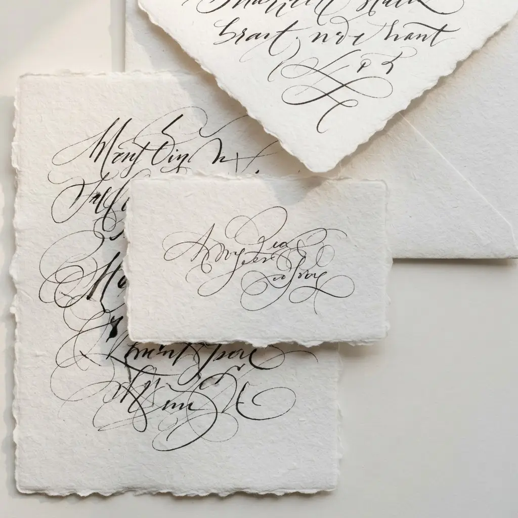
This suite feels polished from the first glance, yet its lettering still carries a warm personal touch that defines modern hand lettering typography. Start with soft ivory stock and deep espresso ink, then reserve modern calligraphy for the couple’s names and main headings. Is there anything more satisfying than seeing those sweeping capitals sit neatly above crisp ceremony details?
Keep practical text in a high-contrast serif, with generous white space around every line. Let a thin flourish extend from one capital or frame the names, rather than filling the page with loops. I love how this contrast keeps the invitation romantic while making every detail easy to read.
Carry the same spacing, ink, and letter shapes onto the RSVP card, details card, and envelope. A vellum overlay, monogram, or small venue illustration adds personality, while letterpress printing brings a quiet finish. Use calligraphy addressing on the envelope for a connected final touch.
Trust me, restraint makes the suite feel expensive. Pair dark lettering with warm neutrals, and keep any metallic gold foil to a small accent. The result feels graceful, balanced, and ready for a formal evening celebration.
3. Vintage Ornate Banner Title Design for Decorative Displays
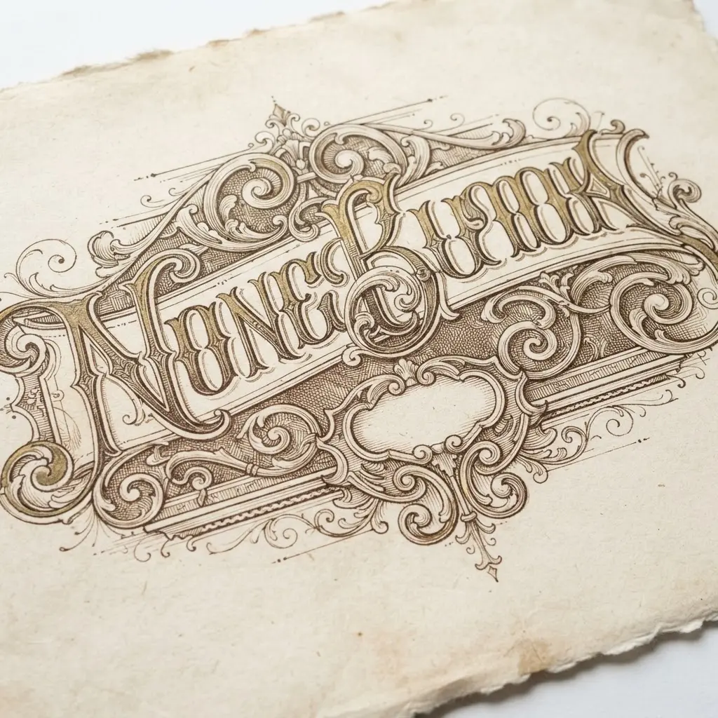
This one is a favorite because it feels polished before the fine details even begin. Start with a symmetrical banner layout, placing the title in the center with enough space around each letter. Draw curved ribbon edges, layered folds, and curled ends so the strip feels dimensional instead of flat, a classic approach to hand lettering typography. Add Victorian scrollwork and small floral accents along both sides, keeping the decoration balanced.
Isn’t it satisfying to watch the structure take shape? Set the main wording in an elegant serif or calligraphic style, then add a smaller refined serif subtitle beneath it. Use burgundy, aged gold, ivory, forest green, or muted brown against parchment for an antique mood.
A gold foil-style outline, soft shadow, and lightly weathered texture add depth, while strong contrast keeps every word clear. I love how the ornament frames the lettering without stealing attention from it. Keep texture light, and let the banner edges hold the strongest detail for a formal, theatrical finish.
4. Playful Bouncing Monoline Lettering Layout With Open Spacing

Soft curves, rounded ends, and wide gaps give this Watercolor lettering for beginners, cheerful look before you even read the words, a clear trait of hand lettering typography. Sound tricky? It is not. Start with a gently uneven baseline, then place each letter a little higher, lower, or at a slight angle. Keep every stroke single-weight and smooth, with enough room around each character for the airy layout to breathe.
I love how small changes create such a friendly rhythm. Work slowly through the word, checking its shape from a short distance as you go. Vary letter height with restraint, since extreme jumps hurt readability and make the phrase feel scattered.
Keep generous gaps between words, too, and resist filling every empty area with extra decoration. This playful approach suits posters, packaging, social graphics, and children’s branding because the open spacing feels modern and easy to read. Use a monoline pen with a rounded tip, then enjoy the joyful bounce in your finished hand lettering.
5. Textured Chalkboard Style Cafe Menu With Hand Drawn Details

A smooth charcoal background is the first mistake in this style. Start with a dark charcoal surface, then brush in tiny grain, uneven marks, and faint dust smudges so the menu feels used rather than digitally flat. Sound complicated? It is not. Keep the lettering loose, with slightly varied heights and stroke edges, while arranging Coffee & Espresso, Fresh Pastries, and Daily Specials in clear blocks.
I love how a restrained chalk palette gives every section its own voice. Use cream or white for menu names, muted beige for prices, and small touches of terracotta, sage green, or soft yellow for headings and accents. Add hand-drawn cups, croissants, beans, leaves, stars, arrows, and flourishes around open spaces, yet leave generous gaps around each line.
Trust me on this one: texture should support readability, not compete with it. Your finished hand lettering typography piece will feel cozy, personal, and ready for a neighborhood café wall.
6. Geometric Block Lettering Logo Concept With Strong Structure

Set up a construction grid with equal horizontal guides, vertical divisions, and modular units. Sketch uppercase block letters inside the same cap height, using rectangles, bars, squared corners, and sharp angles. Keep every main stroke close in width, then leave enough room for counters and openings, a vital practice in hand lettering typography.
Isn’t it satisfying when each letter starts to look like part of one system? Build each character as editable vector paths rather than relying on an untouched font. Adjust letter widths, corners, and spacing by eye, since perfect measurements do not always create equal visual weight.
A narrow opening in one letter might need a small adjustment so the full word stays easy to read. I love testing this style in black and white first. The limited palette exposes weak spacing, blocked negative space, and uneven bars before color distracts you.
Its architectural structure feels dependable for signage, engineering brands, sports marks, and professional services. Finish with a centered composition and inspect it at large and small sizes. A thin geometric frame or horizontal bar is fine, though it should support the wordmark rather than crowd it. Trust me on this one: solve the one-color version first, then try electric blue, vivid red, or safety orange for a clean accent.
7. Floral Embellished Serif Typography Piece With Botanical Accents

Ever wondered why floral details look so polished beside tall serif letters? Start with a centered phrase and give each word generous breathing room. Build slender hairlines against dramatic thick strokes, then keep the letter spacing calm and even. I love extending a curved swash into a winding stem, allowing leaves and tiny blooms to grow from the lettering instead of sitting beside it. This approach keeps the phrase in charge while adding a romantic, vintage-inspired botanical poster aesthetic.
Use a muted botanical palette of ivory, sage, dusty rose, terracotta, and deep forest green, with one darker shade carrying the main weight. Place accents around selected ascenders and along the outer frame, leaving open areas between clusters. A little paper grain, soft shadow, and restrained vintage detailing give the finished piece a handmade surface without making the text muddy.
Keep flowers away from narrow counters and delicate hairlines, since crowded details weaken readability. This is where hand lettering typography feels especially satisfying, turning a stationery panel, wall print, or elegant social graphic into something personal. Trust me, selective decoration gives the cleanest finish and the sweetest sense of control.
8. Minimalist Fine Line Script Composition With Balanced White Space

This style looks polished from the first stroke, yet it stays wonderfully calm. Begin with black ink on white paper and sketch a light center guide before forming each letter with thin, controlled lines, proving hand lettering typography values restraint. Keep the pressure even, then add one or two restrained flourishes near the opening or closing letter. Center the lettering within a broad field of untouched paper, leaving similar margins on every side.
Sound complicated? It is not, though patience matters more than speed. I love how consistent stroke weight gives fine-line script its clean editorial feel. Study the spacing between letters, since tight gaps quickly make delicate writing feel crowded.
Erase the guide only after the ink dries, and check the composition from a short distance. Skip heavy shading, bold outlines, and clusters of decoration, since each addition takes attention away from the white background. Trust me on this one: generous negative space makes the finished piece feel refined, readable, and timeless. Feel proud when the smallest details stay crisp.
9. Retro Bubble Lettering Poster Art With Rounded Outlines
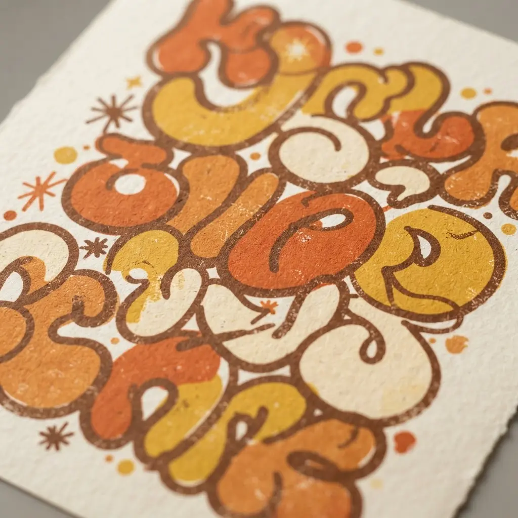
This one is a favorite of mine because oversized bubbles bring instant cheer to a poster. Sound complicated? Start with thick, inflated letters, keeping every corner, terminal, and curve soft, a signature of hand lettering typography. I sketch each form with a slight wobble, then trace it with a rounded outer outline so the words stay clear against the background. A centered phrase such as “GOOD VIBES” or “STAY GROOVY” gives the page a strong focal point.
Next, tuck a few offset shadow layers behind the letters for depth without losing the flat screen-print feel. Build the palette from orange, mustard yellow, cream, coral, avocado green, and deep brown, then repeat two or three colors across the layout. Add starbursts, sparkles, curved stripes, checkerboard accents, and dots around the edges, leaving breathing room around the phrase.
A light paper grain texture and gently faded ink finish bring warmth while preserving legibility. I love how the rounded forms, high contrast, and tiny imperfections make this style feel friendly rather than mechanical. Keep distressing subtle, and let the Watercolor lettering for beginners of the talking.
10. Dynamic Neon Glow Sign Typography for Evening Displays
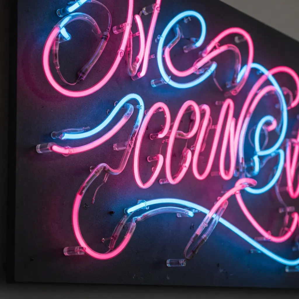
The finished lettering shines with a crisp white tube center, pink and cyan halos, and a faint color wash across the pavement. Does it sound complicated? Start with a bold condensed typeface so every letter keeps a clear shape from across the room. I love how much character appears before any extra effects are added. Trace each stroke with a bright inner line, then build two or three soft glow layers around it.
Let electric cyan shift toward magenta or violet, and leave generous space between letters for quick reading. Add reflected color beneath the headline, plus a little haze or glass reflection near the edges. A deep charcoal background gives the light room to stand out, while a restrained pulse or flicker adds movement without making the words hard to read.
Keep the surrounding effects quieter than the lettering itself, especially near thin joins and tight counters. A bright tube core matters more than a large halo, since glow without an inner highlight looks foggy instead of lit. For storefronts, rooftop signs, or dark studio scenes, this hand lettering typography style feels lively and polished. Trust me on this one: clean spacing and a clear silhouette deliver the satisfying evening-sign finish.
Scanning And Photographing Finished Letterforms
Scan finished lettering at 600 ppi when you need clean edges for enlargement or detailed editing. Flatbed scanners keep paper square and remove perspective distortion, while a phone camera suits larger sheets or textured surfaces. Place artwork beneath even light and avoid direct overhead glare, which creates pale streaks across ink and gouache. A neutral white balance keeps paper color honest, especially with warm watercolor sheets.
Crop closely but leave a narrow border so outer flourishes retain breathing room. Check counters, hairlines, and shadow edges at full size before saving the file. PNG preserves crisp linework, while TIFF stores high-resolution color with less compression. Name each file with its size and version for quick reference.
Conclusion
So how was your creative session? Each reference gives your lettering practice a different direction, from graceful wedding details to bold signs with strong presence. Hand lettering typography matters because it lets your words carry your personal choices in spacing, stroke weight, decoration, and mood. Look at what you have made, because careful observation and steady repetition build real skill.
For your next step, choose one design from this collection and redraw a single word in three variations. Change the letter width, adjust the spacing, or replace a flourish with a simple line. Keep the version that feels most natural in your hand. I love seeing how one small study leads to a more confident finished piece. Pick your favorite style, set aside a few quiet minutes, and start with one word today.
FAQs
Q: How do I choose a lettering style for a design project?
A: Start with the message, audience, and setting. Pick brush lettering for energy, modern calligraphy for grace, block letters for clarity, or monoline script for a relaxed feel.
Q: What pens work well for hand lettering typography?
A: Brush pens suit thick and thin stroke changes, while monoline fineliners keep outlines clean. Test each pen on your chosen paper before beginning the final piece.
Q: How do I keep lettering layouts balanced?
A: Mark a light baseline and set loose margins before adding words. Check the spaces between letters, around the phrase, and near every decorative detail.
Q: How do I combine two lettering styles without making the design messy?
A: Give each style a clear role, such as a script phrase with small block accents. Keep the color palette limited and repeat one detail across both styles.
Q: What paper works best for practice lettering?
A: Smooth marker paper suits brush pens and fine liners. A lightly textured sheet works well for chalk effects, while thick cardstock suits finished cards and display pieces.