
Paper Choice For Clean Printable Coloring
Use 160 gsm heavyweight paper for printable coloring pages when markers or watercolor pencils add moisture. Thicker stock reduces show-through and keeps narrow outlines crisp after printing. Smooth, bright-white sheets give black lines stronger contrast, while slightly textured paper suits pencil layering but softens tiny details, which matters greatly for adult coloring pages.
Check your printer settings before printing, since borderless scaling might trim enclosed shapes near the edge. Test one spare sheet with your darkest marker and wettest pencil blend to check bleed-through before filling a favorite page. Place a blank sheet beneath the design during coloring if ordinary copy paper forms your only option.
Heavyweight stock also handles erasing better, so small corrections do not roughen the printed outline. For colored pencil work, 160 gsm paper offers enough tooth for layered shading without feeling bulky.
Matching Detail Density To Available Time
Pick a page with broad sections for a ten-minute coloring session, while tightly repeated patterns suit longer periods with fine pencils or gel pens. Detail density affects eye comfort as much as visual difficulty, so open negative space helps you pause without losing your place, especially when browsing adult coloring pages.
Designs with varied area sizes let you switch between broad markers and controlled pencil shading on the same sheet. Fine lines reward a sharp colored pencil and steady hand, yet they often frustrate tired eyes or stiff fingers. Look for clear separations between shapes, since ambiguous boundaries force guesswork and interrupt a relaxing session. Keep highly detailed pages for patient evenings, and choose simpler compositions for travel, short breaks, or first attempts.
1. Detailed Symmetrical Floral Mandala Coloring Page

Ever wondered why symmetrical designs feel so calming? Start with the central multi-layered flower, filling its concentric petals and small interior shapes one section at a time. Move outward through blooming rosettes, curling vines, leaves, fern details, paisleys, and teardrops, repeating each motif across eight evenly spaced sections. This orderly pattern gives your adult coloring pages a clear rhythm and plenty of enclosed spaces for pencils or markers.
Finish with a decorative floral frame of pointed petals, rounded leaves, scalloped edges, and geometric accents, a hallmark of adult coloring pages everywhere. I love using varied line weights as a guide for gentle color changes, since crisp black outlines keep every area easy to follow. Print at 300 DPI on clean white paper in portrait format, then enjoy the focused calm of each finished section.
2. Whimsical Forest Creature Woodland Scene Page

This woodland scene feels cheerful from the first glance, with friendly animals gathered in one connected setting. Start with bold black outlines, then place the fox, rabbit, hedgehog, squirrel, and tiny owl among trees, ferns, vines, mushrooms, and wildflowers. Add a hollow log, winding stream, acorns, butterflies, and small fireflies, leaving broad white spaces around every shape. Doesn’t this give you plenty to color without making the page tiring, which makes adult coloring pages perfect for weekend mornings?
I love using warm browns for the animals, leafy greens for the plants, and gentle blues for the stream, while bright touches make the expressions pop. Keep each shape simple and skip built-in shading, so your pencils supply the depth. The connected layout works because every creature feels part of the same little forest story. Trust me, a portrait page with open areas feels relaxing while still giving adult coloring pages a satisfying amount of detail.
3. Geometric Abstract Mosaic Pattern Page

This one is a favorite of mine because each section feels orderly without looking dull. Start with a central motif, then follow its edges outward through triangles, diamonds, hexagons, circles, arcs, and irregular polygons. Keep every section enclosed by bold, clean outlines, leaving the square page white and free from gray or shading.
Is there anything more satisfying than watching neighboring shapes gain contrast, a classic joy of adult coloring pages? Use a limited palette, then repeat three colors across selected sections while placing a different shade beside each color block. The symmetry keeps your choices calm, while small changes prevent the design from feeling monotonous. Print on bright white paper, and choose coloring tools with tips suited to the narrow spaces. Feel proud when the mosaic settles into balance.
4. Tropical Leaf Botanical Illustration Page
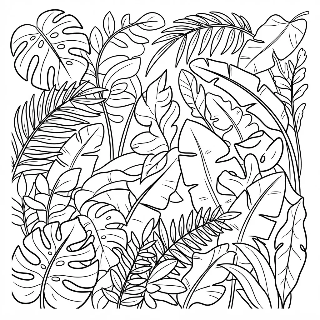
Muted greens settle across an aged ivory sheet, while a monstera split catches soft shadows beside a tall banana leaf. Isn’t it satisfying when a page feels both calm and full of small details? Arrange monstera, banana, palm, bird-of-paradise, and philodendron leaves with generous white space, which works beautifully for adult coloring pages.
Trace each form using a fine-line outline, then add veins, splits, stems, and gentle watercolor-style washes in emerald, sage, and olive. Add small handwritten-style scientific labels and fine measurement lines near selected leaves, keeping every mark light. I love how this layout gives adult coloring pages a quiet study quality without crowding the foliage. Use warm cream accents sparingly, and leave open areas for pencils or soft blending.
This is my go-to tip: vary each leaf’s structure so the arrangement feels natural, not repetitive. Your finished page will feel peaceful, polished, and ready for a journal insert, just like many professional adult coloring pages.
5. Stained Glass Style Cathedral Window

A common mistake is treating this window as a flat geometric pattern, but the color placement needs to suggest light passing through glass. Begin with a symmetrical Gothic arch, then separate each section using bold black lead lines so every panel stays clear, a technique that elevates adult coloring pages significantly.
Fill the panels with ruby red, sapphire blue, emerald green, and golden amber, adding floral details and soft light rays around the arch. Isn’t it satisfying when the sections begin to look like a real cathedral window? I love leaving small areas lighter within each color, since the variation gives the glass a luminous finish. Keep both sides balanced as you work, and enjoy the calm focus this richly detailed design brings.
6. Vintage Art Deco Pattern Page

Place a fan motif at the center of your page, then mirror its rays on both sides to build a neat sunburst. Add stepped shapes and a repeating border around the edge, keeping every section balanced and evenly spaced. Use thin black linework, then fill selected areas with gold, cream, emerald, and deep burgundy for a rich vintage finish, which suits adult coloring pages beautifully.
Add a light distressed paper texture only after the geometry is complete, so the fine details stay clear. Why does this style feel so satisfying? Its mirrored structure gives your coloring session a calm rhythm, and I love watching each small shape sharpen the whole design. Keep metallic-style accents narrow, and leave text and logos out.
7. Deep Sea Underwater Coral Reef
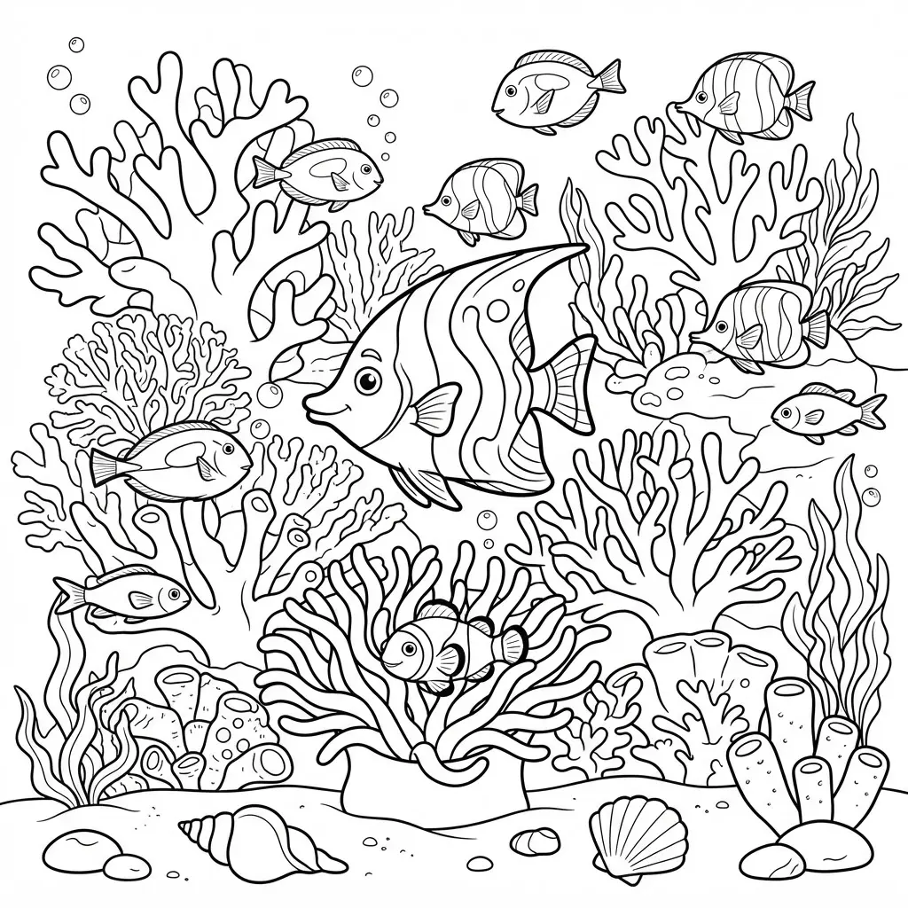
Ever wanted your coloring session to feel like a quiet scene beneath the waves? Begin with a layered coral reef in the foreground, mixing branching coral, rounded forms, and sea fans. Place turtles, rays, jellyfish, and schools of fish at varied distances, then add sunbeams filtering through deep blue water.
Keep the reef as your focal point while smaller creatures guide your eye across the page. I love how the repeating coral marks make focused coloring feel calming, especially for ocean-themed adult coloring pages.
Use darker blue around the edges and pale shades beneath the light rays for a clear sense of depth. Leave open water sections beside the textured reef, so detailed work never fills every space. Try fine-tip colored pencils for coral lines and tiny fish scales, then switch to broader strokes in the water. Your finished page will feel mysterious, balanced, and full of life, a goal shared by adult coloring pages.
8. Minimalist Scandinavian Line Art Scenery

This scene feels peaceful from the first clean line, yet it stays easy to color. Start with rolling hill outlines, then add slender birch trees, distant mountains, and a small Nordic cabin near the lake. Keep every shape open and readable, with a white background and generous empty space, ideal for beginner adult coloring pages.
Use steady, continuous strokes for the trees and water, leaving out shading, gradients, and text. The quiet structure suits adult coloring pages because you have room to choose soft blues, pale greens, or a single monochromatic palette. Is not the uncluttered look satisfying, as seen in top-tier adult coloring pages?
Pro tip: pause between sections and check the balance before adding extra geometric details, much like minimalist adult coloring pages. Sparse lines give this scenery its fresh Nordic feel, so let the open areas stay open and enjoy the calm finish. I love how each simple element gets room to stand out.
9. Fantasy Castle Mountain Backdrop Page

I love this scene because the castle gives your coloring a clear focal point while the mountain setting adds room for soft, moody shading. It feels grand without needing a crowded page, which aligns with premium adult coloring pages.
Begin with pale mountain layers in the distance, then deepen each closer ridge with slate blue and gray. Add mist through the valleys, dark pine forests below, and a winding path guiding your eye toward the castle. Ever tried giving each tower a different roof color? Small changes help the stone walls, flags, and glowing windows stand apart, a trick that enhances fantasy adult coloring pages.
Use fine-point pencils for masonry and branches, then blend broad strokes across the sky. A gold gel pen adds lovely highlights to windows, lanterns, or magical particles. Keep the path lighter than the forest, and feel proud when the whole scene comes together, completing your magical adult coloring pages.
10. Cozy Coffee Shop Window Scene
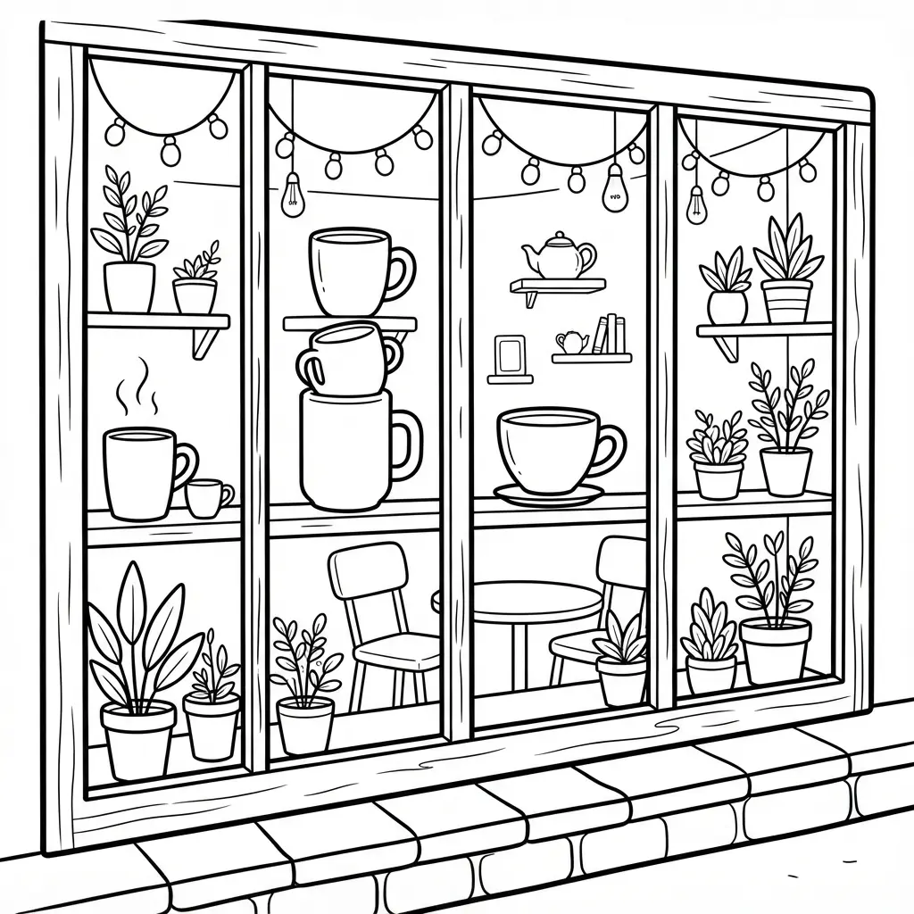
Rain trails slide down the glass while amber pendant lights glow above wooden tables, soft armchairs, and a steaming mug waiting on the windowsill, creating the cozy vibe many adult coloring pages capture. An open book and knitted scarf add a quiet, lived-in touch.
Start with a large fogged window and place rain streaks across it. Add blurred city lights outside, then build inward with shelves of books, potted plants, a pastry display, and pendant lights. Sound complicated? It isn’t. Keep the exterior loose and indistinct so the warmly lit interior leads the eye, a staple technique for adult coloring pages.
I love using layered warm tones to separate the room from the cool rain outside. Add wood grain, ceramic shine, scarf stitches, condensation marks, and book lines for satisfying texture. Use amber, caramel, and espresso brown, then leave small highlights near the lights and mug, bringing your adult coloring pages to life. Feel calm as the scene comes together.
11. Detailed Paisley Pattern Fabric Design
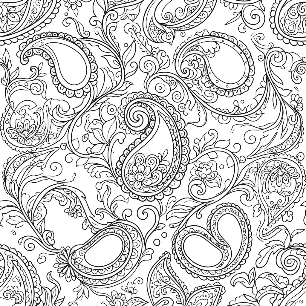
Many people treat paisley as a collection of random teardrops, but its charm comes from a steady repeating rhythm. Start with alternating paisley shapes, turning each large curve in a new direction, then fill the interiors with rosettes, leaves, curls, dots, and slender vines. Keep the outer silhouette clear so every motif stays easy to read, which defines quality adult coloring pages.
I love using a deep navy background with antique gold, teal, ivory, and rust accents, giving these adult coloring pages a warm textile feel. Smaller paisleys and scalloped borders fill open spaces without crowding the repeat, while lighter and darker pencil pressure suggests printed fabric. Isn’t it satisfying when every curve, flower, and border settles into a rich pattern? Yes, especially with adult coloring pages.
12. Zen Stone Stack Harmony Page
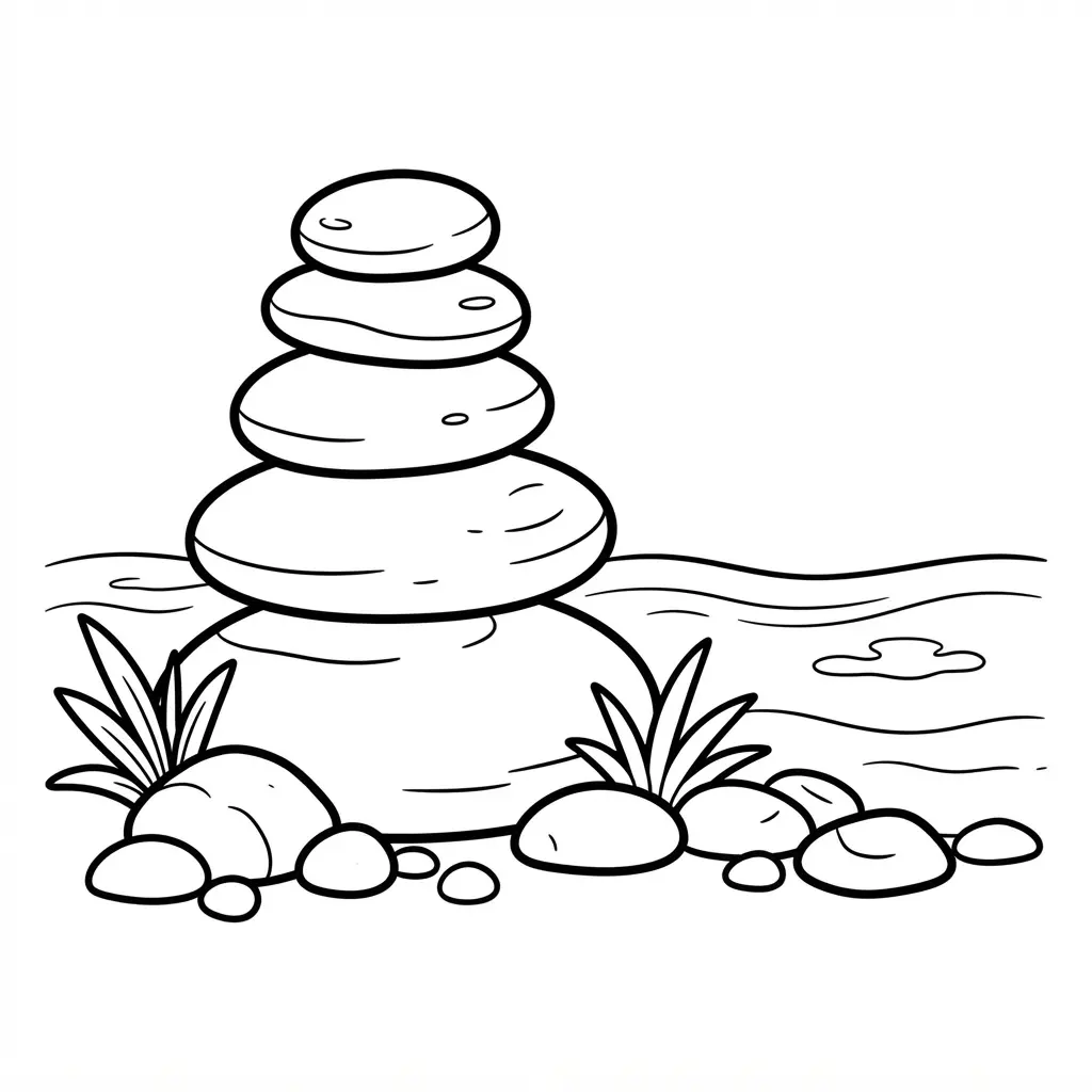
Place the largest stone near the bottom, then add four smaller rounded forms above it. Give each one a slightly different curve, leaving generous space around the stack. I love how this open layout settles the eye before any color touches the paper, a benefit of mindful adult coloring pages.
Add light contour marks and a few uneven grain lines across each surface. Keep the overlap areas pale for soft shadows, then try warm sand, ivory, charcoal, or muted sage. Sound complicated? It is not, since simple shapes guide your hand without demanding dense detail, much like beginner adult coloring pages.
A five-stone stack offers room for grounding, patience, clarity, growth, or peace, while irregular edges keep the result personal. Use a soft colored pencil for gentle shading, letting some paper show through. Your finished page will feel calm, balanced, and distinctly yours, a common joy in adult coloring pages.
13. Celestial Moon and Star Sky

Want a quiet page filled with moonlight and stars? Start with a dark blue base, then layer soft violet around the moon and leave a pale ring near its edge. Dot tiny stars across the open space, varying their size so the sky feels natural rather than crowded, perfect for celestial adult coloring pages.
I love adding silver or pale yellow accents to the crescent, along with a few wispy clouds near the border. This scene feels satisfying because each small mark adds more depth without making the design difficult. Keep the deepest color near the corners and let the center stay lighter for a gentle glow. Take your time with the star placement, then enjoy the peaceful finish, a staple of adult coloring pages.
14. Realistic Succulent Terrarium Arrangement Page

This page feels detailed, yet the forms stay calm and easy to follow. Start with a clear glass bowl, then outline layered gravel, a gently uneven soil bed, and an off-center echeveria. Add smaller haworthia, rounded sedum, and a compact jade plant, leaving open spaces between each shape. Use varied leaf silhouettes to keep the arrangement natural rather than stiff, a hallmark of botanical adult coloring pages.
Build depth with darker lines beneath the soil and lighter lines along the glass rim. Scatter small stone clusters, then add a winding sand strip and one quiet piece of bark. I love repeating sage, dusty blue, tan, and muted purple across separate leaves and ground details. Doesn’t it feel satisfying? Definitely, especially for intricate adult coloring pages. A soft pencil first, followed by colored pencils, gives you control over transparent glass and tiny textures.
15. Victorian Style Filigree Corner Frame
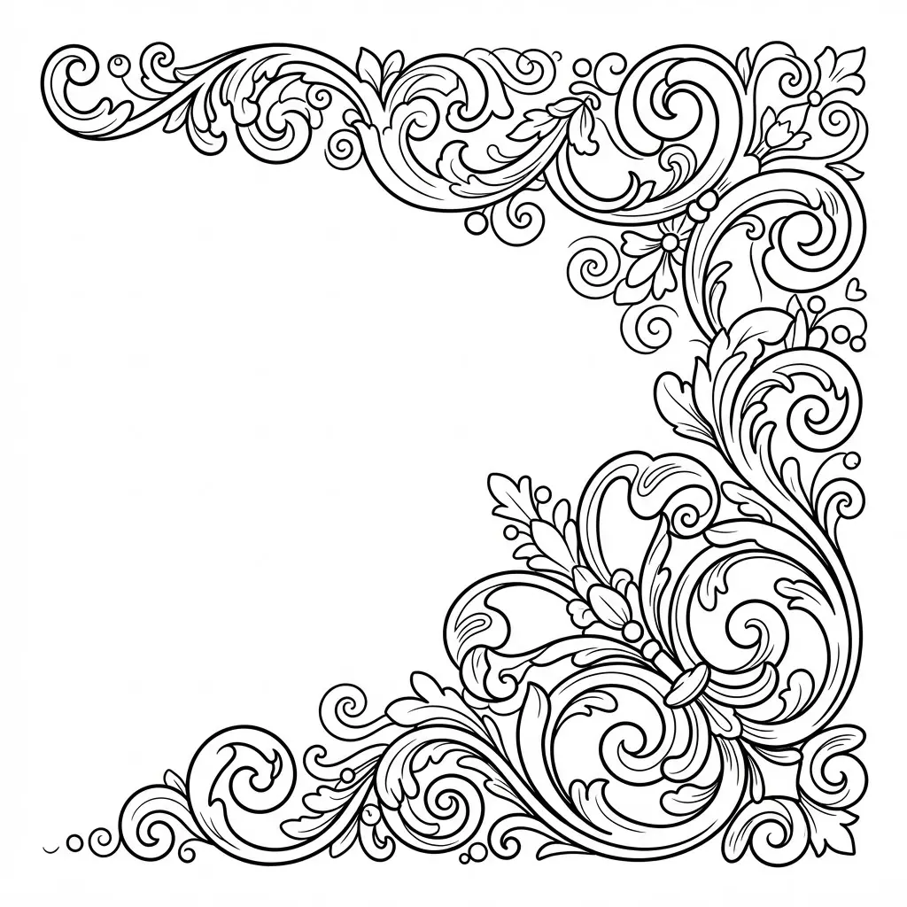
This is one of my favorite adult coloring pages because the corner shape feels elegant without filling the whole sheet. Ever tried keeping the rest of the page quiet while one ornate corner takes focus? Begin with a light pencil sketch, then trace curling leaves, small beads, and looping scrolls from the corner outward. Use a fine-tip liner to vary line weight, making inner curls darker and outer flourishes softer. Leave small gaps between shapes so your color choices stay clear, much like professional adult coloring pages.
Color each section with colored pencils in two or three related shades, adding the deepest tone near overlapping lines. The repeated curves make this design soothing, while the open space gives your eyes a restful pause. Pro tip: add a few pale highlights after coloring to keep the filigree airy and refined. Feel proud when the final corner looks graceful and polished, a goal for all adult coloring pages.
16. Detailed Owl Feather Texture Pattern

The finished page feels soft at the center, with rounded breast feathers layered closely and sharper tips framing the edges. Start with overlapping feather shapes, varying each size, direction, length, and spacing so the surface avoids a stiff repeat, a key trait of animal adult coloring pages.
Add a curved shaft to every feather, then draw fine barbs, keeping bases fluffy, tips crisp, and seams darker where layers meet. Facial feathers should circle the eyes, while breast and wing marks follow the body’s flow, with earthy brown, gray, cream, tan, and charcoal accents. Isn’t it satisfying when speckles, broken teardrops, bars, shadows, and ridge highlights bring the texture forward? I love using colored pencils here, since small shifts in pressure create a soft, touchable finish.
17. Cyberpunk Cityscape Neon Outline Page
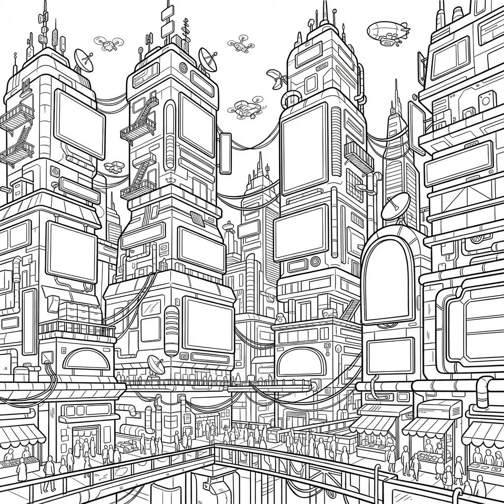
A common mistake is filling the dark buildings with black, which removes space for color. Keep the unshaded page so every sign, window, cable, and street panel stays ready for your ideas, which modern adult coloring pages encourage. Sound complicated? It isn’t.
Start with the tallest skyscrapers, then follow the strong perspective toward narrow alleys and rain-slick streets. Add elevated train tracks, rooftop antennas, overhead cables, flying cars, and distant silhouettes for depth. I love this one because each section invites a different neon shade. Use a bold outline pen for clean edges, while leaving holographic advertisements and sign shapes open inside, a favorite among fans of urban adult coloring pages.
Choose contrasting colors for signs, windows, and vehicle lights, then repeat small accents across the scene. A neon color palette makes the futuristic setting feel lively without gray tones or solid fills, transforming typical adult coloring pages into vibrant art. Trust me, watching the city brighten under your choices feels fantastic.
18. Enchanted Secret Garden Gate Scene

Draw the ornate iron gate first, leaving its doors slightly open. Trace weathered bars, curling ivy, rose blooms, and tiny glowing flowers across the frame. Extend a winding stone path beyond the entrance, then layer trees, moss-covered statues, butterflies, and fireflies along each side. Is the garden beginning to feel hidden and inviting, just like classic adult coloring pages?
I love using emerald greens for foliage, rose pinks for petals, warm golds for filtered sunlight, and lavender-blue accents for mist. Keep the gate darkest near the foreground, then soften distant lines to give the scene depth. This layered setup makes adult coloring pages feel calm while giving your eyes plenty of small details to enjoy. Add pale highlights to flowers and fireflies last for a gentle magical finish.
19. Psychedelic Swirl Pattern Art Page

Ever tried turning a simple spiral into a full page of color? Start with bold black outlines, placing two or three large spiral forms near the center and repeating curved lines around them. Add paisley shapes, smaller swirls, and organic loops in the open areas, keeping each section enclosed and comfortable for your pencils or markers.
I love how the balanced repetition feels soothing while still giving you plenty of room to test bright color combinations, which many adult coloring pages explore. Keep the background white, skip gray shading and text, and vary the size of each space for a pattern that feels organized instead of crowded. Finish your last section and enjoy the hypnotic result!
20. Art Nouveau Butterfly Wing Detail
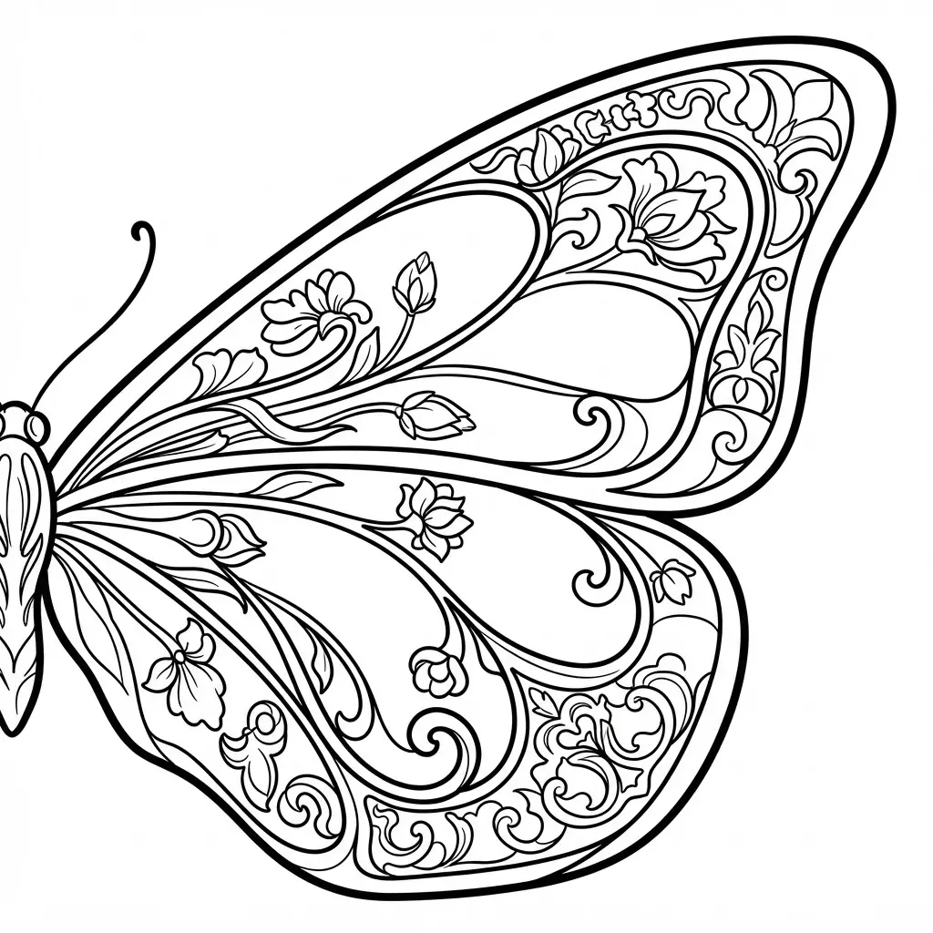
This butterfly wing study looks ornate from the start, yet its structure keeps the coloring calm and focused, essential for elegant adult coloring pages. Begin with symmetrical wing sections, following the broad curves from the center toward the edges.
Fill each section with vines, leaves, and fine curls, keeping the botanical forms connected to the wing lines. Add a stained-glass texture through small enclosed shapes, then choose jewel-toned blues, turquoise, emerald, violet, and gold. Sound complicated? It is not. I love how the pattern gives you small spaces for careful color changes without losing the graceful Art Nouveau style, a hallmark of premium adult coloring pages.
Keep darker shades near the divisions so the linework stays clear, and place soft iridescent highlights along selected curves. Treat the image as decorative rather than naturalistic. Pro tip: leave a few sections lighter, since contrast helps the finished panel feel luminous and refined, much like curated adult coloring pages.
21. Calm Winter Snowfall Cabin Scene
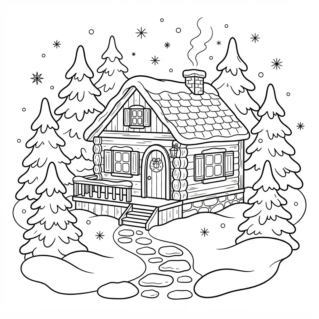
I love this scene because its quiet details make adult coloring pages feel slow and peaceful. Doesn’t the contrast between a warm cabin and blue snow invite you to linger? Start with a wooden cabin focal point, then frame it with snow-laden pine trees and soft blue twilight.
Add a frozen pond nearby, using pale moonlight and gentle reflection lines to extend the view. Finish with winding footprints, delicate snowfall, and drifting chimney smoke, while keeping the warm window glow clear as the main point of attention. I find this balance satisfying because every area offers a different texture without making the scene feel busy, which defines winter adult coloring pages.
22. Abstract Liquid Marble Flow Design

Pearl-white ribbons curl through deep black, cobalt blue, and gold-inspired spaces, while glossy highlights catch the eye. Start with continuous curved bands, letting each line sweep across the page before twisting into its neighbor. Keep the forms organic, and leave clear sections for careful coloring rather than adding objects or lettering, a common feature of abstract adult coloring pages.
Sound complicated? It isn’t. Layer pale shapes over darker areas to suggest translucent depth, then add soft reflections near selected curves. I love using this plan for adult coloring pages because the motion keeps my attention while each section offers a fresh color choice. Let the bold contrast guide your palette, and enjoy the polished finish.
23. Gothic Architecture Gargoyle Detail Page
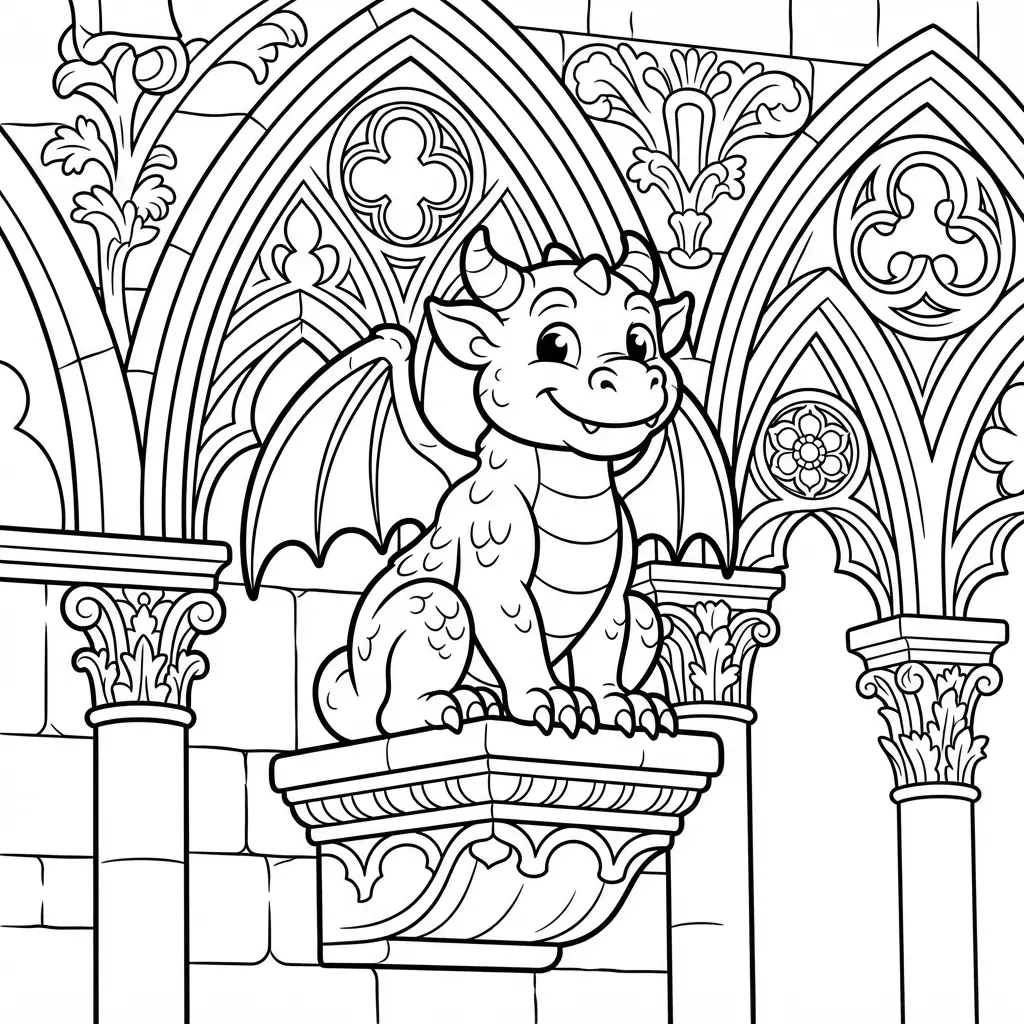
Many people think a gargoyle detail page needs a black-and-gray palette, but rich color works beautifully too. Does a stone face have to stay dull? Not at all. I love starting with slate-gray shading, then adding muted green, dusty violet, or warm copper to separate the stone from the sky, a trick that enhances dramatic adult coloring pages.
Follow the carved ridges around the brow, wings, teeth, and tiny cracks instead of filling each section with one flat tone. A fine-tip marker helps you reinforce narrow lines, while pencils keep broad stone areas soft. Leave small highlights along the nose and cheekbones so the face keeps its weathered texture, essential for gothic adult coloring pages.
This close view feels satisfying because every short line gives the gargoyle more age and personality, exactly what historical adult coloring pages require. Keep your darkest tones beneath ledges and inside recesses, then soften the outer stone with a light gray pencil. Your page will feel wonderfully moody without losing its clean detail.
24. Succulent Wreath Circular Mandala Design
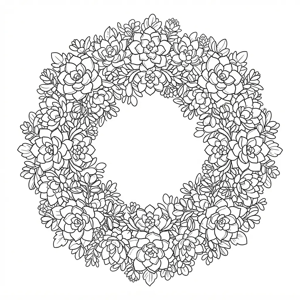
Start with an open circle, then place balanced rosette shapes around its edge. Add layered succulent blooms and rounded echeveria petals first, followed by pointed aloe leaves and slim trailing vines. Ever tried varying leaf shapes while keeping each section evenly spaced? Keep overlaps clear, so every form has its own crisp outline, a standard for geometric adult coloring pages.
Use sage green, dusty teal, muted lavender, soft pink, and earthy terracotta for a gentle botanical palette, a favorite among modern adult coloring pages. I love how the open center gives your eyes a calm resting spot while the outer details stay rich. Finish with crisp black outlines, skip shading, and enjoy the steady rhythm of coloring each repeating section.
25. Dreamy Hot Air Balloon Sky

Ever wished adult coloring pages felt calm and storybook-like? This scene gives you a wide sky filled with striped balloons, rounded clouds, tiny birds, and a sunrise horizon. Start with separate balloon panels, giving each section a soft color change.
Layer peach, pink, lavender, and pale blue across the upper air, keeping warm golden tones near the horizon. Add cotton-candy clouds with pale centers and gentle shading along their lower edges, typical of dreamy adult coloring pages. I love how soft color blending keeps the view peaceful while preserving its fine details.
Finish with fading hill outlines beneath the mist, using darker lines in front and lighter marks for distant valleys. Leave open areas between forms for smooth coloring with pencils or markers. Keep the birds small and avoid heavy colors, since a gentle palette keeps the dreamy mood clear. Feel proud when every balloon looks ready to float, a hallmark of scenic adult coloring pages.
Archiving Finished Sheets In A Personal Collection
Store fully dry sheets in an acid-free archival folder to protect finished coloring pages from yellowing, dust, and bent corners. Use a folder sized for the printed page so corners stay flat instead of pressing against a tight spine. Separate marker-heavy sheets with glassine or plain unprinted tissue, since fully dry ink still transfers under pressure.
Write the date, paper type, and main medium on a small label, giving each sheet useful context years later. Store colored pencil work away from direct sun, which fades strong pigments and changes pale background tones. A clear sleeve protects delicate pages during handling, yet archival paper folders suit long-term storage better than ordinary plastic.
Leave a little room for future additions, so your personal collection stays easy to browse without bending older sheets, preserving your collection of adult coloring pages for years.
Conclusion
So how was your creative session? You have chosen colors, tested ideas, and spent meaningful time with your own attention. Look at what you have made, real skill sits right there in every choice. Adult coloring pages give you room to relax, practice shading, and express a mood without needing perfect results.
Before your next page, place a spare sheet beneath your work, especially when using markers, then test one small area before adding darker layers. Pick a design based on your available time, since a small pattern suits a quick pause and a full scene suits a slower evening. I hope one of these pages becomes part of your regular creative routine. Choose your favorite theme, set out three colors you love, and start the next page while your ideas still feel fresh, and remember that adult coloring pages thrive on your unique touch.
FAQs
Q: What paper works best for printable coloring pages?
A: Smooth, heavyweight paper works well for colored pencils and gel pens. Marker users should choose marker paper or place a spare sheet underneath.
Q: How do I stop markers from bleeding through the page?
A: Test the marker on a separate sheet first. Add a backing sheet beneath the design and use lighter layers near small sections.
Q: Which coloring tools suit detailed designs?
A: Colored pencils suit small areas and gradual shading. Fine-tip gel pens and markers add crisp accents after larger sections receive color.
Q: How do I choose a page for a short break?
A: Pick a pattern with larger sections and fewer tiny details. Geometric designs, simple leaves, and small mandalas fit shorter sessions.
Q: How do I keep colored pencil layers smooth?
A: Begin with light pressure and build several thin layers. Keep the pencil sharp and rotate between colors to create gentle changes.