

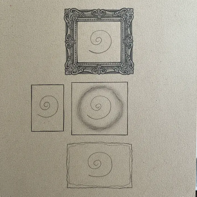
Physical Boundaries as Psychological Thresholds
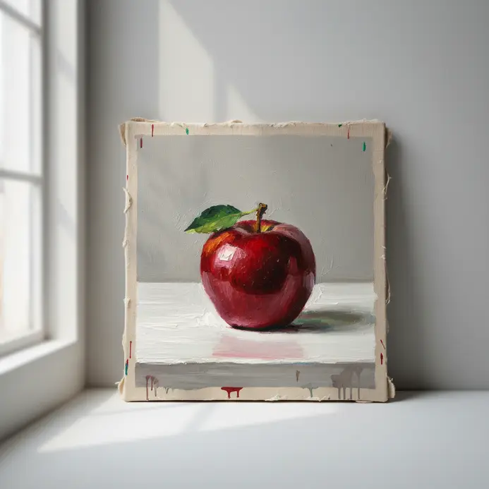
A frame that crowds your piece forces the viewer’s gaze to the edge and creates a tense, claustrophobic feeling. Proper breathing room, on the other hand, invites a calm, focused look at the center. We all know the frustration of a piece that feels slightly off even when the art itself is perfect. Noticing exactly how the framing affects the artwork explains that heavy psychological weight at the edges. You must treat the mat and border as a visual airlock, a transition space that prepares the mind to receive the work’s true intent. The fastest way to establish this airlock is by ensuring your matting width stays proportional to the piece’s visual density. A busy, detailed image needs more calm space around it than a minimalist composition. This simple adjustment controls visual isolation and becomes the very first cue for your viewer. It sets the entire viewing pace before your eyes ever meet the paint.
Selecting Profiles to Align with Artist Intent
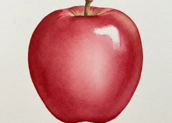
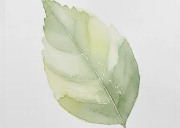
An ornate, gilded border shouts historical portrait and can utterly drown a delicate watercolor landscape. That shift completely alters the perceived era and value of the work on the wall. Here is the simple truth: the profile’s weight and style must echo the energy inside the art itself. A bold, textured oil painting carries enough visual strength to support a thicker mold. A light pencil sketch needs something slender and quiet to breathe properly. You will notice the best pairings create a dialogue where the edge feels like a natural extension of the original lines. Trust me on this, understanding how the framing affects the artwork prevents the common mistake of choosing wood to match your sofa. Instead, hold candidate profiles right against the piece and see which one quietly recedes. This focus on internal geometry ensures the border acts as a supportive window.
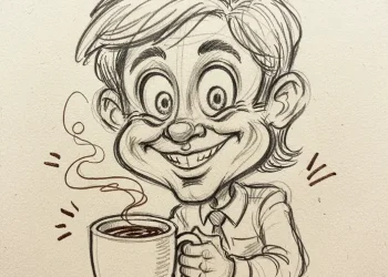
1. Apply Minimalist Thin Edge Frames for a Clean, Contemporary Look
Ever feel like a border is shouting over the art it holds? A minimalist thin edge frame serves as the quiet friend who lets the artwork do all the talking. These profiles, with a face width under an inch, act as a subtle visual boundary. They give your piece definition without adding heavy bulk. The result is a clean, contemporary presentation that puts the focus exactly where it belongs. I love how versatile these metal or wood borders really are. You can choose a matte black metal for a bold, modern statement or a natural wood like maple for a warm, organic feel. The key is selecting a finish that complements your colors without competing. This careful selection is a big part of how the framing affects the artwork, enhancing its natural presence on the wall. For the ultimate minimalist approach, skip the mat and let your art fill the entire opening. It creates a direct, powerful statement for contemporary spaces, especially when framing isn’t limited to conventional styles. Or, add a white paper mat for breathing room and a classic gallery aesthetic. The slim profile keeps everything feeling light and uncluttered.
2. Choose Ornate Baroque Style Borders to Amplify Drama and History
Ever notice how an ornate wood piece can make a simple portrait feel like a museum treasure? That transformation comes directly from the power of a Baroque border. This historical style, rooted in the 17th and 18th centuries, relies heavily on drama and movement. Think of elaborate scrolls and acanthus leaves wrapping around your work. That historical carving creates a sense of rich, visual depth that flat walls simply cannot match. I love how you can dial the theatrical weight up or down depending on your subject. A subtle border pattern adds elegant visual grounding to a busy room. A dense carving with overlapping shells and cherubs brings full classical opulence. The key is matching the border’s intensity to your artwork’s focal point so it enhances the image instead of crushing it. Seeing how the framing affects the artwork helps you decide between a subtle scroll and heavy decorative shells. Remember, the color and finish dictate the final historical mood. A gilded gold leaf screams absolute grandeur to anyone walking past the wall.
3. Use Acid-Free Matting Spacing to Protect and Elevate Your Art
Ever wondered why a professionally mounted piece looks significantly more important than a snapshot popped in cheap plastic? The visual secret almost always lives inside the paper mat. I love this specific upgrade because it delivers both archival safety and gallery polish. Using acid-free matting creates a crucial chemical barrier around delicate paper works. This barrier stops environmental acids and wood pulp from migrating directly into your painting. It prevents that permanent yellowing and brittleness you see in old family photos. Think of the mat board as a visual breathing zone for your subject, enhancing the aesthetics of the framing process. Proper spacing gives your art visual room and guides the viewer’s eye right to the center details. A common professional technique is bottom weighting, where you cut the lower border slightly wider than the top. This grounds the piece physically and balances heavy visual weight in the composition. Recognizing how the framing affects the artwork when you add a wide, weighted mat explains why museums use this trick so often. For a deeper look into archival mounting methods, you can explore advanced paper conservation guides online.
4. Create High Contrast Color Framing for Bold Visual Impact
Ever looked at a gallery wall layout and felt your eye pulled straight to one specific piece? That magnetic pull comes from smart high contrast framing applied to quiet spaces. You create a distinct boundary using colors that sit far apart on the color wheel, like deep blue borders around warm orange prints. Pairing a light painted wall with a dark wood mold achieves the same striking separation instantly. The stark color difference makes the outer edge pop forward visually. That sudden highlight forces immediate attention onto everything inside it. This visual trick works because our brains are wired to instantly process extreme differences. The tension between the bright border and the muted content creates a natural focal point. That tension adds instant drama and visual energy to flat living spaces. I use this technique constantly to make a single small element feel commanding. Understanding how the framing affects the artwork through deliberate color pairing shows you exactly why contrast drives attention.
5. Build Floating Frame Depth Effects for a Modern, Gallery Feel
Does your printed canvas sometimes feel flat and lifeless against a painted wall? Adding a consistent shadow gap lifts that heavy feeling immediately. You achieve the floating effect by mounting your piece from the back of a deep-profile frame. That recess creates a clean margin around all four edges without touching the paper. The resulting shadow makes your print look physically suspended inside the opening. That illusion adds a sleek, three-dimensional quality to flat gallery papers and enhances the aesthetics of the piece. I love how this precise spacing in the picture frame completely changes how a piece of art interacts with light. It draws your eye directly to the image center and gives it that expensive modern gallery finish. The construction trick involves using tiny wooden spacers during assembly to keep that shadow line perfectly even. Witnessing how the framing affects the artwork when you introduce that floating shadow proves why modern galleries abandon traditional overlaps. Trust me once you see the elevated vibe it brings to your wall. You will want to upgrade every heavy canvas to this sleek presentation method.
6. Add Rustic Distressed Wood Textures for Warmth and Character
Ever feel like a pristine white room looks too sterile and lacks personality? A rough wood texture instantly injects cozy warmth and historical character into that cold space. This rustic approach embraces natural imperfections like exposed knots, old saw marks, and uneven grain lines. Those natural flaws bring a lived-in charm that smooth walls simply cannot reproduce. You can introduce this tactile character through a distressed wood accent wall behind your main seating area. A dining table with a heavily worn surface brings that same grounded energy to family meals. Wide floor planks with a hand-scraped finish add incredible visual depth under your feet. Even a simple decorative box or rustic border carries that warm, grounded quality. The varied surfaces and imperfect natural edges prevent your space from feeling like a furniture showroom. Those rough textures scatter light differently and keep your walls visually alive, enhancing the fine art displayed. Observing how the framing affects the artwork when surrounded by worn timber explains why rustic spaces feel so grounded. It remains a wonderfully practical choice since minor scuffs simply blend into the existing patina.
7. Layer Metallic Finish Modern Frames to Reflect Light and Style
Ever wondered how to make a dark hallway feel bright and visually open? This display trick works wonders for adding instant bounce and modern flair. You start by choosing thin, clean-lined metallic profiles in various silver and brass tones. Those reflective surfaces naturally amplify whatever ambient light exists in your space. Lean a few against the wall and hang others at different heights for a curated look. That layered arrangement creates a dynamic gallery feel along blank corridors. The polished surfaces bounce sunlight and lamp glow across the corridor beautifully. That bounced light makes cramped rooms feel significantly more spacious and airy. The metallic sheen adds serious textural richness while the modern edge keeps everything feeling current. I highly recommend mixing a dominant silver tone with a few warm brass accents for visual variety. Seeing how the framing affects the artwork when placed next to polished metal shows you exactly why reflections add depth. Try this grouping trick to bring a personal, glossy energy to dull corners.
8. Achieve Archival Glass Reflections Control for Optimal Viewing
Ever looked at a gallery wall piece and seen your own face staring back instead? That distracting mirror effect happens every time cheap clear sheets sit against bright windows in a custom frame. Standard clear glass reflects nearly eight percent of room light directly into your eyes. You can solve that annoying glare instantly by upgrading your front cover material. Your two best options are non-glare glass with a lightly textured surface or premium anti-reflective museum sheets. The textured version scatters incoming light rays to stop sharp mirror images. Non-glare works well for general prints but softens fine visual details slightly in traditional art framing. Premium museum glass uses an optical coating to cancel reflections almost entirely. That special coating drops reflected light down to less than one percent, delivering stunning clarity. The pigment colors stay incredibly vibrant and sharp behind that invisible barrier. It also delivers exceptional UV protection against fading sunlight damage. Watching how the framing affects the artwork when you swap cheap glass for museum clarity proves why collectors invest heavily here.
9. Balance Proportional Frame Width to Anchor Your Artwork
Ever hung a small poster in a custom frame and felt it disappear completely against a large painted wall? That floating isolation usually stems from an improperly sized outer edge. You need to give small pieces enough visual weight so they hold their position. I love balancing this math because it relies entirely on harmonious proportions between the piece and its surroundings, showing that choosing the right frame isn’t just about size. Think of your border as the literal visual foundation for your displayed item. A tiny, delicate illustration benefits from a A relatively wider frame can greatly impact the overall aesthetics of the artwork displayed. to give it heavy presence. A massive, bold canvas needs a slimmer profile so it never feels boxed in. Always factor your room architecture into the mold choice too. A sleek modern space naturally calls for narrow metal edges. A traditional study can easily handle wide, carved wooden borders that complement the fine art it holds. Adding a paper mat expands the visual footprint before you even select the wood. Understanding how the framing affects the artwork when you adjust those edge ratios explains why tiny prints need extra grounding. The goal is perfect visual harmony that feels anchored but never heavy.
10. Match Period Appropriate Frame Styles for Authentic Curation
Ever placed a lovely antique oil painting inside a trendy modern edge and felt it look completely wrong in its picture frame? That visual clash usually happens when the border ignores the piece’s original era. Choosing a historically accurate style works like dressing your artwork in period clothing. That match instantly restores the original context and historical weight of the works of art displayed. You must research the materials and finishes favored by artists during that decade. An eighteenth century portrait traditionally demands carved walnut with a warm oil glaze. A nineteen seventies graphic poster shines inside a sleek, anodized aluminum strip. Your goal remains supporting the original artist’s intended aesthetic surroundings. I always examine the profile and ornamentation closely before making my final selection. A heavy gilded Baroque box will absolutely crush a light Impressionist sketch. Works created before the nineteenth century benefit from a tight wood edge without paper spacing. Recognizing how the framing affects the artwork when you align it with its birth decade keeps historical pieces looking completely authentic. An appropriately aged finish always tells a much richer visual story than factory-fresh paint in a picture frame.
Environmental Factors Influencing Long Term Conservation
Standard picture glazing bounces every ceiling fixture and open window straight into your eyes. That constant reflection pushes viewers away from your walls instead of drawing them in. You can eliminate that harsh bounce by upgrading to anti-reflective museum glass. The subtle optical coating allows your printed colors to shine through clearly. Beyond daily viewing clarity, this specialized sheet filters out harmful ultraviolet rays. Those invisible rays destroy vibrant pigments slowly over decades of exposure. Your finished piece of art also requires proper internal air circulation if it sits on paper or cloth. Never seal it tightly inside an airtight backing that traps damp air. For truly archival storage and display, pair that glass with acid-free backing boards. Those boards prevent permanent chemical burns that yellow delicate paper edges over time. Understanding how the framing affects the artwork when you incorporate these archival materials protects both the immediate look and decades of longevity. That final environmental shield respects the creator’s original vision as much as your immediate enjoyment.
Conclusion
Choosing a display edge remains one of the most personal steps in home curation. That final border choice reflects your personal taste while simultaneously honoring the original piece. Hold several different profile samples directly against your art in your actual room lighting. Notice which combination makes your printed colors feel vibrant and completely balanced. Learning exactly how the framing affects the artwork hands you the creative confidence needed for your next project. Your display decisions will align perfectly with your original collection vision. That careful matching process turns simple walls into a cohesive personal gallery. Take your time testing different materials before committing to any permanent mount. Your artwork deserves the visual support that matches its unique character. Trust your instincts and enjoy the process of bringing those pieces fully to life. That final presentation will reward your patience every single time you glance up.
FAQs
Q: How does framing affect the artwork’s visual appeal?
A: Framing can significantly enhance a piece by creating a frame that complements the art’s colors, scale, and mood; a well-chosen frame elevates a piece into a captivating focal point, enhancing its visual appeal and creating a cohesive presentation within the artwork and the surrounding space.
Q: Can the wrong frame harm the value of the artwork?
A: Yes—choosing a wrong frame can detract from the art’s impact, confuse its intended style, and even lower the value of your artwork in the eyes of collectors; conversely, a good frame or professional framing can add perceived quality and sometimes increase the value, especially for art collectors and resale markets.


Q: What is the difference between conservation framing and regular framing?
A: Conservation framing focuses on materials and techniques that protect the art piece long-term—using acid-free mats, uv-protective glazing, and archival backing—to prevent deterioration from light, humidity, and pollutants, while regular framing often prioritizes aesthetics and may not provide the same level of protection.
Q: How does frame size and style influence modern art versus traditional pieces?
A: Frame size and style should respond to the art styles: minimalist frame choices or simple floating frames often suit modern art, while ornate frame styles may complement classical or renaissance-influenced works; the frame size (width and profile) contributes to a sense of grandeur or restraint and must be balanced with the artwork’s scale.
Q: Why should I use professional framing or a reputable framer?
A: A professional framer brings technical knowledge of framing techniques, conservation framing, and materials selection—ensuring frames provide both protection and enhancement; high-quality framing protects your artwork from environmental damage and supports long-term preservation, which is important for any art collection.


