


Anatomical Considerations for Letter Placement
The biggest mistake someone makes is putting a script alphabet on a high-flex area like the inner elbow without adjusting its flow to muscle movement. Your letters will twist and warp every time you bend your arm, turning elegant script into an unreadable blur. You want to orient the letters so they follow the natural lines of your body, like curving a phrase along your collarbone or stacking block letters vertically down your spine. This alignment with your skeletal structure is exactly what makes reviewing various alphabet tattoo ideas so helpful, as it ensures the design feels like a part of you instead of something just stuck on top.
Selecting Typography Based on Skin Texture
Fine-line script with delicate hairlines will blur into a gray smudge on porous or frequently sun-exposed skin over a few short years. Your skin texture dictates the minimum line weight you should use for lasting clarity. For areas with more elastic skin or finer pores, like the inner wrist, you have more freedom with detail. When evaluating different alphabet tattoo ideas, remember that hands or forearms require a bolder, simpler font with consistent line weight to hold its shape over the years.
1. Minimalist Fine Line Script A Wrist Tattoo

Who would have thought a single letter could feel so personal and chic? This piece relies on delicate fine line needles and black ink, creating a subtle script ‘A’ right on your inner wrist. Your artist will use a very light hand to trace the elegant font you choose, resulting in a piece that’s both meaningful and incredibly discreet. I love how it feels like a secret you carry with you, which is exactly why this stands out among the best alphabet tattoo ideas for beginners.
Getting the design right means finding an artist with a solid portfolio of creative initial A tattoo designs, so you know they can nail the precision every single time. Trust me, the result is pure, quiet elegance.
2. Bold Old English B Initial Collarbone Design

Who would have thought a single letter could make such a strong statement? A bold Old English ‘B’ on the collarbone does exactly that, commanding attention with its striking presence. The thick, bold lines of this Blackletter script create a powerful, decorative initial that follows your bone’s natural curve beautifully. I love how this style turns a personal symbol into a piece of art with real presence.
You need to pick a design with clear, legible lines to prevent it from becoming a blurry blob over time. Exploring more personalized letter B tattoo designs shows how different fonts and placements work together on actual skin. Trust me, you will feel completely confident when that bold ‘B’ looks sharp and stunning for years, proving why it belongs in any collection of alphabet tattoo ideas.
3. Elegant Cursive C Letter Ankle Piece

Ever wondered how a single letter looks so graceful on its own? This elegant cursive ‘C’ tattoo for the ankle relies entirely on flowing, delicate lines that catch the light. The design wraps subtly around the bone, often with tiny flourishes that give it a deeply personal touch. The key to its lasting beauty is choosing the right fine line script font during your consultation process.
A font that looks too detailed on paper often blurs over time, especially on a highly mobile area like the ankle. I always recommend finding an artist who specializes in this exact style to ensure crisp, clean lines that heal perfectly. Its discreet placement makes this one of the most timeless alphabet tattoo ideas available today, feeling like a quiet secret you share only when you want to. Browsing elegant cursive C tattoo concepts before your consultation helps you pinpoint the exact flourish style you love.
4. Victorian Serif D Letter Inner Arm Tattoo

Ever wondered how to turn a simple initial into a true heirloom piece? A Victorian Serif ‘D’ on your inner arm achieves exactly that, blending personal meaning with ornate, historical typography. The process starts with a thorough consultation to finalize your design, ensuring it has the right scale for all its delicate serifs and flourishes. I love how this placement lets you show off that elegant detail or keep it private, and the skin here handles longer sessions exceptionally well.
A practical first step is researching meaningful initial D tattoo placements to see how your chosen letter flows with different body contours. Does that not look absolutely stunning as a standout choice among alphabet tattoo ideas for collectors?
5. Handwritten Cursive E Initial Ribcage Tattoo

This design perfectly captures a tattoo that feels like a private journal entry. The handwritten cursive script makes it look exactly like a note you wrote yourself, avoiding the rigid structure of a standard digital font. It is incredibly personal and effortlessly elegant.
Placement on the ribcage naturally adds to that intimate, quiet feel. It is a spot chosen often for its privacy and subtle elegance, keeping the design away from harsh daily friction. You can show it off when you choose to, but it stays mostly reserved just for you, which aligns with many handwritten letter E tattoo ideas for personal milestones. It’s exactly this kind of deeply personal approach that makes alphabet tattoo ideas so unforgettable.
6. Industrial Stencil Style F Letter Bicep Design
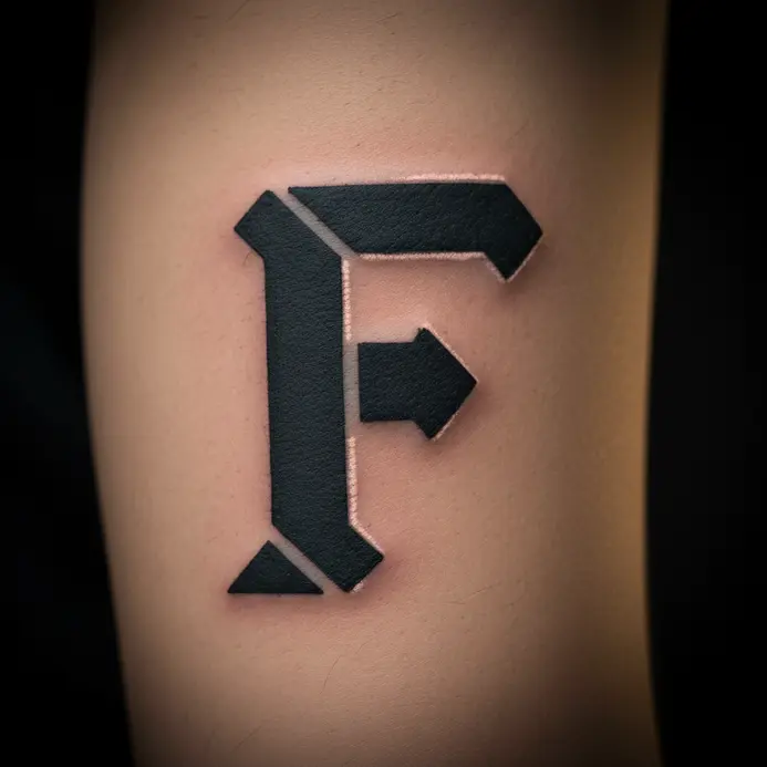
This design looks exactly like it was stamped straight from a factory floor, doesn’t it? It achieves that authentic manufactured look through sharp, clean lines and a visual weight that feels cut from solid metal. The secret lies in that stencil-style lettering where negative space defines the letterform, creating a graphic, architectural impact on your arm. I love how it feels both raw and perfectly precise, proving why it ranks high among industrial letter F tattoo concepts. That raw, stamped-metal aesthetic is what places this design firmly among the most distinctive alphabet tattoo ideas.
7. Gothic Blackletter G Letter Spine Piece

Who would have thought a single letter could carry such heavy visual power? This spine piece demands a bold, linear structure to follow your body’s central axis without distortion. The dense, dark strokes of a Gothic Blackletter script create a dramatic statement that commands the eye. It is not just a letter; it is a tangible piece of medieval typography on your skin.
Getting the right look means choosing your exact variant, from the sharp angles of Textura to the sweeping curves of Fraktur. Your artist will use shader needles to pack in solid black ink, which remains key for achieving that classic heavy aesthetic. Be ready for a more intense experience, as the spine sits very close to sensitive nerve bundles. To see other ways an initial can be styled, look at classic initial G tattoo variations for direct inspiration that expands your list of alphabet tattoo ideas.
8. Modern Sans Serif H Letter Finger Tattoo
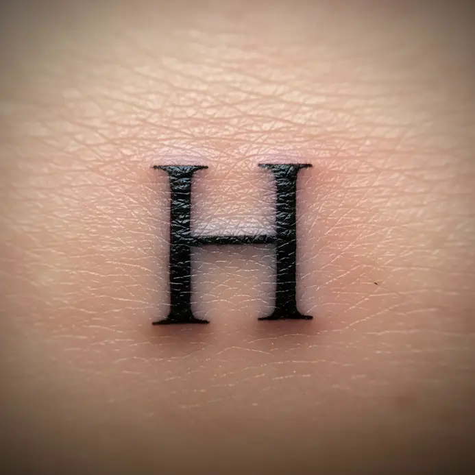
This particular layout remains a favorite for its clean, uncluttered personal statement. A modern sans-serif ‘H’ placed directly on your finger offers the perfect balance of subtlety and clear meaning. You will love how crisp and completely legible it stays, even when scaled down to a tiny footprint. The absolute key lies in using a simple, bold font weight that helps it withstand constant daily friction.
I always suggest discussing exact placement with your artist before the needle touches down, as side-of-the-finger positioning often extends longevity significantly. To make the letter truly reflect your taste, browse elegant letter H tattoo fonts with your artist well before the stencil goes on. Seeing every available option helps you select the perfect modern ‘H’ for your skin.
9. Vintage Typewriter Font I Initial Inner Forearm Tattoo

Ever wondered how a single character feels so rich with inherited character? This specific design relies on a vintage typewriter font for your initial, delivering that timeless, slightly imperfect texture you notice on aged book pages. The inner forearm provides a perfect flat canvas because it allows you to display it openly or tuck it away quickly. I love how this style merges personal meaning with a nostalgic aesthetic.
It functions as a simple statement that carries substantial emotional weight. For more minimalist letter I tattoo inspiration, observe how others have kept their layouts clean and visually powerful. Your artist will switch to a fine-line needle to capture those sharp edges cleanly. Trust me, watching that clean ‘I’ emerge on your skin feels incredibly satisfying, reinforcing why this remains a staple among timeless alphabet tattoo ideas.
10. Artistic Abstract Calligraphy J Letter Shoulder Design

This is the moment where a basic character transforms into a genuine museum-quality piece. The entire composition begins with a beautifully rendered calligraphic J serving as the structural anchor. From there, your artist introduces flowing wisps, geometric fragments, or textured organic layers that breathe movement into the static shape. It succeeds entirely because the shoulder’s natural curvature allows those abstract extensions to flow seamlessly with your posture.
I admire how this aesthetic lets you embed specific personal meaning directly into every deliberate stroke and splash of pigment. Trust me, locating an artist skilled in intricate letter J tattoo artistry remains the absolute requirement for executing this vision properly. Your finished composition will look stunning and feel completely unique to your journey.
11. Geometric Sans Serif K Letter Nape Piece

Ever wanted a design that feels simultaneously contemporary and completely timeless? This sharply structured ‘K’ on the nape captures that balance effortlessly. The layout employs a fine liner needle to draw razor-straight lines with zero weight variation, delivering a precise, architectural impression. I love how this technical approach elevates a basic initial into a monument to exactness.
The nape placement stays a classic selection because it disappears instantly behind hairline or reveals itself with a simple glance upward. Choosing your artist carefully remains absolutely necessary for this specific look. You need someone specializing in geometric designs to guarantee every calculated angle aligns perfectly. Before you finalize anything, exploring other modern letter K tattoo ideas confirms whether this sharp aesthetic truly fits your skin.
12. Whimsical Bubble L Letter Calf Tattoo

This particular layout radiates pure visual joy from a distance. It resembles a cheerful, floating bubble you carry effortlessly wherever you walk. The soft pastel inks filling the inflated curves generate that sweet, shimmering quality immediately. I love dropping in tiny stars or a single crisp highlight to amplify the playful atmosphere.
Achieving that perfectly rounded, blown-up silhouette depends entirely on expert shading techniques and precise white highlight placement. A frequent error involves overcrowding the shape with unnecessary extras. Keep the layout clean and let the charming bubble character dominate the canvas, which explains why it frequently tops lists of colorful letter L tattoo ideas.
13. Distressed Grunge Style M Letter Shin Design

Ever wanted a piece that resembles a weathered artifact instead of a brand-new print? This unpolished, rebellious approach ages your letter to resemble a survivor of harsh conditions. The tattooist applies black and grey washes meticulously to construct realistic scratches, fractures, and rusted textures. I admire how this method completely swaps out sterile perfection for raw, gritty authenticity.
It succeeds beautifully because the shin offers a wide, highly visible stage suited for a loud declaration. Before you lock in any custom lettering, reviewing artistic customized letter M tattoos provides an excellent roadmap for expanding your options. Your chosen design will look absolutely striking with that deliberately worn character.
14. Delicate Script N Initial Collarbone Tattoo

Who would have thought a single character could carry such refined elegance? This particular layout prioritizes complete subtlety, showcasing a whisper-thin script ‘N’ aligned precisely along your collarbone’s natural curve. The tattooist operates an ultra-precise needle with pure black ink to draft those sweeping, calligraphy-grade lines directly onto your skin.
I love how this specific tattoo works by embedding deep personal significance inside a remarkably clean shell. You secure a permanent tribute to a cherished name or word, all packaged within a highly polished, minimalist framework. It stays highly visible during outings but conceals effortlessly when needed, which proves ideal for corporate environments. Looking through contemporary letter N tattoo examples shows how differently artists interpret the same foundational shape. Trust me completely on this approach: invest time selecting a highly readable font with adequate thickness to ensure graceful aging.
15. Ornate Calligraphy O Letter Inner Arm Piece

Who would have thought a basic circle transforms into something so heavily detailed? This inner arm placement upgrades the simple O into a complete visual study by incorporating wide loops with heavy pressure variations. The specific location remains ideal for admiring those swashes and flourishes up close without distortion from surrounding skin folds.
I love how the inner arm provides a stable, flat surface that allows complex calligraphy to perform flawlessly without warping. It functions as an outstanding selection for anyone attracted to highly stylized single characters with a deeply personal narrative. Does that not look incredibly stunning when viewed alongside other highly decorative letter O tattoo ideas?
16. Minimalist Single Needle P Letter Ear Tattoo

Who would have thought a single character delivers such refined sophistication in a microscopic format? This entire concept revolves around a compact, crisp ‘P’ inked behind the ear through a dedicated single needle technique. The final output produces a faint, sketched aesthetic that remains quietly understated yet deeply intentional. I admire how this specific method turns a basic initial into a hidden artistic statement.
It functions flawlessly because the stripped-down methodology guarantees complete timelessness. Success hinges entirely on selecting a highly legible typeface and relying on your artist’s judgment for exact sizing on that specific cartilage zone. You will quickly encounter a variety of letter P tattoo styles that help spark your final decision. Does that not sound like an incredibly personal finishing detail?
17. Traditional Bold Serif Q Letter Chest Script

Who would have thought a solitary character projects such undeniable gravity? This specific composition emphasizes thick, heavy strokes alongside traditional bracketed feet, delivering an undeniably classic appearance. The true focal point remains the sweeping tail on the letter Q, which artists typically render as either a strict geometric extension or a sweeping organic flourish. It succeeds completely because that solid, highly defined shape feels permanent and historically valuable.
Executing that flawless vintage aesthetic relies entirely on surgical precision during the outlining phase. Your artist will deploy a liner needle to carve those sharp boundaries perfectly, guaranteeing every serif lands exactly right. I love this particular layout because it sits so confidently against your chest contour, ready to become your personal mark. Browsing classic serif Q tattoo variations shows how different artists handle that distinctive sweeping tail.
18. Decorative Flourish R Initial Hand Tattoo

Ever wondered how a single alphabetical character expands into a complete decorative composition? This particular design swallows the letter “R” entirely, wrapping its core structure inside sweeping calligraphic flourishes that resemble climbing vines or silk ribbons. The specific hand location guarantees a highly visible, daily reminder of your chosen aesthetic. I love how the dense line conversion upgrades a basic initial into something highly elegant and completely one-of-a-kind.
When mapping out a piece of this scale, you absolutely must research decorative letter R tattoo ideas to grasp every available stylistic route. It functions perfectly because it fuses deeply private meaning with undeniable public beauty. Trust me completely, wearing this custom-built composition generates lasting pride every single morning.
19. Shadowed Block S Letter Thigh Design

Ever wondered how a basic character suddenly appears to lift right off the surface? This specific execution leans heavily on a solid block font as the foundation, layering carefully calibrated drop shadows underneath to generate complete three-dimensionality. The thigh’s expansive real estate supports oversized sizing comfortably, making it an ideal match for this bold approach. I admire how the optical depth injects serious weight into the overall composition.
Achieving that flawless hovering illusion depends entirely on maintaining a unidirectional light source throughout the shading process. Your artist plots the exact shadow trajectory first, then blends smooth ink gradients to construct the full illusion. Trust me completely, witnessing that final pop of realistic depth delivers immense satisfaction during the reveal session. Exploring shadowed block S tattoo variations helps you decide exactly how dramatic you want that dimensional effect to be.
20. Small Roman Numeral T Letter Wrist Date Tattoo

This concept delivers a brilliantly clever method for freezing important calendar moments permanently in ink. You merge the initial ‘T’ alongside a specific Roman numeral sequence, tucking the entire arrangement into delicate script along the inner wrist. I admire how this quick combination upgrades a basic character into a deeply private historical marker you carry everywhere. The approach succeeds completely because the fine line tattoo style preserves crisp edges and elegant proportions at a highly reduced scale.
Isn’t it amazing how much emotional weight fits inside such a stripped-down framework? Feel that quiet, deeply personal satisfaction every time you casually glance downward during your day. Before locking in your specific numbers, browsing a comprehensive letter T tattoo directory guarantees your ‘T’ integrates flawlessly alongside those historical numerals.
21. Connected Intertwined Script U Letter Forearm Tattoo

This specific layout looks highly complex at first glance, yet the underlying structure remains wonderfully straightforward. It starts with a foundational cursive letter, then actively weaves it around flowing supplementary elements like braided ribbons or botanical vines. I absolutely love how those intertwining lines layer an entirely fresh narrative onto a single basic character without overwhelming the canvas. The forearm provides the ideal stage because those continuous curves naturally follow your arm’s underlying musculature.
Your artist deploys a fine-liner needle to trace every delicate bend accurately. Maintaining crisp definitions during the healing phase demands adequate internal spacing, which remains a crucial industry tip for long-term readability.. When the scabbing finally clears, you retain a highly personal artifact that doubles as wearable fine art. For more flowing typography inspiration, browse intertwined letter U tattoo designs to see similar looping techniques.
22. Graphic Outline V Letter Ankle Design

Isn’t it fascinating how a single angular character instantly grabs attention through pure minimalism? This stripped-down outline concept relies entirely on razor-sharp boundaries to construct a crisp V shape directly along the ankle’s front surface. You absolutely need a specialist in steady handwork to guarantee those terminal points align flawlessly. I love this clean aesthetic because it delivers modern relevance without unnecessary visual noise, proving why it ranks high among sharp alphabet tattoo ideas for minimalist collectors.
23. Hidden Behind Ear Cursive W Initial Tattoo

Ever craved a design that operates strictly as your own personal secret? This exact setup remains tailored specifically for that purpose. A microscopic, finely curved W tucked directly into the mastoid zone represents the ultimate quiet mark. This entire configuration depends entirely on precision fine line needles to draft those soft, sweeping script transitions accurately. I admire how it vanishes instantly behind loose hair but reappears smoothly with a simple head shift.
It functions flawlessly because it transforms a basic character into a highly refined, wearable artistic fragment. Dedicate ample consultation sessions selecting your exact cursive typeface alongside your artist, guaranteeing sharp healing results. Reviewing hidden cursive W tattoo inspiration beforehand gives you a clearer picture of how this discreet placement heals. This careful preparation ensures your chosen initial retains its elegant shape permanently.
24. Elaborate Celtic Knotwork X Letter Upper Arm Design

Who would have thought a single crossed character holds such dense historical power? I completely admire how this specific configuration upgrades the X into a profound symbol of crossroads and hidden mysteries through completely unbroken, looping strands. You immediately spot the knot structure integrated tightly into the letter’s skeleton, frequently utilizing dense repeating motifs that wrap seamlessly around the bicep. It functions perfectly because those endless, interlocking strokes feel genuinely ancient, embedding a rich narrative directly into your personal initial. For a project demanding this much structural complexity, you definitely want to review detailed letter X tattoo craftsmanship alongside your chosen artist, guaranteeing every overlapping curve lands exactly right.
25. Elegant Script Y Letter Ribcage Infinity Tattoo

Ever wondered how a single alphabetical character merges so effortlessly with a mathematical symbol? This exact composition fuses a highly delicate script Y alongside a continuous infinity loop, positioning the entire arrangement precisely against the ribcage curve. This specific placement injects an intensely intimate atmosphere, keeping the artwork tucked near your heart permanently. I love how the delicate strokes from a fine liner needle make both the sweeping letter and the unbroken loop appear incredibly weightless. That specific combination generates stunning visual movement alongside a deeply personal concept of permanence. Exploring elegant script Y tattoo designs reveals other ways artists merge typography with symbolic shapes. Feel that quiet, grounded satisfaction once the final wipe reveals the complete design.
26. Bold Minimalist Outline Z Letter Finger Design

Who would have thought the absolute final letter delivers such a sharp, confident visual punch? This layout revolves entirely around that bold outline scaled meticulously to span two digits comfortably. You are essentially receiving a clean, stamped graphic of the character Z, utilizing rigid angular strokes that generate immediate contrast while healing beautifully over years. I admire how it converts pure typographic simplicity into something highly edgy and completely modern.
It functions brilliantly specifically because those heavy outer walls prevent the ink spreading that regularly ruins finer hand tattoos. Searching through bold letter Z tattoo designs provides an excellent continuation step for expanding your personal collection.
Maintaining Clarity and Line Sharpness Over Time
The absolute best strategy for long-term preservation involves demanding generous negative space between every character arc, particularly when working inside highly ornate typefaces. As your underlying tissue matures and pigment migrates slightly downward, those microscopic separation pockets seal first, gradually merging neighboring strokes into dark, muddy patches. An experienced tattooist knows precisely how to increase the kerning strategically during the initial stencil transfer to anticipate that natural biological expansion. You will deeply appreciate this foresight a decade later when the design remains highly readable from a standard viewing distance. This proactive methodology separates permanent artwork from a heavily compromised piece that eventually requires expensive correction work.
Conclusion
Choosing a letter for your skin represents a deeply personal selection process, blending private narrative with deliberate artistic execution. The most successful alphabet tattoo ideas function exactly like natural extensions of your personal history, completely avoiding generic internet templates. My strongest recommendation involves treating these specific examples strictly as opening topics for conversation with your chosen professional. Bring preferred characters, share stylistic preferences that resonate emotionally, and allow their technical expertise to translate your raw thoughts into a layout that ages gracefully across your specific skin type. Your personal lettering journey focuses entirely on locating that perfect equilibrium between your intended message and visual execution, resulting in a permanent artifact you genuinely cherish forever.
FAQs
Q: How do I choose the right font for my letter tattoo?
A: Consider the exact emotional tone you want the character to broadcast. A highly delicate script naturally conveys intimacy and elegance, while a heavy blackletter structure delivers undeniable historical weight. Evaluate how the chosen typographic style aligns with your daily wardrobe and the personal significance behind the selected character.
Q: Will a fine-line script letter tattoo blur over time?
A: Every single tattoo experiences natural softening through the aging process, but micro-detail layouts demand extra attention during application. Placing the design strictly in low-movement zones and hiring an artist who understands pigment saturation depth remains essential for long-term sharpness. Address your specific longevity concerns directly during the initial planning session.
Q: What should I bring to my tattoo consultation for a custom letter design?
A: Gather reference photos highlighting typefaces or visual styles you admire strongly, even if the sources come from completely unrelated industries. Define the exact character, understand its personal significance clearly, and communicate your preferred anatomical location. Remain completely receptive to your artist’s technical recommendations regarding scale adjustments that guarantee lasting visual integrity.
Q: Are finger tattoos a good place for letters?
A: Hand digits frequently lose pigment faster because constant soap exposure and direct sunlight accelerate ink breakdown. These locations perform best when applied as thick geometric outlines or heavy blackletter blocks instead of fragile cursive strokes. Mentally prepare yourself for scheduled maintenance sessions if you insist on keeping the artwork on your fingertips.
Q: How can I make a single initial tattoo feel unique?
A: Focus entirely on altering the visual execution rather than changing the alphabetical character itself. Experiment with integrating a microscopic geometric accent, a single sweeping extension, or weaving the letter directly into a simple emblem that carries private significance for your daily life.


