


1. Forget the Face (At First): Paint the Shadow Instead
This is my go-to portrait idea when I’m feeling intimidated. Instead of starting with the facial features, I start with the shape their shadow makes on a wall. Seriously, it’s liberating. Here’s how I tinker with it: I ask my subject (or myself, for a self-portrait) to sit near a bright lamp. I watch how their profile casts this long, dramatic shape. That shape becomes my Rembrandt blueprint. I start blocking in that big, dark silhouette on my canvas. Then, and only then, do I maybe suggest the actual person inside or around it—with just a few bold lines or a wash of colour. You capture the essence without the stress of perfect anatomy. It becomes more about lighting and composition than about getting the pupil right. It’s a quicker, like the swift brushstrokes of a Rembrandt., more intuitive way in, and it always leads to something interesting. The “mistake” here often becomes the best part. Give it a try this week: Set up a simple lamp, grab some acrylic or watercolour (they’re water-based and fast to work with), and paint just the shadow shape. See what story it tells on its own.

2. The “Two-in-One” Portrait: A Conversation on Canvas
I love a painting that has a secret, a double meaning. One of my favorite art projects is painting two portraits in one. Not two separate faces, but one image that changes depending on how you look at it. Think about it: you could paint a young face that, when you squint, also reveals the depth found in a Rembrandt. outline of an older face within it. Or a face that, from one angle, looks serene, but from another, the shadows converge to show grief. I once saw a portrait where the negative space around a woman’s hair clearly formed a map of her homeland. It blew my mind. This idea pushes you to think about positive and negative space. You’re not just painting the subject; you’re painting the space around them with equal intention. It’s a puzzle. You sketch and refine your outlines, and work with a limited palette—maybe just cadmium red, yellow ochre, and black—to keep the focus on the visual stories, not the color. Don’t start with paint. Start with a pencil and a whole pad of paper, drawing ideas. What two concepts belong together? Joy and sorrow? Past and present? Let that guide you.

3. Paint a Memory, Not a Photograph
Our memories aren’t HD. They’re blurry at the edges. The colors are faded or strangely intense. Why do we try to paint from reference photos with such sharp detail? I challenge you to paint a portrait from a memory. Close your eyes and think of someone. What’s the first detail that pops up, reminiscent of a Rembrandt masterpiece? Is it the warmer tone of their laugh? The cooler blue of a shirt they always wore? Is the image clear, or is it mostly a feeling of sunlight? Now, try to channel a Rembrandt in your work. capture that. Use your brushstroke to emulate that haziness. Dilute your oils or acrylics to make them bleed. Blend the facial features softly, reminiscent of a Rembrandt painting. Let a Rembrandt influence your artistic vision. watercolour wash do most of the work. The goal is evocation, not representation. This was a game-changer for me. It freed me from the tyranny of the reference photo and connected me to the real reason I wanted to paint that person in the first place: the emotion they sparked in me.

4. The “Wrong Color” Challenge: Break the Realism Rule
Skin isn’t just beige, pink, and brown. Look closer. In the right light, you’ll see greens, purples, blues, and brilliant yellows. One of the fastest ways to jump-start your creativity is to commit to a deliberately “wrong” color palette. Pick a wild scheme. What if you painted a portrait using only shades of green and purple? Or fiery reds and oranges? What emotion would that convey? A portrait in cool blues and grays instantly feels different from one in warm earth tones. Here’s a fun exercise: Take a photograph of your subject and turn it black and white on your phone. Now, you’re free. Paint the values you see (the lights and darks) but with any colors you want. Use a filbert brush to mix and blend these unexpected hues right on the linen. You’ll learn more about tone and form in this one painting than in ten “realistic” ones.


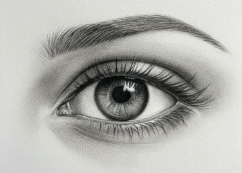
5. Zoom In. Way, Way In.
We’re programmed to paint the whole face. But what if the whole story is in a fragment? This idea is about amplifying the overlooked details. Get close. Paint just the curve of an eye and the crow’s feet beside it. Paint a mouth with a chipped tooth and a smudge of lipstick. Paint hands covering a face. Focus on the texture of stubble, the blend of lipstick, the pattern of freckles across a nose. This approach is deeply intimate. It forces you to see the anatomy not as a diagram, but as a landscape. You can marinate in the texture, spend time on a single stroke that defines a facial curve. It turns a portrait into an abstraction of human details, which is often far more powerful. My tip: Use a smaller canvas for this. A powerful, tightly cropped image on a small board can have more impact than a full figure on a giant canvas. It’s a perfect project for a quiet afternoon.

More Creative Portrait Painting Ideas Gallery for Inspiration


Conclusion
I’ll let you in on a secret I’m still figuring out: no one creates their best work from a place of pressure. They create it from a place of curiosity, much like a Rembrandt artist. These creative portrait painting ideas aren’t a checklist. They’re invitations. Invitations to mess up, to see differently, and to find what you find interesting about a face. The next time you face that blank canvas, don’t ask, “How do I make this perfect?” Ask, “What can I discover today?” Then just start. That’s the only thing that ever works.
FAQs
Q: How do I choose the best medium for creative portrait painting ideas?
A: Choosing a medium—oil painting, crayon, watercolor, acrylic or mixed media—depends on the texture and finish you want, how you like to paint, and the portraiture techniques you want to explore; oil painting offers rich skin tones and glazing for Rembrandt-like depth, while crayon or pastel gives immediacy and a tactile touch that can inspire new ideas quickly.
Q: Where can I find portrait inspiration if I’m stuck for new ideas?
A: Build a pinterest board with diverse references, study photography and classical portraiture, listen to art podcasts for interviews with full-time artists, and collect original photos or prompts that spark compositions—mixing sources like old masters, street photography, and contemporary portrait inspiration often leads to unexpected creative directions.
Q: How can I use photography effectively as a reference without losing artistic interpretation?
A: Use an original photo to capture pose and lighting, then use it as a starting point, altering colors, background, or expression to push the idea; practice translating photographic detail into painterly brushwork, exaggerating or simplifying to keep the work artistic rather than a photo copy.
Q: What are simple steps to improve painting realistic skin tones?
A: Start with a step-by-step approach: block in local values, mix a base skin tone from primary pigments, add warm and cool variations for shadow and highlight, consider undertones from the original photo and adjust with glazes in oil painting or thin layers in acrylic to achieve natural depth and believable skin tones.
Q: How do I create dynamic poses and compositions for portraits?
A: Experiment with unconventional poses and angles, use gesture sketches from photography or life to capture movement, change the crop or pose in thumbnails to find tension and balance, and combine a strong pose with expressive touch or mark-making to take a portrait to the next level.


