Matching Paper Texture To Intended Markmaking
Cold-pressed watercolor paper gives granulation and softened edges without swallowing pigment. Choose hot-pressed paper when your plan depends on crisp pen lines, tiny botanical details, or smooth glazing.
Rough paper suits dry-brush marks, broken color, and textured washes, though small shapes lose clean borders across its peaks. A 300 gsm sheet handles generous water with less buckling than lighter stock, while cotton fibers support lifting and repeated layers.
Test each pigment on a scrap because staining colors resist lifting and granulating colors settle into paper valleys. Your brush choice should match the surface too, and remembering the many Ways to Use Watercolor helps you pair them wisely: a mop spreads water across rough fibers, while a round brush keeps marks controlled.
Keep hot-pressed sheets for detail work and rough sheets for texture, so the paper supports the mark instead of competing with it.
Planning White Space Before Applying Pigment
Reserve the brightest highlights by leaving paper untouched, since watercolor white usually comes from the sheet itself. Lightly circle those areas on a thumbnail or use a pale pencil mark before pigment reaches them. Use masking fluid for narrow highlights, whiskers, or small gaps inside dark passages, then remove it only after the surrounding wash dries fully.
Keep a clean border around focal shapes so adjacent washes do not creep into every pale area. White space needs different sizes and shapes, because identical gaps make a painting feel stiff and evenly divided. Reserve larger untouched zones for calm areas, while scattered pinpoints keep attention near fine details.
Check the plan under a cool lamp before painting, as warm room light often makes pale paper look darker than it is. Exploring Ways to Use Watercolor under steady light prevents accidental tonal mistakes, which proves why planning remains essential.
1. Wet on Wet Watercolor Technique for Soft Color Bleeds
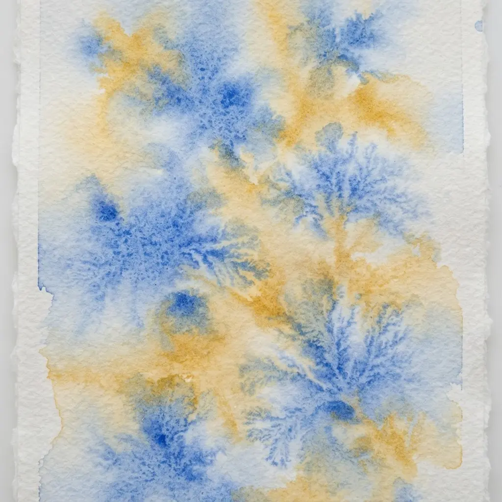
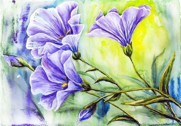
Ever wondered how soft skies and gentle color bleeds come together without hard outlines? Start with damp paper prepared with clean water until the surface looks slightly glossy, with no puddles. Load a round or mop brush with fluid paint, touch it to the paper, then place a neighboring shade beside it.
Blue beside green or yellow beside orange creates a smooth transition as the pigments spread and meet. I love this technique because the water guides each color into natural, airy blends. Watch the moisture closely, and remember that Ways to Use Watercolor always depend on timing.
Soaking wet paper sends pigment outward quickly, while a damp surface gives you more control and almost-dry paper creates firmer edges. Tilt the sheet gently to guide a wash, then leave it still until fully dry.
Keep two water containers nearby, use a paper towel to lift excess moisture, and avoid scrubbing the same spot. Understanding Ways to Use Watercolor in damp conditions prevents muddy washes. Dirty water dulls fresh color, while too much paint or water leads to muddy blooms. Test the surface on scrap paper first, then enjoy soft skies, reflections, florals, sunsets, and atmospheric backgrounds with a relaxed touch.
2. Wet on Dry Watercolor Technique for Crisp Edges
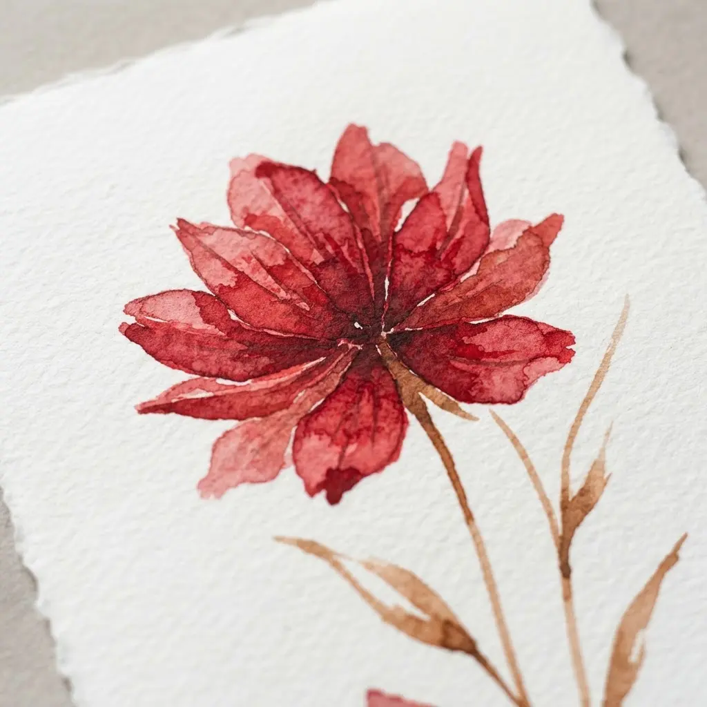
This technique gives your Essential watercolor painting tips shapes and edges without losing the soft glow of transparent paint. I love using it for leaves, window frames, petals, and small architectural details, where a controlled outline makes each form easy to read.
Start only after the paper or earlier layer is fully dry, then load a pointed brush with diluted pigment and apply deliberate strokes. Wait for a fully dry surface before you begin, since even a little moisture softens the edge.
Test the paint on scrap paper first to check its flow and strength. Keep the brush moist enough to release color, but avoid flooding the paper, since excess water often creates blooms. Isn’t it satisfying to see a crisp shadow or fine border appear exactly where you placed it?
Use a light touch and avoid brushing over one spot repeatedly, since extra strokes disturb lower layers and create uneven patches. Let each shape dry before adding nearby details, especially while layering transparent color. This is my go-to approach whenever a painting needs structure, fine lines, or sharply defined shadows.
3. Watercolor Glazing and Layering Method for Luminous Depth
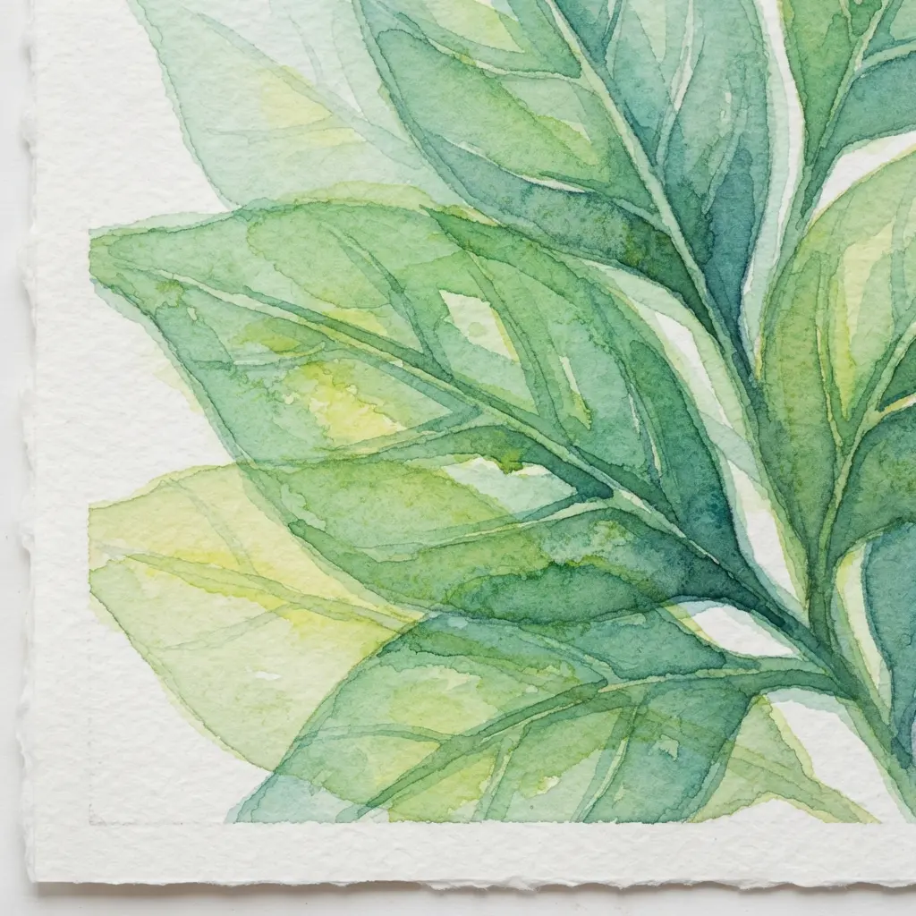
This is one of my favorite watercolor methods because pale washes slowly turn into rich, glowing color. Start by saving the lightest areas for highlights, then lay down a diluted first wash over the larger shapes. Let the paper dry fully before adding another transparent layer, or the earlier color might lift and turn muddy.
Build the middle values with curved strokes for rounded forms, horizontal strokes for flat surfaces, or vertical strokes for trunks and buildings. Add smaller glazes as the painting develops, leaving parts of each underwash visible. A warm yellow beneath transparent red creates orange, while a golden layer beneath blue helps form richer green.
Sound complicated? It is not, though patience matters. Reserve the deepest shadows for the end, using cool violet or blue in selected areas and a few crisp accents near overlaps. Trying these Ways to Use Watercolor reveals deeper luminosity.
Fewer layers in the background keep atmospheric depth soft, while extra contrast near the focal point guides the eye. I love how this method keeps the paper’s natural light shining through. Pro tip: test each pigment on scrap paper first, then enjoy those luminous color shifts.
4. Dry Brush Watercolor Texture Application for Broken Marks
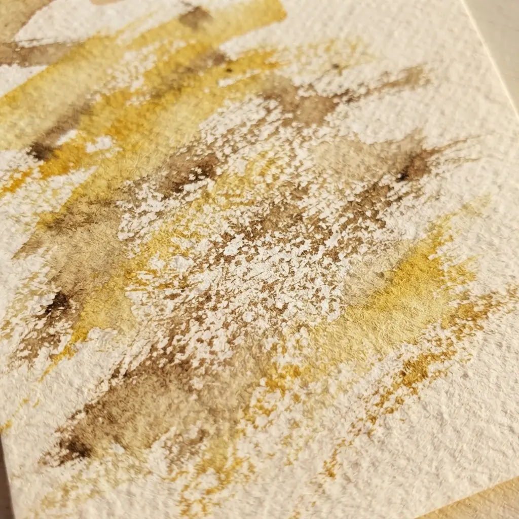
Rough bark, weathered wood, and dry grass take on a broken, scratchy surface, with tiny flecks of white paper showing between the pigment. Isn’t it satisfying when a few loose strokes suggest so much texture?
Load a small stiff round or flat brush with concentrated watercolor, then blot away most moisture on a paper towel. Hold it low and drag lightly across textured watercolor paper, letting separated bristles skip over the grain instead of pressing into a solid line. Vary the direction, length, spacing, and pressure so the marks feel natural rather than stamped.
I love using this pass over a dry underlayer, especially along stone edges or an aged wall. Dry brush works because irregular pigment deposits and exposed paper create quick visual clues for rough surfaces without drawing every detail. Keep some areas untouched, and wait until the first layer dries before adding darker strokes.
Too much water creates a smooth wash, while too little leaves weak dusty marks. Trust me, a light touch gives the texture more life. Exploring Ways to Use Watercolor in this textured manner builds confidence quickly.
5. Salt Granulation Watercolor Texture Effect for Speckled Surfaces

Salt does nothing on dry paint, and this is where many first attempts go wrong. It needs a wet surface so the grains draw moisture and pigment into pale centers with darker edges. Brush clean water across cold-pressed paper until it looks glossy, then add a rich, fairly dark color without leaving puddles. Sprinkle a small amount of fine salt over the wash, leave it untouched until fully dry, then brush away the grains gently.
Ever tried this before? I love this technique for sand, stone, snow, rough walls, and foliage because each mark arrives with a natural variation. Exploring Ways to Use Watercolor with salt expands your textural vocabulary.
Fine salt leaves tiny speckles, while coarse sea salt forms larger starburst shapes and stronger texture. Test each pigment on scrap paper first, since some colors form crisp blooms while others granulate softly. Add dry-brush marks, small splatters, or a light glaze after cleanup if the surface needs more depth or unity.
Keep the salt layer light, especially in humid weather, since excess grains create a crowded pattern and attract moisture. The finished surface feels organic without painting every speck by hand, and I always enjoy seeing the pattern appear as the paper dries.
6. Plastic Wrap Watercolor Impression Technique for Organic Shapes
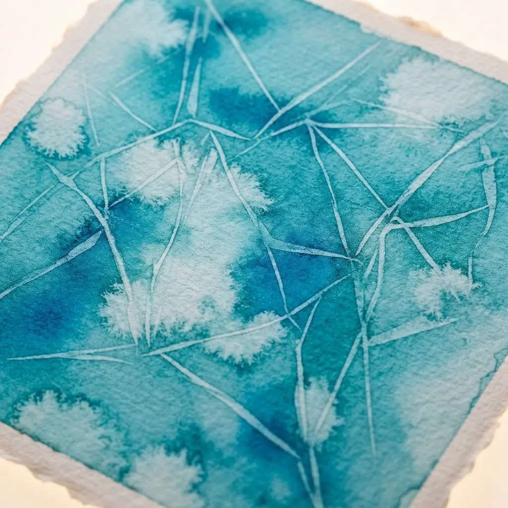
Lightly sketch a leaf, petal, cloud, stone, or loose abstract shape on watercolor paper, then fill it with a generous wash of two related colors. Place clear plastic wrap over the wet paint while it still glistens, leaving gentle wrinkles and folds across the surface. Press the wrap softly with your fingertips, but avoid sliding it around, since too much movement muddles the colors.
Ever tried this before? The drying paint gathers around each ridge, creating marbled veins and crystalline marks without tedious brushwork. Keep the wrap in place until the paper feels dry, then peel it away slowly. More water gives soft, flowing texture, while a lighter wash gives sharper impressions, so test both on scrap paper first.
I love leaving part of a leaf or stone smooth, then adding a few veins with a fine brush, colored pencil, or waterproof pen. Erase pencil lines only after the page dries fully, and enjoy the surprise of each organic texture. Finding more Ways to Use Watercolor like this brings fresh energy to simple studies.
7. Negative Painting Watercolor Background Approach for Clear Silhouettes
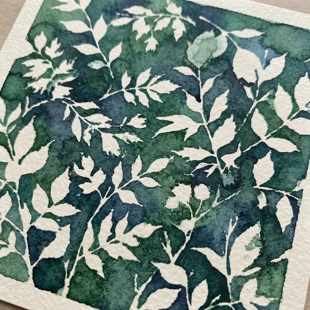
Ever wondered how a pale figure gets such a clean shape without a dark outline? Negative painting creates the silhouette by coloring the space around it. Start with a light pencil outline, keeping fingers, leaves, ears, or loose hair strands easy to recognize. Leave the subject white or add a pale wash, then paint the surrounding shapes instead.
Work outward with a larger brush, then switch to a small brush near important edges. Discovering Ways to Use Watercolor negatively builds stronger compositions. Let each wash dry before adding another layer. Place deeper indigo, violet, or gray beside focal contours, while lighter washes farther away add gentle depth.
Overlapping background shapes help separate limbs and small forms without drawing a heavy border. I love this approach because the subject feels connected to its setting, while the background gains depth and interest. Keep quieter areas light, preserve a few white spaces, and check your painting from a distance or through narrowed eyes. Strong value contrast keeps the silhouette readable. Trust me, seeing those crisp edges appear feels so satisfying.
8. Watercolor Paint Lifting Removal Method for Highlights
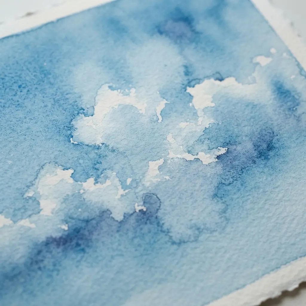
Paint lifting gives you a second chance to place light areas after the first wash has dried. I love this method because a small, careful touch brings back highlights without covering the surrounding color. Sound complicated? It’s not. Start with clean water and a slightly wet soft watercolor brush, then touch the highlight gently.
Wait a few seconds for the pigment to soften, then lift it with a cotton swab for tiny marks, damp tissue for broad light patches, or a sponge for texture. Blot the moisture with a clean paper towel and let the paper dry before repeating. A nearly dry brush gives you sharper control, while a damp tool leaves softer edges.
Use less water than you think, since flooding the area spreads pigment and blurs the shape. Rough or cold-pressed paper often releases color more readily than smooth paper, while staining pigments tend to hold fast. Test each color on scrap paper first, and avoid scrubbing, which damages the paper surface.
Trust me on this one: gradual lifting keeps the painting fresh and makes every highlight feel intentional. One of the most practical Ways to Use Watercolor involves this very step.
9. Wax Resist Watercolor Pattern Creation for White Lines
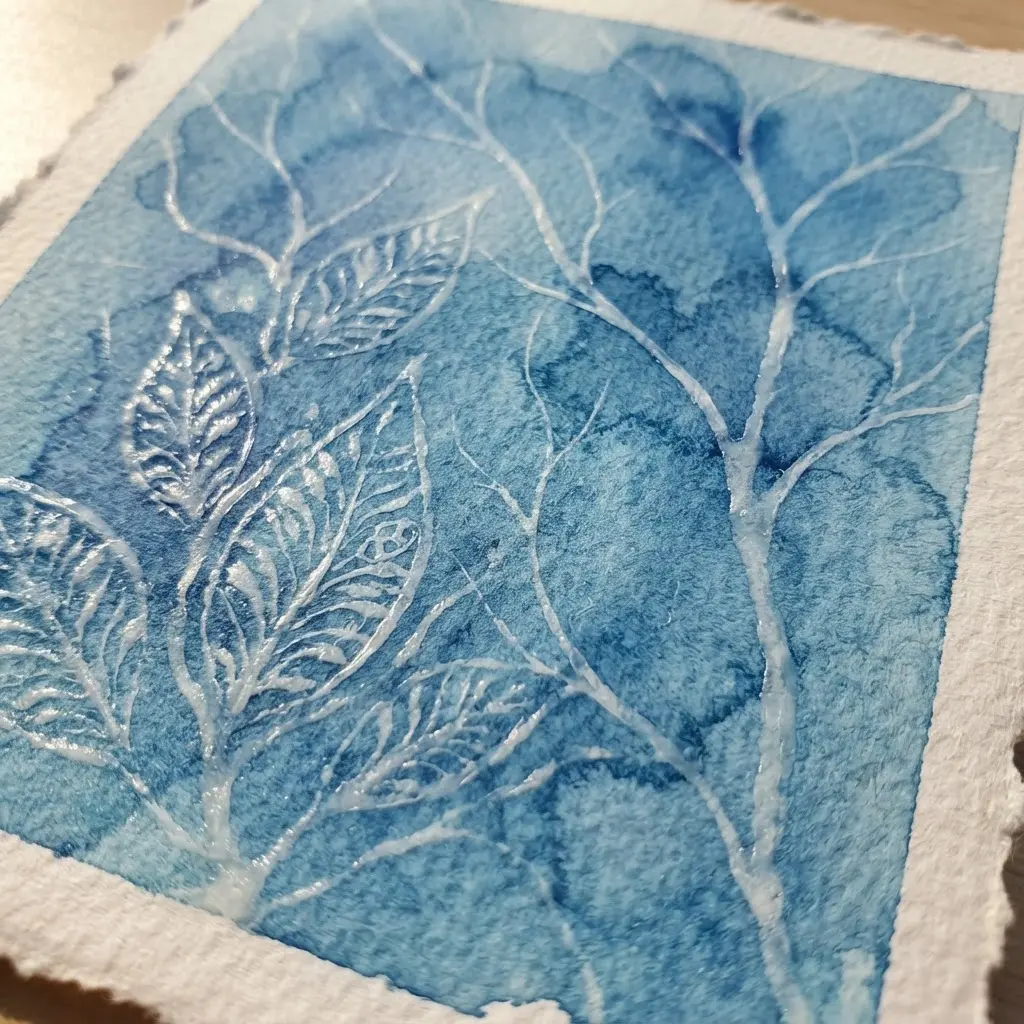
I love this method because a plain sheet suddenly reveals clean white lines beneath the paint. It feels playful, yet the result looks neat enough for borders, waves, spirals, leaves, flowers, stars, or simple geometric shapes. Is there anything more satisfying than watching a hidden pattern appear?
Lightly sketch your design on watercolor paper, then trace it with a white crayon, candle, or beeswax. Press firmly enough to leave a clear wax layer, using a pointed tool for thin details and lighter pressure for softer line changes. Keep the wax in place before adding any paint.
Brush a diluted watercolor wash across the full surface, allowing color to flow over the paper while the waxed marks stay white. Add a second color after the first layer dries to increase contrast and give the pattern more presence. I love how varied pressure produces lines with a natural, hand-drawn feel.
Let the painting dry fully before gently wiping away excess wax with a paper towel. Too little pressure creates faint lines, while wiping early might disturb damp paint. Try a repeating border first, then enjoy the fresh contrast in your finished watercolor. Adding wax resist to your Ways to Use Watercolor expands your toolkit.
10. Controlled Gradient Watercolor Wash Blending for Smooth Transitions
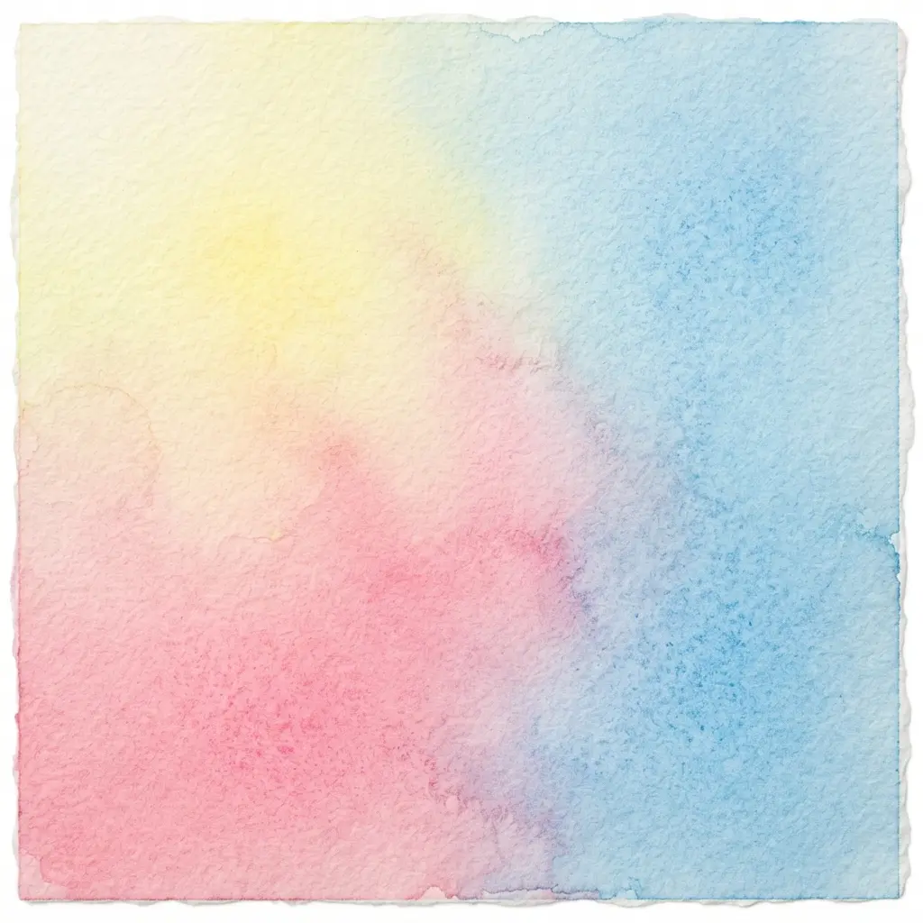
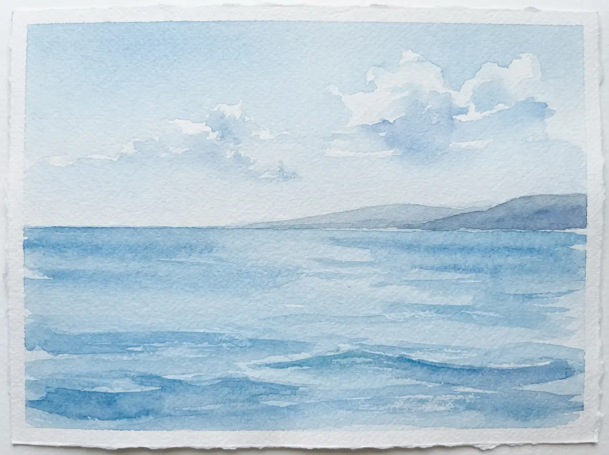
A finished gradient looks calm and even, moving from a deep pool of pigment into a pale glow with no stripes or sudden edges. Sound complicated? It is not. Mix enough paint for the whole area, load a large watercolor brush, and lay horizontal strokes from dark to light while each lower edge stays moist.
Add a little more clean water with every stroke, overlapping before the previous edge dries. For a two-color gradient, keep both sides equally wet, rinse between colors, and soften the center with a clean, damp brush. Mastering Ways to Use Watercolor here gives you smoother results every time.
This steady moisture creates even value changes for skies, rounded forms, soft shadows, and atmospheric backgrounds, and I love how peaceful the finished wash feels. Pro tip: keep the paper flat, blot excess water, and stop brushing once the transition looks smooth, since touching a half-dry wash often causes blooms and tide marks.
Photographing Finished Paintings Without Surface Glare
Photograph watercolor paintings beside a large window, not directly under a ceiling lamp, to reduce glare across glossy pigments. A phone or camera should face the paper straight on, with the lens centered at the painting’s midpoint to prevent slanted edges. A tripod keeps framing steady while a polarizing filter cuts reflections from wet-looking passages and glass.
Turn off flash, since its small hard light creates a bright hotspot and changes the apparent color temperature. Use a neutral gray card beside the painting for a more reliable white balance, then crop without trimming the paper edge, which shows scale. Keep the original file and compare the photograph with the painting under the same daylight before adjusting exposure.
Matte surfaces photograph evenly compared with glossy varnish, while side lighting reveals texture. Reviewing different Ways to Use Watercolor includes sharing your work well, and proper lighting preserves your effort.
Conclusion
So, how was your creative session? Look at the marks, edges, blooms, and lifted areas you made. Each one shows you paid attention to water, paper, and timing, and those choices are real skill right there. Ways to Use Watercolor becomes more personal when you stop chasing perfect control and let each test teach you something.
Keep a small page of swatches beside your paints, with notes about paper moisture and drying time. For your next project, choose one subject, such as a leaf, cup, or small sky, and use two techniques from this list together. I still find the best progress comes from returning to a familiar method with one new adjustment.
Let us keep the results, including the uneven ones, because they show how your hand is growing. Pick your favorite technique, prepare one small study, and give yourself room to see where it leads next. Practicing these Ways to Use Watercolor daily builds lasting confidence.
FAQs
Q: Which paper works best for watercolor techniques?
A: Use 300gsm cold-press watercolor paper for washes, lifting, and layered work. Its weight reduces buckling, while the tooth holds pigment and supports varied brush marks.
Q: How do I know if watercolor paper is damp or wet?
A: Damp paper looks softly reflective without holding visible puddles. Wet paper has a clear sheen and lets paint spread quickly across the surface.
Q: Why does salt create patterns in watercolor paint?
A: Salt draws moisture toward its crystals as the wash dries. Pigment gathers around those spots, leaving pale starbursts and speckled marks.
Q: How do I lift watercolor paint for highlights?
A: Blot a damp brush or clean tissue on a partially dry wash. Press gently, lift the color, and rinse the tool between each mark.
Q: How many watercolor layers should I use?
A: Start with two or three thin layers for transparent color and gradual depth. Let each layer dry fully before adding the next one.