Beyond the List: The Art and Anatomy of Skateboard Design
Before you dive into a gallery of visual inspiration, let’s build a foundational understanding of what skateboard design truly is. It’s the dynamic intersection of technical engineering and pure artistic expression, where the deck’s shape, concave, and wheelbase dictate performance, while the graphic transforms it into a moving canvas. While most content focuses on surface-level style lists, we’re exploring the deeper principles that bridge functional specifications with creative intent, moving from basic inspiration to informed creation.
Your Canvas: The Deck as a Three-Dimensional Artwork
Forget a flat surface; a skateboard deck is a curved, concave sculpture built for motion. This unique three-dimensional form fundamentally influences any graphic you apply. A successful design doesn’t just sit on the board—it interacts with its contours, flows with its lines, and withstands the grit of the ride. From the functional geometry that controls your tricks to the visual balance that defines its style, every element is a deliberate choice in this fusion of sport and art.
1. Psychedelic Liquid Marble Skateboard Design Styles

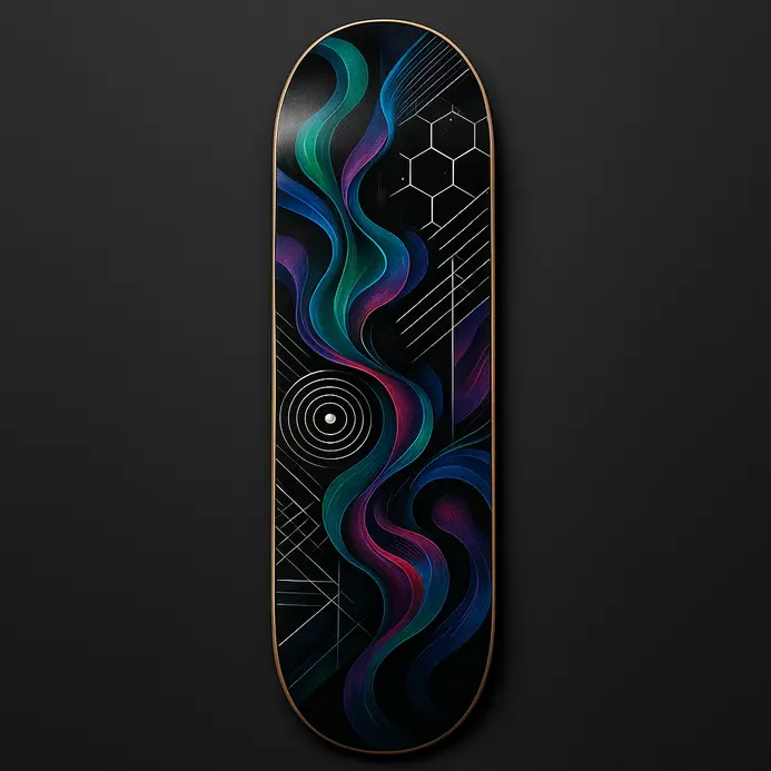
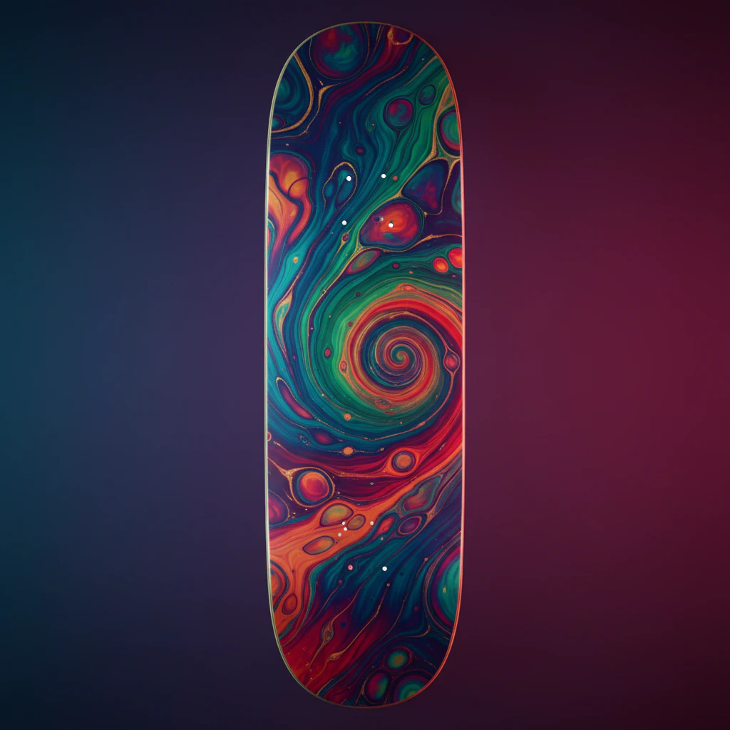
Picture your board as a swirling portal to another dimension, where colors melt and flow in ways you’ve only seen in your wildest dreams. Psychedelic liquid marble is less of a graphic and more of an experience, blending deep, glossy liquid swirls with eye-popping neon colors. Each deck becomes a one-of-a-kind piece of moving art, with patterns that look like cosmic nebulae or living, pulsing organisms. We love this style because it turns a simple skateboard into a personal statement of vibrant, unrestrained creativity. Want to make yours pop even more? Try using a deep black base with metallic flake accents to make those electric pinks and blues look like they’re floating in space. It’s a killer way to explore unique skateboard design ideas that truly stand out at the park.
2. Geometric Optical Illusion Deck Graphic Ideas
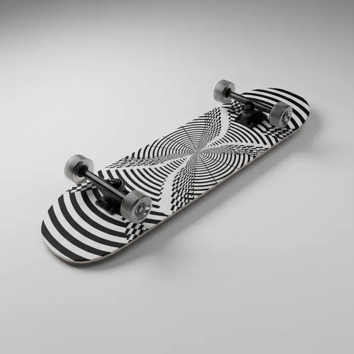
Have you ever seen a skateboard deck that seems to warp reality right under your feet? That’s the magic of geometric optical illusion graphics. We’re diving into designs that use precise patterns and high-contrast colors to create mind-bending effects. Imagine a deck with a black and white tessellation that makes the board look like it’s folding in on itself, or a vibrant color scheme with metallic inks that catch the light just right. It’s like having a piece of art you can ride. People are drawn to this style because it combines the rebellious spirit of skateboarding with the intellectual kick of optical art, making it a standout choice for creative skateboard design ideas. Plus, it makes your setup stand out in a sea of standard graphics. A pro tip: when sketching your ideas, start with simple illusions like the Kanizsa triangle or figure-ground reversals—they’re easier to scale and look awesome on the curved surface of a deck.
3. Minimalist Line Art Skateboard Examples
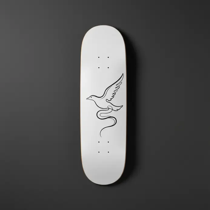
Let’s talk about the ultimate clean look: a single, perfect line snaking across your deck. This style is all about saying more with less, creating a board that feels modern, intentional, and seriously iconic. We’re talking about clean lines, smart use of negative space, and one powerful idea that hits you instantly. It strips away all the noise so the core concept can shine through, and honestly, it makes your setup look incredibly sharp. You’ll see this approach everywhere from a single continuous line drawing of a soaring bird to a stark geometric pattern that plays with your eyes. Why does it work so well? The simplicity forces the artwork to be conceptually strong, and that clarity is what makes it so memorable and easy to connect with. A quick tip for pulling this off yourself: try sketching your idea with a pen and not lifting it from the paper—that’s the fluid, confident energy you want to capture. If you’re new to line work, practicing some easy things to draw for beginners can build that steady hand.
4. Surrealist Dreamscape Deck Design Styles
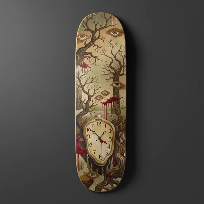
Have you ever gazed at a skateboard and felt like you were seeing into a dream? That’s the magic of surrealist dreamscape designs for your skateboard design ideas. We blend unrelated elements with dream logic, so a bird could have a lightbulb for a head or landscapes might be made of skin. It’s about tapping into the subconscious to create graphics that feel significant and mysterious. Skaters love this style because it turns their deck into a moving piece of art that sparks curiosity. Here’s a tip: if you’re stuck, start with automatic drawing – let your hand move without thinking to uncover hidden shapes. For more on drawing techniques, easy drawing ideas for beginners can help kickstart your creativity.
5. Cyberpunk Glitch Art Skateboard Graphic Examples
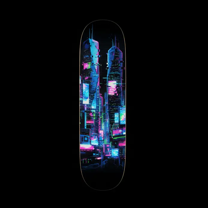
Okay, picture this: a neon-drenched, rain-slicked cityscape smeared into a beautiful, chaotic data mosh right on your deck. That’s the electric vibe of cyberpunk glitch art graphics. We’re mashing dystopian futurism with intentional digital corruption for something that feels rebellious and totally unique. Imagine a classic samurai silhouette, but parts of their armor are shattered into pixel-sorted blocks of color or a circuit board street map where the roads glitch out. It’s about taking familiar cyberpunk icons and making them look like they’re malfunctioning or being hacked. You get this awesome sense of digital decay and system failure that fits skateboarding’s counter-culture spirit perfectly. So, why does this combo work so well for our skateboard design ideas? It’s all about high-contrast, bold visuals that pop when you’re moving. The glitch effects—like chromatic aberration and scan lines—create dynamic textures that catch the eye from a distance. It tells a story without words, suggesting a world where technology is both awe-inspiring and broken. Want a pro tip? Try using a pixel sorting filter on a clean line-art character for a killer, flowing distortion effect that still reads clearly at high speed.
6. Art Nouveau Floral Deck Design Ideas
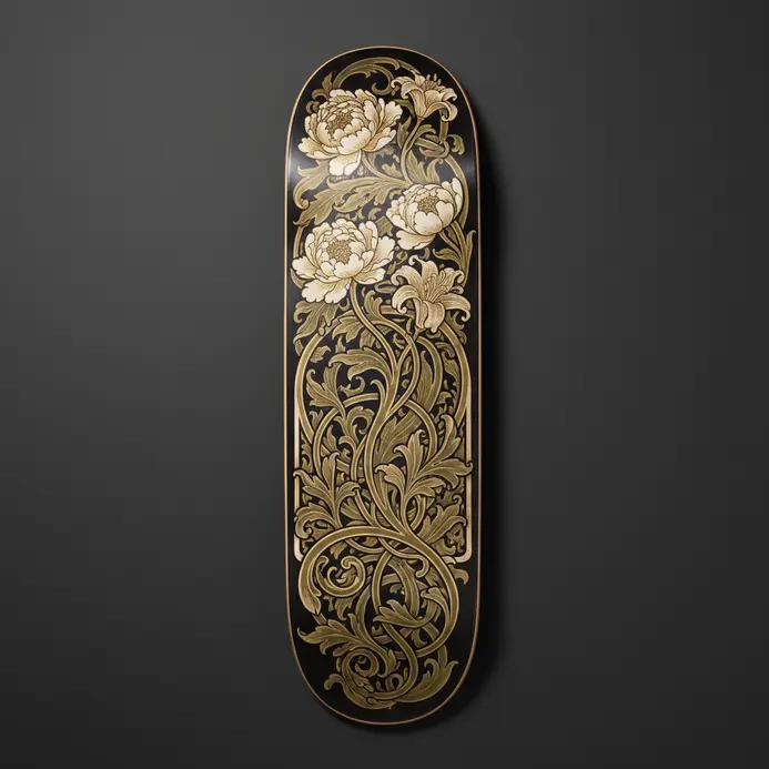
Picture this: your deck isn’t just a platform, it’s a flowing, organic masterpiece straight out of a classic art poster. We’re talking about bringing the iconic, elegant curves of Art Nouveau right to your backyard. This style is all about those gorgeous whiplash lines that mimic vines, paired with stylized florals like irises and lilies. The magic happens when the art isn’t just slapped on but is woven into the structure itself, maybe through a railing of wrought-iron tendrils or a deck border cut into soft, flowing curves. People adore this because it turns ordinary outdoor space into a personalized, artistic sanctuary that feels timeless. Want a pro tip to make it pop? Try using a two-tone wood stain on your deck boards—a dark field with lighter inlaid curves—to really make those organic patterns sing. It creates incredible visual depth without saying a word.
7. Bauhaus Geometric Skateboard Examples
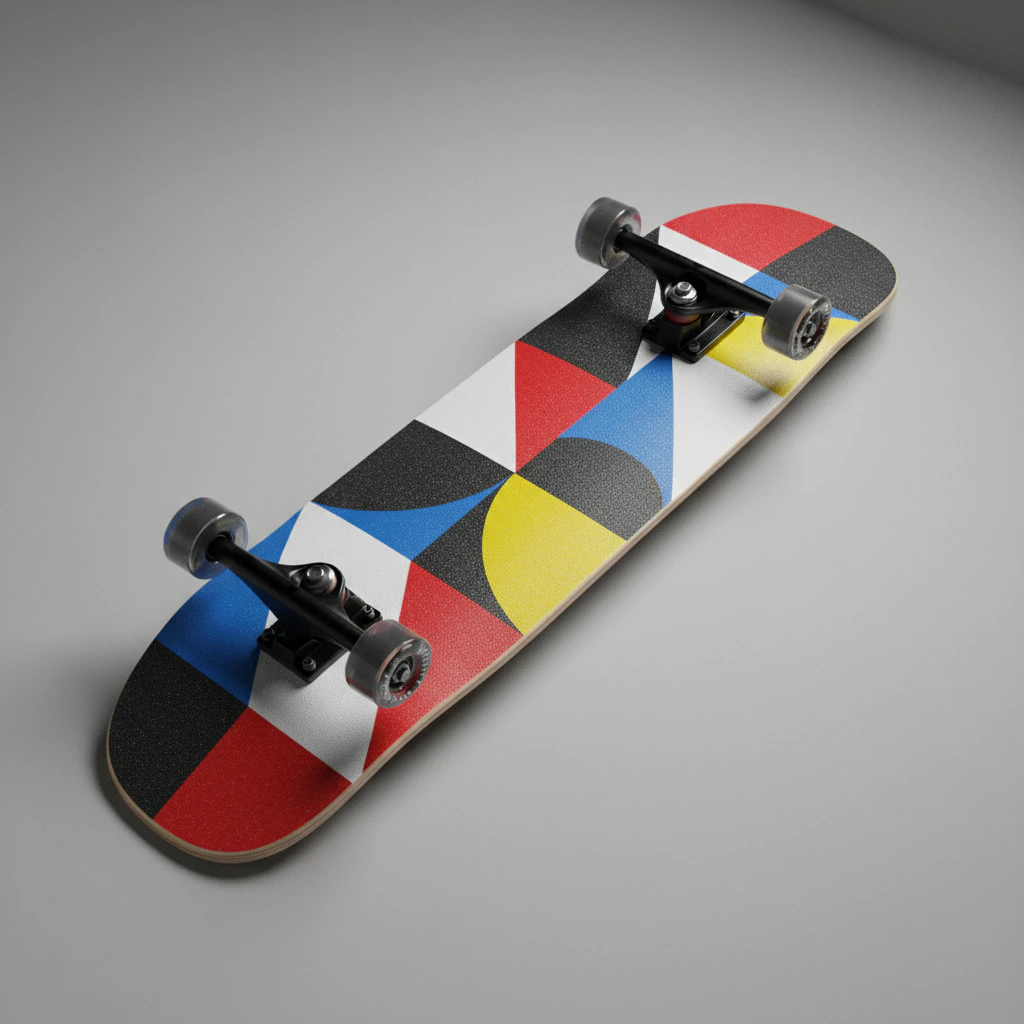
Picture your skateboard deck transformed into a moving Mondrian painting, all sharp black grids and bold blocks of red, blue, and yellow. That’s the magic of applying Bauhaus principles to your skateboard design ideas. We’re talking about treating the deck as a functional canvas for clean lines, primary colors, and dynamic, asymmetrical layouts. It strips away the noise and focuses on pure geometric impact. Why does this style work so well for us? It’s all about visual rhythm. The interaction of circles, triangles, and grids can mimic the flow and energy of skating itself. Let’s take a tip from the Bauhaus workshop: try a monochromatic design with a single, perfect circle placed off-center on a natural wood deck. This celebrates the board as a designed object and gives you a seriously sharp graphic that feels both minimal and full of intention.
8. Japanese Ukiyo-e Inspired Deck Graphic Styles

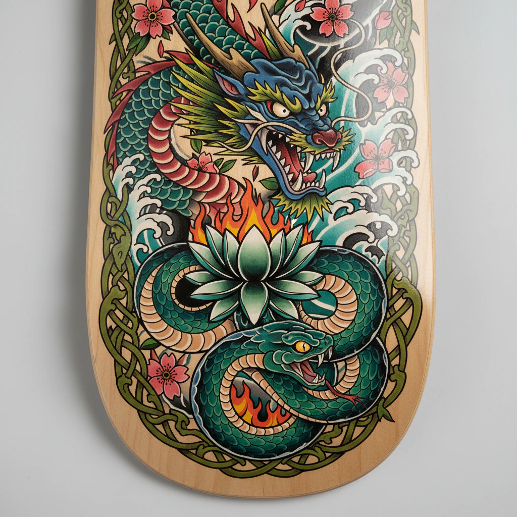
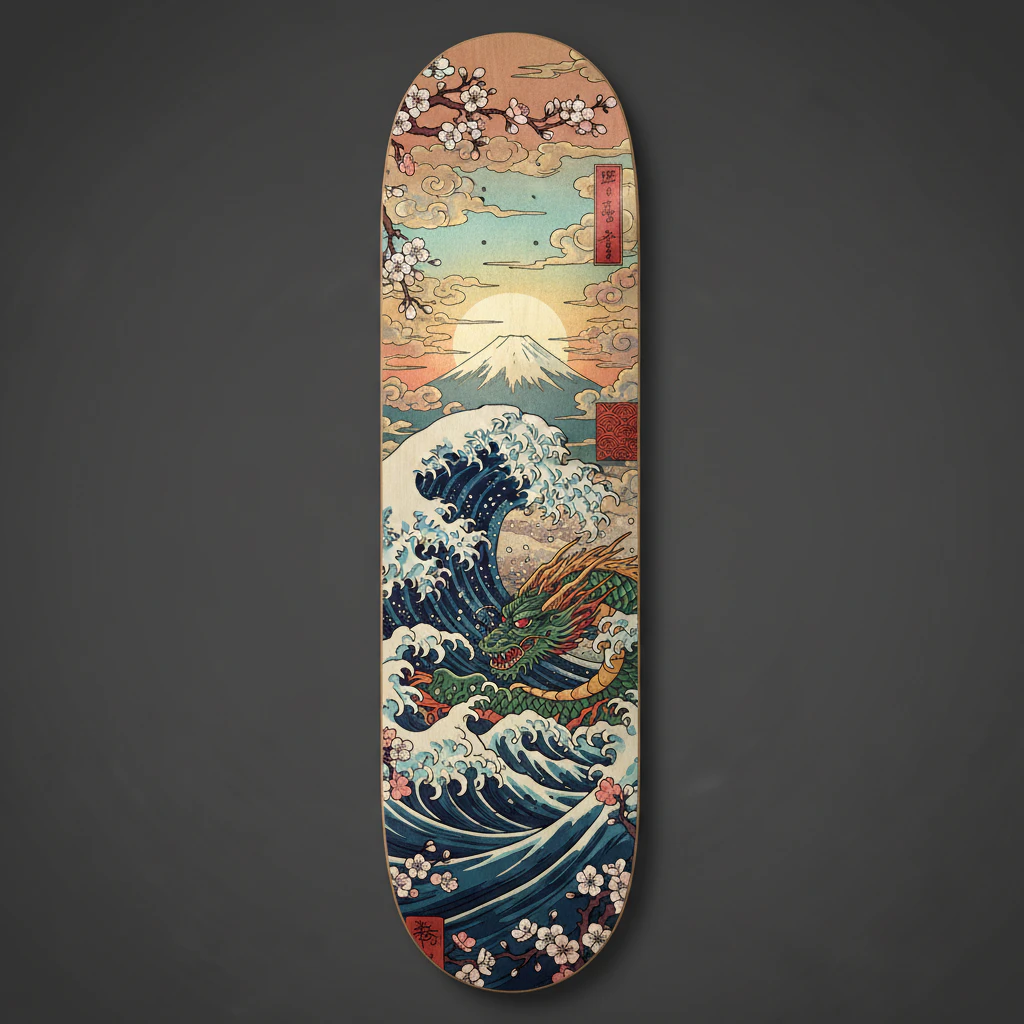
Picture this: your skateboard deck transformed with the vibrant, graphic style of a Japanese Ukiyo-e print. We’re talking about asymmetric layouts that guide the eye, combined with clean, black outlines and flat, unmodulated colors. This approach turns your board into a canvas that reflects timeless artistry, perfect for those skateboard design ideas that need a cultural twist. Why does it resonate? It offers a unique aesthetic that stands out in any skate park, merging traditional beauty with rebellious street vibes. My tip? Focus on incorporating specific patterns like seigaiha waves or karakusa scrolls to add authentic texture without cluttering the design.
9. Mexican Folk Art Skateboard Design Examples
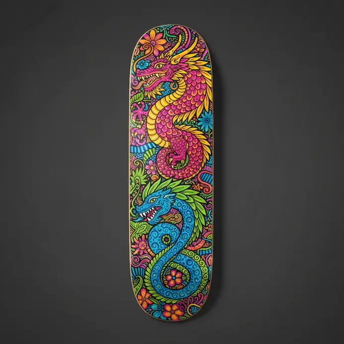
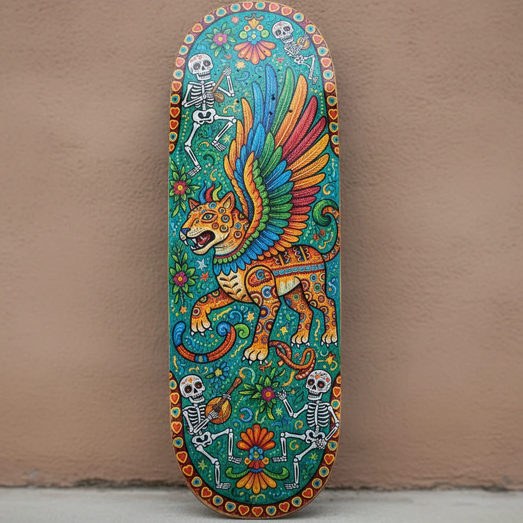
Let’s talk about turning your deck into a moving gallery of vibrant Mexican folk art. The colors and patterns are so dynamic they practically beg to be ridden. We’re looking at everything from the fantastical spirit animals of alebrijes to the geometric beauty of Talavera tilework. Why does this style work so well? The graphic, flat nature of these art forms is a perfect match for the skateboard’s shape, creating a complete, eye-catching graphic that tells a story. For a modern twist, try a minimalist alebrije outline on natural wood—it lets the art’s form shine while keeping your skateboard design ideas fresh and unique.
10. Celtic Knotwork Deck Graphic Ideas
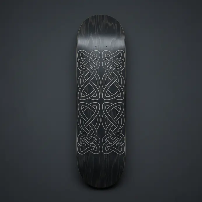
Let’s give your board a timeless, mystical vibe with designs that feel like they’re straight from an ancient manuscript. Celtic knotwork uses those endless, interwoven loops and geometric patterns to create graphics full of movement and deep meaning. Think about a bold central triskele (a triple spiral) representing mind, body, and spirit, or a border of intricate key patterns framing your deck’s nose and tail. This style isn’t just about looking cool—it tells a story of eternity and connection right under your feet. Why does this work so well for a skateboard in the context of skateboarding culture? The flowing, unbroken lines of the art mirror the fluid motion of skating itself. You can adapt classic motifs, like transforming the suit symbols from a standard deck into Celtic weapons or using knot counts to match card values for a truly custom piece. For a killer tip, try using a stark black-and-white color scheme to make those complex weaves pop with graphic clarity. It’s a sophisticated way to make your skateboard design ideas stand out in the park with something both rebellious and rooted in history.
11. Abstract Expressionist Splatter Skateboard Examples
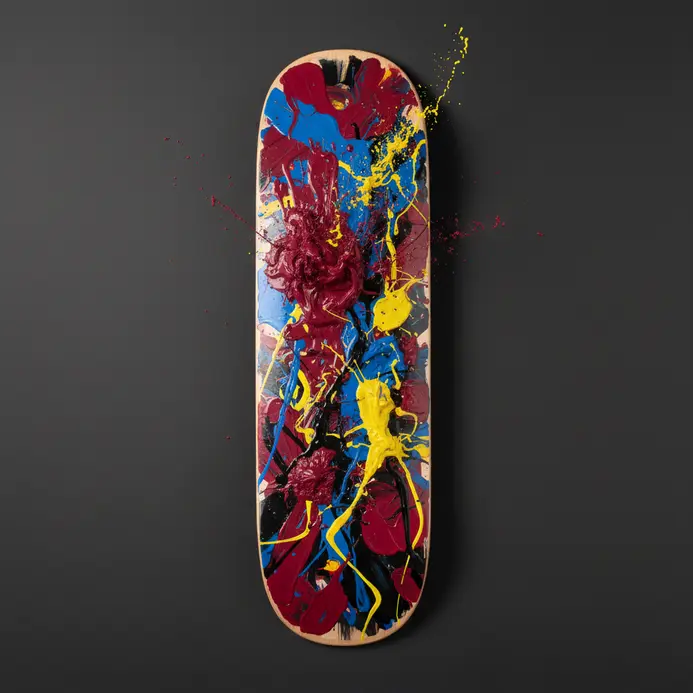
Picture this: a skateboard deck that looks like a piece of the art museum wall broke free and learned to kickflip. That’s the wild energy of Abstract Expressionist splatter designs for you. We’re taking the raw, rebellious spirit of Jackson Pollock’s drip paintings and launching it into the skate park. The deck becomes a kinetic canvas where every flick and pour of paint captures a moment of pure, physical action. It’s not just a graphic, it’s a captured explosion of motion. Why does this chaotic style work so well on a board? It translates that gestural energy from the artist’s studio directly into the skater’s ride. The overlapping drips and bold spatters feel alive, mirroring the dynamic movement of skating itself. You get a functional piece of art that reflects the culture’s independent and experimental heart. Want to try a DIY version? Start with a solid Color Field wash as your background, then go wild with contrasting flicks and fine top-layer drips for amazing depth.
12. Pointillism Stippling Deck Design Styles
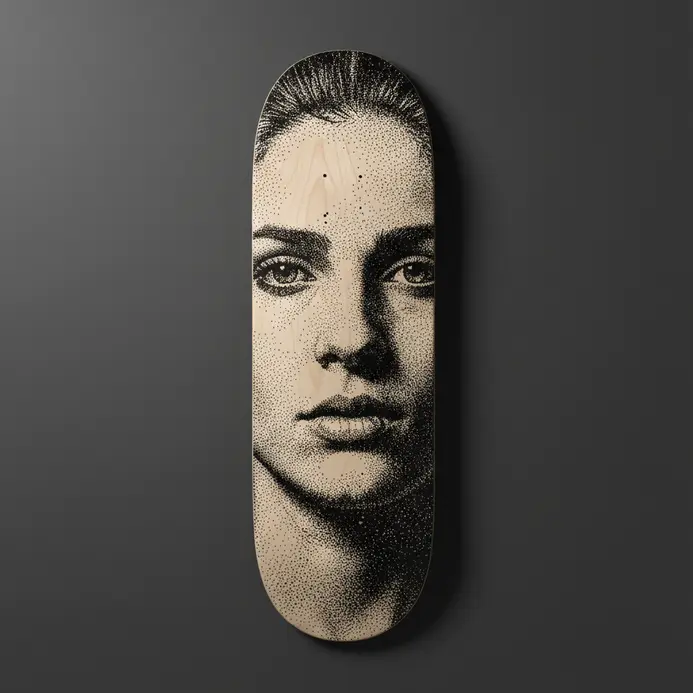
Ever look at a skateboard deck and feel like it’s humming with raw, pixelated energy? That’s the magic of pointillism and stippling styles. We’re talking about designs built entirely from thousands of tiny dots. Up close, it’s a fascinating abstract texture, but step back and those dots snap together into a powerful, luminous image. It creates this incredible sense of motion and grit that feels perfect for skating. The technique is a total game for light and shadow. Artists use the density and spacing of the dots to build smooth gradients, which is amazing for rendering smoke, skin, or celestial scenes on your board. Why does this style hit so hard? It gives your deck a handmade, almost ancient feel that stands out from flat digital prints, adding a layer of rebellious, patient artistry to your ride. For a killer variation, try a monochrome stipple design using just black dots for a super classic, high-contrast look that makes your graphic pop.
13. Mosaic Tile Pattern Skateboard Graphic Examples
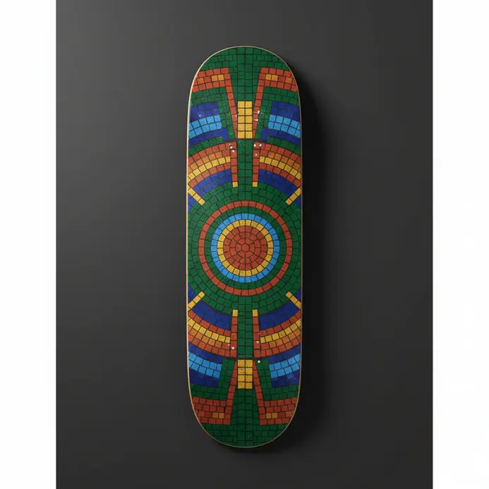
What if your skateboard looked like a piece of ancient art you just pulled from a Roman villa floor? Mosaic tile patterns make that fantasy a reality, turning your deck into a stunning geometric canvas. We are talking about graphics built from hundreds of tiny, interlocking tiles that form incredible pictures or mesmerizing optical patterns. It is a design style that feels both timeless and totally fresh on the street. You will see everything from classical mythological scenes to wild, abstract 3D cubes that play tricks on your eyes. The beauty is in the details, like the grout lines between each piece and the bold, often vibrant color palettes. This style works so well because those sharp, angular patterns naturally complement the shape of the board itself, creating a powerful visual impact whether you are rolling or resting. For a different kind of tiled art inspiration, you can check out some stunning glass painting designs that use similar color-blocking techniques. My favorite tip for skateboarders? Look for decks where the artist plays with the tile shape itself, using hexagons or triangles instead of plain squares to create a totally unique rhythm. It is a small detail that makes a huge difference and shows a next-level attention to your skateboard design ideas.
14. Biomorphic Organic Shape Deck Design Ideas
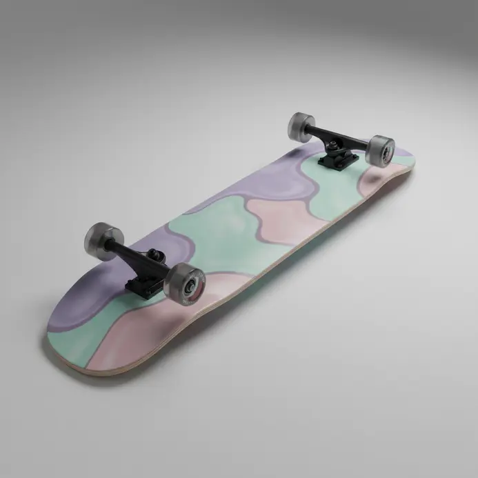
Let’s ditch the boring rectangle and let your deck flow like a river or bloom like a leaf! Biomorphic skateboard design ideas are all about pulling those smooth, irregular curves and shapes straight from nature. Think of a deck with edges that meander like a creek bed or a platform shaped like a soft, puffy cloud. It’s a total departure from sharp angles, creating a board that feels alive and integrated with the world around it. Why does this style work so well? It gives your setup a unique, artistic character that feels both modern and timeless, making your ride a true piece of rolling art. You’ve got killer options like the ‘Amoeba’ platform for a bold, sculptural look or the intricate ‘Leaf’ cluster design that zones your deck into different functional areas. The feeling is serene and exploratory, guiding your movement with its intuitive curves. A small tip? Play with your grip tape application to follow those organic lines, adding another layer of dynamic texture. Ready to make your board a natural wonder?
15. Constructivist Typography Skateboard Examples
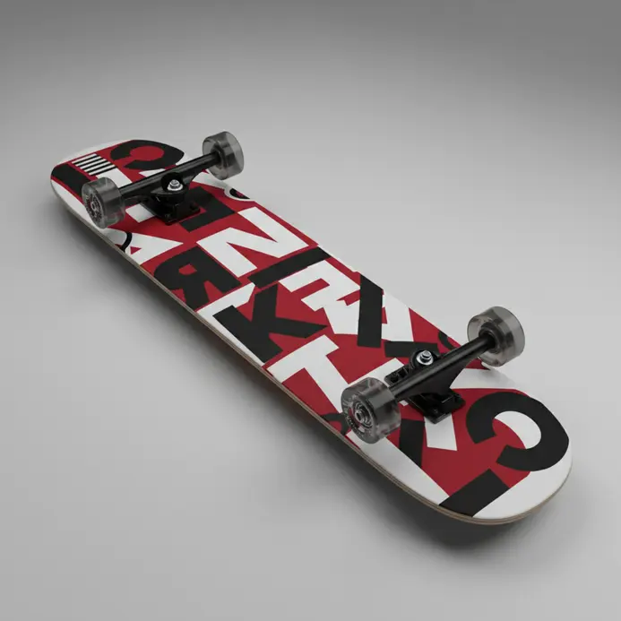
Picture a deck where the letters aren’t just a word, they’re the entire graphic structure, built from bold, red blocks and sharp diagonals. That’s the raw power of Constructivist typography in skateboard design. We’re talking about a style that treats text like architecture, using heavy sans-serif fonts, stark red, black, and white color schemes, and compositions that feel like they’re in motion. It’s a perfect marriage of early 20th-century revolutionary art and skateboarding’s own rebellious spirit, turning your board into a piece of dynamic propaganda. Why does this style work so well on a deck? The dynamic diagonals and mechanical energy of the design directly mirror the feeling of carving and pushing on your board. Brands like Supreme and Polar Skate Co. have built identities on this aesthetic, using that iconic, angled box logo or clean, graphic layouts where the typography is the hero. It’s a look that screams intention and urban utility. For a killer variation, try a design with a grainy black-and-white photo overlaid with transparent geometric shapes and a single, stenciled command. What says ‘skate’ more than a board that looks ready for a revolution?
16. Steampunk Mechanical Deck Graphic Styles

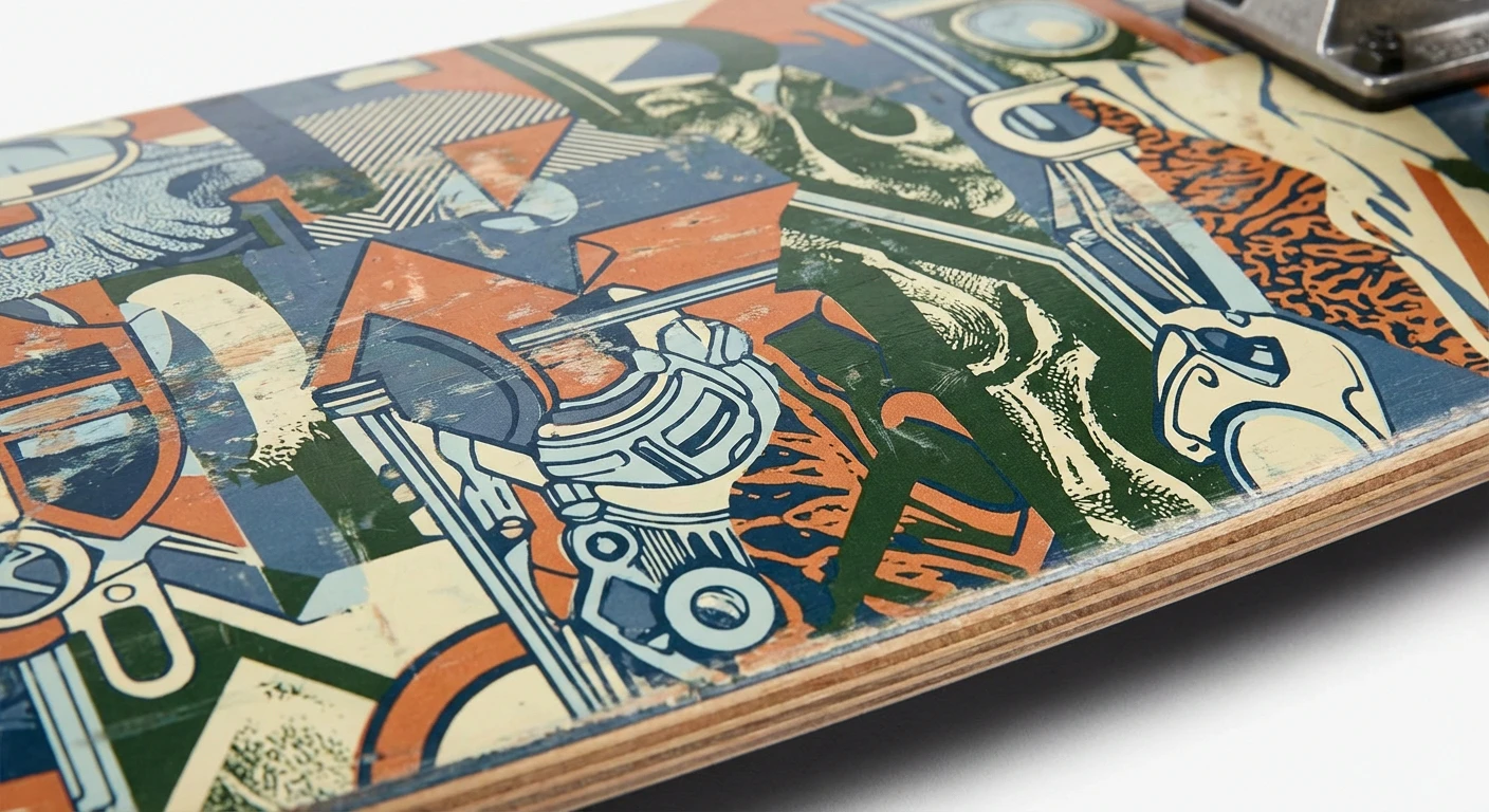
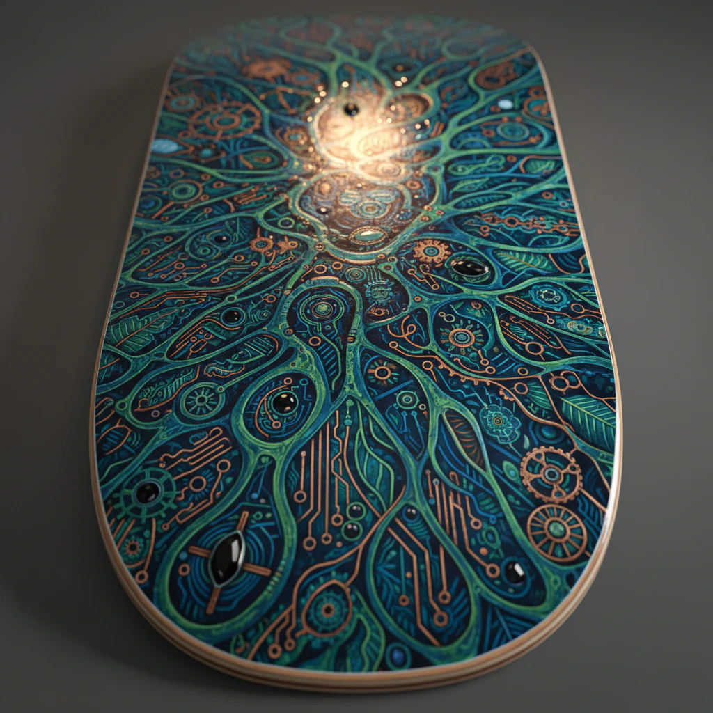
Picture your deck not just as a board, but as a piece of intricate, working machinery straight out of a Jules Verne novel. We’re talking exposed gears, weathered brass, and blueprints that look like they were drawn by a mad inventor. This style merges Victorian elegance with gritty industrial parts to create something that feels both antique and impossibly advanced. It’s perfect for anyone whose skateboard design ideas lean more towards a workshop than a gallery. The appeal is all about that rich, tactile detail. You get the warm glow of aged copper, the precise lines of technical diagrams, and the cool, functional look of interlocking cogs. Why does it work so well? It tells a story of adventure and invention every time you look down at your board. Let’s be honest, who wouldn’t want to ride a piece of functional art that looks like it could power a airship? For a killer variation, try a monochrome look with just black, white, and a single metallic foil hit. It makes all those mechanical details pop without feeling too busy. Or, weave a tiny, hidden scientific diagram into your grip tape for an extra layer of discovery. The key is balancing all that awesome complexity so your deck’s personality still shines through when you’re rolling.
17. Tribal Pattern Integration Skateboard Design Examples
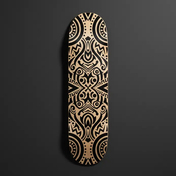
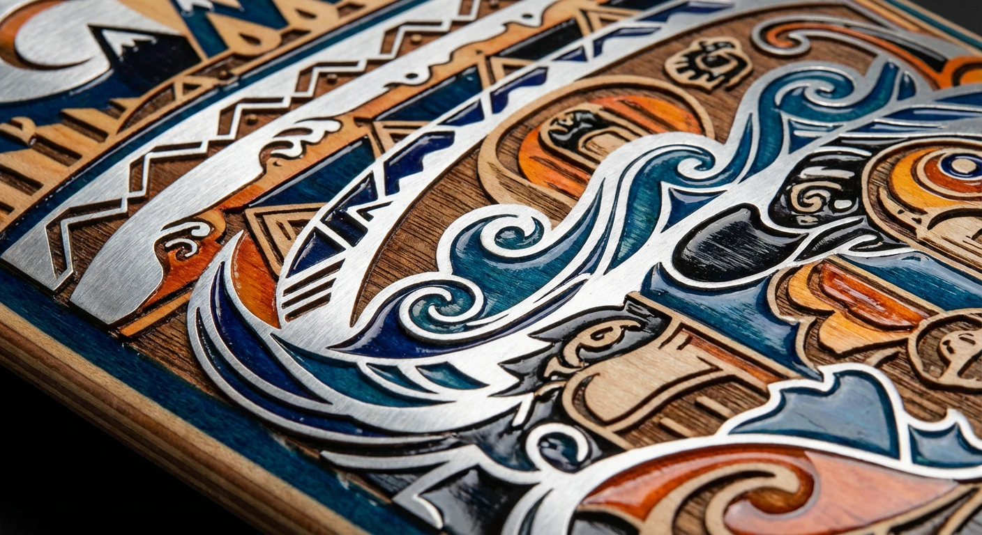
Let’s talk about one of the most visually striking skateboard design ideas out there: decks that look like they’re in motion even when they’re standing still. We’re seeing ancient patterns, like bold Māori scrollwork or intricate Navajo weaving, flow perfectly over the board’s curves. This isn’t just random art; the long, sweeping lines of tribal designs are a natural match for the dynamic shape of a skateboard. It works because the graphic creates a sense of speed and energy that feels connected to the sport’s roots in movement and rebellion. For a modern twist, look for designs that use a single, powerful Adinkra symbol in metallic ink—it makes a bold statement without overwhelming the deck’s lines.
18. Art Deco Architectural Deck Design Ideas
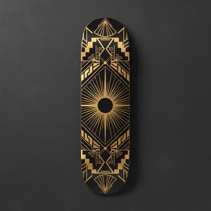
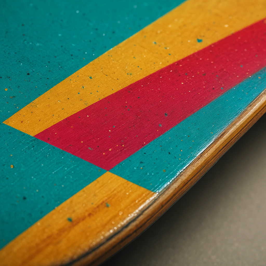
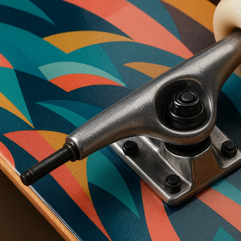
Picture this: you’re rolling through the park on a deck that looks like it was plucked from the lobby of a 1920s skyscraper. How cool is that? Art Deco architectural design brings all that geometric grandeur and streamlined elegance right under your feet. We’re talking bold chevron patterns and sharp sunburst motifs inlaid into the wood, creating a floor graphic with serious presence. It’s a style that turns your board into a moving piece of architectural history. Why does this work so well for a skateboard? The strong, symmetrical lines and high-contrast colors aren’t just stunning to look at; they create a visual rhythm that matches the dynamic flow of skating. You get a deck that feels both luxuriously crafted and perfectly built for motion. I love how these designs make a graphic feel intentional and powerful, rather than just a random splash of color. Want a pro tip? Try using a dark stained wood as your foundation and use a lighter stain or paint for those geometric inlays to make the pattern really pop.
19. Pop Art Comic Style Skateboard Examples
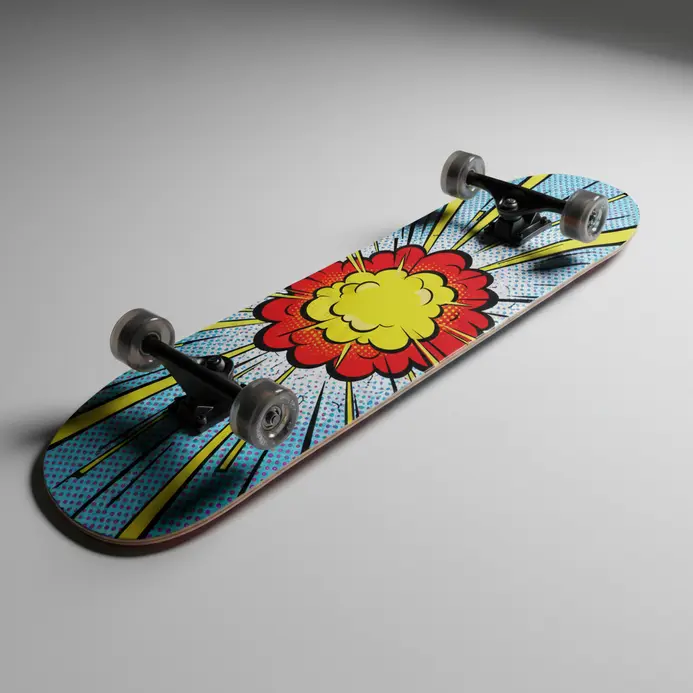
Let’s dive into a style that turns your skateboard into a moving piece of art history! Pop Art comic style decks are all about bold, graphic energy that pops off the board. We’re talking thick black outlines, those signature Ben-Day dots for shading, and a punchy primary color palette. It’s like having a classic comic panel or a Roy Lichtenstein painting right under your feet. I love how brands like Supreme have collaborated with artists to bring fine art directly into skate culture. Think of the iconic ‘Girl with Ball’ deck or explosive ‘POW!’ graphics – these designs use action lines and onomatopoeia to add dynamic movement. This style works because it’s instantly recognizable, vibrantly expressive, and perfectly captures the rebellious, street-smart spirit of both skateboarding and skateboard culture. If you’re inspired to create your own skateboard design ideas, start by sketching with bold lines and limited colors – check out some easy drawing ideas to practice those comic-inspired graphics.
20. Dada Collage Mixed Media Deck Graphic Styles
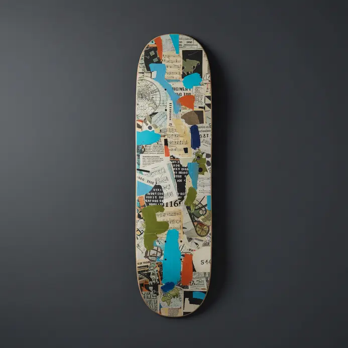
Let’s get messy and break all the rules with a deck style that feels like a punk rock art history lesson, shall we? This is all about taking the chaotic, rebellious spirit of Dada collage and turning it into a usable digital toolkit. We’re talking simulated torn paper, mismatched fonts that look cut from old magazines, and gritty texture overlays that make your graphic feel like a found object from a different era. It’s organized chaos you can actually apply to a project in seconds. Why does this wild style work so well for skateboard design ideas in skateboard culture? It captures that raw, anti-establishment energy of street culture perfectly. The whole point is to look intentionally accidental, like a collection of fragments that somehow tell a cohesive story. You get a deck full of these styles, and suddenly your board graphic has the depth and attitude of a handmade zine or a weathered concert poster. Want a quick tip? Try layering a clean vector shape with a glue stain texture and a ‘typewriter’ font effect for instant vintage rebellion.
21. Mandala Symmetry Skateboard Design Examples
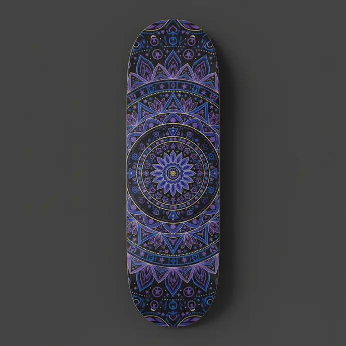
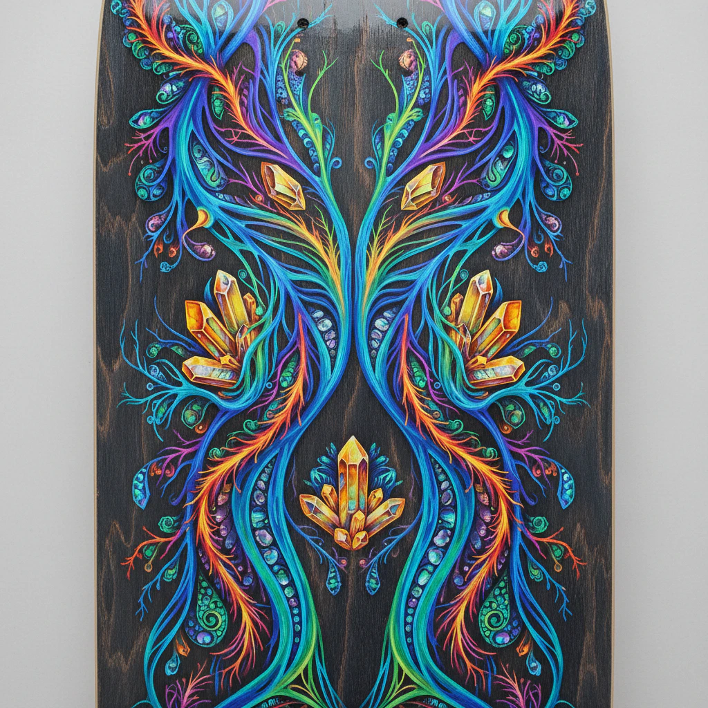
Okay, picture this: you’re rolling through the park, and your board is spinning out this hypnotic, perfectly balanced pattern with every flip. That’s the magic of a mandala deck. It’s not just a graphic, it’s a moving piece of sacred geometry that uses the board’s natural shape as its perfect frame. The symmetry creates a focal point that feels energetic and centered, which honestly mirrors the focus you need when skating. We love how these designs turn a functional object into a portable work of art. Want to see the concept in action on another creative surface? Check out these glass painting designs for a similar vibe with translucent layers. Let’s break down why this style works so well. The classic popsicle deck has those symmetrical curves from nose to tail, right, making it a favorite among skateboarders? A true radial mandala, with patterns exploding from the center, leans into that shape beautifully, showcasing skateboard art. You’ll see incredible dotwork shading creating depth or intricate floral patterns acting like ornate bookends on the nose and tail, appealing to skateboarders. Some artists even split a single mandala in half and mirror it along the board’s length, creating these epic ‘wings’ that guide your eye. It’s all about balance, and that visual harmony makes the skateboard feel alive even when it’s still, reflecting skateboard culture. Are you drawn to the detailed linework? Starting with some beautiful mandala drawing ideas for beginners is a fantastic way to practice the core patterns before scaling up to deck size.
22. Topographic Map Deck Design Ideas

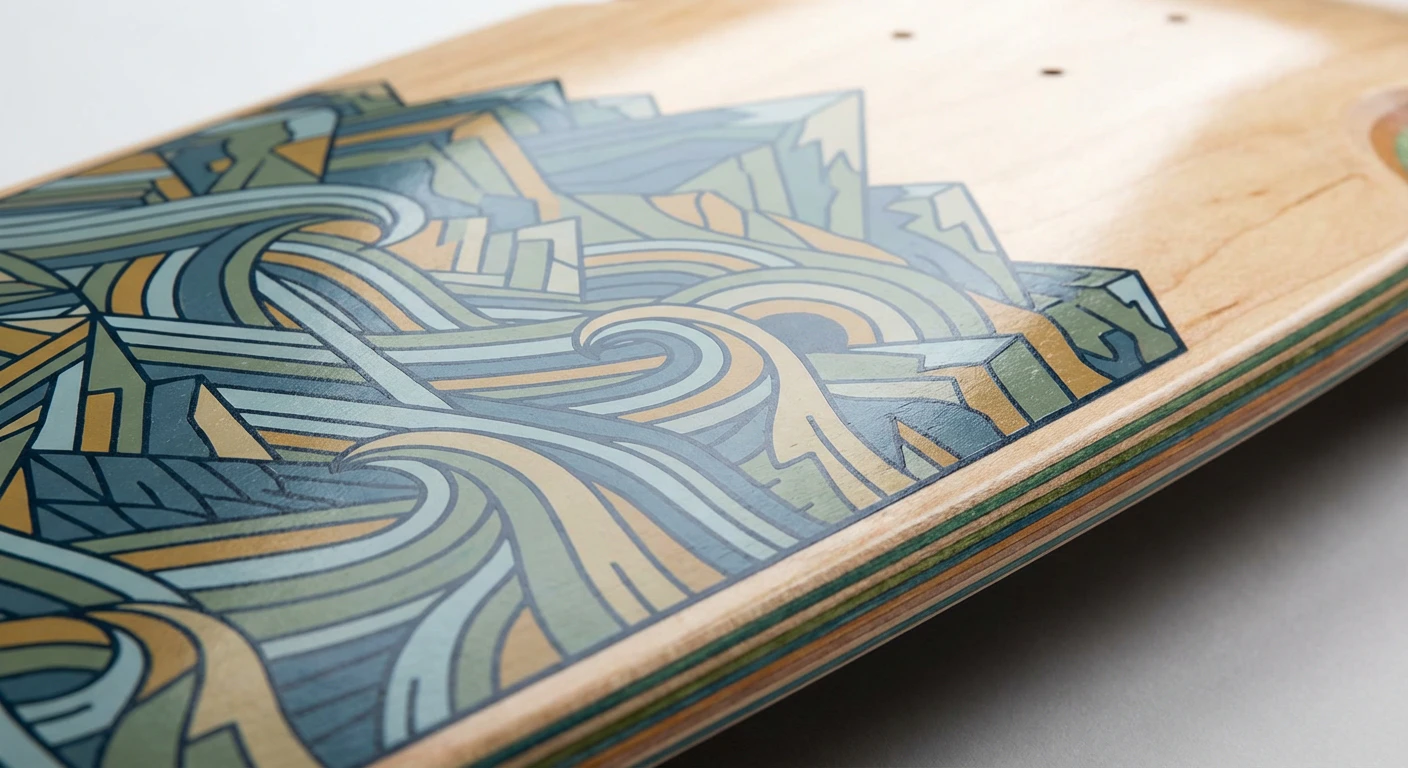
Let’s talk about turning your board into a personal, wearable piece of cartography. This is one of my favorite skateboard design ideas because it transforms your deck into a literal map of a place that means something to you. Picture the intricate contour lines of your favorite mountain or the winding path of a local river flowing right under your grip tape. It’s a fantastic way to blend art, nature, and personal story into your ride. People love this style because it’s so much more than a graphic—it’s a conversation starter and a piece of your world. A great tip is to use a laser-cut grip tape overlay to really make those elevation lines pop with clean, sharp detail.
23. Microbial Cellular Pattern Skateboard Examples
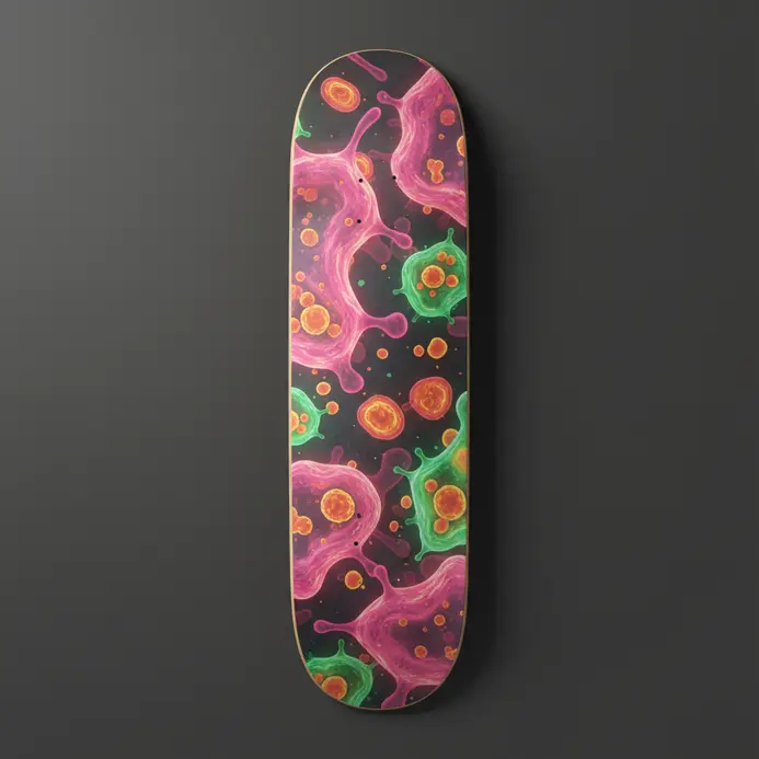
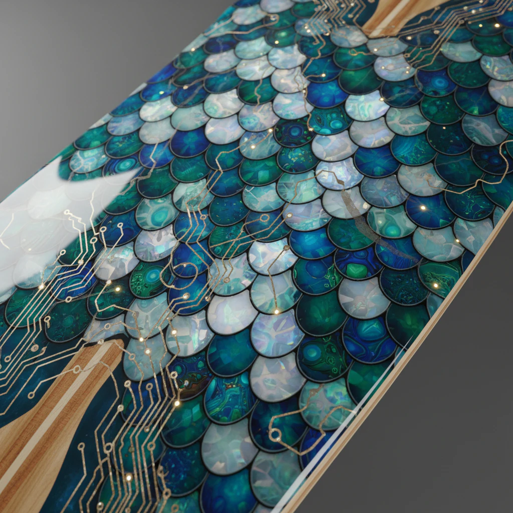
Have you ever seen a skateboard that looks like it just stepped out of a biology lab? That’s the magic of microbial cellular patterns! These skateboard design ideas fuse science with street culture, featuring everything from detailed bacterial colonies on grip tape to abstract amoebic blobs. We love how designs like the bacteriophage virus make for striking, symmetrical graphics that catch the eye. Why does this work so well? It offers a fresh, educational twist that stands out in the skate park. For a DIY approach, start by looking at microscope images online for inspiration, then sketch your own interpretations, and if you need drawing basics, easy things to draw for beginners is a great resource.
24. Cosmic Nebula Deck Graphic Styles
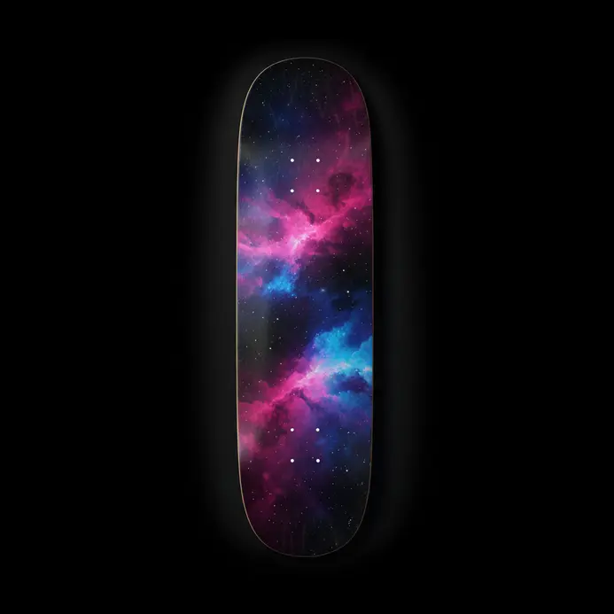
Picture your board as a portable window into deep space, swirling with ethereal clouds of purple, blue, and magenta. This style transforms a simple deck into a piece of moving art, using the raw beauty of the cosmos as its primary inspiration. We are talking about more than a starry night here. It is about capturing the dynamic, glowing essence of a nebula right under your feet. The magic happens with those deep color palettes and textures like gas clouds and subtle star fields. You get a design that feels both massive and detailed, perfect for making a statement at the park for any skateboarder. Why does it work so well? It taps into that universal sense of wonder, giving your ride an otherworldly, almost mystical vibe that stands out from typical street graphics. For a killer variation, try a retro space look with grainy textures and a limited color palette that colorful skateboarders would love. It gives those cosmic skateboard design ideas a cool, vintage feel that is totally unique.
25. Urban Graffiti Fusion Skateboard Design Examples
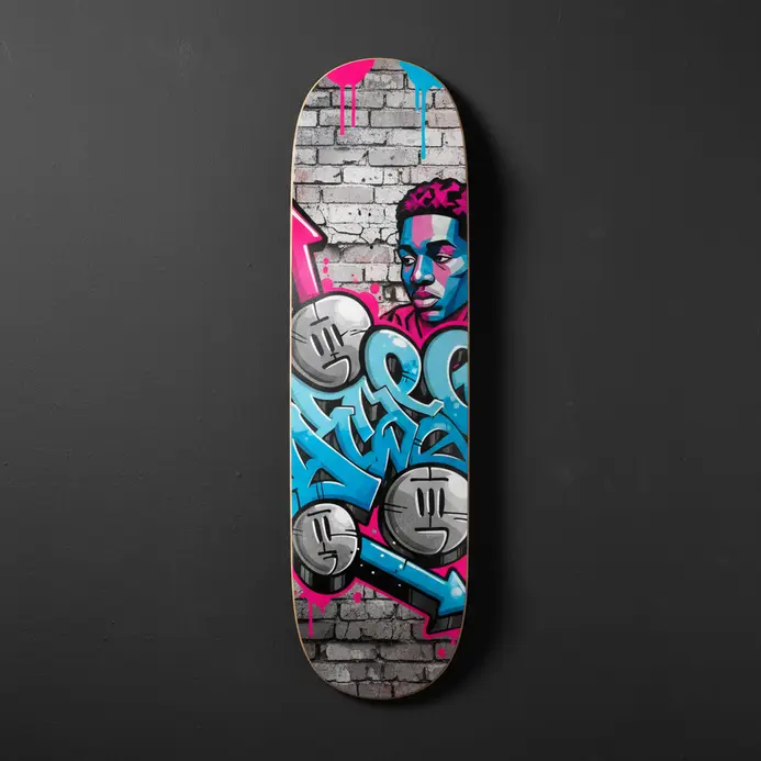
Ever seen a skateboard that looks like it jumped straight off a city wall and into your hands? That’s the magic of Urban Graffiti Fusion design. This style isn’t about slapping any graffiti on a deck. It’s a thoughtful blend where wildstyle letters might twist into gears, or a bold stencil carries a skate-centric message. We take the dripping paints and bold lines of street art and make them flow with the board’s shape, ensuring every kickflip shows off the artwork. It’s a celebration of both skateboarding’s energy and graffiti’s rebellious voice. Skaters dig this fusion because it turns their board into a personalized, moving masterpiece that shouts their style without saying a word. When brainstorming your own skateboard design ideas, play with textures like simulated drips or scratches to add that gritty, lived-in feel that makes it pop.
From Inspiration to Creation: Your Design Journey Begins
Armed with this blend of technical insight and artistic principle, you’re no longer just browsing ideas—you’re equipped to evaluate and create them. Whether you’re drawn to minimalist geometry, bold character art, or textured organic illustrations, remember that the most resonant designs speak to both the rider’s style and the board’s function. Let these foundational concepts guide your exploration, turning inspiration into a coherent graphic that truly reflects your identity on and off the skatepark.
The Evolving Canvas of Skate Culture
Skateboard design is a living dialogue between rider, artist, and urban landscape. As you move forward, consider how your creations contribute to this visual culture. Experiment fearlessly, respect the craft’s technical roots, and always push to see the deck not just as equipment, but as a platform for personal and artistic statement. Now go forth—design, iterate, and let your board tell its own unique story.
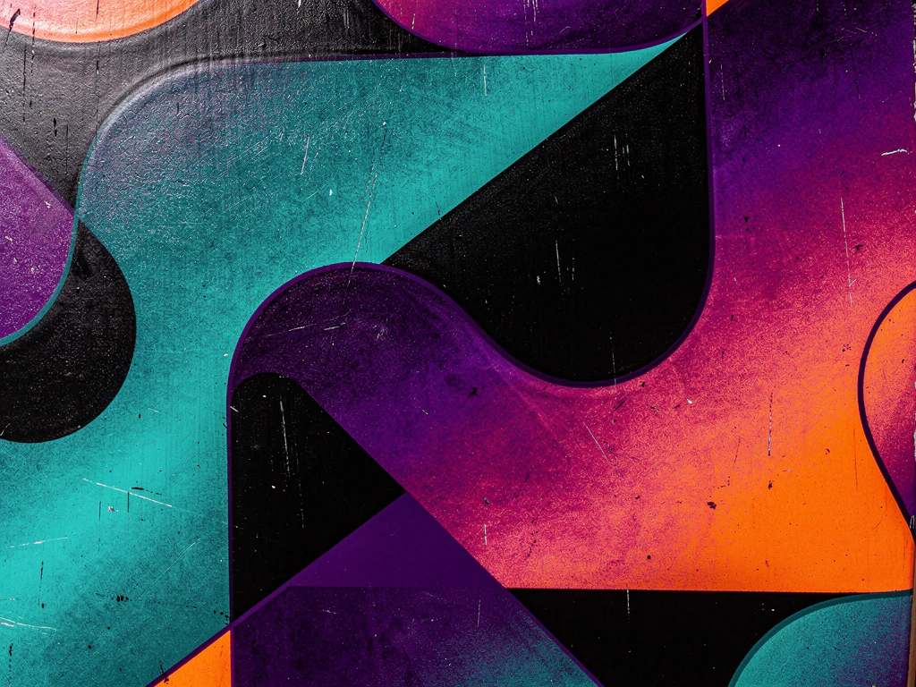
More Skateboard Deck Design Ideas Gallery for Inspiration














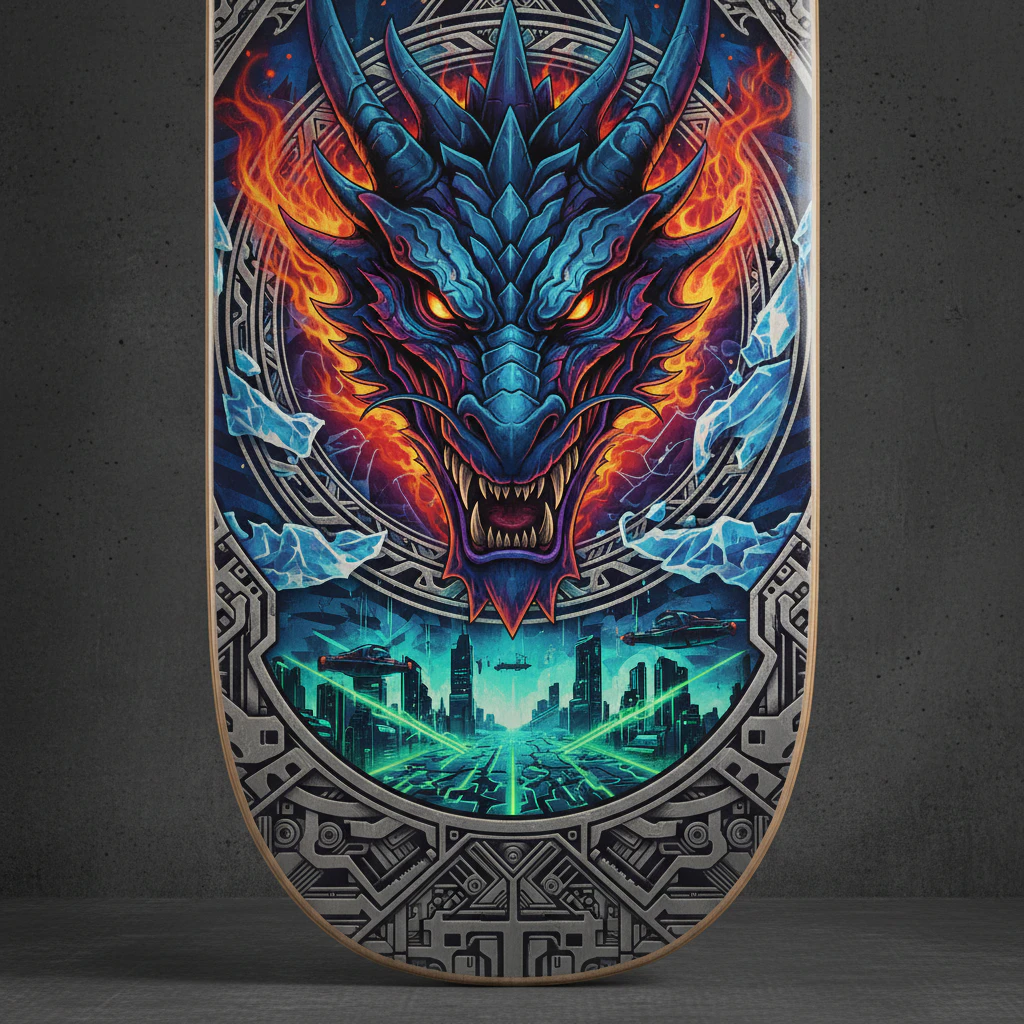
Conclusion
So, what do you think? We’ve taken a whirlwind tour through art history, cultural traditions, and pure imagination to show you the incredible range of skateboard design ideas waiting for your deck. From the mathematical precision of optical illusions to the wild freedom of abstract splatter, your board’s graphic is a direct line to your personal vibe. It’s about more than just looking cool at the skate park. It’s about carrying a piece of art that moves with you. Now that you’re packed with inspiration, the next step is yours. Grab a deck, pick a style that speaks to you, and start making it your own. Let’s see what you create.
FAQs
Q: What are some popular skateboard design ideas to excite my creative side?
A: Popular skateboard design ideas that excite creators often use bold imagery, bright colors, and mixed media—think hand-painted graphics combined with vinyl decals or screen-printed motifs. To produce an exclusive look, select one or two dominant colors and a signature component like geometric patterns or a mascot to enhance visual cohesion across decks.
Q: How do I select the right design to match my skating style?
A: To select a design that matches your skating style, examine whether you prefer technical street tricks, vert ramp flow, or cruising. Technical skaters often choose simpler, high-contrast graphics that perform well under wear, while vert and cruiser riders may prefer elaborate art that enhances board identity. Awareness of how graphics age with scuffs helps you choose designs that still look great after use.
Q: Can I produce a design that is both exclusive and functional?
A: Yes, you can produce an exclusive design that remains functional by balancing aesthetics with durability. Use protective clear coats, choose high-quality prints for the deck’s plywood, and place delicate elements away from high-wear areas. This approach ensures the design will perform reliably while remaining visually distinctive.
Q: What components should I examine when creating a full skateboard design idea set?
A: Examine every component: deck graphic, grip tape pattern, trucks color, wheel design, and hardware finishes. Coordinating these parts—such as matching wheel color to bright colors in the graphic or adding a custom grip-tape cutout—will enhance the overall look and strengthen the board’s visual identity.
Q: How can I use bright colors without making the design overwhelming?
A: Use bright colors strategically as accents rather than full-coverage backgrounds. For example, pick a neutral base and add pops of neon on logos, borders, or small illustrated elements to excite visual interest. This selective use lets the bold hues perform as focal points while preserving balance.