


Neurobiological Basis of Human Visual Sensitivity
Your eyes contain three types of cone cells, each sensitive to a different wavelength range, which explains why some of your mixes turn out muddy. The good news is your brain constantly adjusts these signals, a process called lateral inhibition that sharpens edges and makes colors pop against their surroundings. This is the neurobiological reason for simultaneous contrast, where a grey shape looks warm on a blue background but cool on a red one. Trust me, failing to account for this automatic brain trick reveals exactly how the physiology of color mapping influences your daily studies, which is why your color studies sometimes feel off even when the isolated hue is perfect.
Controlled Lighting Environments for Color Accuracy
A 5000K full-spectrum bulb is your secret weapon for consistent work, as it mimics neutral daylight. Here is the thing, your pigments are spectral reflectors, not color emitters, so the light hitting them dictates what bounces back to your eye. Warm indoor lighting, with its orange-yellow bias, will silently shift every cool color on your palette toward mud. We often paint under inconsistent light, but that guarantees the hues you mixed at night will look wrong in the morning sun. You want to create a stable controlled lighting environment to eliminate this variable, studying the physiology of color matching which is the only way to judge the true interaction of your paints.
This setup prevents metamerism, where two different pigment mixes match under your studio lamp but clash on the gallery wall.
1. Analyze the Visible Light Spectrum for Your Palette
Ever wondered how your favorite set of paints relates to the rainbow you see in the sky? It all starts with the visible light spectrum, the range of light your eyes can detect from reds to violets. When you analyze a digital palette, look at the hue value in HSL notation. This number directly maps to a position on that spectrum, telling you if your color leans toward long-wavelength reds or short-wavelength blues.
This knowledge acts as your secret weapon for mixing pigments effectively and creating mood, directly reflecting the physiology of color matching in everyday practice. You will understand why a color looks different under a lamp versus sunlight. It transforms guesswork into informed, confident choices. I love how this turns color selection from a mystery into a clear, logical process. Feel that clarity when you see your harmonious artwork come together, and get a great start with these principles in how to start painting watercolors.
2. Map Human Retina Photoreceptor Functions to Color Perception
Ever wondered why you can’t see color in a dim room? That is your rods taking over for low-light vision, but they only see in grayscale. For the full rainbow, you need bright light and your cones. Isn’t it fascinating that your entire perception of color comes from just three tiny light sensors in your eye?
Your six to seven million cones are concentrated in your central vision and come in three types. Think of them as specialized receivers: short (blue), medium (green), and long (red) wavelength cones. When light hits them, each type responds differently based on the light’s wavelength, proving the physiology of color matching relies heavily on these receptors. Your brain then mixes these signals to create every hue you see, from a deep violet to a bright orange. This whole process is the foundation of the Trichromatic Theory.
Here is a key insight I love: your so-called red cones are actually most sensitive to yellow-green light. Their broad sensitivity into longer wavelengths is what lets you perceive red. This is why understanding your spectral sensitivities matters so much for your art. It explains how colors interact and why certain combinations create such vibrant visual impact. Feel empowered knowing the biology behind your palette.
3. Apply Trichromatic Cone Activation Theory When Mixing
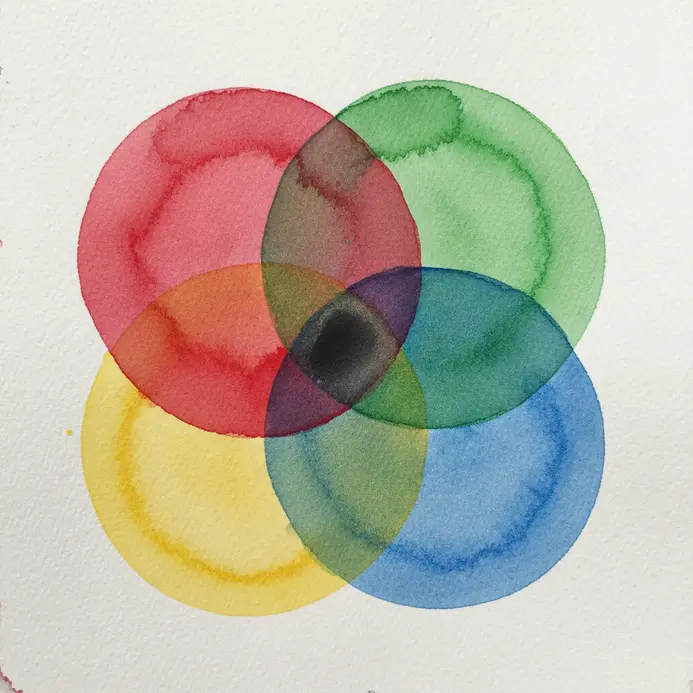
Ever wondered why mixing red and green light makes yellow, but mixing red and green paint makes mud? It all comes down to how your eye’s three cone photoreceptors work. I love thinking about this when I paint. The theory explains that you perceive color based on the ratio of stimulation between your S, M, and L cones, which are sensitive to blue, green, and red wavelengths, highlighting a core aspect of the physiology of color matching.
When you mix light, you are adding wavelengths to stimulate those cones directly. For pigments, you are subtracting light, so the reflected light is what stimulates them. This is why knowing your primary color systems is crucial. If you want to explore colored pencil techniques, this theory helps you predict how layers will interact. It moves you from guessing to knowing exactly why a color appears, and that is a fantastic feeling.
4. Compensate for Neural Processing and Color Constancy
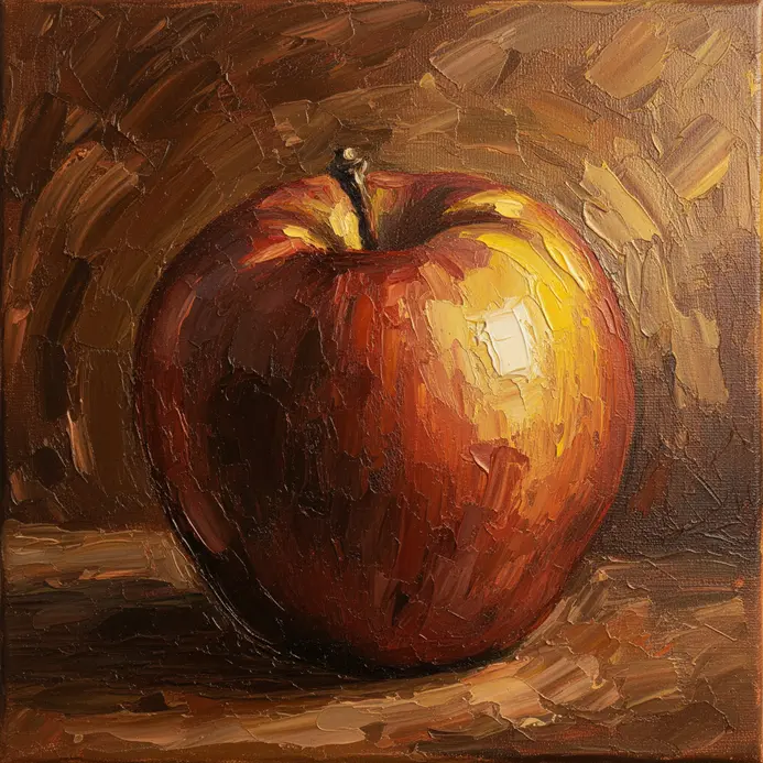
Ever notice how a red apple still looks red under a lamp or in the sun? That is your brain’s color constancy at work, actively compensating for different light sources. It is a neat trick, but it can also trick you when you are trying to paint what you see, not what you know. Recognizing this biological filter is essential when you study the physiology of color matching during plein air sessions.
Your visual system is constantly adjusting, which is why digital displays use gamma correction to make brightness steps look uniform to our eyes. To get accurate color in your art, you have to learn to see past this automatic correction. I love using a viewfinder or a piece of gray card to isolate a color from its surroundings, which helps me paint the actual hue I am observing.
Mastering this skill is a huge step toward creating work that feels true to life. mastering various watercolor methods. Feel that satisfying click when your colors finally look right.
5. Use Chromatic Adaptation Mechanisms to Your Advantage
Ever notice how your perception of color seems to shift after staring at a sunset? That is your visual system adapting. Your eyes and brain are constantly adjusting their sensitivity to the dominant light in your environment to maintain a sense of color constancy. This is why a white wall looks white to you under both warm lamplight and cool daylight.
You can use this to your artistic advantage, directly applying principles of the physiology of color matching to your daily workflow. When you plan your work, think about the viewing environment’s lighting. Creating a piece under bright studio lights? Its colors might feel different in a cozy gallery with warm tones. Your own neural adaptation can also trick you as you paint for hours under one type of light, so take a break in natural light to check your color mixes.
The payoff is huge. Understanding this lets you predict how your work will be seen and even manipulate mood with color temperature. Try it and feel the control it gives you over your final piece.
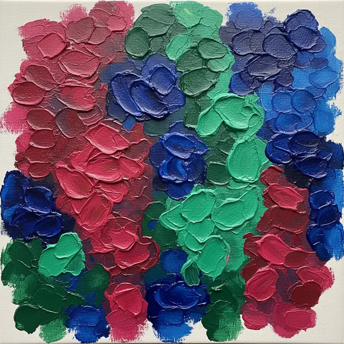
6. Master Simultaneous Color Contrast Effects in Composition
Ever notice how a color seems to change depending on what is next to it? That is not your paint shifting, it is simultaneous color contrast at work. It is a powerful trick where your brain makes a color appear to shift towards the complement of its neighbor. A neutral gray square looks greenish on a red background, for instance. This effect is strongest when you place complementary colors side-by-side, instantly boosting each other’s vibrancy through the mechanics of the physiology of color matching.
To use this in your art, first identify your complementary pairs on a color wheel. Then, experiment with their value and saturation. Placing colors of similar lightness together makes the hue shift really pop, sometimes creating a shimmering energy. I love using this to make a focal point sing without having to mix a more intense pigment. For more nuanced color variations, try placing a color next to a non-complementary one and watch it subtly transform.
This whole concept is a cornerstone of color theory, letting you create depth and visual excitement. It is how you make colors appear more luminous on the canvas. A great way to practice this is by trying to achieve realistic watercolor effects where accurate color relationships are key. Try it and feel your compositions come alive with new energy.
7. Control Light Source Spectral Quality in Your Studio
Ever wondered why colors look so different from your studio to the camera? The culprit is often the light itself. Controlling spectral quality means ensuring your studio lights contain a full, balanced rainbow of wavelengths, just like natural daylight. I love this because it’s the secret to true color accuracy and aligns perfectly with the physiology of color matching requirements.
To get it right, look for lighting with a high Color Rendering Index (CRI) of 90 or more. For video work, check the Television Lighting Consistency Index (TLCI) and aim for the same high score. This minimizes metamerism, where two colors match under one light but not another, saving you hours of frustrating color correction later.
Your portraits will show natural, pleasing skin tones, and your product shots will render every hue faithfully. Trust me, investing in good quality light makes everything you create look more vibrant and professional.
8. Navigate Subtractive Pigment Mixing Limitations
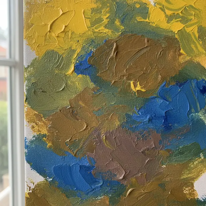
Have you ever mixed what you thought would be a vibrant violet, only to end up with a dull, muddy brown? This is the classic frustration of subtractive pigment mixing. Each pigment you add absorbs more light, so the more colors you combine, the duller and darker the mixture becomes. It is not about the number of paints you use, but their specific properties.
To avoid this muddiness, I love focusing on just two or three pigments at most for a clean mix. Pay close attention to each pigment’s opacity and lightfastness too, as these affect the final color’s vibrancy and longevity. This understanding helps you make smarter choices, preventing those disappointing color shifts while respecting the physiology of color matching limits of human vision.
For a fun application of this knowledge, check out these creative whimsical watercolor approaches to play with color intentionally. Trust me, mastering this limitation feels incredibly freeing. You will stop fighting your paints and start working with their true nature, which leads to much more satisfying and predictable results in your artwork.
9. Calibrate Your View with a Neutral Grey Background
Ever finish a piece, look at it the next day, and wonder why the colors look so different? Your eyes are amazing, but they are easily fooled by their surroundings. That is where a neutral grey background for your workspace comes in. It gives your eyes an unbiased reference point, letting you see the true colors in your work without any visual trickery. This simple switch directly supports your practice of the physiology of color matching and can dramatically improve your accuracy.
Setting it up is super easy. In most software, you can right-click on the area around your canvas to set a custom color. I love using a simple mid-grey, like RGB 128 for each value. This neutral tone stops your eyes from adapting to a dominant color, which is the secret to consistent perception. You will be amazed at how much more detail you can see in your shadows and highlights.
This practice reduces eye strain and gives you a reliable, objective view of your art. It is my go-to tip for anyone serious about color work. For a great place to apply this calibrated view, check out these beginner painting subject ideas.
10. Manage Visual Fatigue for Consistent Color Judgment
Ever notice your color choices feeling a bit ‘off’ after a long session? That is visual fatigue at work, and it directly messes with your perception. Your eyes get tired, and suddenly those subtle differences between shades just vanish, leading to inconsistent judgments.
To fight this, start with your environment. Use neutral, diffuse lighting that matches your monitor’s color temperature. I love this tip because it stops competing light sources from creating color casts. Also, paint your walls a matte, neutral gray to prevent reflections from influencing what you see, keeping you grounded in the physiology of color matching throughout the day.
Your work habits matter just as much. Follow the 20-20-20 rule to give your eye muscles a quick reset. Take regular breaks and vary your tasks. This is not about comfort, it is about protecting your color discrimination so every choice you make is accurate and intentional.
Standardizing Color Profiles Through Digital Calibration
Calibrating your monitor with a hardware colorimeter ensures the digital photo of your painting shows its true hues. This process creates a standardized color profile that tells your screen how to display specific RGB values accurately. Without it, you might edit a photo to ‘fix’ colors that were perfect in real life, creating a digital version that no longer matches your physical art. The goal is to close the loop between your eye, the pigments, and the camera, making your digital archive a trustworthy reference. For a final check, compare a printed proof under your calibrated studio light to the original canvas to confirm the spectral power distribution of your inks aligns with your paints, closing out your study of the physiology of color matching.
Conclusion
Grasping these concepts means you are no longer fighting your own senses in the studio. You now understand why a color can look perfect one moment and off the next, and you have tools to correct for it. That knowledge is a powerful form of creative confidence. For your next project, try starting with a simple color study under controlled light, actively applying what you know about the physiology of color matching to every brushstroke. Notice how your decisions feel more intentional and the results more reliable. Your eye is an incredible instrument, and learning how it works only deepens your connection to the art you make.
FAQs
Q: Why do my colors look different in natural light versus my studio lamp?
A: Different light sources emit different parts of the spectrum. Your studio lamp may lack certain wavelengths, making some pigments appear dull or shifting their hue compared to full-spectrum daylight. Use daylight-balanced bulbs for the most accurate color work.
Q: How can I stop my eyes from getting tired when mixing colors?
A: Eye fatigue often comes from staring intently at bright or saturated hues. Take regular breaks to look at something distant and neutral, like a grey wall or out a window. This resets your photoreceptors and helps maintain consistent color judgment.
Q: What is the best background color for judging my painting?
A: A neutral mid-grey background is ideal. White or colored backgrounds cause simultaneous contrast, tricking your brain and altering your perception of the colors on your canvas. Grey provides a neutral baseline for your eyes.
Q: Why can I not mix a paint color as bright as the light on my screen?
A: Screens mix colors additively with light, which can create very bright, saturated hues. Paints mix subtractively with pigments, which absorb light. Each mix reduces brightness and saturation, creating a physical limit to how vibrant a mixed pigment can be.
Q: How long should I let my eyes adjust before making final color decisions?
A: Give yourself at least five to ten minutes in your consistent working light before making critical color choices. This allows for chromatic adaptation, where your visual system adjusts to the light source for more stable perception.


