Flash Sheet History And Symbolic Vocabulary
Choose a flash composition with one dominant subject before comparing historical symbols, because crowded references lose the direct reading central to american traditional tattoos. Early tattoo sheets favored compact images with heavy outlines, limited colors, and clear shapes suited to quick selection and repeatable tattooing. Stars, banners, daggers, ropes, leaves, and framing shapes each carry familiar associations, yet placement and accompanying text often shift their tone.
A sailor’s anchor suggests travel or service, while a rose or eagle often signals love, loyalty, or national pride. Treat those symbols as visual vocabulary rather than interchangeable decoration.
A strong single-subject flash design leaves enough negative space for every contour to read from several feet away. Comparing framing shapes helps collectors spot genuine traditional restraint instead of neo-traditional detail.
Line Weight Planning For Long-Term Readability
Keep the outer contour heavier than interior detail, with line weight scaled to the tattoo’s final size and body area, a foundational rule for american traditional tattoos. A 7RL or 9RL grouping gives broad, stable borders for medium pieces, while smaller groupings suit selective interior marks rather than full outlines. Heavy black contours separate saturated red, yellow, green, and blue blocks, preventing nearby colors from merging as ink settles.
Leave deliberate negative space around lettering, stars, and small accents so each shape keeps its identity. Thin lines packed into a small wrist or ankle piece often soften sooner than collectors expect. Ask your artist to show healed examples at comparable scale, not only fresh work under bright studio light.
A 7RL needle grouping supports the firm visual structure associated with classic tattooing. Placement also matters, since curved shoulders, ribs, and knees alter straight edges and spacing.
1. Bold Eagle Chest Piece Design With Classic Color

Ever wondered why an eagle chest piece feels so bold? This chest piece places a symmetrical eagle across the sternum, with wings following your natural chest shape, a layout often seen in american traditional tattoos.
Start with a centered eagle head over the sternum, then spread the wings evenly before adding feather textures, sharp eyes, a beak, and talons. Bold black outlines keep every feature clear, while a flag, shield, banner, stars, or rays add classic character.
I love how this layout fills the chest without losing its clean, readable style. Use a classic color palette of black, deep red, golden yellow, warm brown, cream, and muted blue, then add traditional shading for depth.
Keep both wings balanced and leave open space around the feathers, since crowded background details weaken the central image, a common consideration with american traditional tattoos. Pro tip: ask your artist to check the stencil from several angles before the session begins. Strong contrast and careful spacing give this eagle its fearless, timeless finish.
2. Red Rose Hand Tattoo Motif With Green Leaves
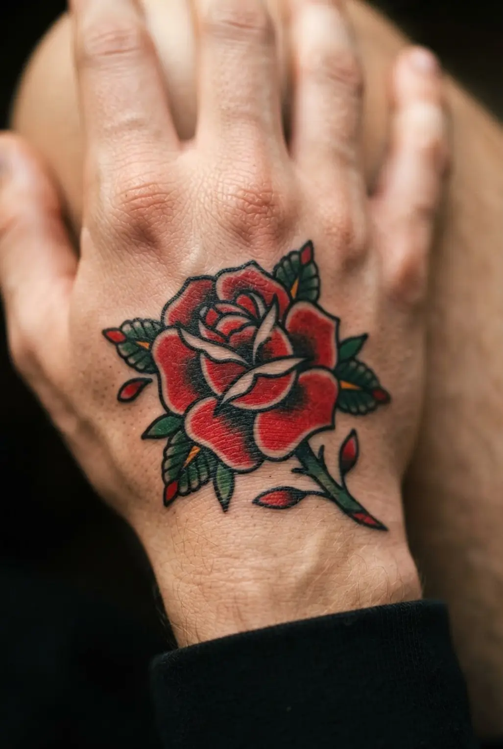
This rose hand motif has a strong presence from the first glance, drawing immediate attention in american traditional tattoos. Place a slightly open bloom across the back of the hand, then guide the stem toward the wrist.
Trace each petal with fine black outlines, filling the folds with crimson, scarlet, and deep red shading. Add two or three forest green leaves near the wrist and fingers, plus small thorns along the stem. Sound complicated? It is not.
The red and green contrast keeps the flower clear, while soft watercolor-style shading gives the petals depth without losing the clean traditional botanical look, honoring the legacy of american traditional tattoos. I love how the hand placement keeps the bloom visible and lets the stem create a smooth visual flow.
Keep the leaves distinct from the petals, and leave enough open skin around the thorns so each detail stays readable over time. Trust me, this piece feels romantic, timeless, and bold when the colors stay crisp.
3. Blue Swallow Forearm Flash Graphic And Banner

This one is my favorite because the blue swallow feels lively without crowding the forearm, making it a staple choice for american traditional tattoos. Sound complicated? It is not.
Start with a bold black outline, giving the bird spread wings and a clear silhouette. Fill the body with vivid blue, then add small red and cream accents for contrast.
Place a curved vintage banner beneath the bird and letter “STAY TRUE” with room between each character, a common feature in american traditional tattoos. A few stars, leaves, or wind lines suggest motion, yet too many details will muddy the compact vertical layout.
Strong illustrative shading gives the flash image depth while keeping its main shapes easy to read. I love how the banner turns movement into a personal statement. Pro tip: check the lettering at forearm distance before committing, so every word stays crisp.
4. Dagger Through Heart Shoulder Piece With Red Detail
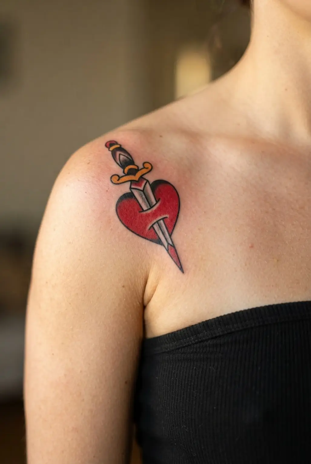
The finished piece catches the eye with a deep black dagger, a shaded heart, and small red marks standing out against the shoulder, capturing the dramatic essence of american traditional tattoos. Sound dramatic? It is, yet the layout stays clean when the heart and blade follow the shoulder’s natural curve.
Start with a stencil, check its balance from several angles, then build firm outlines and black-and-gray shading before adding selective red ink to the heart, blood drops, or an ornament.
I love this design because limited color gives the classic image a clear focal point without weakening its bold structure, proving the effectiveness of american traditional tattoos. Keep the red focused, since too much spreads attention across the piece, and ask a qualified tattoo artist to choose the needle setup for each line and shade.
Trust me, careful stencil placement makes the finished shoulder piece feel settled and strong.
5. Coiled Snake Thigh Tattoo Composition In Bold Green

Many people think a coiled snake needs a wide, flat space, but the upper thigh gives it a natural vertical path, a smart approach for american traditional tattoos. Start with overlapping body coils, following the leg’s curve, then raise the head near the hip so sharp eyes, fangs, and a slightly open mouth lead the design.
Emerald and forest green scales gain depth through darker green shading, while small black outlines and restrained yellow highlights keep each loop clear. I love adding a few dark leaves or thorny vines, yet the snake must stay dominant.
Is anything more satisfying than seeing the raised head pull the whole piece together? Trust your artist to check the layout from several angles before the stencil goes on.
6. Crouching Black Panther Calf Tattoo With Red Mouth

Start by placing the panther low along the leg, with its spine following the calf’s curve, maintaining the dynamic posture seen in american traditional tattoos. Use a calf-following silhouette to keep the body rounded and ready to spring forward.
Let the paws reach slightly ahead while the haunches sit lower, giving the pose a clear crouch. Sound complicated? It is not.
Build the body with smooth black-and-gray shading, leaving enough lighter space to show the shoulders, ribs, and folded legs, a technique vital for american traditional tattoos. Keep the mouth open with sharp teeth, a red tongue or inner-mouth area, and bright yellow or green eyes.
Small claws and soft jungle shadows add detail without crowding the face. I love how the red mouth becomes the first detail people notice.
Strong outlines and controlled dark areas suit this classic style, while the calf placement gives the panther natural movement, reinforcing the bold principles of american traditional tattoos. Trust me, keep the eyes, teeth, and mouth clean and separated from the deepest shading.
Your finished piece will look bold, focused, and ready to pounce.
7. Classic Nautical Anchor Arm Piece With Rope Border

Ever wondered why an anchor arm piece still feels fresh after generations, a testament to the enduring appeal of american traditional tattoos? Start with a tall anchor, giving its flukes and ring room to read from every angle.
Use bold black outlines first, then add restrained gray shading beneath the arms and along the shaft. A thick rope wraps around the shaft before continuing into a clean border, so the whole tattoo feels finished without extra clutter.
I love how this layout follows the arm’s length naturally, making it a reliable choice for american traditional tattoos. The outer forearm suits a visible vertical piece, while the inner forearm feels more personal and the upper arm supports a compact arrangement.
Keep the rope wider than small interior lines, and limit waves, a compass star, or a banner to one supporting detail. Navy blue, muted red, and cream add sailor character beside black and gray.
Choose a word or date tied to strength, loyalty, or perseverance, then feel proud of the steady design.
8. Sailing Ship Bicep Tattoo Design Under Blue Waves
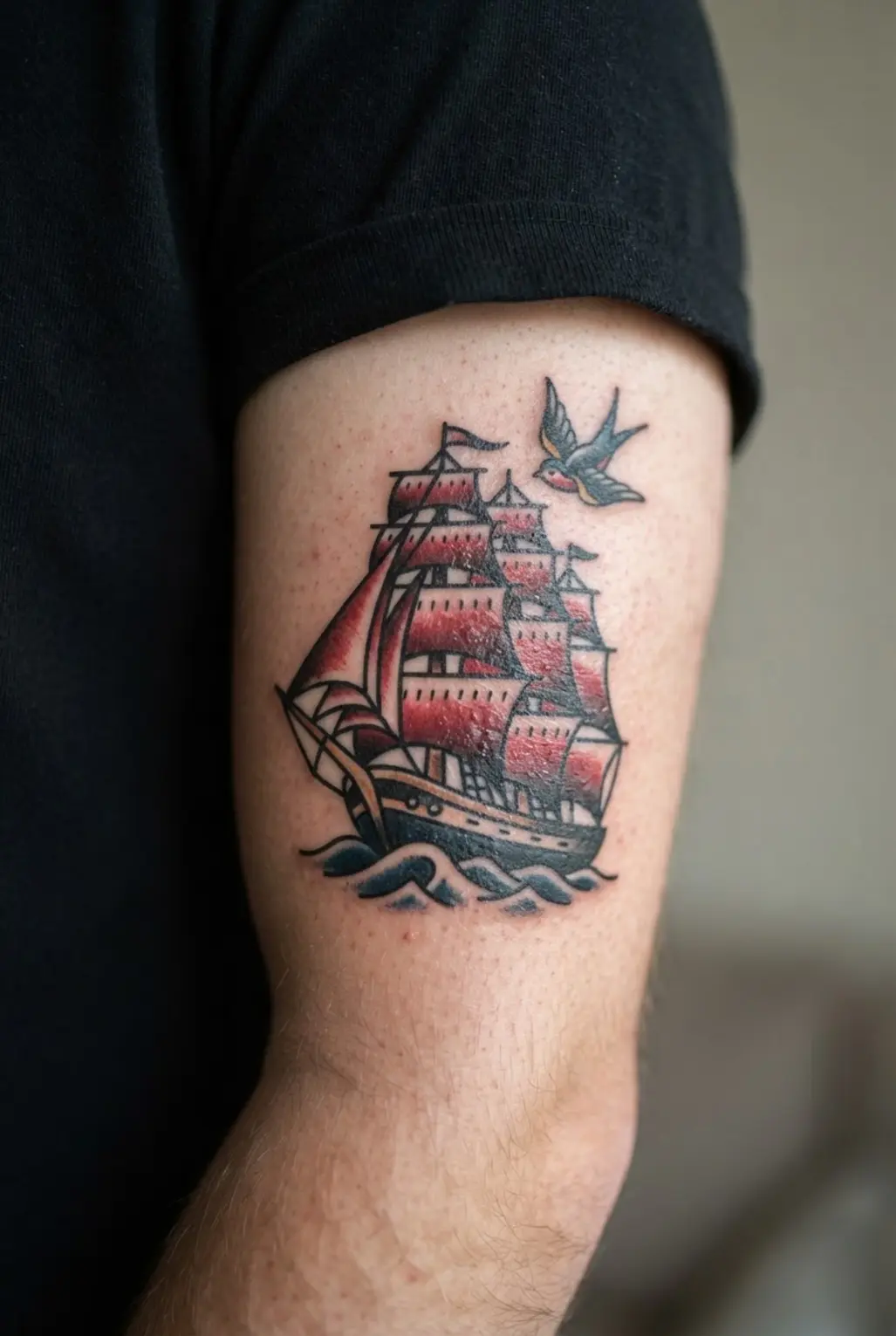
A tall ship on the outer bicep has instant motion when its lines follow the arm’s curve, echoing vintage american traditional tattoos. Place the three raised masts at an angle, then add billowing sails, fine rigging, and a hull tilted toward the waves.
Sound complicated? It is not, especially once the ship becomes your clear focal point.
Layer deep navy, cobalt, and turquoise waves beneath the hull, using white foam highlights to separate water from wood, a hallmark of american traditional tattoos. I love adding a small compass star or distant lighthouse only after the main scene feels complete.
Keep extra details sparse, since a banner or anchor should support the nautical tattoo rather than crowd the bicep. Trust me, the curved composition feels adventurous and free-spirited when every wave sweeps around the arm.
9. Traditional Skull With Sailor Cap And Banner

This one is my favorite because the grinning skull, sailor cap, and curved banner tell a clear story at a glance, capturing the narrative spirit of american traditional tattoos. Sound complicated? It is not.
Start with a balanced skull and a wide grin, then fit the cap into the upper outline. Wrap a curved banner beneath the jaw so it frames the lower section without hiding the teeth.
Thick outlines keep the design bold, while red, cream, black, and muted blue give it a worn vintage feel, aligning with the heritage of american traditional tattoos. Keep both sides even, use light shading, and leave enough room for “SAILOR’S FATE” or your own words.
I love how the limited palette keeps every detail easy to read. Isn’t the balance satisfying? Give the lettering space, and your finished piece will feel strong, personal, and ready for display.
10. Heart With Banner Stomach Tattoo And Classic Lettering

Deep red ink, heavy black outlines, and muted gold details give this stomach piece a rich old-school look. A bold heart sits beneath the ribcage, while a flowing banner curves across its center, a layout favored by collectors of american traditional tattoos.
The result feels personal before the lettering is even read. Begin with a full-size stencil so the heart and banner suit the stomach’s contours.
Keep the heart broad, then guide the banner around it without crowding the classic serif or blackletter text. Sound complicated? It is not.
I love how this layout gives meaningful words a clear place to stand. Strong shapes and limited color keep the composition readable from across the room, reflecting the disciplined approach of classic styles.
Ask your tattooer to keep every letter open and bold, since tiny details blur over time. Trust me on this tip: never shrink the design to force it into a smaller area.
Let the heart and banner breathe, and feel proud when the vintage balance comes together.
11. Lucky Horseshoe And Star Motif For Good Fortune
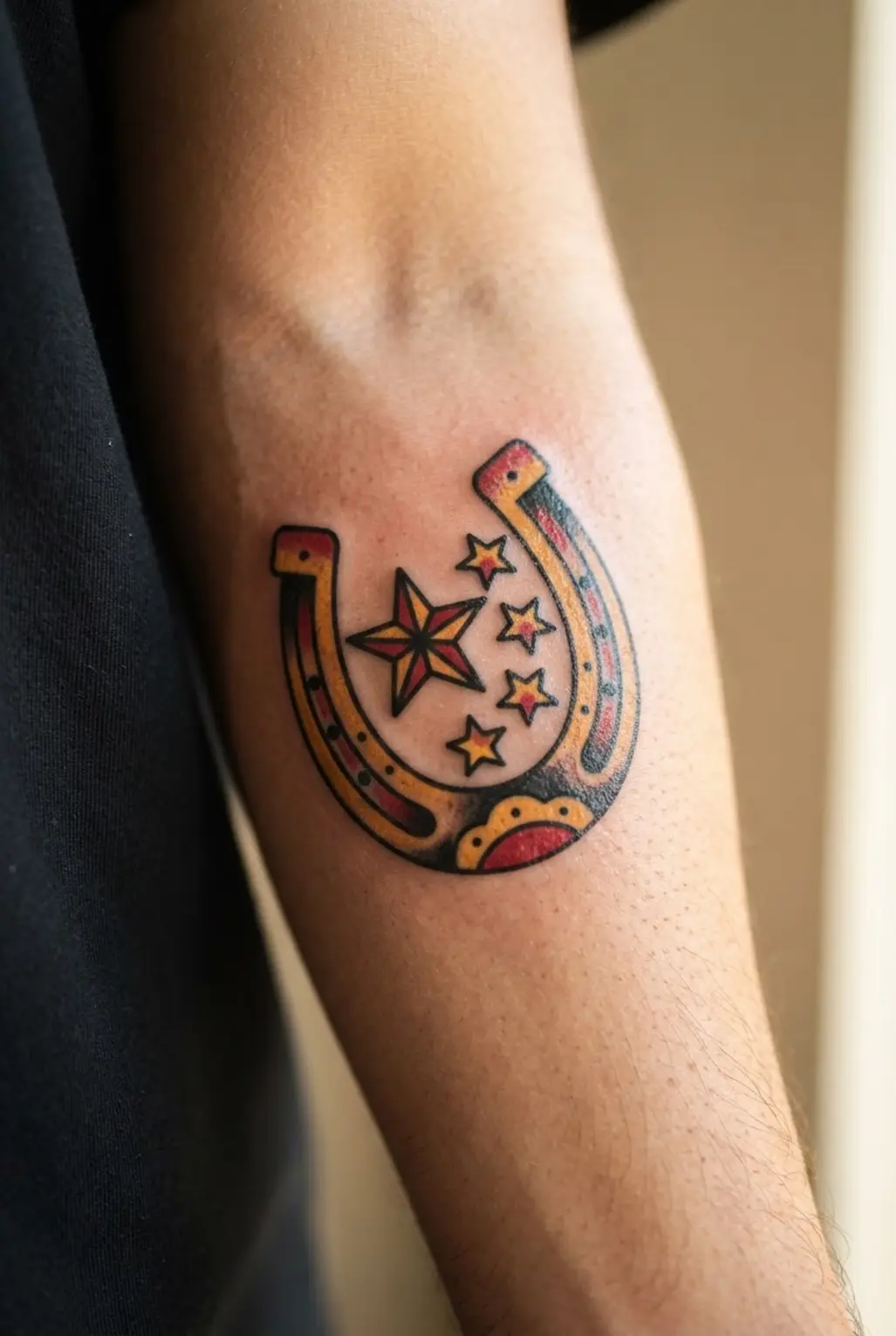
Many people turn the horseshoe upside down, but an upright shape is the classic choice for holding luck. I love how a bold horseshoe outline gives the design a clear center, while a star inside or beside it adds guidance, hope, ambition, and a bright future.
Sound complicated? It is not. Start with engraved horseshoe details, then place one large star or a small cluster inside the opening.
Gold, silver, black, or deep navy suits the old-school look, while sparkles, a clover, initials, or a ribbon add personal meaning. A ribbon beneath the motif might carry “Good Fortune” or “Lucky Always,” though keeping extras limited helps the central pairing stay crisp.
Trust me, this compact symbol feels satisfying because luck and direction sit together in one easy-to-read image.
12. Pinup Girl Traditional Flash Motif On The Calf

Map the seated figure in a tall, compact shape before adding details. Keep her pose confident, with victory-roll hair, a red bandana, sailor-inspired clothing, and high-waisted shorts.
Use thick black outlines so every feature stays clear from a distance, and keep the design balanced along the calf. Sound complicated? It isn’t.
I love how the restricted red, mustard yellow, cream, and black palette gives this flash motif its vintage look without clutter. Fill the figure with a limited color palette, then add minimal shading and small rose or ribbon accents.
A blank banner feels timeless, while “Lucky Strike” adds extra period character. Keep every detail compact and readable, and feel proud when the bold calf composition comes together.
13. Traditional Dice And Cards Piece With Lucky Symbols

Ever wondered how so many lucky icons stay readable in one tattoo? Start with red dice and a fan of playing cards, then place horseshoes, four-leaf clovers, cherries, coins, and a bold seven around them.
Use bold black outlines on every object so the busy arrangement reads as one vintage composition, not a pile of separate stickers. I love how the familiar shapes give the piece an instant old-school casino feel.
Fill the dice, cards, and cherries with rich red, while gold suits the coins, horseshoes, and lucky number. Add subtle shading beneath overlapping forms and small casino details around the edges for depth, keeping each symbol open and easy to read.
This balance works because the limited palette gives every object a clear role without losing the nostalgic look. Pro tip: sketch the full arrangement first, then check the spaces between symbols before adding color. Your finished piece will feel lively, orderly, and full of good luck.
14. Cherries With Leaf Shin Tattoo In Red And Green
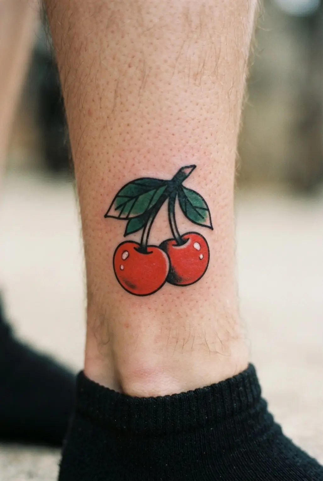
This shin piece has a sweet, old-school look, with two ripe cherries carrying the whole design. I love how bold black outlines keep each fruit, leaf, and stem crisp against the skin.
Sound complicated? It isn’t. Place the cherries along the shin, then curve the green stem upward and let the two leaves extend outward.
Use rich red shading inside the fruit, leaving small areas lighter for a ripe, rounded finish. A vertical composition follows the leg’s long shape more naturally than a wide layout.
The strong red and green contrast gives this classic illustrative tattoo plenty of clarity without needing extra details. Keep the leaves and stem fresh green, and trust your artist to keep every small edge clean. Feel proud when this cheerful piece comes together.
15. Flaming Matchbook Arm Tattoo Design With Red Flames

I love this arm piece because it feels playful while keeping the bold clarity of classic flash. Ever seen a matchbook tattoo with flames rising from its open cover? The vertical shape suits an outer forearm, upper arm, or inner forearm, with visible matches, distressed edges, sparks, and small smoke accents.
Start with a stencil to align the cover, matches, lettering, and flame tips. Build the matchbook in gray and black, then fill layered crimson, scarlet, and orange-red flames with bold black outlines.
A banner phrase such as “Burn Bright” fits neatly inside the layout, though fewer words keep the image easy to read. The restrained cover makes the red flame color pop, while separated layers keep every shape clear.
Trust me on this one: leave space between each flame and keep lettering away from the elbow bend. You will love the crisp vintage finish.
16. Spider Web Elbow Tattoo Design With Clean Lines

The finished piece sits over the elbow with a crisp black outline, neat openings, and a rounded shape visible from every angle. Is this look hard to keep tidy? Start by centering the stencil on the joint, then trace the outer curve before building the web inward with evenly spaced lines.
Keep an open center and skip shading, so the simple geometry stays sharp instead of crowded. I love how the symmetry follows the elbow’s curve and gives the piece a steady, timeless feel.
Trust me, check the stencil with a bent arm and a straight arm before lining the tattoo, since an off-center web shows quickly. A bold black outline finishes the American traditional look with strong definition. Feel proud when every section meets cleanly.
17. Traditional Tiger Head Shoulder Tattoo With Orange Stripes
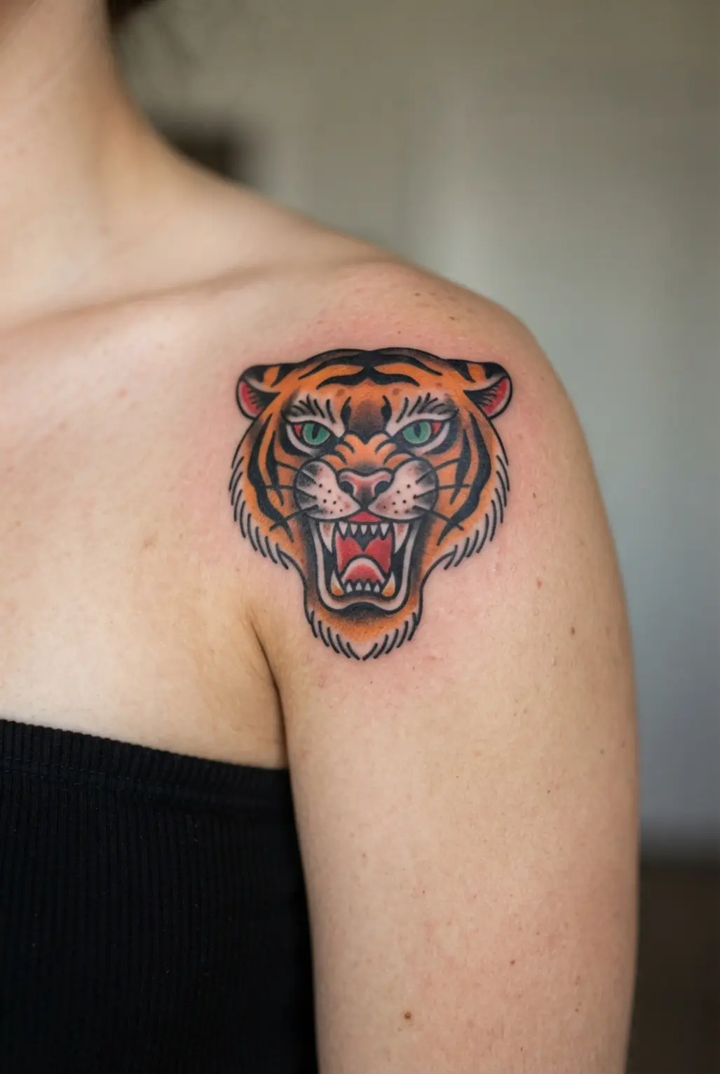
A common mistake is treating a shoulder tiger like a flat sticker. Plan the face around the shoulder cap from the start, so the brow, cheeks, and ears follow its rounded shape. I love how shoulder-cap placement gives the head a natural curve without losing its strong symmetry.
Start with heavy black outlines, then fill the orange sections and bold black stripes. Keep the eyes level and expressive, with sharp white highlights under the brow and along the fur.
Layered fur marks should support the face, not cover it. Sound complicated? It is not, once the main shapes stay clear. Use restrained red accents near the mouth and ears, since too much red competes with the orange.
Check the outline for even weight before adding small details, and keep every stripe easy to read from across the room. Trust me on this one: strong contrast makes this classic shoulder piece feel fierce and satisfying.
18. Hula Girl Traditional Flash Motif With Flower Detail

Start with a bold black outline for the hula girl’s smiling face and graceful mid-dance pose. Add a clear grass skirt with a few curved strokes, then place a large hibiscus or plumeria beside her hair or hand.
Warm red and yellow accents bring the flower, clothing, and small details to life, while traditional shading gives the image its vintage flash character. Sound complicated? It is not.
Keep Polynesian-inspired marks subtle, since the figure and flower should read instantly in the clean language of classic flash art. I love how the flower draws your eye without stealing attention from the dancer.
Keep every shape open and readable, and your finished piece will feel cheerful, balanced, and ready for the flash sheet.
19. Anchor And Rope Forearm Piece In Navy Colors
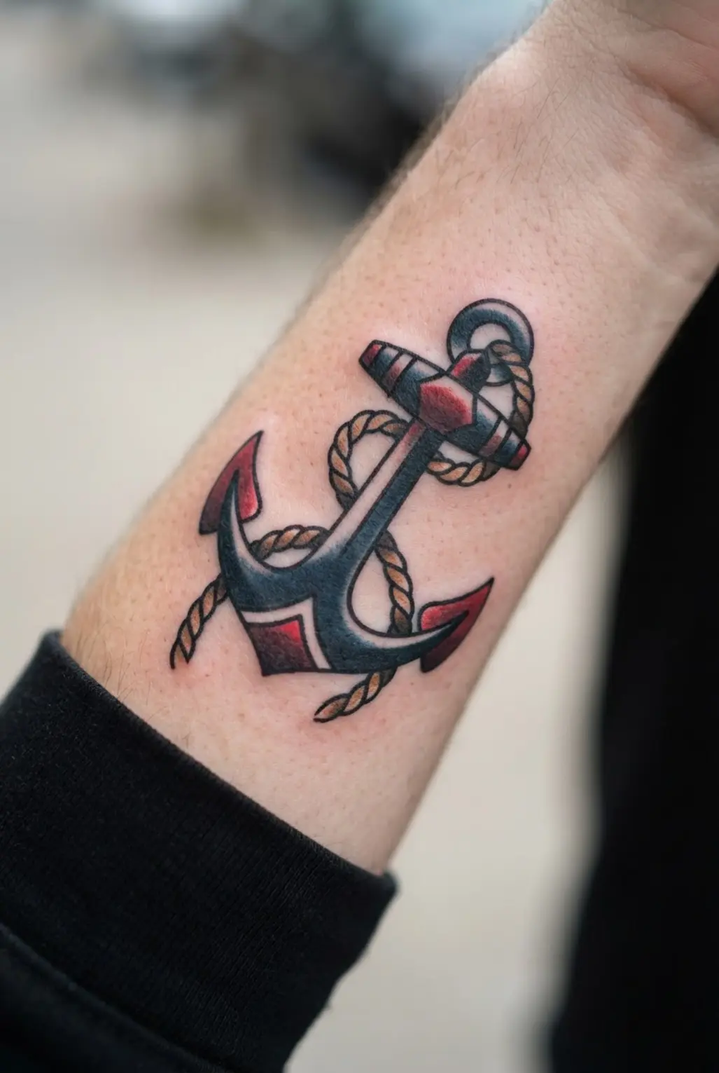
Ever wondered why an anchor forearm tattoo still feels bold with a restrained palette? Start with a tall anchor silhouette, then wind a thick rope wrap around its shaft, arms, and lower curve.
Keep each twist and knot crisp so the rope stays separate from the metal. Deep navy and muted steel blue bring maritime character, while black outlines and soft gray shading give the anchor aged texture.
I love how the forearm shape keeps the design neat from wrist toward elbow, with tiny wave accents tucked beneath the flukes. The limited colors suit classic tattoo style and let the symbols of strength, loyalty, and stability speak clearly.
Pro tip: keep the waves small and leave breathing room around the rope, so every knot stays readable as the piece heals.
20. Rose And Dagger Calf Tattoo With Green Leaves
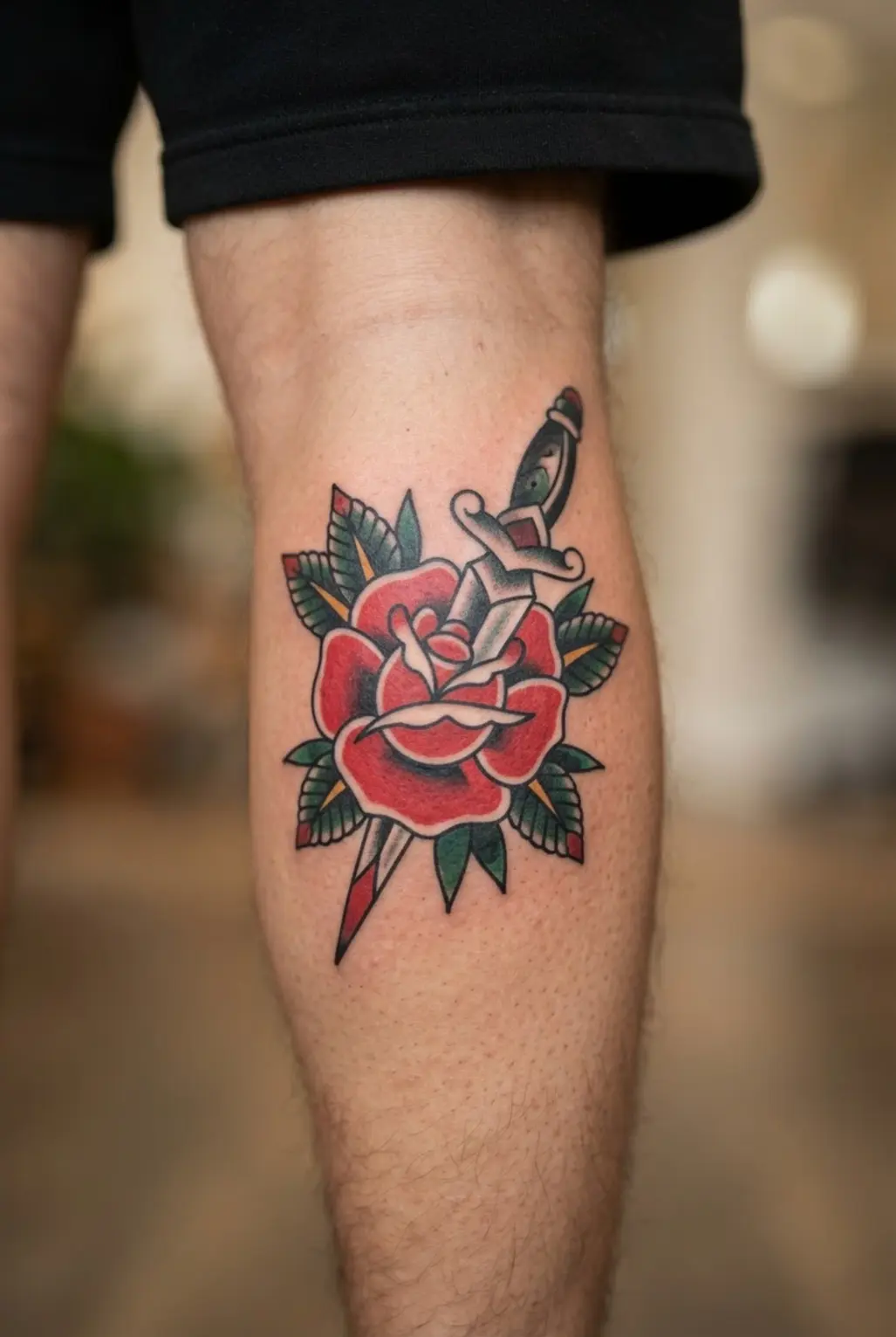
This calf piece has instant old-school charm, with a red rose leading the design and a dagger running beneath it. A vertical layout keeps the rose, blade, and green leaves aligned with your leg, while the leaves spread outward for a clean sense of movement.
I love how the soft petals soften the sharp blade without taking attention away from the flower. Sound complicated? It is not.
Ask your artist to place the rose first, then shape the dagger and foliage around its outline. Bold black outlines keep each form readable as the tattoo ages.
Keep tiny leaf details secondary, and you will have a balanced calf piece with plenty of classic tattoo style.
21. Traditional Wolf Head Chest Design With Moon Detail
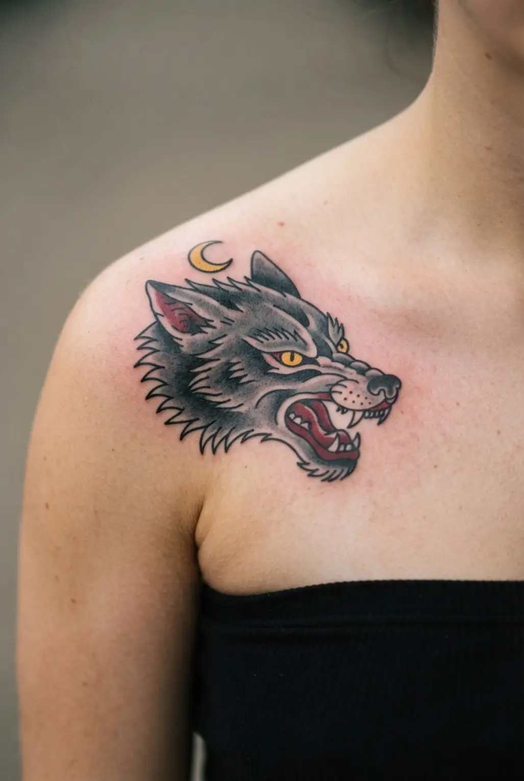
I love this chest piece because the wolf’s fierce face grabs attention right away. Start with a centered stencil, then build thick black outlines around the eyes, muzzle, open mouth, and layered fur.
Ever tried keeping a moon detail from stealing the spotlight? Place the crescent moon behind the head, using soft gray shading and small rays for a night setting.
Add a few stars, pine branches, or ornamental leaves across the upper chest, while muted brown, cream, gray, and deep blue keep the palette controlled. The wolf should stay darker and sharper than the moon.
This design feels protective and connected to the wilderness, which gives the chest a strong emotional presence. Pro tip: check the stencil from straight on before tattooing, since even spacing keeps the wolf balanced across the body.
Trust me, bold contrast makes this piece feel finished.
22. Swallow With Banner Neck Tattoo In Classic Flash

Red and blue wings spread across the neck, while a warm yellow highlight brings the swallow’s body forward and the banner curls neatly beneath its beak. Ever wondered why this compact flash design stays so readable?
Start with a vertical stencil for the front or side of the neck, then check the wing span, banner length, and lettering from every angle. Use thick black outlines first, followed by solid red, blue, and yellow ink, with light stipple shading kept away from the main shapes.
I love how a phrase like “STAY TRUE” adds a personal note without crowding the image. Pro tip: keep the letters large, simple, and well spaced so the message stays clear as the tattoo heals.
23. Traditional Lantern Leg Tattoo Design With Yellow Glow
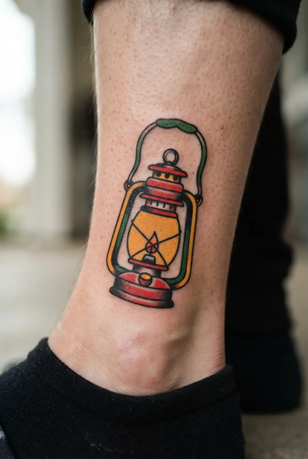
Making the frame too dark is a common mistake, since it hides the lantern’s warm center. Keep the outer structure bold, but reserve the yellow glow for the glass panels. Sound complicated? It’s not.
I love this design on the calf or shin, where its tall shape follows the leg naturally. Start with bold black outlines, then fill deep red, burgundy, and brass sections with clean, saturated blocks.
Leave clear space between each color so the frame stays readable. Add classic traditional shading around the frame to give each metal section depth without dulling the bright interior.
Small smoke curls, stars, or ornamental details should sit outside the main shape. The strong contrast gives this leg tattoo its crisp, old-school look.
Trust me on this one: keep the yellow panels open and bright, then let the darker frame carry the weight. You’ll love how the glow catches attention while the vertical layout stays neat and balanced.
24. Eagle And Shield Arm Piece With Red White Blue
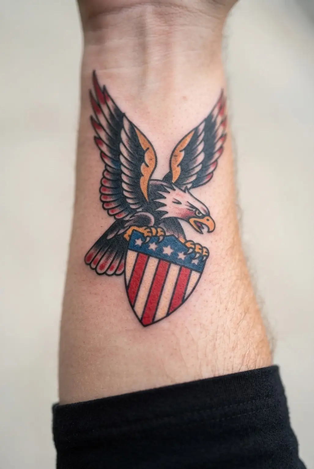
Start by placing a shield stencil on the bicep, then spread the eagle’s wings along the arm’s curve. Center the stars-and-stripes pattern inside the shield, and build the eagle behind it with black outlines, gray feather shading, and crisp eyes.
Add deep navy, vivid red, and bright white in small areas so every detail stays clear. Ever wondered why this design feels so satisfying? The shield gives the piece a firm focal point, while the wings bring motion around the upper arm.
I love how the muted foundation lets the flag colors speak without crowding the composition. Before your appointment, ask for a size large enough to keep the stars and stripes readable as your arm bends.
25. Classic Nautical Compass Forearm Tattoo With Four Points

Ever wondered why a compass feels so at home on the forearm? I love this version because its tall shape follows the arm cleanly. Start with a four-point compass, keeping N, E, S, and W easy to read.
Bold black lines set the classic maritime look, while a centered hub keeps every point balanced. Add a small rope border or aged brass accents for extra nautical character, then place a soft banner beneath the compass.
Words like “Guidance,” “Adventure,” or “True North” give the piece a personal direction without covering the central form. Keep subtle shading and spacing open, since crowded details weaken readability.
Trust me on this one: clear structure makes the design feel confident from every angle.
Photographing A Cohesive Traditional Tattoo Collection
Use the same lighting, distance, and camera angle for every healed tattoo photograph, then place a neutral gray card beside one reference image to keep color comparisons honest. Fresh ink often looks sharper and more saturated than healed work, so a collection needs images taken after the skin has settled.
Photograph each piece against an uncluttered background with the body part relaxed, since stretched skin changes proportions and line spacing. Group tattoos by visual rhythm, keeping similar black density or color intensity from competing in adjacent images.
Healed reference photos give your collection a reliable record when red, yellow, and blue ink appear together. Record each tattoo’s size and placement beside its image, since scale helps collectors judge whether a flash-style composition fits surrounding work.
Consistent framing makes the collection feel intentional without hiding differences in age, saturation, or healing.
Conclusion
So, how did these designs feel beside the pieces already in your collection? A classic tattoo often matters because its symbol connects with a memory, belief, place, or person you carry with you. American traditional tattoos give those meanings a clear visual form through strong outlines, limited colors, and familiar imagery.
Before choosing, save a few references, note the symbols you keep returning to, and speak with an artist whose portfolio shows confident traditional work. Ask about size and placement too, since readable shapes need enough room to age well.
I love the way a simple rose, swallow, or anchor still feels personal after decades of changing trends. Your favorite idea does not need extra detail to feel special. Choose the image with the strongest connection, bring it to your consultation, and let your artist help shape a piece you will feel proud to see each day.
FAQs
Q: How do I choose the right American traditional tattoo design?
A: Start with symbols linked to your memories, values, or personal interests. Compare a few references, then ask an artist how size and placement will support clear lines.
Q: What colors are used in American traditional tattoos?
A: Common colors include black, red, yellow, green, and blue. Artists often keep the palette limited so each shape stays clear and bold.
Q: Where do these tattoos look best?
A: Arms, calves, shoulders, chest, and thighs suit bold traditional imagery. Your artist can help match the design size with the shape and movement of the chosen area.
Q: How long do bold traditional tattoos stay readable?
A: Strong outlines and solid color help these tattoos stay readable for years. Sun protection and consistent aftercare support clean-looking color as your skin changes.
Q: What should I bring to a tattoo consultation?
A: Bring a few reference images, your preferred symbols, and notes about placement and size. Share the meaning behind the design so your artist understands the personal direction.